
Recomendados
Más contenido relacionado
La actualidad más candente
Destacado
Destacado (16)
Similar a Ancillary front cover of album draft
Similar a Ancillary front cover of album draft (20)
Último
Último (20)
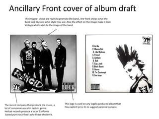
Ancillary front cover of album draft
- 1. Ancillary Front cover of album draft The images I chose are really to promote the band , the front shows what the Band look like and what style they are. Also the effect on the image make it look Vintage which adds to the image of the band. 1.Cut Me 2. Wanna Bet 3. Like Medusa 4. Friend 5. Anthem 6. Bob 7. Cap. Jack 8.Black Boots 9. Horns 10. I’m Contempt 11. Fan boys The record company that produce the music, a This logo is used on any legally produced album that lot of companies excel in certain genre. Has explicit lyrics its to suggest parental consent. Hellcat records produce a lot of California based punk rock that's why I have chosen it.
- 2. Ancillary Front cover of album draft I thought about using 2 colours of the colour wheel which Match but instead used black and white instead. This is also part of Band recognition because rancid are known for the plain choice in colour. 1. Cut Me 2. Wanna bet3. Like Medusa 4. Friend 5. Anthem 6. Bob 7. Cap. Jack 8.Black Boots 9. Horns 10. I’m Contempt 11. Fan boys The track listing I made up but With relation to the genre and Band. The hand’s are to signify punk rock as a genre it is a widely used Gesture by fans of punk rock music.
- 3. Ancillary Front cover of album draft The 'Rancid' logo is in a unique font compared to the rest of the album The title on the album 'Nucking cover as the font represents the Futs' is a clever play on words to bands genre of pop punk as the represent the bands attitude bands are all trying to be as original towards their music style and shows as they can. fans what they will get from the 'Rancid'. In additon to this the album cover title represents the 'recklessness' of the band and the genre they are in. The parental advisory sticker: the industry regulates itself. This gives a warning to whoever buys this CD that their maybe content or language that could offend people. This is important especially for this album as even the title could offend people. The record label logo for 'Hellcat records' is large on the front cover of the album to show that they are important to the band who specialises in ska,punk and hardcore bands. This record label is the same one that 'Rancid' use so represents who put faith in them to make it as a band to the audience.
- 4. Ancillary Front cover of album draft I thought about using 2 colours of the colour wheel which The 'Rancid' logo is in a unique match but instead used black font compared to the rest of the and white instead. This is also album cover as the font represents part of band recognition the bands genre of pop punk as because rancid are known for the bands are all trying to be as the plain choice in colour. original as they can. The hand gesture 'rock on' on 1. Cut Me 2. Wanna bet3. Like Medusa 4. Friend the back of the album cover 5. Anthem 6. Bob 7. Cap. Jack 8.Black Boots symbolises the genre of the 9. Horns 10. I’m Contempt 11. Fan boys pop punk music as the bands fans use it to express their gratification toward them at gigs. The 'rock on' sign is also The track listing on the back of the album cover i have made up in been reversed in the black and relation to the previous album titles Rancid have brought out to white shading to match the represent the pop punk genre of the band and the artwork on the background and represent the front and back of the album. The layout of the track listing is Rancid band. presentable on the cover so the audience can read the name of the fonts clearly also the font the track listing is in is easily to read so the audience can recognise it at first glance.
- 5. Ancillary Front cover of album draft The album doesn’t have A name because I've found Some bigger bands like weezer Don’t have names because The image are random but really fit in with the bands image Of their recognition. That they are reckless and that their genre is punk. 1.Cut Me 2. Dinosaurs Rules 3. Like Medusa 4. Friend 5. Anthem 6. Bob 7. Cap. Jack 8.Black Boots 9. Horns 10. I’m Contempt 11. Fan boys The logo is for the band to be recognised by. The colours are basic I found a lot of inspiration in big bands logos such as Arctic Monkeys And Nofx.