

Recomendados
Más contenido relacionado
La actualidad más candente
La actualidad más candente (20)
Destacado
Destacado (16)
Similar a Vibe magazine done
Similar a Vibe magazine done (20)
Vibe magazine done
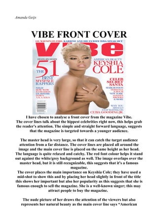
- 1. Amanda Geijs VIBE FRONT COVER I have chosen to analyse a front cover from the magazine Vibe. The cover lines talk about the hippest celebrities right now, this helps grab the reader's attention. The simple and straight forward language, suggests that the magazine is targeted towards a younger audience. The master head is very large, so that it can catch the target audience attention from a far distance. The cover lines are placed all around the image and the main cover line is placed on the same height as her head. The language is quite relaxed and catchy. The red font colour helps it stand out against the white/grey background as well. The image overlaps over the master head, but it is still recognizable, this suggests that it's a famous magazine. The cover places the main importance on Keyshia Cole; they have used a mid-shot to show this and by placing her head slightly in front of the title this shows her important but also her popularity as this suggests that she is famous enough to sell the magazine. She is a well-known singer; this may attract people to buy the magazine. The nude picture of her draws the attention of the viewers but also represents her natural beauty as the main cover line says “American
- 2. Beauty Keyshia Cole”, to reinforce this she is wearing natural make up as well. The barcode is at the bottom right hand side of the magazine. Close to it you can find the issue date. VIBE CONTENTS PAGE This is the contents page from the October 2008 issue of Vibe. The artist here is clearly the focus on this page. The contents page is clear and calm. This was achieved by listening all the “Features” and “Fashion” on one side and not using so much colour and by only using relaxed colours which here is white, beige and black, and even the artist herself is not wearing much accessories or colours either. The image shows the artist in a sensual but calm light. The details of the photo shoot and the outfits are listed in the left hand bottom corner of the page. As a whole the contents page is simple. The pages are defied into two different sections “Features” and “Fashion”, this
- 3. gives a better overview and shows that the magazine is or organized, which will encourage people to read it. All the features are listed on one side which makes it easier for the audience to find their particular article that they are looking for. The title of the page captures the reader’s attention straight away, this is because it is written against a dark background, which makes the white letters stand out and also because it is written in large bold letters. The attractive pose of the woman benefits the magazine as it will draw the attention of their young target audience. The plain background makes the text and the woman stand out more and gives the magazine a classy and professional look. VIBE DOUBLE SPREAD PAGE This is the double page spread about Solange Knowles of Vibe. “VIBE” places the main importance on the singer Solange Knowles, they do this by making her the largest on the page and also by having
- 4. little pictures of her at the top of the page. The images are respectable, playful, fun and display Miss Knowles in a playful light. The most enticing quote from the interview is placed in the right side of the main image of Solange, which persuades readers to read the whole interview to understand and read what she meant. The actual article is placed on both sides of the page but mainly on the left side. Compared to the proportion of the image, the proportion of the text is quite small. The red colour of her dress also draws the attention to her, as the background colours of the magazine are blue, grey and black. The colours that have been used for the page are very dull, this shows that Solange Knowles is the centre of attention of this page and therefor most important. However her name is written in bright blue colour this as well shows the importance of. The target audience of this magazine are both females and males. Females will most likely read it because she is a fashion icon and therefor a role model for a lot of females and males would be attracted to the picture of her, which is showing a little bit of skin to tease the audience.