
Recomendados
Recomendados
Más contenido relacionado
La actualidad más candente
La actualidad más candente (18)
Destacado
Destacado (16)
Similar a Short andrea mobile_presentation
Similar a Short andrea mobile_presentation (20)
Último
Último (20)
Short andrea mobile_presentation
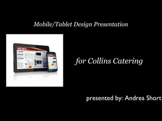
- 1. Mobile/Tablet Design Presentation for Collins Catering presented by: Andrea Short
- 2. Time spent on mobile apps has more than doubled since 2010 By 2014 there will be more mobile internet users than desktop internet users
- 3. Creating a great mobile app makes your business more accessible to consumers
- 4. 64% of mobile phone time is spent on apps and those numbers are growing
- 5. Understanding your target audience will allow you to create the most successful app
- 6. Tips to improving your website’s accessibility • Simplify your design • Be flexible • Prioritize your pages • Optimize graphics • Know your audience
- 7. 60% of users expect a mobile site to load in three seconds or less. 78% will retry a site two times or less if it doesn’t load initially. 71%of users expect a mobile site to load as fast as a desktop site.
- 8. illegible text easy to read easy to difficult to navigate navigate too much content isolated content Web design has changed to accommodate mobile and tablet users.
- 9. Twitter is mobile user friendly Twitter for Twitter for Desktop Mobile Internet Internet Users Users
- 10. Hardee’s mobile site falls short Hardee’s Desktop Hardee’s Mobile
- 11. • Simplify your website and provide only the most important content • Add the ability to book an event on mobile devices • Reduce your page length to better fit a smaller screen • Optimize your graphics to better suit a smaller screen
- 12. Resources “13 Tips to Improve Your Site’s Accessibility From Mobile Devices” at: http://www.fuelyourcreativity.com/13-tips-to-improve-your-sites-accessibility-from-mobile-devices/ “Brands’ Mobile Apps Frustrate Users” at: http://www.marketingprofs.com/charts/2010/4031/brands-mobile-apps- frustrate-users “Confusion over HTML5 & WAI-ARIA” at: http://www.karlgroves.com/2011/12/24/confusion-over-html5-wai-aria/ “Engaging Mobile Audiences, Part 1: Do I Have To?” at: http://instantencore.blogspot.com/2012/02/engaging-mob ile-audiences-part-i-do-you.html “Engaging Mobile Audiences, Part 2: Apps vs. Websites” at: http://instantencore.blogspot.com/2012/02/engaging-mobile-audiences- part-ii-apps.html “Meet Generation C: The Connected Customer” at: http://www.briansolis.com/2012/04/meet-generation-c-the-connected- customer/ “The Rise and Demand for Enterprise Mobility (and IT is Listening)” at: http://mobileapplicationtestingtimes.wordpress.com/ “Why Mobile Matters for Small Business” at: http://www.milkmen.com/blog/
Notas del editor
- In 2009, researchers at Morgan Stanley released a report projecting that by 2014 there would be more mobile internet users than desktop internet users. He seems to be accurate in his projections thus far which could be why more businesses are starting to accommodate mobile internet users.
- Consumers use their mobile devices throughout their whole day; unlike a TV that they turn off (or have on in the background while using their tablet or mobile phone) and walk away from. Creating a mobile app makes your business more accessible to consumers 24 hours a day 7 days a week.
- As your company is well aware mobile and tablet usage is on the rise but did you know 64% of mobile time is being spent on apps? It’s numbers like these that are driving businesses to create apps for their consumers.
- Customers use mobile and tablet devices for various reasons. Understanding why your target audience uses these devices will help you create an app specifically geared for them. This makes them happy and lands you a repeat consumer and perhaps some free word-of-mouth business as well.
- HTML5 is the current technology used to make websites accessible on all devices. Staying up-to-date with technology is vital but simply having the technology isn’t enough. Here are some tips to improving your websites accessibility.
- So you know you need an app so just use your website you have and put it on a phone right? Well that will work if the goal is to simply have an app but if you want a user friendly app that consumers will use again and again you might need to change some things.
- Mobile and tablet usage has impacted Web design in a huge way. What works great for desktop internet doesn’t always go over so well on a smaller screen. In fact designers are now designing sites with mobile compatibility already in mind to make the transition easier.
- Twitter is a great example of a company that took their website and made it mobile user friendly. They eliminated the excess content which made the mobile site look cleaner while maintaining the easy navigation available to desktop users.
- Hardee’s has a great website but unfortunately this didn’t transfer over to their mobile website. Hardee’s made the classic mistake of eliminating too much content.
- Your company has a beautiful website that is easy to navigate on desktop internet but when viewed from a mobile device the site becomes difficult to maneuver which can be very frustrating for a potential client and cause them to look elsewhere.