1. Teaser Title:
In the first frame I will be focusing on the title of our trailer. How the research we had gathered
by watching horror film trailers also, doing research on different style and types of font made us
decide to go with ‘Cloak’. The whole point behind calling our trailer cloak was that we really
wanted our film to stand out form the rest of the other trailers. Once we established that a
cloaked lady was our antagonist we realized that ‘Cloak’ would be the perfect mysterious,
unique name. The ‘Cloak’ fits in very well into the trailer as it has connotations of darkness, fear
and the un known. The main meaning behind the title was that the person in the cloak is
unknown which is a bit of a mystery to the audience, making it much more exciting form them.
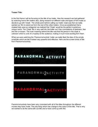
When we were watching the ‘Paranormal activity’ trailer we really liked the idea of the simple
small title which we felt it looked very powerful and effective. Here are the screen shots of title
from Paranormal activity:
Paranormal activity have been very consistent with all of the titles throughout the different
movies they have made. The only thing which has change is the colour of the title. That is why
we wanted to do the same with out title and w have come up with this:
2. By doing all of that research on the differences styles of typography we decided to have a black
plain background and place white writing on to which would make it pop out more.
Once we completed the title, we wanted to give it an edge by adding in the electric blue outline
which makes it look like it is glowing. However, after we had completed the trailer we thought
that the glow makes it look like a sc-fi genre. This would mean that leaving it just plain white
would have suited the convention of the horror genre. We had placed the title right at the end of
the trailer which follows the conventions of a teaser trailer. Rather then it being at front as that
would make it look like an opening sequence. We placed the writing in the middle as, it grabs
the attention of the audience more
Location and Setting:
In the second framers we will be looking at setting and location. Once we all sat down and tried
to remember some of the horror films we have seen in the past, we realised that a lot of ur
favourite ones have mostly been set in the woods. We took some inspiration form ‘The Cabin in
the Woods’ and ‘Friday the 13th’ which both of their setting an location was in woods. We felt
that by setting the trailer in the wood would perfectly follow the convention of our genre. Once
we had found the the right location for us , we realised that the closeness of the trees and the
branches and all of them looking very similar could give a sense of confusion to the character
which would be in the woods. Also the creation of shadows by the tall trees and the quietness in
the woods would really give it a scary feel for the audience. Once that was all filmed we added
special effect by turning down the brightness of the shots to make them darker.
3. The main thing for us was to create a sinister, threatening atmosphere for the audience. When
all of the special effect were done we ended up with this result:
Costumes and Props:
In the primary and secondary research which I did I realized that is most of the horror films the
protagonists usually wear the simple teenage look. Jeans and a tee-shirt. Harry was the typical
teenager wearing a jumper and jeans this give him a connotation of a typical boy in his
particular age group. In complete contrast to the antagonist in with our movie which is the
cloaked person. They were wearing a long black cloak, which didn't give any indication of who
or what might have been behind it, there is no sing of the face of the person. This creates
mystery for the audience, making the scenes with the cloaked figure more threatening and
dangerous. Another thing was that by having a cloak and not being able to see a face we can
create a story about the person. For example that it has a horrible past or doesn't want to show
their face and that is why they are hiding behind it as, if it was protecting them. By creating that
sense of fear in the audience eyes we were able to follow the genre convention. We researched
the film ‘Goblin’ which has character that is always hidden behind the cloak. The darkness of the
cloak has a connotation of evil, danger, panic and this was exactly how we wanted to make our
audience feel.
4. Editing and Camerawork:
During the whole planning process and then the filming we kept reminding ourselves that we
need a range of different shot types and angles. We knew that one of the most important shots
that we needed to film was the scare jump. This would be a close-up of the cloaked figure.
Filming a variety of different shot keeps the audience interested. In the post production process
we started to edit using fast paced cuts building the tension up. By speeding up the cuts it keeps
the audience on an edge, not knowing what is next. By zooming in on the jump scare it makes
the figure look much more dominant and powerful as, if it is over taking the screen. We have
followed the horror genre conventions as we knew that, that way we would achieve the best
outcome.
5. For example in the sinister film the dark effects and the behind shoulder shot gives it an intense
feeling.
Story Introduction:
The first scene is the introduction into the whole mystery in the film. It is introduced with non
diegetic sound which was the dialogue between the psychiatrist and Harry, talking about his
experience with the cloaked lady. The dream that he has are mean to act like flashbacks
reminding Harry of what has happened to him. We tried to use as less dialogue as possible as
we didn't want to reveal much of the story. Trailers usually hint about what the story line, this is
how usually all the trailers are structured and shown. There is a real resemblance between ‘The
Conjuring’ film and how our characters tell the story.
Characters are introduced:
By including parts of the characters and letting the audience know who they are and what their
role is, that is now more then enough for a trailer. Establishing the situation that they are in and
how they carry on with it, is why the audience will want to know. In my research I did find that in
all of the trailers there isn't much description about the past of the character and who they are.
We have followed the genre convention by trying to replicate a famous horror film called
‘Sinister’. In the trailer there is just enough shots of the male characters for us the auctioned to
understand that something will happen to him. Close ups of the character and also a screen
play got developed to suit the situation. Our main worry was not having too much dialogue as,
we thought that might ruin the mystery of our cloaked lady.
6. Company Ident:
After looking at some of the 3 major conglomerates company that dominated the whole film
industry, that being Warner Brother, Sony Film and Universal. We noticed that the ident were
precisely worked on. This is why we created our own small individual distribution company
which is called ‘i’ productions. The ‘i’ was taken form a popular music video ‘i’ of Kendrick Lamar
which had a really strong social meaning it in.
As our distribution company is an individual one and has not yet been established, we wanted to
create an explosive ident which would instantly attract the audience. We used garage band to
create a new track for the ident to make it unique and our own. It is important for out to
extinguish our self for them competitors, that is why it is animated and also has special effects
added.
7. Title font and style:
As brand identity was also very important to us we knew that we needed to keep the same style
of font throughout the three media products. We had used the same font type on all of them but
only slightly changing the colour of it.
The style of the font is very simple but looks interesting at the same time. We tried to keep is
that way as we thought that it would fit the convention with our horror genre. In the first practice
poster which we created, I thought that we should create a tag line, this could be very useful for
future marketing purposes in the social media. The tag line started to be - DREAM, SEE, FEAR
however, when we were working on the finale version of our poster we changed it to SEE HER .
FEAR HER which we thought sounded more spooky and edgy. The wording on the poster was
relatively simple, we tried to keep it quiet sharp but professional. We had followed the
conventions of our genre as, we made all the whole background very dark and mysterious and
the writing on the side gives a hint about what the readers can expect to see in side the
magazine.
Genre:
We have stuck and followed the genre conventions in all of the marketing campaigns. The
genre type is suggested in the whole trailer because of the dark effects used on every shot to
make them seem much more sinister. In the trailer in the woods scenes, Harry is always trying
to hide and look if the mysterious cloaked lady isn't watching him. The following scenes are
typically done in most of the trailers to portal that someone is in danger and also, that the
audience can distinguish between the evil and the good in the film. By creating quick movement
such as, when the cloaked figure passes thought the camera lens, this makes the audience fear
of what might happen with the protagonist. Also, when the figure which is the antagonist, is
8. walking slowly behind the tree this creates a sense of tensions build in the audience. Them
wanting to find out more about what will happen and then making them go and watch the film.