Presentation Skills by Md. Safayet Hossain for Dhaka University Career Club
•
54 recomendaciones•29,602 vistas

This document provides tips and lessons for creating effective presentations. It discusses the importance of knowing your audience, using clear and concise language in slides, maintaining consistency in formatting and design, and engaging the audience during the presentation through eye contact, pacing, and stories. The key lessons are to focus on the audience experience, avoid complex or distracting slide content and design, and remember that an effective presentation depends more on how the information is delivered than what is said.

Recomendados
Más contenido relacionado
La actualidad más candente
La actualidad más candente (20)
Destacado
Destacado (12)
Similar a Presentation Skills by Md. Safayet Hossain for Dhaka University Career Club
Similar a Presentation Skills by Md. Safayet Hossain for Dhaka University Career Club (20)
Último
Último (20)
Presentation Skills by Md. Safayet Hossain for Dhaka University Career Club
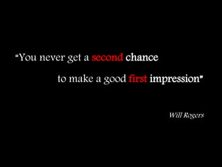
- 1. to make a good first impression” Will Rogers “You never get a second chance
- 2. What changed this world Apple Apple Apple
- 3. Adam’s Apple
- 4. Lesson one: Never Do DON’Ts
- 5. Newton’s Apple vsPhilosophers at War: The Quarrel between Newton and Leibniz LeibnizNewton
- 6. Lesson two: The world is too CRUEL you need to TELL what you are
- 10. Want to learn how to drive a car? DRIVE Want to learn how to be good presenter? PRESENT
- 11. • Ethos Credibility (Who you are) • Pathos Emotional Connection (How affluent your are ) • Logos Logic (What you are talking about )
- 12. How to start Know Your Audience
- 14. Account Type 5: Guaranteed Lifetime Withdrawal Benefits Payments a fixed percentage of “withdrawal base” Withdrawal base can increase with increases in the value of the underlying account but can never decrease Insurance company guarantees payments for the life of the client or clients Funds may be withdrawn at any time, decreasing the withdrawal base Fees for investment management and insurance
- 15. … is the average lifespan a newborn can expect … is short when child deaths are common
- 16. Getting Started Draw the timeline
- 17. Preparing Slides Slide 1 Announce the title Slide 2 Seize attention of your audience
- 19. 3,000,000,000 poor About 50% of the world population
- 20. Text on the slide Rule of Six 6/6 No more than six words No more than six words No more than six words No more than six words No more than six words No more than six words
- 21. Slide Structure - Bad • This page contains too many words for a presentation slide. It is not written in point form, making it difficult both for your audience to read and for you to present each point. Although there are exactly the same number of points on this slide as the previous slide, it looks much more complicated. In short, your audience will spend too much time trying to read this paragraph instead of listening to you.
- 22. Fonts - Bad • If you use a small font, your audience won’t be able to read what you have written • CAPITALIZE ONLY WHEN NECESSARY. IT IS DIFFICULT TO READ • Don’t use a complicated font
- 23. Be Consistent 1. Title a. Point1 b. Point 02 c. Point 3 B. Title 2 i. Point 1 ii. Point 2 iii. Point 3 2. TITLE i. Point 1 ii. Point 02 iii. Point 3 A. Title 1 i. Point 1 ii. Point 2 iii. Point 3
- 24. Inconsistent font 1. Larger customer Base 2. Higher income ratio 3. Greater accessibility 4. Easier to get financed 5. Flexible rules
- 25. Color - Bad • Using a font colour that does not contrast with the background colour is hard to read • Using colour for decoration is distracting and annoying. • Using a different colour for each point is unnecessary – Using a different colour for secondary points is also unnecessary • Trying to be creative can also be bad
- 26. Background – Bad • Avoid backgrounds that are distracting or difficult to read from • Always be consistent with the background that you use
- 27. Graphs - Bad January February March April Blue Balls 20.4 27.4 90 20.4 Red Balls 30.6 38.6 34.6 31.6
- 28. Graphs - Bad 20.4 27.4 90 20.4 30.6 38.6 34.6 31.6 0 10 20 30 40 50 60 70 80 90 100 January February March April Blue Balls Red Balls
- 29. Endowment funds and Alternative Investment 0% 10% 20% 30% 40% 50% 60% 70% More than 1 billion100 million to 500 millionLess than 50 million Fixed Income International Equities Domestic Equities Alternative Strategies
- 30. 7% 7% 14% 30% 15% 10% 12% 5% 0% 5% 10% 15% 20% 25% 30% Domestic Equity Foreing Equity Emerging Market Equity Private Equity Absolute Return Publy traded commodity Real Estate Fixed Income Proposed Allocation for Harvard
- 31. 0% 20% 40% 60% 80% 100% 0% 20% 40% 60% 80% 100% Current Year 1 Year 2 Year 3 Year 4 Proposed Domestic Equity Foreing Equity Emerging Market Equity Private Equity Absolute Return Publy traded commodity Real Estate Fixed Income How to reach there?
- 32. Check • Grammar is importance • Spelling sould be revewed • Punctuations should be corrected;
- 35. Open effectively Engage audience from the beginning Trick 01 Human interest Trick 02 Tell a story Trick 03 Quotations, questions
- 37. Things to remember • Behave naturally • Correct your accent • Keep hands out of pocket • Don’t fold your arms • Let audience see your face
- 38. Things to remember • Breathe • Speak slowly and clearly • Vary your inflection and pace • Pause regularly • Maintain eye contact
- 39. Doesn’t matter WHAT It matters HOW
- 40. DON’Ts
- 41. if you wish to be disliked Use Jargon
- 43. Summing up • Summarize the conclusion in short • Use an effective and strong closing – Audience remembers last words
- 44. Q and A • Not everyone can answer all questions • Prepare some questions • Be confident with your answer • But not be stubborn
- 45. Suggestions Listen to professional speakers Take note of effective speakers TED speakers English Movies Different English books, periodicals
- 46. What is success? Nobody knows