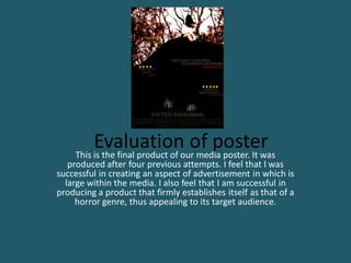
1. Evaluationour media poster. It was
This is the final product of
of poster
produced after four previous attempts. I feel that I was
successful in creating an aspect of advertisement in which is
large within the media. I also feel that I am successful in
producing a product that firmly establishes itself as that of a
horror genre, thus appealing to its target audience.
2. The image displayed within the poster covers the entirety of the page. This
allows it to become the focal attention of the audience. The picture depicts
authority over the little girl, placed at the top of the page. The fact that we
can't see her face creates fear and excitement, almost allowing the audience
to imagine themselves what the young girl looks like.
Also, the image of the hands being dragged away above the title
confirms that there is violence in the film. This is very powerful,
showing aggression within the poster, a fine contrast to the
authoritative girl sitting above.
Symmetry is displayed within the poster, particularly within the reviews
and the tagline of the poster. This creates an enticing and relevant
relationship between the two. The structure of these texts are compatible.
This allows the poster to link well, appearing more neat and enticing.
The colour scheme, red, grey and black is a consistent one, each
denoting haunting, blood and evil, and death and the unknown.
Such colours are displayed within many media products and
allow the poster to assert itself as that of a horror genre. The
colours seem very powerful, contrasting off one another. This
will certainly draw attention to the product,, and will allows the
audience to quickly acknowledge the genre.
3. The nature of the entire product was to create fear within something that is typically viewed
as innocence and vulnerably. By using a young girl as the evil character, we are almost
challenging this idea, forcing people to feel more vulnerable. This is echoed significantly within
this poster. The use of the girl is haunting, the addition of the doll supports this, particularly as
it is disconnected from the girl. This suggests that she is not vulnerable. This is made evident
by her higher position, giving her authority and power over the audience
The poster contains the typical codes and conventions
of an already existing film poster. This will bring about
this sense of realism. The general information such as
actors and taglines allows the product to associate and
familiarise itself with existing posters. Moreover the
credits at the bottom of the page further demonstrate
this.
Reviews produce this sense of realism within the product. It
is largely an enticement, attempting to make people to want
to watch the film. It also acts in a way to entice the audience,
particularly as both reviews are by experts in the film
industry. Audiences will be greatly reliant on such experts on
deciding whether to view the film, highlighting this two-step
flow theory
4. The tagline, as typical existing ones, acts in a way in which
anchors the nature of the film, suggesting possession. It is
successful in that it doesn't give too much of the plot away, but is
enough to entice and attract the audience
Moreover, the title is very appropriate and finds
great symmetry and links to the trailer and the
poster. Again, making reference to the innocent
nursery rhyme, it becomes fearful and eerie. The
film is associated greatly by this idea of possession.
In the nursery rhyme, the sandman hold great
powers, making it powerful. This seems very
effective, and allows us to challenge innocence,
what people think is safe, is actually fearful.
5. How does it compare to already existing products?
Much like my film poster, 'Wicked little things' demonstrates many similarities,
concerning the protagonist, location, and colour scheme,
6. Firstly, an important thing to recognise is that both posters share the use of a little girl as the singular
character. This highlights the importance of both characters within the film. Moreover, both images of
the girls are distorted, so that their faces are partially covered. This allows the audience to interpret
their own characterisation of the girls, arguably emphasising the fear brought upon by the poster.
However, one contrast in which is clear is the positioning of both characters. The girl used within my
poster is portrayed by the use of a high-angle shot, emphasising her dominating, powerful and evil role
within the film trailer. None the less, the camera angle used within the 'Wicked little things' poster is still
slightly lower, semantically depicting her role within the film.
Moreover, the anchorage of the location within both posters is very apparent, with the inclusion of the
woods in the background of both. This brings about this feeling of isolation, emphasising the fear brought to
the audience. Additionally the colours used within the location shot are in some way changed. My poster
uses a de-saturation of colours to bring about this dull, eerie tone. In contrast to this, the poster ‘wicked
little things’ has used a range of tones, including the powerful sepia effect to create this grungy appearance,
ensuring that the poster is in no way glamorised.
The use of black colour is very apparent throughout both posters. This fits greatly within the horror genre,
denoting death as a focal theme. Moreover, in using this black as a primary colour of the page, the boldness
entices the audience, attracting them to look at the product. A recognisable difference within both posters is
the use of white in which I have adopted. This colour, I feel, creates a haunting tone, clearly not innocence.
7. My poster presents reviews as a means of enticing the audience, and persuading them that they should view
my film. the use of these reviews and additional codes and conventions; such as credits, brings about a large
sense of realism. This is a contrast to the real media product. Although 'wicked little things' hasn't adopted
this into their product, it still asserts itself as one. I feel that my using the review in my product, it defines its
role as a real media advertising product.
Another obvious contrast within both posters is the significance of the tagline. In my product, the tagline is a
central feature of the poster, using bold text, both red and white; it is certainly enticing for the audience.
However, despite the already existing product using a tagline, it doesn't seem an important feature. it almost
blends into the black background. Yes, this is allowing the image and the title to become the key aspects of
the media, but, it almost undermines the typical conventions that are developed within posters.
Clearly, my film poster generates the typical conventions of already existing media products. The poster
'Wicked little things' is a fine example of finding both similarities and differences. In studying both products,
i have concluded that my poster uses the significant factors in which 'Wicked little things' does, including
the title, a main image, a tagline, and credits. However, my poster further develops other existing products,
by including the film review, and the names of the main actors/actresses starring in our film trailer.