
Recomendados
Más contenido relacionado
La actualidad más candente
La actualidad más candente (18)
Similar a Contents page analysis
Similar a Contents page analysis (20)
Más de anthonyy12
Último
Último (20)
Contents page analysis
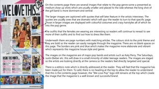
- 1. On the contents page there are several images that relate to the pop genre some a presented as medium close up shots which are usually smaller and placed to the side whereas the long shot of the girl band is more dominant and central. The larger images are captioned with quotes that will later feature in the artists interviews. The quotes are usually ones that are dramatic which will spur the reader to turn to that specific page. Those in larger images are displayed with colourful costumes and crazy hairstyles all of which tie into the pop genre. The outfits that the females are wearing are interesting so readers will continue to reread to see more of their outfits and to find out how to dress like them. Underneath there are page numbers with matching articles. The colours stick to the pink theme and they are bold so the reader can easily navigate through the magazine. There are no blank spaces on this page. The borders are pink and blue which makes the magazine more elaborate and vibrant which represents the magazine house style and genre. The images on the magazine are of major pop bands and artists such as Katy Perry, The Saturdays, Justin Bieber etc. this will draw in a small minority of older teenage readers. The images are staged so the artists are looking directly at the camera so the readers feel directly targeted and special. There is a editors note which is directly addressed at the reader. They will feel that the magazine has been made just for them. To add, there is no heading at the top to allow the reader to understand that this is the contents page however, the “We Love Pop” logo still remains at the top which create the image that the magazine is a well known and successful brand.