SaptaIDC portfolio_010116
•
0 recomendaciones•441 vistas

This presentation showcases key and recent projects completed. Each project case study presented here, amplifies certain stages of our design process such as - discover, design or detailing.

Recomendados
Recomendados
Más contenido relacionado
La actualidad más candente
La actualidad más candente (20)
Similar a SaptaIDC portfolio_010116
Similar a SaptaIDC portfolio_010116 (20)
Más de Archana Belani
Último
Último (20)
SaptaIDC portfolio_010116
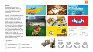
- 1. GOLD AWARD STORE DESIGN VM&RD GOLD AWARD WEB DESIGN BIGBANG TOP 11 DESIGN SUPPLIER RETAILER TECH 30 APP DESIGN TECHSPARKS Sapta is a Business Design company.We deliver impact by combining business and creative thinking, by collaborating with stakeholders. At Sapta, every engagement begins with a deep understanding of our client’s business. We dive in to discover unmet needs, conduct design research from a user- perspective and gain insights that give direction to possible scenarios. Our customers form an integral part in co-creating the experience for their brand or offering enabling a more robust business solution. We develop measurable ways to gauge design impact; and as our customers are involved through the entire process, the final solution already has a thorough buy-in even before it hits the market. © Copyright 2014 Adobe Systems Incorporated. All rights reserved. THE PULSE OF NEW CREATIVES IN APAC: AN ADOBE SURVEY 2014 Capabilities Brand Experience Digital Strategy Furniture Design Collaborative Spaces Awards About
- 2. DEVELOP DIALOGUE DISCOVER DESIGN DETAIL DELIVER DISCOVER DEVELOP DESIGN DETAIL DELIVER USER competition/ trends analogous etc sharing stories & developing insights strategy formulation develop business & design strategies ideation/brainstorm concept development idea selection metrics prototyping research objectives market audit competition audit language audit trends research analogous & adjacent research brand experience audit idea refinement validation of prototype co creation DIS S E C T user feedback idea detailing define metrics visual design content finalization focus group/co-creation feedback/ revisions project debrief & induction to formulate the project brief expectation requirement/ features timelines roles current status D I A L O G U E D I A L O G U E business position & direction target audience, offerings, etc design direction target audience, offerings, etc SEO marketing launch PPC advertising display advertising email marketing content optimisation social media analysis & reporting The portfolio presented here is chosen according to our Sapa process developed. The intension here is to present an aspect of the project which best communicates the corresponding process cycle. Presentation overview
- 3. DEVELOP DIALOGUE DISCOVER DESIGN DETAIL DELIVER DISCOVER DEVELOP DESIGN DETAIL DELIVER USER Project Adobe Capricot Project DIS S E C T Project Eyewear Store The Bombay Store D I A L O G U E D I A L O G U E Mahyco Project Britannia Adobe Zinnov Adobe 3MThe portfolio presented here is chosen according to our Sapa process developed. The intension here is to present an aspect of the project which best communicates the corresponding process cycle. Presentation overview Pile on me Project Big Toss Drools Capricot Book Design Pile on me DIALOGUE+DISSECT this part of the process runs across the duration of the project. It involves constant communication, and validation of the ideas DISCOVERY the most critical phase, where we uncover insights through design research, observational studies, competition audit and more DEVELOP based on the insights and learning from the discovery, we develop the strategy and co-create the creative brief DESIGN in this stage we conduct collaborative brainstorming, develop concepts, quick mockups ready to presen DETAIL once the designs are finalised, all the necessary design touch points are detailed for final approvals DELIVER prior to final launch (depending on project type) we conduct a learning launch to analyse any learning
- 4. The project was to develop an online ecommerce webiste. The client was based in France. Pileon-Me is where buyers aggregate their offers to get the best of deals from various companies. They are also able to compare their deals with various brands to see the best rates out there. Our target is to design a working prototype website with user validation. The challenge here was the concept was massive, and the website needed to capture all these aspects. The detail of the project showcased here is to highlight the intensity of the research we conducted which obviously combined both secondary and primary research. Pile on me We quickly conducted a prototype of the concept with actual users. We used the BMC to communicate not just our competitors but also the pros & cons of the brand We used cultural probes to deep dive into various user lives Brand Experience Digital Strategy Defining the challenge - combination of fish fingers with what we know, dont know and assume An iduction document Project management detail DISCOVERDIALOGUE
- 5. Showcased here are the results of the research insights - personas, purchasing cycles and key insights. We also moved into a develop phase where we developed the first level draft of the website frames with their feature lists. Pile on me Brand Experience Digital Strategy DEVELOP
- 6. Brand Experience Big Toss Brand Development While developing the brand “The Big Toss,” a social sports app launched first for Cricket the thought was to “bring the stadium alive in one’s hands’. On connecting with sports fans and with a better understanding of the commonalities among various sports we took a direction for the brand that resonated from the thoughts of a stadium. We developed quick mockups of the application of the identity into future avatars to test the feasibility of the ideas we presented. This enabled in seeking quicker decisions on the branding which then got extended into the various design touch points Scope: Brand logomark Stationery & Collateral DEVELOP DESIGN
- 7. We were approached by The Big Toss team when the app was already six months into development. Our initial scope was to develop the branding. As the project progressed and we collaborated with the client on brainstorming sessions, usability of the app and other features the client suggested we try our hand on designing the visual UI right through the app. This was our first assignment in the category. A great collaboration with the client and quick iterations later, the app was launched coinciding the recently held ICC Champions Trophy (2013). We developed all the critical pages, the design assets, the customised social sharing iconography along with promotional graphics for social media advertising. Digital Strategy TECH 30 APP DESIGN TECHSPARKS "Sapta has exceptional design and creative resources. We have used Sapta on over 5-6 occasions, they were able to exceed our expectations each and every time. All of their work gets done with the highest levels of communication, process and delivery" − Gappan Annamalai | CEO, TheBigToss.com & Cooolio Big Toss UI & Web DEVELOP DESIGN
- 8. Brand Experience (Book Design) City Books and Coffee Table books have always captured the eye of the reader. When Mr. Atmaram N Gangaram, owner of Gangarams Gallery, (one of Bangalore’s oldest book and stationery landmarks) approached us to do a book on Bangalore, we know that the project would be a discovery of our own city and we signed up. Also when we received the draft written by the author Dr. A Ravindra, the advisor to the government on urban affairs, the depth of information covered made us approach a “typical coffee table book brief” differently. Over the course of 6 months we collaborated with photographers, discovered new places of the city we never knew, got access into the State archives as well as some of the first people to visit Bangalore’s first metro rail project. We created a book that tells us the story of the city through its multiple facets. Titled Multiplicity the book was released by the then Chief Minister (Shri Sadananda Gowda) and over 10000 copies were sold within the first year. Bangalore Multiplicity DEVELOP DESIGN
- 9. We love animals (of all kinds). So, when the opportunity came to develop a brand that would compete against global players in pet food. We started off by visiting our dog’s vet, stores that we usually bought pet food from, observed how people shop for pet food and what they were looking for. Basis our market study and the positioning that we were looking to establish, we needed a brand that would immediately associate with pet food. The name drools came about during one of our iterative sessions and the name was an instant hit and connected very well with what we were offering. Drools now sells in all major pet food stores across India and has become a national brand and a worthy competitor to the global giants. Drools Brand Experience DEVELOP DESIGN
- 10. This project excited us because it gave us a blank canvas to work on, a chance to create an iconic brand. We had to chance to create something new! CAPRICOT, an organisation that helps people to unleash ideas to change the world! An intensive workshop oriented design thinking approach saw the team explore materials, form, colour, and more to give the brand more meaning. Creating a cohesive and comprehensive expression of the brand across various platforms,- realms and touch points such as physical, digital, marketing, collater- al and press launch Capricot Brand Development Brand Experience We took 4 days to ideate different themes and explore the potential of each logomark. We explored using different mediums and not just on the system. The exercise was lots of fun, and we were able to shortlist 3 directions to present to the client. DEVELOP
- 11. We coined the name ‘Capricot’ that was unique, catchy, with a good recall value and yet was rooted in meaning. An identity that was dynamic, vibrant and energetic and representative of the coming together of four companies. An identity that is fluid yet ensconced in structure, both important attributes for the organisation to run. The brand identity represents the “Eye to the Future” in a vibrant colour palette that embodies the energy of the organisation. The ‘hidden arrow’ represents that path and direction of the organisation – always moving up! Capricot Brand Development Brand Experience Extensive prototyping and testing was conducted, on aspects of the logomark - color, size, font, shape, etc. and even extended into various mediums such paper, signage, uniform and many more elements. DEVELOP DESIGN
- 12. Brand Design: Extension of the brand into various collaterals including signage, uniforms, marketing and sales communication, etc. Digital Experience: We extend the brand experience into the digital world of web as well as to try and build a unified imagery across the social media. Video Animation: To showcase the brand at a “30000 feet” level, we developed an intro film to depict what Capricot is all about. To view the final video see appendix. Capricot SOW Brand Experience 1 1 2 2 3 3 The brief was to develop a video to showcase the brand at a 30,000 ft. level. To see if the concept works, we replicated a scenario where the video could be presented. We rented out a hall at a hotel, dimmed lighting as it will be used in actuality. We then invited the marketing, sales team along with the CEO’s. We developed a score card, to rate the key factors needed to make the video successful. We also broke the audience into teams to discuss what worked, what can be improved, questions, ideas, etc. Digital Strategy DEVELOP DESIGN
- 13. Adobe Creative Pulse APAC To design a creative design information report basis the online survey conducted by Adobe across all the APAC regions. The report should be designed in such a way that is: 1.applicable across regions 2.express the Adobe values 3.the report will only be shared through digital mediums such as mobile devices, social media and press releases 4.the report should create a stir in the design community and encourage "sharing" across platforms. Brand Experience DEVELOP DESIGN
- 14. Adobe Creative Pulse APAC This project success could be attributed to the brainstorming techniques adopted. One of the techniques used was the Taxi Zebra. Here we combined two random words, forming random units. From there we developed 6 themes. A close up of one of the themes can be seen on the right. The themes were presented to the client after we adutied the themes ouselves using a napkin pitch. Brand Experience DEVELOP
- 15. We were assigned to develop the retail identity for Odyssey’s venture into Eyewear Retail. This was an end-end project that saw developments in branding, retail, speciality fixtures, signage as well as execution. The Lenticular Story: While designing the store, a single column seemed to jut out in the layout. This being a premium store, we didn’t want to look at conventional column cladding treatments. After a bit of R&D, we came across this new technology of Lenticular Displays (with no installation in India till then). This store design won us a Gold at VM&RD for best store design in the category. Eyewear Store Brand Experience Collaborative Spaces GOLD AWARD STORE DESIGN VM&RD DETAIL
- 16. India’s oldest retail brand “The Bombay Store” approached us to relook at their retail identity. As a brand they were slowly looking at bringing in a range of contemporary Indian products (unlike the craft products that they earlier had). As part of our solution we positioned the Bombay Store as a brand where one can “Discover a New India”. This positioning percolated to every team member in the organisation. From a signage standpoint, we took classic Indian Prints (like the mehendi) and gave it a modern twist. Using laser cutting techniques on acrylic we created partitions that we fondly called the Mehendi partition. This became one of the essential focal points of the store. We also introduced signage printed on canvas with a hanging bell that talked about categories, a day-night backlit sign that stretched across the entire “L” shaped facade that increased visibility to the store. Facade Reception Brand Experience The Bombay Store DETAIL
- 17. Our retail transformation for 'The Bombay Store' featured in the VM&RD June 2010 issue: 1 - The wall units were inspired by Indian Jaipur architecture 2 - The suspended units were cladded with laser cut Acrylic tiles, with stylized Indian Mehendi patterns 3 - The suspended signages were made to look like modern scrolls with a bell hanging at the ends 1 1 2 3 DETAIL
- 18. Britannia GoodDay Britannia’s oldest brand “GoodDay” was completing 25 successful years in the marketplace. As part of the celebration they were giving away Gold Coins to lucky winners every hour for a period over a month. While the ATL and the technological backend was planned to take care of the promotion, the critical in-store awareness and impulse creation was still something Britannia was looking into when they approached us. Inspired by the “Las Vegas Jackpot” our thematic concepts brought alive the offers in retail. Our concept for the Island Display got featured on the cover of the April 2013 issue of POP magazine. Brand Experience DELIVER
- 19. Brand Experience We were recruited by a PR agency called The Practice, who is driving the perceptions mapping of Mahyco. The project is a perception exercise. The challenge is Mahyco communication and knowledge is very technical so we needed to work it in a way it helps communicate or showcase: 1. pro-framers 2. not just BT 3. the large research investment (10 to 30% revenues are reinvested) 4. bio technology investment in agriculture 5. 50 years legacy Scope included: 1. Developing infographics 2. Brochures and marketing communication kits 3. Videos Mahyco Marketing Communication There were many constraints as we were working with a rigid Indian coporation. We explored ideas using the Mahyco product itself. The ideation of the project was very experimentive and we tried to prototype the ideas quickly. Also we communicated to the client using a lot of quick videos so that they can understand the ideas better, for buy-in. See Appendix DELIVER
- 20. Brand Experience We were approached by Zinnov with an urgent requirement to design the communication needed for their conference on enterprise digital transformation. This project included designing a video, a report, a website and an infographic. Besides the design we were involved deeply in the technical content writing skills needed for all communication. We had less than a month to complete all work. About Zinnov Zinnov has been at the forefront of innovation and thought leadership. With over a decade experience in globalization, understanding customer problems and coming up with viable solutions. They assist clients in addressing globalization challenges by offering customers insights, data, and implementation support to address their challenges. Their in-depth experience is driven by their focus on engineering and digital practice areas. Zinnov Report Showcased here are sketches for the cover and few inside pages. The complete report can be downloaded by clicking on this link: http://www.digital.zinn- ov.com/imag- es/events/EDT_Re- port.pdf DELIVER
- 21. Brand Experience Zinnov The video can be viewed on this link: https://www.you- tube.com/watch?v=ToL4zo2o kV0 Screenshots DELIVER
- 22. MTD & Packaging 3M Antiskid Tapes 3M, one of the worlds leading innovation companies came to us with a simple problem. They wanted to market their industrial anti-skid tapes to the consumer market. The challenge was, they had approached their regular vendor, got options on designs but it was still very industrial in its language. The bigger challenge was that the production time was already locked in and owing to the loss of time on the initial iteration there was only a 10 day period left to deliver the final designs. We applied our rapid ideation techiniques and got the client to collaborate on this exercise to be able to delver within the speculated time. We took the familiar “slip and fall” character humpty dumpty into connecting with the product. Clear colour codes differentiated between the wet and dry version of the tapes and the designs have been imple- mented successfully across India DELIVER
- 23. Thank You