SlideShare una empresa de Scribd logo
1 de 10
Descargar para leer sin conexión
| Module 3: E3 Activity on “Informational and Statistical Visuals”.
IDT 560: Visual Literacy
By: Arturo Pelayo.


Instructions:


         Redesign the form you created for Module 2, now include criteria on Visual Tools as well as Visual Actions (CARP).
  I.

  II.    Use the new form to critique a poorly designed chart, graph, table, diagram, or illustration.

  III.   Redesign the item you choose to critique.

  IV.    Write a short paragraph outlining the improvements.
Procedure:


  • Creation of an introductory documentation page for future reference and incorporation of Best Practices.

  • Creation of a Document Version History Page to detail the changes of the E2 Form and the E3. (Satisfies Instruction I).

  • The 3rd page of this document includes the “E2” form.

  • The 4th & 5th pages represent the new “E3” form.

  • When printed, the document can be easily laminated, as each side of the form would remain on the same sheet of

     paper.

  • The 4th page will be the CARP side & the 5th page will include the criteria on Visual tools. (Satisfies Instruction II).

  • The 6th page includes the “old” illustration evaluated in E2.

  • The 7th page includes the redesigned illustration. (Satisfies Instruction III).

  • The 8th & 9th pages include an E3 template. (Satisfies Instruction I).

  • The 10th page includes a paragraph with discussion of improvements.
Documentation of changes to form (document version history):


         Change                 E2                         E3                                           Reason?


 Font type used.     Helvetica, size 11.       Euphemia UCAS, size 12.     The Integration of mild serifs enhances the visual appeal of the
                                                                           document while also providing better readability and less eye
                                                                           strain.

                                                                           Risk:   This is not a standard font of MS Word.
                                                                           Mitigation:    Provide a PDF file.
 Page Formatting     US Letter (landscape).    US Legal (landscape).       Provides better readability and uniform density of text presented.

                                                                           Risk:   The evaluator may not have legal-sized paper when
                                                                                   printing the document.
                                                                           Mitigation: Provide a notice to the user.
 Graphics            A clock was used as a     For CARP side there are
                     metaphor instead of an    no changes. For Visual      Keeping consistency in the presentation and adding visual cues
                     ordinary itemization of   Tools, a similar metaphor   for variables aids the learner in identifying them.
                     variables                 is used
 Chart titles        Not present               On the top left corner in   For easy identification, form titles of “visual tools” and “visual
                                               black background.           actions” where added with appropriate figure/ground relationship.
★✩✩✩✩                                   ★★✩✩✩                               ★★★✩✩                           ★★★★✩                        ★★★★★
   visual
                            Lame                               Disappointing                           So-So                          Marginal                      Unified
  actions
              The material lacks any guidance       The material devalues the credibility   The material meets the           The material is “OK” but     The material enhances
               for the user to discern what it is    of the sponsoring agencies.             needs. But does not show         has no “added value”.        the appeal of the event &
 st
1 glance       he/she is looking at.                                                         quality.                                                      sponsors.
              The objective of the document         “Farewell Reception” is the main        Text Headings and visuals        Its seamless to understand   Best practices are
               cannot be discerned visually or       purpose of the document, yet it is      allow the user to identify the   the interface, minor         followed and Image
  purpose      through writing.                      the last line written.                  use of the material.             details lost.                Strategies are respected.
              The choice of colors and              Overall there is cohesion between       Content relationships are        Variations on the design     The material is appealing
               graphics is overpowering, hard        the fonts, graphics and output          distracting to the purpose of    elements are minimal.        to the eye and is “a
  contrast     to read and disruptive.               media used.                             the material.                                                 scrapbook keeper”.
              Content is over or under sized,       Relationship across elements is         Graphics and text seem to        Minor problems with          The sizes are pleasing to
               pixilated. Illogical.                 distorted.                              belong on the same space.        text/graphics                the eye.
      scale                                                                                                                   relationships.
              The spacing of text is inconsistent   Text grouping does not match            It is easy to discern sections   Some elements slightly       Has perfect cohesion of
               from one page to the next. No         physical or invisible margins of        from one another.                “off the rule of thirds” .   relationships.
alignment      hierarchy.                            graphics.
              The material lacks order,             The graphic/text-to-space ratio is      There are some “dead             The product has balance,     The material has appeal.
               structure and cannot have             not cohesive. Font variation is         spots” (blank areas make         cohesion and is              (Fibonacci harmony).
 harmony       appeal or value of any kind.          disrupting.                             imbalance).                      appealing.
              The material has absolute lack of     Changes in text/graphic lacks           The material is boring as it     Content neither              The material has a
               varied graphics / text framing.       uniformity and prevent learner from     does not provoke interest.       overwhelms nor under         cohesive & sound theme.
repetition                                           making connections.                                                      powers the material.
              Material does not provide             Content is scattered, hard to find.     The content is present but       The content may be
               content to fulfill purpose.                                                   other factors undermine its      polished by replacing        The material is “Visually
    content                                                                                  presence.                        words/graphics.              Literate”.
              Spacing of graphics and text is       The figure/ground relationships are     Content “stands on its           Content has cohesion         Material has a natural
               tight. No emphasis on                 missing. No visual independence.        own”, but looses grouping.       and a level of harmony.      visual flow and order.
proximity      relationships.
              The material seems to need an         The material lacks uniformity; it has   The material has a structure     The material can be
               Instruction Manual to be              no interface that can be seamlessly     yet time still needs to be       “read” although some         The material is “Visually
       logic   read/understood.                      followed.                               invested to understand it.       Headings are missing.        Literate”.
                                     The material has 18 out of 50 possible “stars”, it is almost Disappointing, but pretty well in the Lame category.
     verdict
★✩✩✩✩                              ★★✩✩✩                               ★★★✩✩                           ★★★★✩                   ★★★★★
    visual
                        Lame                           Disappointing                         So-So                          Marginal                 Unified
     tools
              The material is extremely      After a significant loss of time, the   The material meets the        The material is “OK” but   The material enhances
              hard to read and lacks         user understands the purpose of         needs. But does not show      has no “added value”.      the appeal of the event
      type
             any guidance for the user      the provided medium.                    quality and shows no                                     & sponsors.
              to discern what it is he/she                                           emphasis on
              is looking at.                                                         relationships.
              The objective of the           There is no cohesion in the design      Visuals and text have         The rule of thirds is      Form and function are
              document cannot be             whatsoever. The relationships,          minimal appeal and            implicit in the design,    clear in the design. The
              discerned visually or          hierarchy and scale are                 relationship to one           yet there are              material has a cohesive
    shape
             through writing. It does not   evidently disproportioned. The          another. The design is        distractions on the        & sound theme.
              provoke interest.              message is lost.                        distracting and “looks        composition.
                                                                                     busy”.
              There are too many colors      Color palette does not work in          Color relationships are       There are variations on    The material has
              which overpower the            harmony with the document as a          distracting to the purpose    the contrast of the use    appeal and is legible.
     color
             document and make it           whole. It deprives the learner          of the material.              of colors.
              hard to read and               from making connections.
              disruptive.
              There is an imbalance on       Relationship across figure and          Objects are not               There are aspects of       Figure and ground
              the figure and ground          ground is not cohesive. It is           appealing and do not          the figure/ground          relationships are
              relationships. Figure has      distorted. There are many “dead         ground properly onto          rations that are still     mastered. There is
     depth
             been reversed. The             spots” (blank areas make                their intended use and        conflicting with one       consistency in design
              material lacks consistency     imbalance).                             hierarchy.                    another. This creates      and relationships are
              in ratios of graphics and                                                                            distracting design.        intuitive.
              text.
              The spacing of text is         Text kerning and alignment do           There are gaps between        Background contrast is     There is consistency on
              inconsistent from one          not have harmony to graphics.           graphics and text,            minimal and color          fonts, colors, graphics
    space
             page to the next. Too          Space is misused and                    anchoring is not              palette is appropriate.    and background art.
              many fonts. Too Heavy.         overpowering.                           mastered.                                                Savvy.


                                                               The material has 7 out of 25 possible “stars”, it is Lame.
    verdict

Original graphic:


                                *


                                *
                        *
                                    *
                            *
                    *
Redesigned graphic:
★✩✩✩✩                                   ★★✩✩✩                               ★★★✩✩                           ★★★★✩                        ★★★★★
   visual
                           Lame                               Disappointing                           So-So                          Marginal                      Unified
  actions
             The material lacks any guidance       The material devalues the credibility   The material meets the           The material is “OK” but     The material enhances
              for the user to discern what it is    of the sponsoring agencies.             needs. But does not show         has no “added value”.        the appeal of the event &
1st glance    he/she is looking at.                                                         quality.                                                      sponsors.
             The objective of the document         “Farewell Reception” is the main        Text Headings and visuals        Its seamless to understand   Best practices are
              cannot be discerned visually or       purpose of the document, yet it is      allow the user to identify the   the interface, minor         followed and Image
  purpose     through writing.                      the last line written.                  use of the material.             details lost.                Strategies are respected.
             The choice of colors and              Overall there is cohesion between       Content relationships are        Variations on the design     The material is appealing
              graphics is overpowering, hard        the fonts, graphics and output          distracting to the purpose of    elements are minimal.        to the eye and is “a
  contrast    to read and disruptive.               media used.                             the material.                                                 scrapbook keeper”.
             Content is over or under sized,       Relationship across elements is         Graphics and text seem to        Minor problems with          The sizes are pleasing to
              pixilated. Illogical.                 distorted.                              belong on the same space.        text/graphics                the eye.
      scale                                                                                                                  relationships.
             The spacing of text is inconsistent   Text grouping does not match            It is easy to discern sections   Some elements slightly       Has perfect cohesion of
              from one page to the next. No         physical or invisible margins of        from one another.                “off the rule of thirds” .   relationships.
alignment     hierarchy.                            graphics.
             The material lacks order,             The graphic/text-to-space ratio is      There are some “dead             The product has balance,     The material has appeal.
              structure and cannot have             not cohesive. Font variation is         spots” (blank areas make         cohesion and is              (Fibonacci harmony).
 harmony      appeal or value of any kind.          disrupting.                             imbalance).                      appealing.
             The material has absolute lack of     Changes in text/graphic lacks           The material is boring as it     Content neither              The material has a
              varied graphics / text framing.       uniformity and prevent learner from     does not provoke interest.       overwhelms nor under         cohesive & sound theme.
repetition                                          making connections.                                                      powers the material.
             Material does not provide             Content is scattered, hard to find.     The content is present but       The content may be
              content to fulfill purpose.                                                   other factors undermine its      polished by replacing        The material is “Visually
   content                                                                                  presence.                        words/graphics.              Literate”.
             Spacing of graphics and text is       The figure/ground relationships are     Content “stands on its           Content has cohesion         Material has a natural
              tight. No emphasis on                 missing. No visual independence.        own”, but looses grouping.       and a level of harmony.      visual flow and order.
proximity     relationships.
             The material seems to need an         The material lacks uniformity; it has   The material has a structure     The material can be
              Instruction Manual to be              no interface that can be seamlessly     yet time still needs to be       “read” although some         The material is “Visually
      logic   read/understood.                      followed.                               invested to understand it.       Headings are missing.        Literate”.

              Write a review here:
       
   verdict
★✩✩✩✩                              ★★✩✩✩                               ★★★✩✩                       ★★★★✩                      ★★★★★
    visual
                        Lame                           Disappointing                         So-So                       Marginal                   Unified
     tools
              The material is extremely      After a significant loss of time, the   The material meets the       The material is “OK” but   The material enhances
              hard to read and lacks         user understands the purpose of         needs. But does not show     has no “added value”.      the appeal of the event
      type
             any guidance for the user      the provided medium.                    quality and shows no                                    & sponsors.
              to discern what it is he/she                                           emphasis on
              is looking at.                                                         relationships.
              The objective of the           There is no cohesion in the design      Visuals and text have        The rule of thirds is      Form and function are
              document cannot be             whatsoever. The relationships,          minimal appeal and           implicit in the design,    clear in the design. The
              discerned visually or          hierarchy and scale are                 relationship to one          yet there are              material has a cohesive
    shape
             through writing. It does not   evidently disproportioned. The          another. The design is       distractions on the        & sound theme.
              provoke interest.              message is lost.                        distracting and “looks       composition.
                                                                                     busy”.
              There are too many colors      Color palette does not work in          Color relationships are      There are variations on    The material has
              which overpower the            harmony with the document as a          distracting to the purpose   the contrast of the use    appeal and is legible.
     color
             document and make it           whole. It deprives the learner          of the material.             of colors.
              hard to read and               from making connections.
              disruptive.
              There is an imbalance on       Relationship across figure and          Objects are not              There are aspects of       Figure and ground
              the figure and ground          ground is not cohesive. It is           appealing and do not         the figure/ground          relationships are
              relationships. Figure has      distorted. There are many “dead         ground properly onto         rations that are still     mastered. There is
     depth
             been reversed. The             spots” (blank areas make                their intended use and       conflicting with one       consistency in design
              material lacks consistency     imbalance).                             hierarchy.                   another. This creates      and relationships are
              in ratios of graphics and                                                                           distracting design.        intuitive.
              text.
              The spacing of text is         Text kerning and alignment do           There are gaps between       Background contrast is     There is consistency on
              inconsistent from one          not have harmony to graphics.           graphics and text,           minimal and color          fonts, colors, graphics
    space
             page to the next. Too          Space is misused and                    anchoring is not             palette is appropriate.    and background art.
              many fonts. Too Heavy.         overpowering.                           mastered.                                               Savvy.

              Write a review here:


    verdict

Discussion of Improvements:

One of the primary aspects that caught my attention on the original graphic was the misuse of repetition
of an outdated graphic (the world map) that was also too small as an original image that was imported to
the document in the first place.

The use of the original purple globe map tried to emphasize the “internationality” aspect of the event,
however it was too empowering and off scale in relation to the text and other bodies in the document. It
broke all margins and was visually too heavy to be at the top of the document. Such distraction caused
the text to seem out of place and the font type used with such strong serifs was inappropriate as it seemed
that the text was “in a hurry”.

The front cover did not have a clear message of the event. The new design is bold and objective. It
employs a large graphic with sufficient alpha transparency to make it recede on to the background and
anchor the weight of a borderless design. The sponsoring agencies’ logos where also removed as the
integration of so many graphics receded from chunking into high density stacking.

The new design looks and feels 30 years younger. It is bold, innovative and enhances the image of the
agencies involved.

Más contenido relacionado

Similar a Visual Tools & Visual Actions: Graphic Design Work.

PowerPoint: Powerful Presentation Design
PowerPoint:  Powerful Presentation DesignPowerPoint:  Powerful Presentation Design
PowerPoint: Powerful Presentation DesignKellie Demmler
 
Proyecto sistema solar
Proyecto sistema solarProyecto sistema solar
Proyecto sistema solarmaldosuz
 
Eye-catching science: Finding the visual story in your data
Eye-catching science: Finding the visual story in your dataEye-catching science: Finding the visual story in your data
Eye-catching science: Finding the visual story in your dataFuture Earth
 
Web Page Evaluation
Web Page EvaluationWeb Page Evaluation
Web Page EvaluationBlair E
 
WebQuest Evaluation
WebQuest Evaluation WebQuest Evaluation
WebQuest Evaluation Lisa Quraish
 
Presenting Visual Information(Notes)
Presenting Visual Information(Notes)Presenting Visual Information(Notes)
Presenting Visual Information(Notes)Ben MacNeill
 
Rubric for responses
Rubric for responsesRubric for responses
Rubric for responsesKay Gormley
 
StoryViz Visual Communication Principles
StoryViz Visual Communication PrinciplesStoryViz Visual Communication Principles
StoryViz Visual Communication Principlesstoryviz
 
Power point rubric, merce and marian presentation
Power point rubric, merce and marian presentationPower point rubric, merce and marian presentation
Power point rubric, merce and marian presentationMercedes Maidana
 
Melt Summer School Socialsoftware and Metadata
Melt Summer School Socialsoftware and MetadataMelt Summer School Socialsoftware and Metadata
Melt Summer School Socialsoftware and MetadataRiina Vuorikari
 
www.amazon.com and www.bn.comContrastContrast simply means diffe.pdf
www.amazon.com and www.bn.comContrastContrast simply means diffe.pdfwww.amazon.com and www.bn.comContrastContrast simply means diffe.pdf
www.amazon.com and www.bn.comContrastContrast simply means diffe.pdfapexsports101
 
Rubrics for presentation (sea class)
Rubrics for presentation (sea class)Rubrics for presentation (sea class)
Rubrics for presentation (sea class)Tuke Ingkhaninan
 
Pubs chap 1 5
Pubs chap 1 5Pubs chap 1 5
Pubs chap 1 5yh00061
 
Creating Effective Posters (old version)
Creating Effective Posters (old version)Creating Effective Posters (old version)
Creating Effective Posters (old version)spautz
 
College magazine evaluation
College magazine evaluationCollege magazine evaluation
College magazine evaluationasmediaf12
 
Prosposed final report card
Prosposed final report cardProsposed final report card
Prosposed final report cardSarah Soltau
 

Similar a Visual Tools & Visual Actions: Graphic Design Work. (20)

PowerPoint: Powerful Presentation Design
PowerPoint:  Powerful Presentation DesignPowerPoint:  Powerful Presentation Design
PowerPoint: Powerful Presentation Design
 
Proyecto sistema solar
Proyecto sistema solarProyecto sistema solar
Proyecto sistema solar
 
Power pointrubric
Power pointrubricPower pointrubric
Power pointrubric
 
Eye-catching science: Finding the visual story in your data
Eye-catching science: Finding the visual story in your dataEye-catching science: Finding the visual story in your data
Eye-catching science: Finding the visual story in your data
 
Web Page Evaluation
Web Page EvaluationWeb Page Evaluation
Web Page Evaluation
 
WebQuest Evaluation
WebQuest Evaluation WebQuest Evaluation
WebQuest Evaluation
 
Presenting Visual Information(Notes)
Presenting Visual Information(Notes)Presenting Visual Information(Notes)
Presenting Visual Information(Notes)
 
Power point rubric
Power point rubricPower point rubric
Power point rubric
 
Rubric for responses
Rubric for responsesRubric for responses
Rubric for responses
 
StoryViz Visual Communication Principles
StoryViz Visual Communication PrinciplesStoryViz Visual Communication Principles
StoryViz Visual Communication Principles
 
Power point rubric, merce and marian presentation
Power point rubric, merce and marian presentationPower point rubric, merce and marian presentation
Power point rubric, merce and marian presentation
 
Melt Summer School Socialsoftware and Metadata
Melt Summer School Socialsoftware and MetadataMelt Summer School Socialsoftware and Metadata
Melt Summer School Socialsoftware and Metadata
 
www.amazon.com and www.bn.comContrastContrast simply means diffe.pdf
www.amazon.com and www.bn.comContrastContrast simply means diffe.pdfwww.amazon.com and www.bn.comContrastContrast simply means diffe.pdf
www.amazon.com and www.bn.comContrastContrast simply means diffe.pdf
 
Finding Matrix
Finding MatrixFinding Matrix
Finding Matrix
 
Rubrics for presentation (sea class)
Rubrics for presentation (sea class)Rubrics for presentation (sea class)
Rubrics for presentation (sea class)
 
Pubs chap 1 5
Pubs chap 1 5Pubs chap 1 5
Pubs chap 1 5
 
Creating Effective Posters (old version)
Creating Effective Posters (old version)Creating Effective Posters (old version)
Creating Effective Posters (old version)
 
College magazine evaluation
College magazine evaluationCollege magazine evaluation
College magazine evaluation
 
Visual Grammar for Business
Visual Grammar for BusinessVisual Grammar for Business
Visual Grammar for Business
 
Prosposed final report card
Prosposed final report cardProsposed final report card
Prosposed final report card
 

Más de Arturo Pelayo

Creation, Creativity & Crowdfunding | BLAT FORUM 30 MAY 2019
Creation, Creativity & Crowdfunding | BLAT FORUM 30 MAY 2019Creation, Creativity & Crowdfunding | BLAT FORUM 30 MAY 2019
Creation, Creativity & Crowdfunding | BLAT FORUM 30 MAY 2019Arturo Pelayo
 
The Age of Smiths (As presented to audience)
The Age of Smiths (As presented to audience)The Age of Smiths (As presented to audience)
The Age of Smiths (As presented to audience)Arturo Pelayo
 
Rewriting The Code Of Life - RNZCGP 2018 AGM AKL
Rewriting The Code Of Life - RNZCGP 2018 AGM AKL Rewriting The Code Of Life - RNZCGP 2018 AGM AKL
Rewriting The Code Of Life - RNZCGP 2018 AGM AKL Arturo Pelayo
 
Care 2027: Be The Ocean, Not the Wave | Digital Summit 2017 Opening Keynote
Care 2027: Be The Ocean, Not the Wave | Digital Summit 2017 Opening KeynoteCare 2027: Be The Ocean, Not the Wave | Digital Summit 2017 Opening Keynote
Care 2027: Be The Ocean, Not the Wave | Digital Summit 2017 Opening KeynoteArturo Pelayo
 
The Shape Of Things To Come | Autodesk2020
The Shape Of Things To Come | Autodesk2020The Shape Of Things To Come | Autodesk2020
The Shape Of Things To Come | Autodesk2020Arturo Pelayo
 
The Rising Billions - Final Audience Slides
The Rising Billions -  Final Audience Slides The Rising Billions -  Final Audience Slides
The Rising Billions - Final Audience Slides Arturo Pelayo
 
The Rising Billions - Complete Deck
The Rising Billions - Complete Deck The Rising Billions - Complete Deck
The Rising Billions - Complete Deck Arturo Pelayo
 
Work Samples - ASB Digital Savvy Workforce (2013)
Work Samples - ASB Digital Savvy Workforce (2013)Work Samples - ASB Digital Savvy Workforce (2013)
Work Samples - ASB Digital Savvy Workforce (2013)Arturo Pelayo
 
Instructional Design Work Sample - WorkSmart Essentials (2014)
Instructional Design Work Sample - WorkSmart Essentials (2014)Instructional Design Work Sample - WorkSmart Essentials (2014)
Instructional Design Work Sample - WorkSmart Essentials (2014)Arturo Pelayo
 
OHSU - Cultural Competencies Foundation Course (2008)
OHSU - Cultural Competencies Foundation Course (2008)OHSU - Cultural Competencies Foundation Course (2008)
OHSU - Cultural Competencies Foundation Course (2008)Arturo Pelayo
 
Teaching Astronomy to blind youth - Tactile Astronomy - a case study.
Teaching Astronomy to blind youth - Tactile Astronomy - a case study.Teaching Astronomy to blind youth - Tactile Astronomy - a case study.
Teaching Astronomy to blind youth - Tactile Astronomy - a case study.Arturo Pelayo
 
El Futuro Del Trabajo Y El Trabajo Del Futuro
El Futuro Del Trabajo Y El Trabajo Del FuturoEl Futuro Del Trabajo Y El Trabajo Del Futuro
El Futuro Del Trabajo Y El Trabajo Del FuturoArturo Pelayo
 
The New Zealand Roadless Economy
The New Zealand Roadless EconomyThe New Zealand Roadless Economy
The New Zealand Roadless EconomyArturo Pelayo
 
It's time to redesign Design
It's time to redesign Design It's time to redesign Design
It's time to redesign Design Arturo Pelayo
 
The Future Of The Future | IPENZ 2016
The Future Of The Future | IPENZ 2016The Future Of The Future | IPENZ 2016
The Future Of The Future | IPENZ 2016Arturo Pelayo
 
The Future Of Work & The Work Of The Future
The Future Of Work & The Work Of The FutureThe Future Of Work & The Work Of The Future
The Future Of Work & The Work Of The FutureArturo Pelayo
 
Digital Disruption & The Future of Work
Digital Disruption & The Future of WorkDigital Disruption & The Future of Work
Digital Disruption & The Future of WorkArturo Pelayo
 
Disruptive Innovation & The Roadless Economy in New Zealand
Disruptive Innovation & The Roadless Economy in New ZealandDisruptive Innovation & The Roadless Economy in New Zealand
Disruptive Innovation & The Roadless Economy in New ZealandArturo Pelayo
 
Taking Instructional Design To Infinity & Beyond!
Taking Instructional Design To Infinity & Beyond!Taking Instructional Design To Infinity & Beyond!
Taking Instructional Design To Infinity & Beyond!Arturo Pelayo
 

Más de Arturo Pelayo (20)

Creation, Creativity & Crowdfunding | BLAT FORUM 30 MAY 2019
Creation, Creativity & Crowdfunding | BLAT FORUM 30 MAY 2019Creation, Creativity & Crowdfunding | BLAT FORUM 30 MAY 2019
Creation, Creativity & Crowdfunding | BLAT FORUM 30 MAY 2019
 
The Age of Smiths (As presented to audience)
The Age of Smiths (As presented to audience)The Age of Smiths (As presented to audience)
The Age of Smiths (As presented to audience)
 
The Age of Smiths
The Age of SmithsThe Age of Smiths
The Age of Smiths
 
Rewriting The Code Of Life - RNZCGP 2018 AGM AKL
Rewriting The Code Of Life - RNZCGP 2018 AGM AKL Rewriting The Code Of Life - RNZCGP 2018 AGM AKL
Rewriting The Code Of Life - RNZCGP 2018 AGM AKL
 
Care 2027: Be The Ocean, Not the Wave | Digital Summit 2017 Opening Keynote
Care 2027: Be The Ocean, Not the Wave | Digital Summit 2017 Opening KeynoteCare 2027: Be The Ocean, Not the Wave | Digital Summit 2017 Opening Keynote
Care 2027: Be The Ocean, Not the Wave | Digital Summit 2017 Opening Keynote
 
The Shape Of Things To Come | Autodesk2020
The Shape Of Things To Come | Autodesk2020The Shape Of Things To Come | Autodesk2020
The Shape Of Things To Come | Autodesk2020
 
The Rising Billions - Final Audience Slides
The Rising Billions -  Final Audience Slides The Rising Billions -  Final Audience Slides
The Rising Billions - Final Audience Slides
 
The Rising Billions - Complete Deck
The Rising Billions - Complete Deck The Rising Billions - Complete Deck
The Rising Billions - Complete Deck
 
Work Samples - ASB Digital Savvy Workforce (2013)
Work Samples - ASB Digital Savvy Workforce (2013)Work Samples - ASB Digital Savvy Workforce (2013)
Work Samples - ASB Digital Savvy Workforce (2013)
 
Instructional Design Work Sample - WorkSmart Essentials (2014)
Instructional Design Work Sample - WorkSmart Essentials (2014)Instructional Design Work Sample - WorkSmart Essentials (2014)
Instructional Design Work Sample - WorkSmart Essentials (2014)
 
OHSU - Cultural Competencies Foundation Course (2008)
OHSU - Cultural Competencies Foundation Course (2008)OHSU - Cultural Competencies Foundation Course (2008)
OHSU - Cultural Competencies Foundation Course (2008)
 
Teaching Astronomy to blind youth - Tactile Astronomy - a case study.
Teaching Astronomy to blind youth - Tactile Astronomy - a case study.Teaching Astronomy to blind youth - Tactile Astronomy - a case study.
Teaching Astronomy to blind youth - Tactile Astronomy - a case study.
 
El Futuro Del Trabajo Y El Trabajo Del Futuro
El Futuro Del Trabajo Y El Trabajo Del FuturoEl Futuro Del Trabajo Y El Trabajo Del Futuro
El Futuro Del Trabajo Y El Trabajo Del Futuro
 
The New Zealand Roadless Economy
The New Zealand Roadless EconomyThe New Zealand Roadless Economy
The New Zealand Roadless Economy
 
It's time to redesign Design
It's time to redesign Design It's time to redesign Design
It's time to redesign Design
 
The Future Of The Future | IPENZ 2016
The Future Of The Future | IPENZ 2016The Future Of The Future | IPENZ 2016
The Future Of The Future | IPENZ 2016
 
The Future Of Work & The Work Of The Future
The Future Of Work & The Work Of The FutureThe Future Of Work & The Work Of The Future
The Future Of Work & The Work Of The Future
 
Digital Disruption & The Future of Work
Digital Disruption & The Future of WorkDigital Disruption & The Future of Work
Digital Disruption & The Future of Work
 
Disruptive Innovation & The Roadless Economy in New Zealand
Disruptive Innovation & The Roadless Economy in New ZealandDisruptive Innovation & The Roadless Economy in New Zealand
Disruptive Innovation & The Roadless Economy in New Zealand
 
Taking Instructional Design To Infinity & Beyond!
Taking Instructional Design To Infinity & Beyond!Taking Instructional Design To Infinity & Beyond!
Taking Instructional Design To Infinity & Beyond!
 

Último

一比一原版(WLU毕业证)罗瑞尔大学毕业证成绩单留信学历认证原版一模一样
一比一原版(WLU毕业证)罗瑞尔大学毕业证成绩单留信学历认证原版一模一样一比一原版(WLU毕业证)罗瑞尔大学毕业证成绩单留信学历认证原版一模一样
一比一原版(WLU毕业证)罗瑞尔大学毕业证成绩单留信学历认证原版一模一样awasv46j
 
怎样办理伯明翰大学学院毕业证(Birmingham毕业证书)成绩单留信认证
怎样办理伯明翰大学学院毕业证(Birmingham毕业证书)成绩单留信认证怎样办理伯明翰大学学院毕业证(Birmingham毕业证书)成绩单留信认证
怎样办理伯明翰大学学院毕业证(Birmingham毕业证书)成绩单留信认证eeanqy
 
Simple Conference Style Presentation by Slidesgo.pptx
Simple Conference Style Presentation by Slidesgo.pptxSimple Conference Style Presentation by Slidesgo.pptx
Simple Conference Style Presentation by Slidesgo.pptxbalqisyamutia
 
Top profile Call Girls In Meerut [ 7014168258 ] Call Me For Genuine Models We...
Top profile Call Girls In Meerut [ 7014168258 ] Call Me For Genuine Models We...Top profile Call Girls In Meerut [ 7014168258 ] Call Me For Genuine Models We...
Top profile Call Girls In Meerut [ 7014168258 ] Call Me For Genuine Models We...gajnagarg
 
怎样办理巴斯大学毕业证(Bath毕业证书)成绩单留信认证
怎样办理巴斯大学毕业证(Bath毕业证书)成绩单留信认证怎样办理巴斯大学毕业证(Bath毕业证书)成绩单留信认证
怎样办理巴斯大学毕业证(Bath毕业证书)成绩单留信认证eeanqy
 
Top profile Call Girls In Mysore [ 7014168258 ] Call Me For Genuine Models We...
Top profile Call Girls In Mysore [ 7014168258 ] Call Me For Genuine Models We...Top profile Call Girls In Mysore [ 7014168258 ] Call Me For Genuine Models We...
Top profile Call Girls In Mysore [ 7014168258 ] Call Me For Genuine Models We...gajnagarg
 
Just Call Vip call girls Fatehpur Escorts ☎️8617370543 Two shot with one girl...
Just Call Vip call girls Fatehpur Escorts ☎️8617370543 Two shot with one girl...Just Call Vip call girls Fatehpur Escorts ☎️8617370543 Two shot with one girl...
Just Call Vip call girls Fatehpur Escorts ☎️8617370543 Two shot with one girl...Nitya salvi
 
Anupama Kundoo Cost Effective detailed ppt with plans and elevations with det...
Anupama Kundoo Cost Effective detailed ppt with plans and elevations with det...Anupama Kundoo Cost Effective detailed ppt with plans and elevations with det...
Anupama Kundoo Cost Effective detailed ppt with plans and elevations with det...sriharipichandi
 
How to Build a Simple Shopify Website
How to Build a Simple Shopify WebsiteHow to Build a Simple Shopify Website
How to Build a Simple Shopify Websitemark11275
 
Call Girls Jalaun Just Call 8617370543 Top Class Call Girl Service Available
Call Girls Jalaun Just Call 8617370543 Top Class Call Girl Service AvailableCall Girls Jalaun Just Call 8617370543 Top Class Call Girl Service Available
Call Girls Jalaun Just Call 8617370543 Top Class Call Girl Service AvailableNitya salvi
 
Just Call Vip call girls Kasganj Escorts ☎️8617370543 Two shot with one girl ...
Just Call Vip call girls Kasganj Escorts ☎️8617370543 Two shot with one girl ...Just Call Vip call girls Kasganj Escorts ☎️8617370543 Two shot with one girl ...
Just Call Vip call girls Kasganj Escorts ☎️8617370543 Two shot with one girl ...Nitya salvi
 
怎样办理伦敦国王学院毕业证(KCL毕业证书)成绩单留信认证
怎样办理伦敦国王学院毕业证(KCL毕业证书)成绩单留信认证怎样办理伦敦国王学院毕业证(KCL毕业证书)成绩单留信认证
怎样办理伦敦国王学院毕业证(KCL毕业证书)成绩单留信认证eeanqy
 
Minimalist Orange Portfolio by Slidesgo.pptx
Minimalist Orange Portfolio by Slidesgo.pptxMinimalist Orange Portfolio by Slidesgo.pptx
Minimalist Orange Portfolio by Slidesgo.pptxbalqisyamutia
 
Call Girls In Ratnagiri Escorts ☎️8617370543 🔝 💃 Enjoy 24/7 Escort Service En...
Call Girls In Ratnagiri Escorts ☎️8617370543 🔝 💃 Enjoy 24/7 Escort Service En...Call Girls In Ratnagiri Escorts ☎️8617370543 🔝 💃 Enjoy 24/7 Escort Service En...
Call Girls In Ratnagiri Escorts ☎️8617370543 🔝 💃 Enjoy 24/7 Escort Service En...Nitya salvi
 
Furniture & Joinery Details_Designs.pptx
Furniture & Joinery Details_Designs.pptxFurniture & Joinery Details_Designs.pptx
Furniture & Joinery Details_Designs.pptxNikhil Raut
 
Madhyamgram \ (Genuine) Escort Service Kolkata | Service-oriented sexy call g...
Madhyamgram \ (Genuine) Escort Service Kolkata | Service-oriented sexy call g...Madhyamgram \ (Genuine) Escort Service Kolkata | Service-oriented sexy call g...
Madhyamgram \ (Genuine) Escort Service Kolkata | Service-oriented sexy call g...HyderabadDolls
 
Essential UI/UX Design Principles: A Comprehensive Guide
Essential UI/UX Design Principles: A Comprehensive GuideEssential UI/UX Design Principles: A Comprehensive Guide
Essential UI/UX Design Principles: A Comprehensive GuideDesign Studio UI UX
 
Gamestore case study UI UX by Amgad Ibrahim
Gamestore case study UI UX by Amgad IbrahimGamestore case study UI UX by Amgad Ibrahim
Gamestore case study UI UX by Amgad Ibrahimamgadibrahim92
 
The hottest UI and UX Design Trends 2024
The hottest UI and UX Design Trends 2024The hottest UI and UX Design Trends 2024
The hottest UI and UX Design Trends 2024Ilham Brata
 

Último (20)

一比一原版(WLU毕业证)罗瑞尔大学毕业证成绩单留信学历认证原版一模一样
一比一原版(WLU毕业证)罗瑞尔大学毕业证成绩单留信学历认证原版一模一样一比一原版(WLU毕业证)罗瑞尔大学毕业证成绩单留信学历认证原版一模一样
一比一原版(WLU毕业证)罗瑞尔大学毕业证成绩单留信学历认证原版一模一样
 
Abortion Pills in Oman (+918133066128) Cytotec clinic buy Oman Muscat
Abortion Pills in Oman (+918133066128) Cytotec clinic buy Oman MuscatAbortion Pills in Oman (+918133066128) Cytotec clinic buy Oman Muscat
Abortion Pills in Oman (+918133066128) Cytotec clinic buy Oman Muscat
 
怎样办理伯明翰大学学院毕业证(Birmingham毕业证书)成绩单留信认证
怎样办理伯明翰大学学院毕业证(Birmingham毕业证书)成绩单留信认证怎样办理伯明翰大学学院毕业证(Birmingham毕业证书)成绩单留信认证
怎样办理伯明翰大学学院毕业证(Birmingham毕业证书)成绩单留信认证
 
Simple Conference Style Presentation by Slidesgo.pptx
Simple Conference Style Presentation by Slidesgo.pptxSimple Conference Style Presentation by Slidesgo.pptx
Simple Conference Style Presentation by Slidesgo.pptx
 
Top profile Call Girls In Meerut [ 7014168258 ] Call Me For Genuine Models We...
Top profile Call Girls In Meerut [ 7014168258 ] Call Me For Genuine Models We...Top profile Call Girls In Meerut [ 7014168258 ] Call Me For Genuine Models We...
Top profile Call Girls In Meerut [ 7014168258 ] Call Me For Genuine Models We...
 
怎样办理巴斯大学毕业证(Bath毕业证书)成绩单留信认证
怎样办理巴斯大学毕业证(Bath毕业证书)成绩单留信认证怎样办理巴斯大学毕业证(Bath毕业证书)成绩单留信认证
怎样办理巴斯大学毕业证(Bath毕业证书)成绩单留信认证
 
Top profile Call Girls In Mysore [ 7014168258 ] Call Me For Genuine Models We...
Top profile Call Girls In Mysore [ 7014168258 ] Call Me For Genuine Models We...Top profile Call Girls In Mysore [ 7014168258 ] Call Me For Genuine Models We...
Top profile Call Girls In Mysore [ 7014168258 ] Call Me For Genuine Models We...
 
Just Call Vip call girls Fatehpur Escorts ☎️8617370543 Two shot with one girl...
Just Call Vip call girls Fatehpur Escorts ☎️8617370543 Two shot with one girl...Just Call Vip call girls Fatehpur Escorts ☎️8617370543 Two shot with one girl...
Just Call Vip call girls Fatehpur Escorts ☎️8617370543 Two shot with one girl...
 
Anupama Kundoo Cost Effective detailed ppt with plans and elevations with det...
Anupama Kundoo Cost Effective detailed ppt with plans and elevations with det...Anupama Kundoo Cost Effective detailed ppt with plans and elevations with det...
Anupama Kundoo Cost Effective detailed ppt with plans and elevations with det...
 
How to Build a Simple Shopify Website
How to Build a Simple Shopify WebsiteHow to Build a Simple Shopify Website
How to Build a Simple Shopify Website
 
Call Girls Jalaun Just Call 8617370543 Top Class Call Girl Service Available
Call Girls Jalaun Just Call 8617370543 Top Class Call Girl Service AvailableCall Girls Jalaun Just Call 8617370543 Top Class Call Girl Service Available
Call Girls Jalaun Just Call 8617370543 Top Class Call Girl Service Available
 
Just Call Vip call girls Kasganj Escorts ☎️8617370543 Two shot with one girl ...
Just Call Vip call girls Kasganj Escorts ☎️8617370543 Two shot with one girl ...Just Call Vip call girls Kasganj Escorts ☎️8617370543 Two shot with one girl ...
Just Call Vip call girls Kasganj Escorts ☎️8617370543 Two shot with one girl ...
 
怎样办理伦敦国王学院毕业证(KCL毕业证书)成绩单留信认证
怎样办理伦敦国王学院毕业证(KCL毕业证书)成绩单留信认证怎样办理伦敦国王学院毕业证(KCL毕业证书)成绩单留信认证
怎样办理伦敦国王学院毕业证(KCL毕业证书)成绩单留信认证
 
Minimalist Orange Portfolio by Slidesgo.pptx
Minimalist Orange Portfolio by Slidesgo.pptxMinimalist Orange Portfolio by Slidesgo.pptx
Minimalist Orange Portfolio by Slidesgo.pptx
 
Call Girls In Ratnagiri Escorts ☎️8617370543 🔝 💃 Enjoy 24/7 Escort Service En...
Call Girls In Ratnagiri Escorts ☎️8617370543 🔝 💃 Enjoy 24/7 Escort Service En...Call Girls In Ratnagiri Escorts ☎️8617370543 🔝 💃 Enjoy 24/7 Escort Service En...
Call Girls In Ratnagiri Escorts ☎️8617370543 🔝 💃 Enjoy 24/7 Escort Service En...
 
Furniture & Joinery Details_Designs.pptx
Furniture & Joinery Details_Designs.pptxFurniture & Joinery Details_Designs.pptx
Furniture & Joinery Details_Designs.pptx
 
Madhyamgram \ (Genuine) Escort Service Kolkata | Service-oriented sexy call g...
Madhyamgram \ (Genuine) Escort Service Kolkata | Service-oriented sexy call g...Madhyamgram \ (Genuine) Escort Service Kolkata | Service-oriented sexy call g...
Madhyamgram \ (Genuine) Escort Service Kolkata | Service-oriented sexy call g...
 
Essential UI/UX Design Principles: A Comprehensive Guide
Essential UI/UX Design Principles: A Comprehensive GuideEssential UI/UX Design Principles: A Comprehensive Guide
Essential UI/UX Design Principles: A Comprehensive Guide
 
Gamestore case study UI UX by Amgad Ibrahim
Gamestore case study UI UX by Amgad IbrahimGamestore case study UI UX by Amgad Ibrahim
Gamestore case study UI UX by Amgad Ibrahim
 
The hottest UI and UX Design Trends 2024
The hottest UI and UX Design Trends 2024The hottest UI and UX Design Trends 2024
The hottest UI and UX Design Trends 2024
 

Visual Tools & Visual Actions: Graphic Design Work.

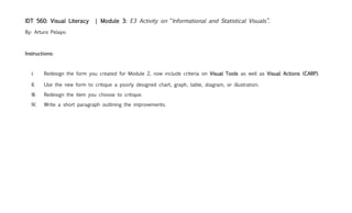
  • 1. | Module 3: E3 Activity on “Informational and Statistical Visuals”. IDT 560: Visual Literacy By: Arturo Pelayo. Instructions: Redesign the form you created for Module 2, now include criteria on Visual Tools as well as Visual Actions (CARP). I. II. Use the new form to critique a poorly designed chart, graph, table, diagram, or illustration. III. Redesign the item you choose to critique. IV. Write a short paragraph outlining the improvements.
  • 2. Procedure: • Creation of an introductory documentation page for future reference and incorporation of Best Practices. • Creation of a Document Version History Page to detail the changes of the E2 Form and the E3. (Satisfies Instruction I). • The 3rd page of this document includes the “E2” form. • The 4th & 5th pages represent the new “E3” form. • When printed, the document can be easily laminated, as each side of the form would remain on the same sheet of paper. • The 4th page will be the CARP side & the 5th page will include the criteria on Visual tools. (Satisfies Instruction II). • The 6th page includes the “old” illustration evaluated in E2. • The 7th page includes the redesigned illustration. (Satisfies Instruction III). • The 8th & 9th pages include an E3 template. (Satisfies Instruction I). • The 10th page includes a paragraph with discussion of improvements.
  • 3. Documentation of changes to form (document version history): Change E2 E3 Reason? Font type used. Helvetica, size 11. Euphemia UCAS, size 12. The Integration of mild serifs enhances the visual appeal of the document while also providing better readability and less eye strain. Risk: This is not a standard font of MS Word. Mitigation: Provide a PDF file. Page Formatting US Letter (landscape). US Legal (landscape). Provides better readability and uniform density of text presented. Risk: The evaluator may not have legal-sized paper when printing the document. Mitigation: Provide a notice to the user. Graphics A clock was used as a For CARP side there are metaphor instead of an no changes. For Visual Keeping consistency in the presentation and adding visual cues ordinary itemization of Tools, a similar metaphor for variables aids the learner in identifying them. variables is used Chart titles Not present On the top left corner in For easy identification, form titles of “visual tools” and “visual black background. actions” where added with appropriate figure/ground relationship.
  • 4. ★✩✩✩✩ ★★✩✩✩ ★★★✩✩ ★★★★✩ ★★★★★ visual Lame Disappointing So-So Marginal Unified actions  The material lacks any guidance The material devalues the credibility The material meets the The material is “OK” but The material enhances for the user to discern what it is of the sponsoring agencies. needs. But does not show has no “added value”. the appeal of the event & st 1 glance he/she is looking at. quality. sponsors.  The objective of the document “Farewell Reception” is the main Text Headings and visuals Its seamless to understand Best practices are cannot be discerned visually or purpose of the document, yet it is allow the user to identify the the interface, minor followed and Image purpose through writing. the last line written. use of the material. details lost. Strategies are respected.  The choice of colors and Overall there is cohesion between Content relationships are Variations on the design The material is appealing graphics is overpowering, hard the fonts, graphics and output distracting to the purpose of elements are minimal. to the eye and is “a contrast to read and disruptive. media used. the material. scrapbook keeper”.  Content is over or under sized, Relationship across elements is Graphics and text seem to Minor problems with The sizes are pleasing to pixilated. Illogical. distorted. belong on the same space. text/graphics the eye. scale relationships.  The spacing of text is inconsistent Text grouping does not match It is easy to discern sections Some elements slightly Has perfect cohesion of from one page to the next. No physical or invisible margins of from one another. “off the rule of thirds” . relationships. alignment hierarchy. graphics.  The material lacks order, The graphic/text-to-space ratio is There are some “dead The product has balance, The material has appeal. structure and cannot have not cohesive. Font variation is spots” (blank areas make cohesion and is (Fibonacci harmony). harmony appeal or value of any kind. disrupting. imbalance). appealing.  The material has absolute lack of Changes in text/graphic lacks The material is boring as it Content neither The material has a varied graphics / text framing. uniformity and prevent learner from does not provoke interest. overwhelms nor under cohesive & sound theme. repetition making connections. powers the material.  Material does not provide Content is scattered, hard to find. The content is present but The content may be content to fulfill purpose. other factors undermine its polished by replacing The material is “Visually content presence. words/graphics. Literate”.  Spacing of graphics and text is The figure/ground relationships are Content “stands on its Content has cohesion Material has a natural tight. No emphasis on missing. No visual independence. own”, but looses grouping. and a level of harmony. visual flow and order. proximity relationships.  The material seems to need an The material lacks uniformity; it has The material has a structure The material can be Instruction Manual to be no interface that can be seamlessly yet time still needs to be “read” although some The material is “Visually logic read/understood. followed. invested to understand it. Headings are missing. Literate”.  The material has 18 out of 50 possible “stars”, it is almost Disappointing, but pretty well in the Lame category. verdict
  • 5. ★✩✩✩✩ ★★✩✩✩ ★★★✩✩ ★★★★✩ ★★★★★ visual Lame Disappointing So-So Marginal Unified tools The material is extremely After a significant loss of time, the The material meets the The material is “OK” but The material enhances hard to read and lacks user understands the purpose of needs. But does not show has no “added value”. the appeal of the event type  any guidance for the user the provided medium. quality and shows no & sponsors. to discern what it is he/she emphasis on is looking at. relationships. The objective of the There is no cohesion in the design Visuals and text have The rule of thirds is Form and function are document cannot be whatsoever. The relationships, minimal appeal and implicit in the design, clear in the design. The discerned visually or hierarchy and scale are relationship to one yet there are material has a cohesive shape  through writing. It does not evidently disproportioned. The another. The design is distractions on the & sound theme. provoke interest. message is lost. distracting and “looks composition. busy”. There are too many colors Color palette does not work in Color relationships are There are variations on The material has which overpower the harmony with the document as a distracting to the purpose the contrast of the use appeal and is legible. color  document and make it whole. It deprives the learner of the material. of colors. hard to read and from making connections. disruptive. There is an imbalance on Relationship across figure and Objects are not There are aspects of Figure and ground the figure and ground ground is not cohesive. It is appealing and do not the figure/ground relationships are relationships. Figure has distorted. There are many “dead ground properly onto rations that are still mastered. There is depth  been reversed. The spots” (blank areas make their intended use and conflicting with one consistency in design material lacks consistency imbalance). hierarchy. another. This creates and relationships are in ratios of graphics and distracting design. intuitive. text. The spacing of text is Text kerning and alignment do There are gaps between Background contrast is There is consistency on inconsistent from one not have harmony to graphics. graphics and text, minimal and color fonts, colors, graphics space  page to the next. Too Space is misused and anchoring is not palette is appropriate. and background art. many fonts. Too Heavy. overpowering. mastered. Savvy. The material has 7 out of 25 possible “stars”, it is Lame. verdict 
  • 6. Original graphic: * * * * * *
  • 8. ★✩✩✩✩ ★★✩✩✩ ★★★✩✩ ★★★★✩ ★★★★★ visual Lame Disappointing So-So Marginal Unified actions  The material lacks any guidance The material devalues the credibility The material meets the The material is “OK” but The material enhances for the user to discern what it is of the sponsoring agencies. needs. But does not show has no “added value”. the appeal of the event & 1st glance he/she is looking at. quality. sponsors.  The objective of the document “Farewell Reception” is the main Text Headings and visuals Its seamless to understand Best practices are cannot be discerned visually or purpose of the document, yet it is allow the user to identify the the interface, minor followed and Image purpose through writing. the last line written. use of the material. details lost. Strategies are respected.  The choice of colors and Overall there is cohesion between Content relationships are Variations on the design The material is appealing graphics is overpowering, hard the fonts, graphics and output distracting to the purpose of elements are minimal. to the eye and is “a contrast to read and disruptive. media used. the material. scrapbook keeper”.  Content is over or under sized, Relationship across elements is Graphics and text seem to Minor problems with The sizes are pleasing to pixilated. Illogical. distorted. belong on the same space. text/graphics the eye. scale relationships.  The spacing of text is inconsistent Text grouping does not match It is easy to discern sections Some elements slightly Has perfect cohesion of from one page to the next. No physical or invisible margins of from one another. “off the rule of thirds” . relationships. alignment hierarchy. graphics.  The material lacks order, The graphic/text-to-space ratio is There are some “dead The product has balance, The material has appeal. structure and cannot have not cohesive. Font variation is spots” (blank areas make cohesion and is (Fibonacci harmony). harmony appeal or value of any kind. disrupting. imbalance). appealing.  The material has absolute lack of Changes in text/graphic lacks The material is boring as it Content neither The material has a varied graphics / text framing. uniformity and prevent learner from does not provoke interest. overwhelms nor under cohesive & sound theme. repetition making connections. powers the material.  Material does not provide Content is scattered, hard to find. The content is present but The content may be content to fulfill purpose. other factors undermine its polished by replacing The material is “Visually content presence. words/graphics. Literate”.  Spacing of graphics and text is The figure/ground relationships are Content “stands on its Content has cohesion Material has a natural tight. No emphasis on missing. No visual independence. own”, but looses grouping. and a level of harmony. visual flow and order. proximity relationships.  The material seems to need an The material lacks uniformity; it has The material has a structure The material can be Instruction Manual to be no interface that can be seamlessly yet time still needs to be “read” although some The material is “Visually logic read/understood. followed. invested to understand it. Headings are missing. Literate”. Write a review here:  verdict
  • 9. ★✩✩✩✩ ★★✩✩✩ ★★★✩✩ ★★★★✩ ★★★★★ visual Lame Disappointing So-So Marginal Unified tools The material is extremely After a significant loss of time, the The material meets the The material is “OK” but The material enhances hard to read and lacks user understands the purpose of needs. But does not show has no “added value”. the appeal of the event type  any guidance for the user the provided medium. quality and shows no & sponsors. to discern what it is he/she emphasis on is looking at. relationships. The objective of the There is no cohesion in the design Visuals and text have The rule of thirds is Form and function are document cannot be whatsoever. The relationships, minimal appeal and implicit in the design, clear in the design. The discerned visually or hierarchy and scale are relationship to one yet there are material has a cohesive shape  through writing. It does not evidently disproportioned. The another. The design is distractions on the & sound theme. provoke interest. message is lost. distracting and “looks composition. busy”. There are too many colors Color palette does not work in Color relationships are There are variations on The material has which overpower the harmony with the document as a distracting to the purpose the contrast of the use appeal and is legible. color  document and make it whole. It deprives the learner of the material. of colors. hard to read and from making connections. disruptive. There is an imbalance on Relationship across figure and Objects are not There are aspects of Figure and ground the figure and ground ground is not cohesive. It is appealing and do not the figure/ground relationships are relationships. Figure has distorted. There are many “dead ground properly onto rations that are still mastered. There is depth  been reversed. The spots” (blank areas make their intended use and conflicting with one consistency in design material lacks consistency imbalance). hierarchy. another. This creates and relationships are in ratios of graphics and distracting design. intuitive. text. The spacing of text is Text kerning and alignment do There are gaps between Background contrast is There is consistency on inconsistent from one not have harmony to graphics. graphics and text, minimal and color fonts, colors, graphics space  page to the next. Too Space is misused and anchoring is not palette is appropriate. and background art. many fonts. Too Heavy. overpowering. mastered. Savvy. Write a review here: verdict 
  • 10. Discussion of Improvements: One of the primary aspects that caught my attention on the original graphic was the misuse of repetition of an outdated graphic (the world map) that was also too small as an original image that was imported to the document in the first place. The use of the original purple globe map tried to emphasize the “internationality” aspect of the event, however it was too empowering and off scale in relation to the text and other bodies in the document. It broke all margins and was visually too heavy to be at the top of the document. Such distraction caused the text to seem out of place and the font type used with such strong serifs was inappropriate as it seemed that the text was “in a hurry”. The front cover did not have a clear message of the event. The new design is bold and objective. It employs a large graphic with sufficient alpha transparency to make it recede on to the background and anchor the weight of a borderless design. The sponsoring agencies’ logos where also removed as the integration of so many graphics receded from chunking into high density stacking. The new design looks and feels 30 years younger. It is bold, innovative and enhances the image of the agencies involved.