SlideShare una empresa de Scribd logo
1 de 64
HUMAN COMPUTER INTERACTION
TEXT BOOKS:
The essential guide to user interface design,
Wilbert O Galitz, Wiley DreamaTech.
Designing the user interface. 3rd Edition Ben
Shneidermann , Pearson Education Asia.
No. of slides: 64
INDEX
S.NO. TOPIC LECTURE NO. PPTSLIDES
1. Write clear text and messages L39 L39.1 to L39.9
L40 L40.1 to L40.6
2. Icons and images L41 L41.1 to L41.7
3. Multimedia, colors L42 L42.1 to L42.6
L43 L43.1 to L43.8
4. Problems while using colors L44 L44.1 to L44.6
5. Choosing colors L45 L45.1 to L45.19
L46 L46.1 to L46.5
6. REVISION L47
Write Clear Text and Message
Wording of the interface and its screens is the basic form of
communication with the user. Clear and meaningfully
crafted words, messages, and text lead to greatly
enhanced system usability and minimize user confusion
that leads to errors and possibly even system rejection
Words
• Do not use technical words, made-up words or terms
– filespec, abend, or spool, Ungroup or dearchive
• Do not use abbreviations or acronyms
– Always use the fully spelled-out form the first time it is encountered in the
interface
• Consider the usage of contradictions or short forms (won’t vs will not,
un- -ness), Complete words is preferred
• Positive terms (avoid the prefix “ir-” “in-” “dis-” and “un-”)
• Simple action words (“Project status listing”  “List”)
• Consistency
• Multiple-word phrases are more readable if the entire phrase is on one
line
• Abbreviation, mnemonics, and acronyms should not include
punctuation
Sentences and Messages
• Brief and simple
• Directly and immediately usable (Should not search through reference)
• Affirmative statement is easier to understand than negative statements
• Active voice is usually easier to understand than passive voice
• Main topic at the beginning
• Use the same grammatical structure for elements of sentences
• Imply that the system is awaiting the user’s direction, not that the
system is directing the user
• Negative tones or actions, or threats are not very friendly (“Numbers are
illegal” vs “Months must be entered by name”)
• Encouraging message would be better than insulting message
• Should remain factual and informative, and should not attempt humor or
punishment
Messages
• Screen messages is classified into two categories
– System messages:
• generated by the system to keep the user informed of the system’s
state and activities
– Instructional messages (prompting message) :
• tell the user how to work with, or complete the screen displayed
System Messages
• Status messages
– Providing information concerning the progress of a lengthy
operation
– Usually contains a progress indicator and a short message
• Informational messages (notification messages)
– This kind of message is usually identified by an “I” icon to the left of
the message
• Warning messages
– They are usually identified by an “!”
– The user must determine whether the situation is in fact a problem
and may be asked to advise the system whether or not to proceed
(A deletion request by a user is any action that commonly generates
a warning messages)
System Messages
• Critical messages (Action messages)
– Call attention to conditions that require a user action before the
system can proceed
– Some products use a “Do Not” symbol while others use a “Stop”
sign. An X in a circle used by Microsoft Windows
• Question messages
– A question message asks a question and offers a choice of options
for selection
– It is designated by a “?” icon proceeding the message text
Writing Message Box Text
• Title bar: Clearly identify the source of the message
– The name of the object to which it refers
– The name of the application to which it refers
– Do not include an indication of message type
– Use mixed case in the headline style
• Message box: Provide a clear and concise description of the condition
of the condition causing the message box to be displayed
– Use complete sentences with ending punctuation
– Show only message box about the cause of condition in single message
– Make the solution an option offered in the message
– Use the word “Please” conservatively
• Do not exceed two or three lines
• Center the message text in window
• Include the relevant icon identifying the type of message
Message Box Controls
• Command Buttons:
– If a message requires no choices to be made, include an OK button
– If a message requires a choice to be made
• OK and Cancel buttons only when the user has the option to continue or cancel
• Yes and No buttons when the user must decide how to continue
• If these choices are too ambiguous, label with the name of specific actions
– If a message describes an interrupted process, provide Stop button
– If a message offer a chance to cancel a process, provide a Cancel button
– If more details about a message must be presented, provide a Help button
– Display only one message box for a specific condition
• Close Box:
– Enable the title bar Close only if the message includes a Cancel button
Instructional Messages
• Provide instructional information at the depth of detail needed by the
user
– Accessing instruction through a Help function is the best solution
• Location it at strategic position on the screen
• Display it in a manner that visually differentiates it from other screen
elements
• In writing, follow all relevant writing guideline for words, sentences, and
messages
ERROR!
PLEASE HIT YOUR BACK BUTTON AND ENTER A SEARCH
THE SEARCH FIELD DID NOT CONTAIN AN ENTRY
PLEASE CLICK THE BACK BUTTON AND TYPE A SEARCH VALUE
Text for Web Pages
• Words
– Avoid using words that are specific to the Web (A few Web-specific terms
are “This Web site”, “Click here” and “Follow this link”)
– A good test of this guideline is to print out a page, read it, and see if it
makes as much sense on paper as it does on screen
• Error Messages
– Provide helpful error messages for:
• Incomplete or incorrectly keyed, entered, or selected data
• Requests for documents that do not exist or cannot be found
– Present them in a visually distinctive and noticeable manner
• Instructions
– Make sure instruction are detailed enough to be understood without being
specific to one browser version or brand
– Don’t use “Return To”
– Describe where an “Up” button leads where the user will go
Text for Web Pages
• Presentation
– Provide text that contrasts highly with the background
• Writing
– Write objectively
– Use the inverted pyramid organization
– Be concise, using only about half the number of words of conventional text
– Each paragraph should be short and Contain only one main idea
– Make text more scannable by using bulleted listings, tables, headings and
bold types
– Too many links within text can disrupt reading continuity and content
understanding
– Place them at the beginning or end of paragraphs or section of text
– Test for readability by printing out text to carefully proofread it
Links
• Create wording that make link that user can predict where the link
leads
– Descriptive
– Differentiable
– Predictive
• Create links that are brief and to the point, avoiding wordiness
• Write text containing embedded links as if there were no links in it
– Choose the most relevant words or phrase as the active link
– Link must no t be continued over two lines
• Standalone links should not exceed one sentence in length
– Paragraph with embedded links are sometimes useful for a variety of reasons
– Embedded Links
Paragraph with embedded links are sometimes useful for a variety of reasons
Link Titles
• A short explanation of a link before the user selects the link
• Provide link titles that describes
– The name of site the link will lead to
– The name of subsection the link will lead to
– The kind of information to be found at the destination
– Warning about possible problems to be encountered at the other
end
• Restrict them to no more than 60 characters
Page Title
• Should contain many keywords at possible
• Provide a page title
– That possess meaningful keywords
– Whose first word is its most important descriptor
– That makes sense when viewed completely out of context
– That is different from other page titles
– Is written in mixed case using the headline
• Do not highlight keywords
Heading and Headlines
• Used to scan to find screen content of interest.
• Their wording must provide a strong clue as to the content
they relate to
• Heading should be descriptive and straightforward
• No clever, cute or funny headline
• Skip leading articles (the and a)
Some Words to Forget
AVOID USE
Abend End, Cancel, Stop
Abort End, Cancel, Stop
Access Get, Ready, Display
Available Ready
Boot Start, Run
Error -
Execute Complete
Hit Press, Depress
Implement Do, use, Put Into
Invalid Not Correct, Not Good, Not Valid
Key Type Enter
Kill End, Cancel
Output Report, List, Display
Return Key Enter, Transmit
Terminate End, Exit
Create Meaningful Graphics,
Icons and Images
Creating Images
• Create familiar and concrete shapes
• Create visually and conceptually distinct shapes
– Incorporate unique features of an object
– Do not display within a border
• Clearly reflect object represented
• Simple reflect object represented, avoiding excessive
detail
• Create as a set, communicating relationships to one
another through common shapes
• Provide consistency in icon type
• Create shapes of the proper emotional tone
Icons
• Icons are most often used to represent objects and
actions with which users can interact
• Icons may stand alone on a desktop or in a window, or
be grouped together in a toolbar
• A secondary use of a icon is to reinforce important
information, a warning icon in a dialog message box
Characteristics of Icons
• Syntactics refers to a icon’s physical structure
– Shape, Color, Size
– Similar shapes and colors can be used to classify a group of related
icons
• Semantics is the icon’s meaning
– What does it refer – a file, a waste basket, or some other objects?
• Pragmatics is how the icons are physically produced and
depicted
– Is the screen resolution sufficient to illustrate ?
• Syntactics, semantics and pragmatics determine an icon’s
effectiveness and usability
Influences on Icon Usability
• Provide icons that are
– Familiar
– Clarity
– Simple
– Consistent
– Directness of the meaning
– Efficient
– Discriminable from others
• Also consider the
– Context in which the icon is used
– Expectancies of users
– Complexity of task
Choosing Icons
• A Successful Icon
– Looks different from all other icons
– Is obvious what it does or represents
– Is recognizable when no larger than 16 pixels square
– Look as good in black and white as in color
• Size
– 16x16, 24x24, 26x26, 32x32 pixels 16-and-256 color version
– Use colors from the system palette
• Provide as large a hot zone as possible
– With stylus or pen: 15 pixels square
– With mouse: 20 pixels square
– With finger: 40 pixels square
Choosing Images
• Use existing icons when available
• Use images for nouns, not verbs
• Use traditional images
• Consider user cultural and social norms
Creating Images
• Create familiar and concrete shapes
• Create visually and conceptually distinct shapes
– Incorporate unique features of an object
– Do not display within a border
• Clearly reflect object represented
• Simple reflect object represented, avoiding excessive
detail
• Create as a set, communicating relationships to one
another through common shapes
• Provide consistency in icon type
• Create shapes of the proper emotional tone
Drawing Images
• Providing consistency in shape over varying sizes
• Do not use triangular arrows in design to avoid
confusion with other system symbols
• When icons are used to reflect varying attributes,
express these attributes as meaning meaningfully as
possible
• Provide proper scale and orientation
• Use perspective and dimension whenever possible
• Accompany icon with a label to assure intended
meaning
Icon Animation and Audition
• Animation
– Use
• To provide feedback
• For visual interest
– Make it interruptible or independent of user’s primary
interaction
– Do not use it for decoration
– Permit it to be turned off by the user
– For fluid animation, present images at 16++ frames /second
• Auditions
– Consider auditory icons
The design Process
• Define the icon’s purpose and use
• Collect, evaluate, and sketch ideas
• Draw in black and white
• Draw using an icon-editing utility or drawing package
• Test for users
– Expectations
– Recognition
– Learning
• Test for clarity
• Register new icons in the system’s registry
Graphics in Web
• Use Graphics to
– Supplements the textual content, not as a substitute for it
– Convey information that can’t be effectively accomplished
using text
– Enhance navigation through
• Presenting a site overview
• Identifying site pages
• Identifying content areas
– Limit the use of graphics that take long time to load
– Coordinate the graphics with all other page elements
Images
• Use standard images, image internationalization
• Provide descriptive text or labels with all images
• Distinguish navigational images from decorative
images
• Minimize
– The number of presented images
– The size of presented images
– Image animation
– Number of colors
• GIF, JPEG is prefer
Photographs/Pictures
• Use when every aspect of the images is relevant
• Use JPEG format
• On the initial page
– Display a small version
• A thumbnail
• Zoom-in on most relevant detail
– Link to larger photos showing as much detail as needed
Video
• To show the proper way to perform a task
• To provide a personal message
• To grab attention
• Never automatically download a video into a page
• Provide controls (playing, pausing, and stopping)
• Considering using
– Existing video
– Audio only
– A slide show with audio
Diagrams
• To show the structure of objects
• To show the relationship of objects
• To show the flow of a process or task
• To reveal a temporal or spatial order
Animation
• To explain ideas involving a change in
– Time
– Position
• To illustrate the location or state of a process
• To show continuity in transitions
• To enrich graphical representations
• To aid visualization of 3-D structures
• Provide a freeze frame and stop mode
• Avoid distracting animation
Audition
• Uses as a supplement to text and graphics
• To establish atmosphere
• To create a sense of place
• To teach
• To sample
• The content should be simple
• Provide audio controls
Combining Mediums
• Use sensory combination that work best together
– Auditory text with visual graphics
– Screen text with visual graphics
• Both the visual and auditory information should be
totally relevant to the task being performed
• Visual and auditory textual narrative should be
presented simultaneously
• Considering downloading times when choosing a
media
• Testing
– Legibility
– Comprehensibility
– Acceptance
Learning Improvements for Various
Media
MEDIUM % more Learning
Hearing spoken text and viewing graphics 91%
Viewing graphics alone 63%
Viewing text and viewing graphics 56%
Hearing spoken text, viewing text, and viewing
graphics
46%
Hearing spoken text and viewing text 32%
Viewing text alone 12%
Hearing Spoken text alone 7%
Choose the Proper
Colors
Color adds dimension, or realism, to screen usability.
Color draws attention because it attracts a person’s eye.
HSV color space
Color Uses
• Use color to assist in formatting
– Relating elements into grouping
– Breaking apart separate groupings of information
– Highlighting or calling attention to important information
• Use color as visual code to identify
– Screen captions and data
– Information from different sources
– Status of information
• Use color to
– Realistically portray natural objects
– Increase screen appeal
Possible Problems with Color
• High Attention-Getting Capacity
– Viewer might associate, tie together, screen elements of same color
– Result in confusing, slower reading
• Interference with Use of Other Screens
• Varying Sensitivity of the Eye to Different Colors
– Viewing red and blue  Eye fatigue
• Color-Viewing Deficiencies
• Cross-Disciplinary and Cross-Cultural Differences
– For financial mangers - Corporate qualities or reliability
– For health care professionals – Death
– For nuclear reactor monitors – Coolness or water
– For American movie audiences – Tenderness or Pornography
Choosing Colors for Categories of
Information
• Color chosen to organize information or data on a screen
must aid the transfer of information from the display to the
user, Some examples of using color code
– If decisions are made based on the status of information on the
screen, color-code the types of status the information
– Screen searching is performed to locate information of particular
kind, color-code for contrast
– If the sequence of information use is constrained or ordered, use
color to identify the sequence
– If the information on a screen is crowded, use color to provide visual
grouping
• Never rely on color as the only way of identifying a screen
element
• Always consider how spatial formatting, highlighting, and
messages may also be useful
Color in Context
• Color are subject to contextual effects
• Small adjacent colored images may appear to the eye to
merge or mix
• A color on a dark background will look lighter and
brighter than the same color on a light background
• Colors also change as light levels change
Usage
• Design for monochrome first or in shades of black, white
and gray
• Doing this will permit the screen to be effectively used:
– By people with a color-viewing deficiency
– On monochrome displays
– In conditions where ambient lighting distorts the perceived color
– If the color ever fails
• Use colors conservatively
– Do not use color where other identification techniques, such as
location, are available
Discrimination and Harmony
• Select 4-5 colors for best absolute discrimination
– Red, yellow, green, blue, and brown
• Select 6-7 colors for best comparative discrimination
– Orange, yellow-green, cyan, violet, and magenta
• Choose harmonious colors
– One color plus two colors on either side of its complement
– Three colors at equidistant point around the color circle
• For extended viewing or older viewers, use brighter
colors
Emphasis
• To draw attention or to emphasize elements, use bright
or highlighted colors or use less bright colors for
deemphasize
– The perceived brightness of colors from most to least is white,
yellow, green, blue, red
• To emphasize separation, use contrasting colors
– Red and green, blue and yellow
• To convey similarity, use similar colors
– Orange and yellow, blue and violet
Common Meanings
• To indicate that actions are necessary, use warm colors
– Red, orange, yellow
• To provide status or background, use cool colors
– Green, blue, violet, purple
• Conform to human expectation
– Red: Stop, fire, hot, danger
– Yellow: Caution, slow, test
– Green: Go, OK, clear, vegetation, safety
– Blue: Cold, water, calm, sky, neutrality
– Gray, White: Neutrality
– Warm colors: Action, response required, spatial closeness
– Cool colors: Status, background information, spatial
remoteness
Common Meanings
• Typical implications of color with dramatic portrayal are
– High illumination: Hot, active, comic situations
– Low illumination: Emotional, tense, tragic, romantic situations
– High saturation: Emotional, tense, hot, comic situations
– Warm colors: Active, leisure, recreation, comic situations
– Cool colors: Efficiency, work, tragic and romantic situations
• Proper use of color also requires consideration of the experiences
and expectation of the screen viewers
Location and Ordering
• In the center of the visual field, use red and green
• For peripheral viewing, use blue, yellow, black, and
white
• Use adjacent colors that differ by hue and value or
lightness for a sharp edge and maximum differentiation
• Order colors by their spectral position
– Red, orange, yellow, green, blue, indigo, violet
Foregrounds and Backgrounds
• Foregrounds
– Use colors that highly contrast with the background color
– For text or data
• Black on light-color background of low intensity (no bright white)
• Desaturated spectrum colors such as white, yellow, or green on
dark background
• Warmer more active colors
– To emphasize an element, highlight it in a light value of the
foreground color, pure white, or yellow
– To deemphasize and element, lowlight it in a dark value of the
foreground color
Foregrounds and Backgrounds
• Backgrounds
– Use colors that do not compete with the foreground
– Use
• Light-colored backgrounds of low intensity: Off-white or light gray
• Desaturated colors
• Cool, dark colors such as blue or black
• Colors on the spectral extreme end
– Blue, black, gray, brown, red, green, and purple
Color spectrum  http://www.brobstsystems.com/colors.htm
Gray Scale
• For fine discrimination use a black-gray-white scale
– Recommend values
• White: Screen background, text located in any black area
• Light gray: Background of a Pushbutton area
• Medium gray: Icon background area, Menu drop shadow, Window
drop shadow, Inside area of system icons, Filename
bar
• Dark gray: Window boarder
• Black: Text, Window title bar, Icon border, Icon elements,
Ruled lines
Text in Color
• Text in color is not as visible as it is in black
• When switching text from black to color
– Double the width of lines
– Use bold or larger type:
• If originally 8 to 12 points, increase by 1 to 2 points
• If originally 14 to 24 points, increase by 2 to 4 points
Text in Color
• Text in color is not as visible as it is in black
• When switching text from black to color
– Double the width of lines
– Use bold or larger type:
• If originally 8 to 12 points, increase by 1 to 2 points
• If originally 14 to 24 points, increase by 2 to 4 points
• Check legibility by squinting at text
– Too-light type will recede or even disappear
Effective Combination
Background
Foreground Black Blue Green Cyan Red Magenta Brown White
BLACK X GOOD GOOD GOOD
BLUE X POOR GOOD
H.I BLUE POOR POOR POOR POOR
CYAN GOOD POOR X POOR
H.I. CYAN GOOD GOOD GOOD GOOD GOOD
GREEN GOOD GOOD X POOR GOOD POOR POOR
H.I. GREEN GOOD
YELLOW GOOD GOOD GOOD GOOD
RED POOR X POOR POOR
H.I. RED POOR
MAGENTA POOR POOR X POOR
H.I. MAGENTA GOOD GOOD POOR
BROWN POOR POOR X
GRAY POOR POOR POOR
WHITE GOOD POOR X
H.I.WHITE GOOD GOOD GOOD
Choosing color for web pages
• Always minimize the number of presented colors for faster
downloading
• Always consider color in context, never in isolation
• Use similar or same color schemes throughout a Web site
 help the user maintain a sense of place
• Foreground colors should be a different as possible from
background colors
• The most recommended foreground text color is black
presented on a light-colored background of low intensity
(off white or light gray)
• Use dark backgrounds when establishing contrast
between an area of the screen and the main screen body
Choosing color for web pages
• High intensity colors as back-ground such as red,
magenta and bright green) must be avoided
• When choosing foreground and background colors,
ensure that contrasting combinations are selected
• Use a uniform color in large screen areas
– Large areas of the same color download faster
• For smaller element, the more contrast is required
• Use flat Web-safe colors
• Select color that can be easily reproduced in black and
white
Use of Color to Avoid
• Relying exclusively on color (Spatial Formatting and
component locations)
• Too many colors at one time
• Highly saturated, spectrally extreme colors together
– Red/blue and yellow/purple
– Yellow/blue, green/blue and red/green
• Low-brightness color for extended viewing or older viewer
• Colors of equal brightness
• Colors lacking contrast
• Fully saturated colors for frequently read screen
components
Use of Color to Avoid
• Pure blue for text, thin lines, and small shapes
• Colors in small areas
• Colors for fine details
– Black, gray, and white will provide better resolution
– Other colors for large area or attracting attention
• Non-opponent colors
– Red/yellow or green/blue
– Recommend: Red/green or yellow/blue
• Red and green in the periphery of large-scale displays
– Yellow and blue are much better
Use of Color to Avoid
• Adjacent colors only differing in the amount of blue they
posses
• Single color distinctions for color-deficient user
• Using colors in unexpected ways
• Using color to improve readability of densely packed text
– Recommend to use space lines

Más contenido relacionado

La actualidad más candente

User Interface Design- Module 2 Uid Process
User Interface Design- Module 2 Uid ProcessUser Interface Design- Module 2 Uid Process
User Interface Design- Module 2 Uid ProcessbrindaN
 
User Interface Design-Module 4 Windows
User Interface Design-Module 4  WindowsUser Interface Design-Module 4  Windows
User Interface Design-Module 4 WindowsbrindaN
 
User Interface Design - Module 1 Introduction
User Interface Design - Module 1 IntroductionUser Interface Design - Module 1 Introduction
User Interface Design - Module 1 IntroductionbrindaN
 
HCI - Chapter 3
HCI - Chapter 3HCI - Chapter 3
HCI - Chapter 3Alan Dix
 
evaluation techniques in HCI
evaluation techniques in HCIevaluation techniques in HCI
evaluation techniques in HCIsawsan slii
 
HCI 3e - Ch 9: Evaluation techniques
HCI 3e - Ch 9:  Evaluation techniquesHCI 3e - Ch 9:  Evaluation techniques
HCI 3e - Ch 9: Evaluation techniquesAlan Dix
 
Face to Face Communication and Text Based Communication in HCI
Face to Face Communication and Text Based Communication in HCIFace to Face Communication and Text Based Communication in HCI
Face to Face Communication and Text Based Communication in HCIAbdullah Khosa
 
SELECT THE PROPER KINDS OF WINDOWS
SELECT THE PROPER KINDS OF WINDOWSSELECT THE PROPER KINDS OF WINDOWS
SELECT THE PROPER KINDS OF WINDOWSDhanya LK
 
hci in software development process
hci in software development processhci in software development process
hci in software development processKainat Ilyas
 
Design process interaction design basics
Design process interaction design basicsDesign process interaction design basics
Design process interaction design basicsPreeti Mishra
 
User Interface Design- Module 3 Menus
User Interface Design- Module 3 MenusUser Interface Design- Module 3 Menus
User Interface Design- Module 3 MenusbrindaN
 
Module 1st USER INTERFACE DESIGN (15CS832) - VTU
Module 1st USER INTERFACE DESIGN (15CS832) - VTU Module 1st USER INTERFACE DESIGN (15CS832) - VTU
Module 1st USER INTERFACE DESIGN (15CS832) - VTU Sachin Gowda
 
HCI 3e - Ch 15: Task analysis
HCI 3e - Ch 15:  Task analysisHCI 3e - Ch 15:  Task analysis
HCI 3e - Ch 15: Task analysisAlan Dix
 
USER INTERFACE DESIGN PPT
USER INTERFACE DESIGN PPTUSER INTERFACE DESIGN PPT
USER INTERFACE DESIGN PPTvicci4041
 

La actualidad más candente (20)

User Interface Design- Module 2 Uid Process
User Interface Design- Module 2 Uid ProcessUser Interface Design- Module 2 Uid Process
User Interface Design- Module 2 Uid Process
 
Chapter1(hci)
Chapter1(hci)Chapter1(hci)
Chapter1(hci)
 
User Interface Design-Module 4 Windows
User Interface Design-Module 4  WindowsUser Interface Design-Module 4  Windows
User Interface Design-Module 4 Windows
 
User Interface Design - Module 1 Introduction
User Interface Design - Module 1 IntroductionUser Interface Design - Module 1 Introduction
User Interface Design - Module 1 Introduction
 
HCI - Chapter 3
HCI - Chapter 3HCI - Chapter 3
HCI - Chapter 3
 
evaluation techniques in HCI
evaluation techniques in HCIevaluation techniques in HCI
evaluation techniques in HCI
 
Hypertext, multimedia and www
Hypertext, multimedia and wwwHypertext, multimedia and www
Hypertext, multimedia and www
 
HCI 3e - Ch 9: Evaluation techniques
HCI 3e - Ch 9:  Evaluation techniquesHCI 3e - Ch 9:  Evaluation techniques
HCI 3e - Ch 9: Evaluation techniques
 
Face to Face Communication and Text Based Communication in HCI
Face to Face Communication and Text Based Communication in HCIFace to Face Communication and Text Based Communication in HCI
Face to Face Communication and Text Based Communication in HCI
 
SELECT THE PROPER KINDS OF WINDOWS
SELECT THE PROPER KINDS OF WINDOWSSELECT THE PROPER KINDS OF WINDOWS
SELECT THE PROPER KINDS OF WINDOWS
 
hci in software development process
hci in software development processhci in software development process
hci in software development process
 
User interface design
User interface designUser interface design
User interface design
 
Chapter 2
Chapter 2Chapter 2
Chapter 2
 
Design process interaction design basics
Design process interaction design basicsDesign process interaction design basics
Design process interaction design basics
 
User Interface Design- Module 3 Menus
User Interface Design- Module 3 MenusUser Interface Design- Module 3 Menus
User Interface Design- Module 3 Menus
 
Module 1st USER INTERFACE DESIGN (15CS832) - VTU
Module 1st USER INTERFACE DESIGN (15CS832) - VTU Module 1st USER INTERFACE DESIGN (15CS832) - VTU
Module 1st USER INTERFACE DESIGN (15CS832) - VTU
 
WEB INTERFACE DESIGN
WEB INTERFACE DESIGNWEB INTERFACE DESIGN
WEB INTERFACE DESIGN
 
Multimodal Interaction
Multimodal InteractionMultimodal Interaction
Multimodal Interaction
 
HCI 3e - Ch 15: Task analysis
HCI 3e - Ch 15:  Task analysisHCI 3e - Ch 15:  Task analysis
HCI 3e - Ch 15: Task analysis
 
USER INTERFACE DESIGN PPT
USER INTERFACE DESIGN PPTUSER INTERFACE DESIGN PPT
USER INTERFACE DESIGN PPT
 

Similar a Human Computer Interaction Unit III Part 2

Windows Components.pptx
Windows Components.pptxWindows Components.pptx
Windows Components.pptxSanjay Singh
 
CSUN Creating Accessible Content in MS Office 2010
CSUN Creating Accessible Content in MS Office 2010CSUN Creating Accessible Content in MS Office 2010
CSUN Creating Accessible Content in MS Office 2010Eduardo Meza-Etienne
 
5 Feb 09 Online Journalism – Multimedia Packages&Writing Class Notes Feb5 2009
5 Feb 09 Online Journalism – Multimedia Packages&Writing Class Notes Feb5 20095 Feb 09 Online Journalism – Multimedia Packages&Writing Class Notes Feb5 2009
5 Feb 09 Online Journalism – Multimedia Packages&Writing Class Notes Feb5 2009Neil Foote
 
Keeping Your Website Accessible
Keeping Your Website AccessibleKeeping Your Website Accessible
Keeping Your Website AccessibleKelli Wise
 
Writing-Best-Practices
Writing-Best-PracticesWriting-Best-Practices
Writing-Best-PracticesCandace Loya
 
Anyone Can Write: Writing for Content
Anyone Can Write: Writing for ContentAnyone Can Write: Writing for Content
Anyone Can Write: Writing for ContentCandace Loya
 
writing-web-content-part-one.pptxReading_and_listening_skills_week7.pptx
writing-web-content-part-one.pptxReading_and_listening_skills_week7.pptxwriting-web-content-part-one.pptxReading_and_listening_skills_week7.pptx
writing-web-content-part-one.pptxReading_and_listening_skills_week7.pptxqueenpressman14
 
Google-Slides-Accessibility.pdf
Google-Slides-Accessibility.pdfGoogle-Slides-Accessibility.pdf
Google-Slides-Accessibility.pdfRamSingh355655
 
ASAE Lunch Learning Webinar: Email Trends: What's in Style for 2017
ASAE Lunch Learning Webinar: Email Trends: What's in Style for 2017ASAE Lunch Learning Webinar: Email Trends: What's in Style for 2017
ASAE Lunch Learning Webinar: Email Trends: What's in Style for 2017HighRoad Solution
 
Letting go of the words – an overview
Letting go of the words – an overviewLetting go of the words – an overview
Letting go of the words – an overviewguesta87e6a
 
Letting go of the words – an overview
Letting go of the words – an overviewLetting go of the words – an overview
Letting go of the words – an overviewPerceptive Analytics
 
Design Credibility: No one trusts an ugly website
Design Credibility: No one trusts an ugly websiteDesign Credibility: No one trusts an ugly website
Design Credibility: No one trusts an ugly websitenonlinear creations
 
Writing Effective Emails
Writing Effective EmailsWriting Effective Emails
Writing Effective EmailsShana Masterson
 
Online platform for ict content development
 Online platform for ict content development Online platform for ict content development
Online platform for ict content developmentImmaeviorge
 

Similar a Human Computer Interaction Unit III Part 2 (20)

Windows Components.pptx
Windows Components.pptxWindows Components.pptx
Windows Components.pptx
 
Successful Email Marketing 101
Successful Email Marketing 101Successful Email Marketing 101
Successful Email Marketing 101
 
CSUN Creating Accessible Content in MS Office 2010
CSUN Creating Accessible Content in MS Office 2010CSUN Creating Accessible Content in MS Office 2010
CSUN Creating Accessible Content in MS Office 2010
 
5 Feb 09 Online Journalism – Multimedia Packages&Writing Class Notes Feb5 2009
5 Feb 09 Online Journalism – Multimedia Packages&Writing Class Notes Feb5 20095 Feb 09 Online Journalism – Multimedia Packages&Writing Class Notes Feb5 2009
5 Feb 09 Online Journalism – Multimedia Packages&Writing Class Notes Feb5 2009
 
Keeping Your Website Accessible
Keeping Your Website AccessibleKeeping Your Website Accessible
Keeping Your Website Accessible
 
Writing-Best-Practices
Writing-Best-PracticesWriting-Best-Practices
Writing-Best-Practices
 
Anyone Can Write: Writing for Content
Anyone Can Write: Writing for ContentAnyone Can Write: Writing for Content
Anyone Can Write: Writing for Content
 
writing-web-content-part-one.pptxReading_and_listening_skills_week7.pptx
writing-web-content-part-one.pptxReading_and_listening_skills_week7.pptxwriting-web-content-part-one.pptxReading_and_listening_skills_week7.pptx
writing-web-content-part-one.pptxReading_and_listening_skills_week7.pptx
 
Email Etiquette
Email EtiquetteEmail Etiquette
Email Etiquette
 
Google-Slides-Accessibility.pdf
Google-Slides-Accessibility.pdfGoogle-Slides-Accessibility.pdf
Google-Slides-Accessibility.pdf
 
ASAE Lunch Learning Webinar: Email Trends: What's in Style for 2017
ASAE Lunch Learning Webinar: Email Trends: What's in Style for 2017ASAE Lunch Learning Webinar: Email Trends: What's in Style for 2017
ASAE Lunch Learning Webinar: Email Trends: What's in Style for 2017
 
208-09-writing.ppt
208-09-writing.ppt208-09-writing.ppt
208-09-writing.ppt
 
Writing For The Web
Writing For The WebWriting For The Web
Writing For The Web
 
Letting go of the words – an overview
Letting go of the words – an overviewLetting go of the words – an overview
Letting go of the words – an overview
 
Letting go of the words – an overview
Letting go of the words – an overviewLetting go of the words – an overview
Letting go of the words – an overview
 
Write For Web
Write For WebWrite For Web
Write For Web
 
Design Credibility: No one trusts an ugly website
Design Credibility: No one trusts an ugly websiteDesign Credibility: No one trusts an ugly website
Design Credibility: No one trusts an ugly website
 
Writing Effective Emails
Writing Effective EmailsWriting Effective Emails
Writing Effective Emails
 
Online platform for ict content development
 Online platform for ict content development Online platform for ict content development
Online platform for ict content development
 
Email etiquettes
Email etiquettesEmail etiquettes
Email etiquettes
 

Human Computer Interaction Unit III Part 2

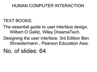
  • 1. HUMAN COMPUTER INTERACTION TEXT BOOKS: The essential guide to user interface design, Wilbert O Galitz, Wiley DreamaTech. Designing the user interface. 3rd Edition Ben Shneidermann , Pearson Education Asia. No. of slides: 64
  • 2. INDEX S.NO. TOPIC LECTURE NO. PPTSLIDES 1. Write clear text and messages L39 L39.1 to L39.9 L40 L40.1 to L40.6 2. Icons and images L41 L41.1 to L41.7 3. Multimedia, colors L42 L42.1 to L42.6 L43 L43.1 to L43.8 4. Problems while using colors L44 L44.1 to L44.6 5. Choosing colors L45 L45.1 to L45.19 L46 L46.1 to L46.5 6. REVISION L47
  • 3. Write Clear Text and Message Wording of the interface and its screens is the basic form of communication with the user. Clear and meaningfully crafted words, messages, and text lead to greatly enhanced system usability and minimize user confusion that leads to errors and possibly even system rejection
  • 4. Words • Do not use technical words, made-up words or terms – filespec, abend, or spool, Ungroup or dearchive • Do not use abbreviations or acronyms – Always use the fully spelled-out form the first time it is encountered in the interface • Consider the usage of contradictions or short forms (won’t vs will not, un- -ness), Complete words is preferred • Positive terms (avoid the prefix “ir-” “in-” “dis-” and “un-”) • Simple action words (“Project status listing”  “List”) • Consistency • Multiple-word phrases are more readable if the entire phrase is on one line • Abbreviation, mnemonics, and acronyms should not include punctuation
  • 5. Sentences and Messages • Brief and simple • Directly and immediately usable (Should not search through reference) • Affirmative statement is easier to understand than negative statements • Active voice is usually easier to understand than passive voice • Main topic at the beginning • Use the same grammatical structure for elements of sentences • Imply that the system is awaiting the user’s direction, not that the system is directing the user • Negative tones or actions, or threats are not very friendly (“Numbers are illegal” vs “Months must be entered by name”) • Encouraging message would be better than insulting message • Should remain factual and informative, and should not attempt humor or punishment
  • 6. Messages • Screen messages is classified into two categories – System messages: • generated by the system to keep the user informed of the system’s state and activities – Instructional messages (prompting message) : • tell the user how to work with, or complete the screen displayed
  • 7. System Messages • Status messages – Providing information concerning the progress of a lengthy operation – Usually contains a progress indicator and a short message • Informational messages (notification messages) – This kind of message is usually identified by an “I” icon to the left of the message • Warning messages – They are usually identified by an “!” – The user must determine whether the situation is in fact a problem and may be asked to advise the system whether or not to proceed (A deletion request by a user is any action that commonly generates a warning messages)
  • 8. System Messages • Critical messages (Action messages) – Call attention to conditions that require a user action before the system can proceed – Some products use a “Do Not” symbol while others use a “Stop” sign. An X in a circle used by Microsoft Windows • Question messages – A question message asks a question and offers a choice of options for selection – It is designated by a “?” icon proceeding the message text
  • 9. Writing Message Box Text • Title bar: Clearly identify the source of the message – The name of the object to which it refers – The name of the application to which it refers – Do not include an indication of message type – Use mixed case in the headline style • Message box: Provide a clear and concise description of the condition of the condition causing the message box to be displayed – Use complete sentences with ending punctuation – Show only message box about the cause of condition in single message – Make the solution an option offered in the message – Use the word “Please” conservatively • Do not exceed two or three lines • Center the message text in window • Include the relevant icon identifying the type of message
  • 10. Message Box Controls • Command Buttons: – If a message requires no choices to be made, include an OK button – If a message requires a choice to be made • OK and Cancel buttons only when the user has the option to continue or cancel • Yes and No buttons when the user must decide how to continue • If these choices are too ambiguous, label with the name of specific actions – If a message describes an interrupted process, provide Stop button – If a message offer a chance to cancel a process, provide a Cancel button – If more details about a message must be presented, provide a Help button – Display only one message box for a specific condition • Close Box: – Enable the title bar Close only if the message includes a Cancel button
  • 11. Instructional Messages • Provide instructional information at the depth of detail needed by the user – Accessing instruction through a Help function is the best solution • Location it at strategic position on the screen • Display it in a manner that visually differentiates it from other screen elements • In writing, follow all relevant writing guideline for words, sentences, and messages ERROR! PLEASE HIT YOUR BACK BUTTON AND ENTER A SEARCH THE SEARCH FIELD DID NOT CONTAIN AN ENTRY PLEASE CLICK THE BACK BUTTON AND TYPE A SEARCH VALUE
  • 12. Text for Web Pages • Words – Avoid using words that are specific to the Web (A few Web-specific terms are “This Web site”, “Click here” and “Follow this link”) – A good test of this guideline is to print out a page, read it, and see if it makes as much sense on paper as it does on screen • Error Messages – Provide helpful error messages for: • Incomplete or incorrectly keyed, entered, or selected data • Requests for documents that do not exist or cannot be found – Present them in a visually distinctive and noticeable manner • Instructions – Make sure instruction are detailed enough to be understood without being specific to one browser version or brand – Don’t use “Return To” – Describe where an “Up” button leads where the user will go
  • 13. Text for Web Pages • Presentation – Provide text that contrasts highly with the background • Writing – Write objectively – Use the inverted pyramid organization – Be concise, using only about half the number of words of conventional text – Each paragraph should be short and Contain only one main idea – Make text more scannable by using bulleted listings, tables, headings and bold types – Too many links within text can disrupt reading continuity and content understanding – Place them at the beginning or end of paragraphs or section of text – Test for readability by printing out text to carefully proofread it
  • 14. Links • Create wording that make link that user can predict where the link leads – Descriptive – Differentiable – Predictive • Create links that are brief and to the point, avoiding wordiness • Write text containing embedded links as if there were no links in it – Choose the most relevant words or phrase as the active link – Link must no t be continued over two lines • Standalone links should not exceed one sentence in length – Paragraph with embedded links are sometimes useful for a variety of reasons – Paragraph with embedded links are sometimes useful for a variety of reasons – Embedded Links Paragraph with embedded links are sometimes useful for a variety of reasons
  • 15. Link Titles • A short explanation of a link before the user selects the link • Provide link titles that describes – The name of site the link will lead to – The name of subsection the link will lead to – The kind of information to be found at the destination – Warning about possible problems to be encountered at the other end • Restrict them to no more than 60 characters
  • 16. Page Title • Should contain many keywords at possible • Provide a page title – That possess meaningful keywords – Whose first word is its most important descriptor – That makes sense when viewed completely out of context – That is different from other page titles – Is written in mixed case using the headline • Do not highlight keywords
  • 17. Heading and Headlines • Used to scan to find screen content of interest. • Their wording must provide a strong clue as to the content they relate to • Heading should be descriptive and straightforward • No clever, cute or funny headline • Skip leading articles (the and a)
  • 18. Some Words to Forget AVOID USE Abend End, Cancel, Stop Abort End, Cancel, Stop Access Get, Ready, Display Available Ready Boot Start, Run Error - Execute Complete Hit Press, Depress Implement Do, use, Put Into Invalid Not Correct, Not Good, Not Valid Key Type Enter Kill End, Cancel Output Report, List, Display Return Key Enter, Transmit Terminate End, Exit
  • 20. Creating Images • Create familiar and concrete shapes • Create visually and conceptually distinct shapes – Incorporate unique features of an object – Do not display within a border • Clearly reflect object represented • Simple reflect object represented, avoiding excessive detail • Create as a set, communicating relationships to one another through common shapes • Provide consistency in icon type • Create shapes of the proper emotional tone
  • 21. Creating Images • Create familiar and concrete shapes • Create visually and conceptually distinct shapes – Incorporate unique features of an object – Do not display within a border • Clearly reflect object represented • Simple reflect object represented, avoiding excessive detail • Create as a set, communicating relationships to one another through common shapes • Provide consistency in icon type • Create shapes of the proper emotional tone
  • 22. Icons • Icons are most often used to represent objects and actions with which users can interact • Icons may stand alone on a desktop or in a window, or be grouped together in a toolbar • A secondary use of a icon is to reinforce important information, a warning icon in a dialog message box
  • 23. Characteristics of Icons • Syntactics refers to a icon’s physical structure – Shape, Color, Size – Similar shapes and colors can be used to classify a group of related icons • Semantics is the icon’s meaning – What does it refer – a file, a waste basket, or some other objects? • Pragmatics is how the icons are physically produced and depicted – Is the screen resolution sufficient to illustrate ? • Syntactics, semantics and pragmatics determine an icon’s effectiveness and usability
  • 24. Influences on Icon Usability • Provide icons that are – Familiar – Clarity – Simple – Consistent – Directness of the meaning – Efficient – Discriminable from others • Also consider the – Context in which the icon is used – Expectancies of users – Complexity of task
  • 25. Choosing Icons • A Successful Icon – Looks different from all other icons – Is obvious what it does or represents – Is recognizable when no larger than 16 pixels square – Look as good in black and white as in color • Size – 16x16, 24x24, 26x26, 32x32 pixels 16-and-256 color version – Use colors from the system palette • Provide as large a hot zone as possible – With stylus or pen: 15 pixels square – With mouse: 20 pixels square – With finger: 40 pixels square
  • 26. Choosing Images • Use existing icons when available • Use images for nouns, not verbs • Use traditional images • Consider user cultural and social norms
  • 27. Creating Images • Create familiar and concrete shapes • Create visually and conceptually distinct shapes – Incorporate unique features of an object – Do not display within a border • Clearly reflect object represented • Simple reflect object represented, avoiding excessive detail • Create as a set, communicating relationships to one another through common shapes • Provide consistency in icon type • Create shapes of the proper emotional tone
  • 28. Creating Images • Create familiar and concrete shapes • Create visually and conceptually distinct shapes – Incorporate unique features of an object – Do not display within a border • Clearly reflect object represented • Simple reflect object represented, avoiding excessive detail • Create as a set, communicating relationships to one another through common shapes • Provide consistency in icon type • Create shapes of the proper emotional tone
  • 29. Drawing Images • Providing consistency in shape over varying sizes • Do not use triangular arrows in design to avoid confusion with other system symbols • When icons are used to reflect varying attributes, express these attributes as meaning meaningfully as possible • Provide proper scale and orientation • Use perspective and dimension whenever possible • Accompany icon with a label to assure intended meaning
  • 30. Icon Animation and Audition • Animation – Use • To provide feedback • For visual interest – Make it interruptible or independent of user’s primary interaction – Do not use it for decoration – Permit it to be turned off by the user – For fluid animation, present images at 16++ frames /second • Auditions – Consider auditory icons
  • 31. The design Process • Define the icon’s purpose and use • Collect, evaluate, and sketch ideas • Draw in black and white • Draw using an icon-editing utility or drawing package • Test for users – Expectations – Recognition – Learning • Test for clarity • Register new icons in the system’s registry
  • 32. Graphics in Web • Use Graphics to – Supplements the textual content, not as a substitute for it – Convey information that can’t be effectively accomplished using text – Enhance navigation through • Presenting a site overview • Identifying site pages • Identifying content areas – Limit the use of graphics that take long time to load – Coordinate the graphics with all other page elements
  • 33. Images • Use standard images, image internationalization • Provide descriptive text or labels with all images • Distinguish navigational images from decorative images • Minimize – The number of presented images – The size of presented images – Image animation – Number of colors • GIF, JPEG is prefer
  • 34. Photographs/Pictures • Use when every aspect of the images is relevant • Use JPEG format • On the initial page – Display a small version • A thumbnail • Zoom-in on most relevant detail – Link to larger photos showing as much detail as needed
  • 35. Video • To show the proper way to perform a task • To provide a personal message • To grab attention • Never automatically download a video into a page • Provide controls (playing, pausing, and stopping) • Considering using – Existing video – Audio only – A slide show with audio
  • 36. Diagrams • To show the structure of objects • To show the relationship of objects • To show the flow of a process or task • To reveal a temporal or spatial order
  • 37. Animation • To explain ideas involving a change in – Time – Position • To illustrate the location or state of a process • To show continuity in transitions • To enrich graphical representations • To aid visualization of 3-D structures • Provide a freeze frame and stop mode • Avoid distracting animation
  • 38. Audition • Uses as a supplement to text and graphics • To establish atmosphere • To create a sense of place • To teach • To sample • The content should be simple • Provide audio controls
  • 39. Combining Mediums • Use sensory combination that work best together – Auditory text with visual graphics – Screen text with visual graphics • Both the visual and auditory information should be totally relevant to the task being performed • Visual and auditory textual narrative should be presented simultaneously • Considering downloading times when choosing a media • Testing – Legibility – Comprehensibility – Acceptance
  • 40. Learning Improvements for Various Media MEDIUM % more Learning Hearing spoken text and viewing graphics 91% Viewing graphics alone 63% Viewing text and viewing graphics 56% Hearing spoken text, viewing text, and viewing graphics 46% Hearing spoken text and viewing text 32% Viewing text alone 12% Hearing Spoken text alone 7%
  • 41. Choose the Proper Colors Color adds dimension, or realism, to screen usability. Color draws attention because it attracts a person’s eye.
  • 43. Color Uses • Use color to assist in formatting – Relating elements into grouping – Breaking apart separate groupings of information – Highlighting or calling attention to important information • Use color as visual code to identify – Screen captions and data – Information from different sources – Status of information • Use color to – Realistically portray natural objects – Increase screen appeal
  • 44. Possible Problems with Color • High Attention-Getting Capacity – Viewer might associate, tie together, screen elements of same color – Result in confusing, slower reading • Interference with Use of Other Screens • Varying Sensitivity of the Eye to Different Colors – Viewing red and blue  Eye fatigue • Color-Viewing Deficiencies • Cross-Disciplinary and Cross-Cultural Differences – For financial mangers - Corporate qualities or reliability – For health care professionals – Death – For nuclear reactor monitors – Coolness or water – For American movie audiences – Tenderness or Pornography
  • 45. Choosing Colors for Categories of Information • Color chosen to organize information or data on a screen must aid the transfer of information from the display to the user, Some examples of using color code – If decisions are made based on the status of information on the screen, color-code the types of status the information – Screen searching is performed to locate information of particular kind, color-code for contrast – If the sequence of information use is constrained or ordered, use color to identify the sequence – If the information on a screen is crowded, use color to provide visual grouping • Never rely on color as the only way of identifying a screen element • Always consider how spatial formatting, highlighting, and messages may also be useful
  • 46. Color in Context • Color are subject to contextual effects • Small adjacent colored images may appear to the eye to merge or mix • A color on a dark background will look lighter and brighter than the same color on a light background • Colors also change as light levels change
  • 47. Usage • Design for monochrome first or in shades of black, white and gray • Doing this will permit the screen to be effectively used: – By people with a color-viewing deficiency – On monochrome displays – In conditions where ambient lighting distorts the perceived color – If the color ever fails • Use colors conservatively – Do not use color where other identification techniques, such as location, are available
  • 48. Discrimination and Harmony • Select 4-5 colors for best absolute discrimination – Red, yellow, green, blue, and brown • Select 6-7 colors for best comparative discrimination – Orange, yellow-green, cyan, violet, and magenta • Choose harmonious colors – One color plus two colors on either side of its complement – Three colors at equidistant point around the color circle • For extended viewing or older viewers, use brighter colors
  • 49. Emphasis • To draw attention or to emphasize elements, use bright or highlighted colors or use less bright colors for deemphasize – The perceived brightness of colors from most to least is white, yellow, green, blue, red • To emphasize separation, use contrasting colors – Red and green, blue and yellow • To convey similarity, use similar colors – Orange and yellow, blue and violet
  • 50. Common Meanings • To indicate that actions are necessary, use warm colors – Red, orange, yellow • To provide status or background, use cool colors – Green, blue, violet, purple • Conform to human expectation – Red: Stop, fire, hot, danger – Yellow: Caution, slow, test – Green: Go, OK, clear, vegetation, safety – Blue: Cold, water, calm, sky, neutrality – Gray, White: Neutrality – Warm colors: Action, response required, spatial closeness – Cool colors: Status, background information, spatial remoteness
  • 51. Common Meanings • Typical implications of color with dramatic portrayal are – High illumination: Hot, active, comic situations – Low illumination: Emotional, tense, tragic, romantic situations – High saturation: Emotional, tense, hot, comic situations – Warm colors: Active, leisure, recreation, comic situations – Cool colors: Efficiency, work, tragic and romantic situations • Proper use of color also requires consideration of the experiences and expectation of the screen viewers
  • 52. Location and Ordering • In the center of the visual field, use red and green • For peripheral viewing, use blue, yellow, black, and white • Use adjacent colors that differ by hue and value or lightness for a sharp edge and maximum differentiation • Order colors by their spectral position – Red, orange, yellow, green, blue, indigo, violet
  • 53. Foregrounds and Backgrounds • Foregrounds – Use colors that highly contrast with the background color – For text or data • Black on light-color background of low intensity (no bright white) • Desaturated spectrum colors such as white, yellow, or green on dark background • Warmer more active colors – To emphasize an element, highlight it in a light value of the foreground color, pure white, or yellow – To deemphasize and element, lowlight it in a dark value of the foreground color
  • 54. Foregrounds and Backgrounds • Backgrounds – Use colors that do not compete with the foreground – Use • Light-colored backgrounds of low intensity: Off-white or light gray • Desaturated colors • Cool, dark colors such as blue or black • Colors on the spectral extreme end – Blue, black, gray, brown, red, green, and purple
  • 55. Foregrounds and Backgrounds • Backgrounds – Use colors that do not compete with the foreground – Use • Light-colored backgrounds of low intensity: Off-white or light gray • Desaturated colors • Cool, dark colors such as blue or black • Colors on the spectral extreme end – Blue, black, gray, brown, red, green, and purple Color spectrum  http://www.brobstsystems.com/colors.htm
  • 56. Gray Scale • For fine discrimination use a black-gray-white scale – Recommend values • White: Screen background, text located in any black area • Light gray: Background of a Pushbutton area • Medium gray: Icon background area, Menu drop shadow, Window drop shadow, Inside area of system icons, Filename bar • Dark gray: Window boarder • Black: Text, Window title bar, Icon border, Icon elements, Ruled lines
  • 57. Text in Color • Text in color is not as visible as it is in black • When switching text from black to color – Double the width of lines – Use bold or larger type: • If originally 8 to 12 points, increase by 1 to 2 points • If originally 14 to 24 points, increase by 2 to 4 points
  • 58. Text in Color • Text in color is not as visible as it is in black • When switching text from black to color – Double the width of lines – Use bold or larger type: • If originally 8 to 12 points, increase by 1 to 2 points • If originally 14 to 24 points, increase by 2 to 4 points • Check legibility by squinting at text – Too-light type will recede or even disappear
  • 59. Effective Combination Background Foreground Black Blue Green Cyan Red Magenta Brown White BLACK X GOOD GOOD GOOD BLUE X POOR GOOD H.I BLUE POOR POOR POOR POOR CYAN GOOD POOR X POOR H.I. CYAN GOOD GOOD GOOD GOOD GOOD GREEN GOOD GOOD X POOR GOOD POOR POOR H.I. GREEN GOOD YELLOW GOOD GOOD GOOD GOOD RED POOR X POOR POOR H.I. RED POOR MAGENTA POOR POOR X POOR H.I. MAGENTA GOOD GOOD POOR BROWN POOR POOR X GRAY POOR POOR POOR WHITE GOOD POOR X H.I.WHITE GOOD GOOD GOOD
  • 60. Choosing color for web pages • Always minimize the number of presented colors for faster downloading • Always consider color in context, never in isolation • Use similar or same color schemes throughout a Web site  help the user maintain a sense of place • Foreground colors should be a different as possible from background colors • The most recommended foreground text color is black presented on a light-colored background of low intensity (off white or light gray) • Use dark backgrounds when establishing contrast between an area of the screen and the main screen body
  • 61. Choosing color for web pages • High intensity colors as back-ground such as red, magenta and bright green) must be avoided • When choosing foreground and background colors, ensure that contrasting combinations are selected • Use a uniform color in large screen areas – Large areas of the same color download faster • For smaller element, the more contrast is required • Use flat Web-safe colors • Select color that can be easily reproduced in black and white
  • 62. Use of Color to Avoid • Relying exclusively on color (Spatial Formatting and component locations) • Too many colors at one time • Highly saturated, spectrally extreme colors together – Red/blue and yellow/purple – Yellow/blue, green/blue and red/green • Low-brightness color for extended viewing or older viewer • Colors of equal brightness • Colors lacking contrast • Fully saturated colors for frequently read screen components
  • 63. Use of Color to Avoid • Pure blue for text, thin lines, and small shapes • Colors in small areas • Colors for fine details – Black, gray, and white will provide better resolution – Other colors for large area or attracting attention • Non-opponent colors – Red/yellow or green/blue – Recommend: Red/green or yellow/blue • Red and green in the periphery of large-scale displays – Yellow and blue are much better
  • 64. Use of Color to Avoid • Adjacent colors only differing in the amount of blue they posses • Single color distinctions for color-deficient user • Using colors in unexpected ways • Using color to improve readability of densely packed text – Recommend to use space lines