
Recomendados
Más contenido relacionado
Destacado
Destacado (20)
Similar a Evaluation
Similar a Evaluation (20)
Más de asmediae12
Más de asmediae12 (20)
Evaluation
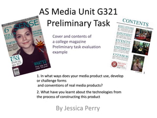
- 1. AS Media Unit G321 Preliminary Task Cover and contents of a college magazine Preliminary task evaluation example 1. In what ways does your media product use, develop or challenge forms and conventions of real media products? 2. What have you learnt about the technologies from the process of constructing this product By Jessica Perry
- 2. In what ways does your media product use, develop or challenge forms and conventions of real media products? THE FRONT COVER-SIMILARITIES Header Masthead Plain background Cover Lines Dominant Main Image (rule of thirds) Barcode
- 3. Differences -front cover 6th Sense Vs Men’s Health I have spaced out my cover lines in my magazine where as on Men’s Health they are close to each other. The font used in my mast head is Sans Serif whereas the Men’s Health masthead is a serif font. The font colour used is teal in my magazine quite a dark colour whereas Men’s Health use bright red and blue. For my main image, I have used a medium close up shot where my model is smiling giving it a friendly feel whereas Men’s Health is a medium shot with a serious action pose. Men’s Health use an action pose because it is promoting health and fitness.
- 4. In what ways does your media product use, develop or challenge forms and conventions of real media products? contents page Date of magazine edition Use of sub-headings to help the reader. Use of pictures to add colour Text on left side of image(s) Block capital text used Page numbers Left of text
- 5. Differences – Contents page I have used a variety of images to show what the magazine has to offer whereas Q has just used two. I haven’t put the title of magazine on the contents page whereas Q have. I haven’t put text on any images. I have got a voucher on my contents page however Q do not.
- 6. What have you learnt about the technologies from the process of constructing this product Learning and using Adobe InDesign to create contents pages. The use of Moodle to get resources. Learning and using Adobe Photoshop to design magazine front cover. The use of digital cameras. (learning about shot angles and shot types)
- 7. Using my digital camera I could ensure my magazine cover main image is a MCU (Medium Close Up) so it could dominate the frame. I also took into account the rule of thirds and made sure my model’s eyes were roughly in the top third. I made sure there was space on the sides for cover lines so they would be on a plain background therefore they could be easily read. I told my model to smile so it shows happiness and that college is a friendly place.
- 8. For my front cover image, I used http://www.picyou.com to edit my main image. Orignal Image Edited Image I edited my main image because I thought my model’s face was really shiny and thought it was too bright. In adobe photoshop I found the colour of my background and used a paint brush to paint over a bit of hair that was sticking out. I also cropped the sides of the image too.
- 9. Using InDesign, I made sure the text saying Contents was the same colour as the masthead so it maintained the same theme. I wanted my text to all be the same size so I changed the shape of all text.