
Recomendados
Más contenido relacionado
La actualidad más candente
La actualidad más candente (20)
Destacado
Destacado (20)
Similar a Research task 3
Similar a Research task 3 (20)
Último
Último (20)
Research task 3
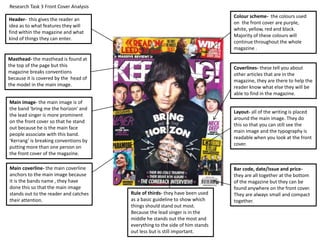
- 1. Research Task 3 Front Cover Analysis Header- this gives the reader an idea as to what features they will find within the magazine and what kind of things they can enter. Masthead- the masthead is found at the top of the page but this magazine breaks conventions because it is covered by the head of the model in the main image. Main image- the main image is of the band ‘bring me the horizon’ and the lead singer is more prominent on the front cover so that he stand out because he is the main face people associate with this band. ‘Kerrang’ is breaking conventions by putting more than one person on the front cover of the magazine. Main coverline- the main coverline anchors to the main image because it is the bands name , they have done this so that the main image stands out to the reader and catches their attention. Bar code, date/issue and price- they are all together at the bottom of the magazine but they can be found anywhere on the front cover. They are always small and compact together. Colour scheme- the colours used on the front cover are purple, white, yellow, red and black. Majority of these colours will continue throughout the whole magazine . Coverlines- these tell you about other articles that are in the magazine, they are there to help the reader know what else they will be able to find in the magazine. Layout- all of the writing is placed around the main image. They do this so that you can still see the main image and the typography is readable when you look at the front cover. Rule of thirds- they have been used as a basic guideline to show which things should stand out most. Because the lead singer is in the middle he stands out the most and everything to the side of him stands out less but is still important.
- 2. Research Task 3 Front Cover Analysis Masthead- the masthead is found at the top of the page and stands out from the rest. It’s there to keep the magazine consistent. Usually the front cover masthead would be found by the contents page title, doing this creates brand identity. This magazine hasn’t created this branding on the contents page however it mage continue through the rest of the magazine. Main image- the main image is used to draw the readers attention into the contents page and make them wonder what the image is linked to and where they can find it in the magazine. Editorial- this magazine has added a comment from the editor, most magazines do this to make the magazine more personal and make the reader feel a connection with the person who made the magazine. they have also included a magazine of themselves to give it that extra little touch. Articles titles- the contents page is where you can find different articles featured inside the magazine. They are also found with page numbers so if someone wants to find a specific part they can easily find out where it is. Colour scheme- the colours found on the front cover have continued onto the contents page. The only colour they have included is purple but red, yellow, black and white are all colours that continue throughout the contents page. Columns- this magazine only has two columns whereas most magazines normally have three, by doing this they are breaking conventions for normal music magazines. Issue number/date- the issue number and date are on contents page, they have done this so the magazine looks professional and people know the release date. Font- the subheadings on the contents page are in bold so that they stand out more sand so the reader can find key parts in the magazine. Images- when images are on the contents page they usually have a border around them, this magazine doesn’t have borders around and so by doing this they are breaking conventions of usual music magazines. Language- the language used clearly identifies what type of genre this magazine is. It also helps the reader to read it because it is well written. It also makes the magazine professional if it is well written. It also includes a lot of jargon.
- 3. Drop cap- this is used to show the first word of the article and pull the readers attention into what is being said in the article. Research Task 3 Double Page Spread Analysis Columns- the columns are all of equal width so that the magazine is well organised and is easy to read. It is also used so that the magazine has structure. Basic Layout- the basic layout allows the magazine to have some sort structure and makes it easy to read because of how well it is lay out. Main heading- this is in larger writing to the rest of the typography on the page, this allows it to stand out and catch the readers eye as they flick through the magazine. By line- this is used to tell the reader who the photograph was taken by. Subheading- this is used to provide more detail of what the article is about after the heading. It gives extra detail after the heading but is in smaller writing. Page number- the page number is there so that if someone wants to find a specific page they can easily flick through the magazine and find the exact page they want without wasting anytime. Colours- they have used very dark colours on this page. This indicates what kind of genre this band plays because of the dark colours on the article. They use black and white which is the same as the other pages in the magazine. Masthead- the masthead is featured at the bottom alongside the page number. They have put the masthead in very small but its still there to create branding. Overall impression- the overall impression you get from this double page is that the genre is rock music. Main image- they have included a main image on the double page and that is the only image used on this page. The image stands out because of how much of the page it covers so when a reader is flicking through it will stand out to them. Font- they have used sans serif throughout the entire article, the important parts on the page are in larger typography to indicate their importance. They have done this so that the magazine is consistent and follows a theme throughout. Icon- they have got an image of a small umbrella, this image is the image on the front cover of a bring me the horizon album, using this creates branding for the band.
- 4. Task 3- Identify the elements that connect the 3 different parts of the magazine All three parts follow a consistent colour scheme. The front cover has the widest amount of colours on it and then the contents page and double page spread use some of the colours from the front cover but they do not have all of them. Using the same colours creates a consistent theme in the whole magazine and keeps it looking professional. All three parts have got a main image on the page. The image always anchors what the text is about and informs the reader what they are reading and who they are reading it about. It also makes the pages stand out when they are just flicking through the magazine so they will see it and be interested in the magazine. The typography on each each part is consistently the same. For the most important parts of text they are in large bold text and then as they go down in important the font goes smaller but if it is still important it is in bold. All the pages shown have got a neat layout. They all have this so that the reader can read the magazine easily and not have a hard time finding the important information.