Radical Reference presentation
•Descargar como PPT, PDF•
1 recomendación•392 vistas

A proposed redesign of the radical reference website. The presentation lays out the research and testing process that went into the redesign. It argues that a new website would have to be trustworthy, informative, collaborative, and intuitive. It presents our design and how it achieves these goals.

Recomendados
Recomendados
Más contenido relacionado
Similar a Radical Reference presentation
Similar a Radical Reference presentation (20)
Más de Alex Watkins
Más de Alex Watkins (11)
Último
Último (20)
Radical Reference presentation
- 4. Summary of Research Findings: Personas & Scenarios The independent journalist The activist The library student The volunteer
- 9. Site Strategy The Radical Reference Website needs to: Foster Community Provide Resources Answer Questions
- 10. To Achieve these Goals the Website Needs to be: Trustworthy Do users trust the organization to answer their questions?
- 11. To Achieve these Goals the Website Needs to be: Trustworthy Do users trust the organization to answer their questions? Informative Is a wealth of unique information at the users' fingertips?
- 12. To Achieve these Goals the Website Needs to be: Trustworthy Do users trust the organization to answer their questions? Informative Is a wealth of unique information at the user’s fingertips? Collaborative Can volunteers participate in meaningful collaboration?
- 13. To Achieve these Goals the Website Needs to be: Trustworthy Do users trust the organization to answer their questions? Informative Is a wealth of unique information at the user’s fingertips? Collaborative Can volunteers participate in meaningful collaboration? Intuitive Is the site’s identity clear, is it easy to use?
- 14. Create a site that is Trustworthy Professional Look Showcase Expert Volunteer Credentials
- 15. New Radical Reference Home Page
- 16. New Radical Reference Home Page
- 17. New Radical Reference Home Page
- 18. New Radical Reference Home Page
- 19. New Radical Reference Home Page: Trustworthy
- 20. Team Profiles, Expert Credentials: Trustworthy
- 21. Create a site that is Informative Make Research Guides Browsable Showcase Presentations Searchable Question Archive
- 22. Research Guides
- 25. Create a site that is Collaborative Customizable Profiles Ability to Join and Discuss Local Chapters and Projects More Collaborative Question Answering
- 27. Local Chapter
- 29. Answer Questions
- 30. Create a site that is Intuitive Expose Organizational Goals Labels and architecture are clear Forms are simple and straightforward
- 31. Home Page: Featured Content
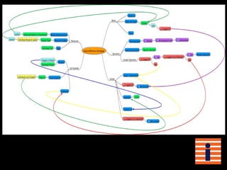
- 32. Sitemap
Notas del editor
- We undertook the task to redesign the front end of Radical Reference’s website. We researched the needs of Radical Reference users and volunteers, established a set of principles which guided our design, and extensively tested our product.
- First we meet with Radical Reference RepresentativesWhat we heard was that the site needed to:Facilitate question asking Attract active volunteersBe simple and easy to use.Make Collaboration possible.
- From our meeting we developed Personas and Scenarios, which are typical users and tasks, to test who would use radical reference and what they would need to do.What we discovered was:Several key tasks as easy and intuitive as possible, such as asking a question, signing up for an account, or answering a question.Users had to be able to trust the site, the answerers to be right, the organization to be senstive, and the webiste itself to work.
- We then cataloged the content of the Radical Reference site creating a content inventory:What we found was:There is a great deal of unique resources on Radical Reference, but that they were hard to explore.A new site would have to harness these resources to be as informative as possible.
- We compared radical reference to 9 other websites to determined what it needed to be doing, its strengths, and design ideas.We saw that Many other sites were using social networking tools, both within the site and through services like twitter to reach a broader audience and to create a community. Any site we would design would have to use social networking principles to be collaborativeThe sites were all easy, intuitive, and professional looking. Radical reference’s site will have to be intuitive, easy to use, and professional to attract users.
- We came up with a number of content areas, wrote those on cards, and had people organize them into categories.This card sort showed that:There are four basic areas of Radical ReferencePeople preferred simple but clear labelsFewer total sections were more intuitive.
- We then made mock-ups of the webpage, which we used to simulate actual browsing.These Paper Prototypes proved that:The top level and secondary navigation needed to show who Radical Reference is as an organization and what they have to offer.
- Site StrategyWhat we concluded from this process is we needed to design a webpage that could serve three main functions: Answering Questions Providing Resources Fostering a Community
- Our first goal was to make the new site Trustworthy. We feel our design adds a professional look while remaining friendly and accessible. Adding volunteer profiles was our way of putting a human face on Radical Reference while showcasing the expert credentials of the volunteers. People need to be reassured that Radical Reference is a reliable, up-to-date source for information. This we showed with a complete redesign of the homepage. (reveal...ta da!)
- Your new home page!
- Images enhance the credibility of Radical Reference! They help the user bond with the site. These pictures of Emma Goldman here, help distinguish Radical Reference from other question and answer sites. The typewriter font we chose for the title and tag line conveys authenticity and realness in a way that the standard fonts really don't The logo is also important to Radical Reference and stands out among all the other images. It always brings you back to homepage.
- The main body of the page is here(point) this Image rotator cycles through all the content on the site. Images change every few seconds from presentations, to local collectives, blog posts, videos...all with pictures. it's visually stimulating without being too distracting and Gives the NEW user an overview of everything Radical Reference is and does.
- In the featured question section, the most recent question posted appears here. Timestamp lets users know that the site is current and thereby reliable. Keeping this on the home page also draws new volunteers into the site especially if they know the answer!
- The Utilities sidebar includes: Calendar, Map, and Twitter feed. These remain constant. Twitter and Facebook icons Allow users to join or follow with social media at any time. The calendar lets you find out when things are happening. The map directs users to local collectives Twitter feed keeps users informed with up-to-the-minute news. All these features add value to the site and make it a TRUSTWORTHY SOURCE for information.
- We also enhanced the credibility of the site by creating Volunteer Profiles. Profiles let users know that there are real people answering your questions. Along with a picture and a name (neither of which need to be real), we included a summary of questions answered, blog posts written and the date they joined Radical Reference. The short bio section here lets volunteers display their expert credentials. The images at the bottom link to the volunteer's local chapter, projects they're working on, and a quick link and RSS feed of blog posts. All of these features achieve our first goal and enhance the trustworthiness of Radical Reference. Our redesign is not only TRUSTWORTHY, but ALSO INFORMATIVE
- Thanks Kevin,In addition to creating a trustworthy Website, our group wanted to make the site more informative by ◦ Making Research Guides Browsable ◦ Showcasing Presentations ◦ and creating an easily Searchable Question Archive
- Radical reference has an important niche to fill. It is the only librarian run site with research guides on a large number of radical topics. By making research guides browsable, our redesign showcases these resources. As you can see here in our high definition template, the guides are split up into categories with images to make them more browsable. Visually appealing and clearly labeled, these categories enable the user to quickly find the topic they are looking for. After extensive research and combing through the Radical Reference Website, our group came up with these categories and subcategories with the idea of adding even more guides. This redesign will make the site an even stronger informative resource.
- By showcasing presentation, we have designed a media template where all presentations can be found in one place. We have created a space to showcase Radical Reference presentations, rather than leaving them spread throughout the site, If the user is audio or visually inclined, they can inform themselves with not only a text document, but a pod cast, slide show or video. The site becomes a dynamic multi-layered informative resource where a user can find it all in one place.
- Answering radical questions is the corner stone of radical reference, so our group wanted to create an easily searchable question archive. Here is our groups template, designed to make it easy to find both new and old questions, so that the user can find the relevant information they need. Through faceted searching here on the left, someone can search by subject category, which relates to the categories I mentioned before in the research guides. Also, if someone wants to find out if a question is answered or unanswered, or if you are looking for a question answered by a specific Radical Reference volunteer , they can, through the faceted searching in our design. In addition questions can be searched through clicking user tags in this tag cloud. One of our goals is to make Radical Reference a more Informative website with wealth of unique information at the user's fingertips.Julie is going to talk about collaboration and how it is showcased in our redesign.
- Know exactly what Rad Ref is and does when arriving - Show wealth of info and services Labels! Expose user to content immediately Rotating content, a teaser of what they'll find on the site! Presentations Resource Guides Profile Blog Post Local chapters Featured Question Keeps the pages clean yet still pique users’ interests. Gives user an overall impression of the content.
- The site has an overall simple hierarchical structure. There are only four top level navigation categories, but they encapsulate what Radical Reference has to offer.
- The local navigation labels are clear and simplified About Us Meet the Team Press Research Guides Media Presentations Blog Ask a Question Search the Archive Answer a Question Volunteer Local Chapters Projects
- Forms and sign-up are simple and clear. Users are funneled through easy and simple sign-up and ask question procedures.