SlideShare una empresa de Scribd logo
1 de 12
Evaluation Ben Murphy
1. In what ways does your media product use, develop or challenge forms and conventions of real media products? Whilst creating my music magazines cover, contents and double page spread I had to take into account the forms and conventions from other music magazines. The main music magazine that I took conventions from was ‘NME’ which stands for ‘New Musical Express’. I chose this magazine because they are aimed at teenagers who like indie-rock music and this is the genre that my music magazine was focused on. The other two magazine that I took forms and conventions from were ‘Kerrang’ and ‘Q’. From studying these three music magazines I would gain ideas for my own magazine and used them to help create my front cover, contents and double page spread. Another way which makes my front cover conventional is the placement of the bar code, which is placed in the bottom right of the page. Most magazines will feature their bar code either here or on the back cover of their magazine. The way in which I have placed my bar code makes my magazine conventional. The Masthead of my magazine has been resized so that it can be place in the top left hand corner of my magazine cover. I took this idea from NME by following their convention. Personally I feel that this is the best place in which to situate my masthead. One thing I did do to also follow conventions was that I have placed my slogan directly underneath my masthead meaning that the reader would straight away recognise my magazine from the cover. Most music magazine will use this technique because the slogan will be featured on the magazine cover every time a new one is released. This makes my magazine conventional. The blue strip which runs along the bottom of my music magazines cover is featured on most magazines and tells the reader what else to expect if they were to read further into the magazine. This also makes my magazine look conventional. The way in which I have used one large image for my front cover was taken for NME, Kerrang and Q which makes my magazine follow conventions. However, I have used the effect of greyscale on my image; hence making my cover unusual and different from other magazines, making it unconventional. My magazine is unconventional because my masthead is layered above my image, making it look more important than the image. Most music magazines will have the image layered above their masthead.
1. In what ways does your media product use, develop or challenge forms and conventions of real media products? Nearly all of the music magazines that I have researched have the word ‘Contents’ written at the top of their contents. I however have opted for the unconventional option and I just wrote the words ‘This Week’ at the top the page. Also, I discovered that most headings on contents pages are usually placed in the top left hand side, where as you can see that mine is placed in the top right hand side, making my contents page seem unconventional. My music magazines contents page does not have many sub-headings on it. Most magazines that I have researched contained lots of subheading, telling the reader what to expect from the rest of the magazine and what page numbers the different stories are on.  However I have made my contents very basic and simple so that it is easy for the reader to understand. This makes my contents page stand out from the crowd because of how different it looks. This makes my contents look unconventional. I have used page numbers for my contents page and have placed it in the bottom right hand corner which is very conventional meaning that I have followed the crowd. All of the music magazines that I have researched had lots to comment about on their colour scheme. Everyone had around three main colours for their contents page and this is similar to mine. My three main colours for my contents page are blue, pink and grey. Another method which I have used to make my music magazine unconventional is that I have only used one big image to cover the whole of the page. Now this is almost as if it is a front cover so this could either be good or bad. Either way, it makes my contents different and unconventional. Very conventional in the way in which I have put a subscribe advertisement on the contents page. These will usually be found here or near the back of the magazine.
1. In what ways does your media product use, develop or challenge forms and conventions of real media products? Page numbers have been used on the edge of both pages. They have been placed here because I have followed the way of conventions; hence making my double page spread conventional overall. I have linked the two pages together by spreading the text across both of the pages. Lots of magazines will link their double page spreads in different ways such text and images. However, these may not be the best choices because it makes it difficult for the reader to make out what the text is stating, or what the picture looks like. Overall though, most music magazines will use either one of the above to link their pages and this makes my magazine very conventional. Sunglasses make the image look unconventional as you do not expect somebody who is playing a guitar to be wearing a pair of sunglasses. ‘ rewind’ masthead/logo is placed in the bottom right hand corner of the double page spread. This helps to advertise the magazine even more meaning that they will gain more sales. It also helps largely to link the two pages together and hence creating the effect of the double page spread feel as one page, so that they both belong with each other. It makes this double page spread seem conventional. All of the best music magazines make their double page spreads linked together extremely well. For my music magazine I have used a popular choice of two thirds text and one third image. The way in which the text is spread across the both pages links them. The colour scheme has been kept basic and retro which is what you would expect from a indie-rock music magazine. The colours white, grey and black are very retro and because it has been kept simple it makes my double page spread very effective whilst also being conventional.
2. How does your media product represent particular social groups? The main two social groups which my music magazine can be defined by are the gender it represents and aims to attract and the age it represents and aims to attract. There are many ways in which different magazines can attract different social groups; as I found out in my research. Firstly, comes the image on the front cover of my magazine. This image is aimed to attract teenagers to young adults and this is mainly due to the genre of which my magazine is representing. The magazine which I have designed represents the genre of ‘indie-rock’, hence why there is a picture of a lad holding a guitar on the front cover. Also the majority of people who listen to indie-rock are most likely to be teenagers and if you performed a survey you would probably find this to be correct. Secondly, comes the colour. Straight away the colours blue and pink are seen to be very youthful colours. However, the background colour of my front cover, contents and double spread is grey, meaning that this magazine is seen to be very sophisticated in its own way and therefore attempting to attract the older generation. The colours blue and pink also suggest that my magazine is aimed at both boys and girls or women and men, blue for boys and pink for men. So this suddenly makes the audience for this magazine even bigger as it is aimed at both genders meaning you are doubling the chance of sales.  Overall, my media product is aimed at both males and females who are in their late teens, because this is the age at where they will start to become more interested in music and will want to keep up with the latest news, views and reviews in the music world. The font below is used on my front cover and also my double page spread. From looking at the font you can tell that it appears to be tough, rough and scruffy. This could be used to suggest that the magazine appeals to rockers and also teenagers as a stereotype.
3. What kind of media institution might distribute your media product and why? My music magazine is called ‘rewind’ and because it is an independent music magazine, this means that it would be manufactured and produced by its own company, just like many magazines. I would then expect my music magazine to be advertised in local newsagents whilst also being sold there along side other music magazines such as NME. However, I would not expect my music magazine to advertised at any greater extent than just a local newsagents and this is because the company would not be able to afford any more than this as they are only a small company. For example rewind would never be advertised on the television because it would be too expensive, but there are hardly any music magazine which have advertisements on the television. There are many different ways in which a music magazine can be sold, however my music magazine’s genre is indie-rock meaning that it could narrow the options down of how my magazine could be sold. Personally I believe that my music magazine would sell the most in well known national shops such as WH Smiths and Superdrug. I believe that it would sell well here along side the likes of other music magazines such as NME and Q who are top selling among the music magazine community. Another great reason why I believe that my magazine would sell well is the price. The price is cheap at just £1.50 and this is also a very similar price to NME giving it even more reason to be sold here. I do not believe that my music magazine would be sold by companies who specialise in certain genres of music and I believe this because my magazine will attract all sorts of people who are into something different. After doing a little bit of research on the internet, I cam across a website which I could imagine selling my own music magazine. The website that I found is called ‘www.isubscribe.co.uk’ and it sells thousands of magazine titles including many music magazines. Isubscribe gives people the chance to subscribe to a certain magazine for usually 3 or 12 months. Personally, I can imagine rewind being distributed here mainly down to the fact that special offers could be put up such as discounts if you subscribe for long periods. Below is an image of the website isubscribe that I found.
4. Who would be the audience for your media product? When I proceeded with my researched, I focused on three main music magazines and these were ‘NME’, ‘Kerrang’ and ‘Q’. There are many ways in which you can decipher what genre of music a magazine is appealing to. The three ways in which you can decipher this are the colour scheme of the magazine, the images used on the magazine and how they are presented and the chosen overall layout of the page. In my research I tested all of these factors against every one of my music magazines that I studied. For example Kerrang’s genre is heavy metal and to show this there colour scheme is white with lots of jet black. NME is a magazine which has a genre as indie and I wanted to produce my media product with it having a genre of indie-rock; hence why I used NME quite a lot in my research. You can see that I have used NME a lot because many of my ideas on my music magazine have in actual fact come from there music magazines. As I wanted to attract the same target audience as NME this I understandable, so the things I focused on was the layout, colour scheme and images used on their magazines. Indie is a very retro style of music that is inventive and different. I have shown the retro side of indie by using the colour grey on my products and have also incorporated the inventive style by using the colours blue and pink which contrast each other to give my magazine a funky look. I feel that my music magazine attracts a niche audience and this is due to the style of music that indie is, people either like it, or they hate it. I believe that although my magazine is aimed at a niche audience, it is done successfully and this mainly because of the images and layout used. However, I do believe that my music magazine could also attract people who are into pop music. I believe this because of the use of the colours pink and blue which give my magazine a funky look. However this does not mean that somebody who was into pop music would like the content inside my magazine.
5. How did you attract/address your audience? After finishing my final media products I can look back through all of the research that I have done and make a note of which features from other magazines I have taken into account and incorporated into my own music magazine that I have designed. From my research, I can tell that there are many features on my own magazine of which I have gained the ideas from other music magazines. Below are a couple of examples of where I have done this. Firstly, I took the idea from NME magazine of having my masthead in the top left hand corner of my music magazine cover. I also chose to use NME’s idea of placing a slogan directly underneath the masthead, so that it is easy for the audience to spot and read. The only thing I didn’t take from NME was the idea of layering the main image above the masthead. I decided not to do this as I felt that my masthead was far more important than the image. Secondly, I used the idea taken from the Q music magazine of having a main image in the centre of my music magazine. I feel that this effect worked well for me as it gives the audience something to focus on. Another idea is one that I took from Q magazine again and this was the use of the strip along the bottom of the magazine giving hints to the reader of what to expect if they read further into the magazine.
6. What have you learnt about technologies from the process of constructing this product? I have many things tod with technologies when constructing my media product in full. I have learnt how to use blogger and how to upload posts with images on them to its website. I have learnt how to use another website called ‘Slideshare’ which I set up an account and then this account could be used to upload my presentations onto blogger as a post. I have used ‘Microsoft PowerPoint’ many times before, however I have become much more familiar with all of its options and uses as the process of designing my product has continued. But the main program which I have learnt how to use is ‘Macromedia Fireworks’. Macromedia Fireworks is a program which is very useful and was created to help you edit images and design things. It was the program in which I created my draft product and my final product. Below I am going to show you a few thing that I have learnt on fireworks whilst designing my product. Firstly, for the image on my front cover and my contents page I have used an affect called ‘greyscale’. This takes all of the colour from the image that you have selected and transforms it into black and white. Below are the steps I took to use the effect. Step 1:  select the image you desire using the mouse and select the ‘Commands’ option from the selection bar located at the top of the page Step 2:  After selecting the ‘Commands’ option, scroll down the options and hover your mouse over the ‘Creative’ option until another set of choices appears. Step 3:  Finally, from the other set of choices that appear select the ‘Convert to Greyscale’ as your choice and then you image that you selected at the beginning will appear in black and white.
7. Looking back at your preliminary task, what do you feel you have learnt in the progression from it to the full product? The description that I have wrote on the previous slide basically sums up the majority of what I have learnt since I began this project and that is my knowledge on the programs that I have used to create my music magazine. The main computer program that I have learnt how to use was ‘Macromedia Fireworks’. This program was excellent once I had learnt how to use it with all its functions to edit images and rearrange the layers of certain objects. With me learning how to use Macromedia Fireworks I would have not been able to create as good as quality products as I created and they would have looked very cheap. My preliminary designs were a major step forward in terms of what I learnt during the making of this project. Firstly, when creating my preliminaries I learnt how to delete the background from images using a tool call the ‘magic wand’. The was really handy because without me learning how to use this tool then all of my images would have had a white background on them making my music magazine look very unprofessional. Secondly, I learnt how to use layering from creating my preliminaries, which is a skill that I also used on my final products. This was also a great skill that I learnt because I could make different objects stand out on my final magazine cover. In this case I decided to place my masthead in front of my main images because felt that it held more importance. However, on my final contents page I have decided to layer my image in front of heading because I feel that it has more importance on this page. A final skill that I used whilst making my preliminaries was an outer ‘glow’ effect. In my preliminaries I just played around with this effect using it on random object, but as you can see I have chosen my targets with much more care on my final products. This is the technique that I have excelled in using this most and it has also helped to make my designs look very professional. The next two slides show both my preliminaries and my final products. I have decided to put them together so that it is easier to compare them and see how I have improved. By looking at them you can see the improvements that I have made to my final products from my preliminaries. Overall you can tell that my final products are far more professional looking than my preliminaries. I feel that my main area of improvement between the two design is my layout and how I have placed objects around my pages. A good example of this would be my two front covers. My preliminary front cover looks as though it should be a contents page and the images that have been placed at the bottom of it just make the whole page look a mess. Where as my final products front cover looks far more professional with a main image that stands out and I have placed other features such as my masthead and headings in much more appealing positions.
Before…
After…

Más contenido relacionado

La actualidad más candente

Question 1: In what ways does your media product develop or challenge forms o...
Question 1: In what ways does your media product develop or challenge forms o...Question 1: In what ways does your media product develop or challenge forms o...
Question 1: In what ways does your media product develop or challenge forms o...vpasmedia
 
Music Magazine Evaluation
Music Magazine EvaluationMusic Magazine Evaluation
Music Magazine Evaluationjerrelle
 
Music Magazine Evaluation
Music Magazine EvaluationMusic Magazine Evaluation
Music Magazine EvaluationAmisha Patel
 
Music magazine – the evaluation final
Music magazine – the evaluation finalMusic magazine – the evaluation final
Music magazine – the evaluation finalRach7
 
Media - Evaluation
Media - EvaluationMedia - Evaluation
Media - Evaluationrreardon1
 
Presentation1 evaluation
Presentation1 evaluationPresentation1 evaluation
Presentation1 evaluationcharlieparker8
 

La actualidad más candente (12)

Magazine evaluation
Magazine evaluationMagazine evaluation
Magazine evaluation
 
Evaluation
EvaluationEvaluation
Evaluation
 
Question 1: In what ways does your media product develop or challenge forms o...
Question 1: In what ways does your media product develop or challenge forms o...Question 1: In what ways does your media product develop or challenge forms o...
Question 1: In what ways does your media product develop or challenge forms o...
 
Music Magazine Evaluation
Music Magazine EvaluationMusic Magazine Evaluation
Music Magazine Evaluation
 
Music Magazine Evaluation
Music Magazine EvaluationMusic Magazine Evaluation
Music Magazine Evaluation
 
Music magazine – the evaluation final
Music magazine – the evaluation finalMusic magazine – the evaluation final
Music magazine – the evaluation final
 
Magazine Evaluation
Magazine EvaluationMagazine Evaluation
Magazine Evaluation
 
Evaluation
EvaluationEvaluation
Evaluation
 
Evaluation
EvaluationEvaluation
Evaluation
 
Media - Evaluation
Media - EvaluationMedia - Evaluation
Media - Evaluation
 
Presentation1 evaluation
Presentation1 evaluationPresentation1 evaluation
Presentation1 evaluation
 
Evaluation
EvaluationEvaluation
Evaluation
 

Similar a Evaluation

Similar a Evaluation (20)

Media evaluation
Media evaluationMedia evaluation
Media evaluation
 
AS Media Final Evaluation
AS Media  Final EvaluationAS Media  Final Evaluation
AS Media Final Evaluation
 
Media evaluation finished
Media evaluation finishedMedia evaluation finished
Media evaluation finished
 
Evaluation
EvaluationEvaluation
Evaluation
 
Evaluation
EvaluationEvaluation
Evaluation
 
Evaluation
EvaluationEvaluation
Evaluation
 
Evaluation
EvaluationEvaluation
Evaluation
 
Evaluation
EvaluationEvaluation
Evaluation
 
Jessica's evaluation
Jessica's evaluationJessica's evaluation
Jessica's evaluation
 
Media evaluation jack kay
Media evaluation jack kayMedia evaluation jack kay
Media evaluation jack kay
 
Evaluation
EvaluationEvaluation
Evaluation
 
Media product evaluation
Media product evaluationMedia product evaluation
Media product evaluation
 
Media Magazine Evaluation
Media Magazine EvaluationMedia Magazine Evaluation
Media Magazine Evaluation
 
Media presentation
Media presentationMedia presentation
Media presentation
 
Media eval
Media evalMedia eval
Media eval
 
Media Evaluation
Media EvaluationMedia Evaluation
Media Evaluation
 
Music Magazne
Music MagazneMusic Magazne
Music Magazne
 
Evaluation
EvaluationEvaluation
Evaluation
 
Evaluation
EvaluationEvaluation
Evaluation
 
Media evaluation
Media evaluationMedia evaluation
Media evaluation
 

Último

Call Girls Nashik Gayatri 7001305949 Independent Escort Service Nashik
Call Girls Nashik Gayatri 7001305949 Independent Escort Service NashikCall Girls Nashik Gayatri 7001305949 Independent Escort Service Nashik
Call Girls Nashik Gayatri 7001305949 Independent Escort Service NashikCall Girls in Nagpur High Profile
 
👙 Kolkata Call Girls Shyam Bazar 💫💫7001035870 Model escorts Service
👙  Kolkata Call Girls Shyam Bazar 💫💫7001035870 Model escorts Service👙  Kolkata Call Girls Shyam Bazar 💫💫7001035870 Model escorts Service
👙 Kolkata Call Girls Shyam Bazar 💫💫7001035870 Model escorts Serviceanamikaraghav4
 
Call Girls in Najafgarh Delhi 💯Call Us 🔝8264348440🔝
Call Girls in Najafgarh Delhi 💯Call Us 🔝8264348440🔝Call Girls in Najafgarh Delhi 💯Call Us 🔝8264348440🔝
Call Girls in Najafgarh Delhi 💯Call Us 🔝8264348440🔝soniya singh
 
Call Girl Nagpur Roshni Call 7001035870 Meet With Nagpur Escorts
Call Girl Nagpur Roshni Call 7001035870 Meet With Nagpur EscortsCall Girl Nagpur Roshni Call 7001035870 Meet With Nagpur Escorts
Call Girl Nagpur Roshni Call 7001035870 Meet With Nagpur EscortsCall Girls in Nagpur High Profile
 
1681275559_haunting-adeline and hunting.pdf
1681275559_haunting-adeline and hunting.pdf1681275559_haunting-adeline and hunting.pdf
1681275559_haunting-adeline and hunting.pdfTanjirokamado769606
 
Call Girls in Barasat | 7001035870 At Low Cost Cash Payment Booking
Call Girls in Barasat | 7001035870 At Low Cost Cash Payment BookingCall Girls in Barasat | 7001035870 At Low Cost Cash Payment Booking
Call Girls in Barasat | 7001035870 At Low Cost Cash Payment Bookingnoor ahmed
 
Housewife Call Girls Sonagachi - 8250192130 Booking and charges genuine rate ...
Housewife Call Girls Sonagachi - 8250192130 Booking and charges genuine rate ...Housewife Call Girls Sonagachi - 8250192130 Booking and charges genuine rate ...
Housewife Call Girls Sonagachi - 8250192130 Booking and charges genuine rate ...Riya Pathan
 
Low Rate Call Girls Gulbarga Anika 8250192130 Independent Escort Service Gulb...
Low Rate Call Girls Gulbarga Anika 8250192130 Independent Escort Service Gulb...Low Rate Call Girls Gulbarga Anika 8250192130 Independent Escort Service Gulb...
Low Rate Call Girls Gulbarga Anika 8250192130 Independent Escort Service Gulb...Riya Pathan
 
Call Girls Service Bantala - Call 8250192130 Rs-3500 with A/C Room Cash on De...
Call Girls Service Bantala - Call 8250192130 Rs-3500 with A/C Room Cash on De...Call Girls Service Bantala - Call 8250192130 Rs-3500 with A/C Room Cash on De...
Call Girls Service Bantala - Call 8250192130 Rs-3500 with A/C Room Cash on De...anamikaraghav4
 
Independent Joka Escorts ✔ 8250192130 ✔ Full Night With Room Online Booking 2...
Independent Joka Escorts ✔ 8250192130 ✔ Full Night With Room Online Booking 2...Independent Joka Escorts ✔ 8250192130 ✔ Full Night With Room Online Booking 2...
Independent Joka Escorts ✔ 8250192130 ✔ Full Night With Room Online Booking 2...noor ahmed
 
Call Girl Nashik Saloni 7001305949 Independent Escort Service Nashik
Call Girl Nashik Saloni 7001305949 Independent Escort Service NashikCall Girl Nashik Saloni 7001305949 Independent Escort Service Nashik
Call Girl Nashik Saloni 7001305949 Independent Escort Service NashikCall Girls in Nagpur High Profile
 
VIP Call Girls Service Banjara Hills Hyderabad Call +91-8250192130
VIP Call Girls Service Banjara Hills Hyderabad Call +91-8250192130VIP Call Girls Service Banjara Hills Hyderabad Call +91-8250192130
VIP Call Girls Service Banjara Hills Hyderabad Call +91-8250192130Suhani Kapoor
 
College Call Girls New Alipore - For 7001035870 Cheap & Best with original Ph...
College Call Girls New Alipore - For 7001035870 Cheap & Best with original Ph...College Call Girls New Alipore - For 7001035870 Cheap & Best with original Ph...
College Call Girls New Alipore - For 7001035870 Cheap & Best with original Ph...anamikaraghav4
 
↑Top Model (Kolkata) Call Girls Howrah ⟟ 8250192130 ⟟ High Class Call Girl In...
↑Top Model (Kolkata) Call Girls Howrah ⟟ 8250192130 ⟟ High Class Call Girl In...↑Top Model (Kolkata) Call Girls Howrah ⟟ 8250192130 ⟟ High Class Call Girl In...
↑Top Model (Kolkata) Call Girls Howrah ⟟ 8250192130 ⟟ High Class Call Girl In...noor ahmed
 
College Call Girl in Rajiv Chowk Delhi 9634446618 Short 1500 Night 6000 Best ...
College Call Girl in Rajiv Chowk Delhi 9634446618 Short 1500 Night 6000 Best ...College Call Girl in Rajiv Chowk Delhi 9634446618 Short 1500 Night 6000 Best ...
College Call Girl in Rajiv Chowk Delhi 9634446618 Short 1500 Night 6000 Best ...perfect solution
 
(DIVYA) Dhanori Call Girls Just Call 7001035870 [ Cash on Delivery ] Pune Esc...
(DIVYA) Dhanori Call Girls Just Call 7001035870 [ Cash on Delivery ] Pune Esc...(DIVYA) Dhanori Call Girls Just Call 7001035870 [ Cash on Delivery ] Pune Esc...
(DIVYA) Dhanori Call Girls Just Call 7001035870 [ Cash on Delivery ] Pune Esc...ranjana rawat
 
Dakshineswar Call Girls ✔ 8005736733 ✔ Hot Model With Sexy Bhabi Ready For Se...
Dakshineswar Call Girls ✔ 8005736733 ✔ Hot Model With Sexy Bhabi Ready For Se...Dakshineswar Call Girls ✔ 8005736733 ✔ Hot Model With Sexy Bhabi Ready For Se...
Dakshineswar Call Girls ✔ 8005736733 ✔ Hot Model With Sexy Bhabi Ready For Se...aamir
 
Call Girls In Goa 9316020077 Goa Call Girl By Indian Call Girls Goa
Call Girls In Goa  9316020077 Goa  Call Girl By Indian Call Girls GoaCall Girls In Goa  9316020077 Goa  Call Girl By Indian Call Girls Goa
Call Girls In Goa 9316020077 Goa Call Girl By Indian Call Girls Goasexy call girls service in goa
 
Kolkata Call Girl Bagbazar 👉 8250192130 ❣️💯 Available With Room 24×7
Kolkata Call Girl Bagbazar 👉 8250192130 ❣️💯 Available With Room 24×7Kolkata Call Girl Bagbazar 👉 8250192130 ❣️💯 Available With Room 24×7
Kolkata Call Girl Bagbazar 👉 8250192130 ❣️💯 Available With Room 24×7Riya Pathan
 
Beyond Bar & Club Udaipur CaLL GiRLS 09602870969
Beyond Bar & Club Udaipur CaLL GiRLS 09602870969Beyond Bar & Club Udaipur CaLL GiRLS 09602870969
Beyond Bar & Club Udaipur CaLL GiRLS 09602870969Apsara Of India
 

Último (20)

Call Girls Nashik Gayatri 7001305949 Independent Escort Service Nashik
Call Girls Nashik Gayatri 7001305949 Independent Escort Service NashikCall Girls Nashik Gayatri 7001305949 Independent Escort Service Nashik
Call Girls Nashik Gayatri 7001305949 Independent Escort Service Nashik
 
👙 Kolkata Call Girls Shyam Bazar 💫💫7001035870 Model escorts Service
👙  Kolkata Call Girls Shyam Bazar 💫💫7001035870 Model escorts Service👙  Kolkata Call Girls Shyam Bazar 💫💫7001035870 Model escorts Service
👙 Kolkata Call Girls Shyam Bazar 💫💫7001035870 Model escorts Service
 
Call Girls in Najafgarh Delhi 💯Call Us 🔝8264348440🔝
Call Girls in Najafgarh Delhi 💯Call Us 🔝8264348440🔝Call Girls in Najafgarh Delhi 💯Call Us 🔝8264348440🔝
Call Girls in Najafgarh Delhi 💯Call Us 🔝8264348440🔝
 
Call Girl Nagpur Roshni Call 7001035870 Meet With Nagpur Escorts
Call Girl Nagpur Roshni Call 7001035870 Meet With Nagpur EscortsCall Girl Nagpur Roshni Call 7001035870 Meet With Nagpur Escorts
Call Girl Nagpur Roshni Call 7001035870 Meet With Nagpur Escorts
 
1681275559_haunting-adeline and hunting.pdf
1681275559_haunting-adeline and hunting.pdf1681275559_haunting-adeline and hunting.pdf
1681275559_haunting-adeline and hunting.pdf
 
Call Girls in Barasat | 7001035870 At Low Cost Cash Payment Booking
Call Girls in Barasat | 7001035870 At Low Cost Cash Payment BookingCall Girls in Barasat | 7001035870 At Low Cost Cash Payment Booking
Call Girls in Barasat | 7001035870 At Low Cost Cash Payment Booking
 
Housewife Call Girls Sonagachi - 8250192130 Booking and charges genuine rate ...
Housewife Call Girls Sonagachi - 8250192130 Booking and charges genuine rate ...Housewife Call Girls Sonagachi - 8250192130 Booking and charges genuine rate ...
Housewife Call Girls Sonagachi - 8250192130 Booking and charges genuine rate ...
 
Low Rate Call Girls Gulbarga Anika 8250192130 Independent Escort Service Gulb...
Low Rate Call Girls Gulbarga Anika 8250192130 Independent Escort Service Gulb...Low Rate Call Girls Gulbarga Anika 8250192130 Independent Escort Service Gulb...
Low Rate Call Girls Gulbarga Anika 8250192130 Independent Escort Service Gulb...
 
Call Girls Service Bantala - Call 8250192130 Rs-3500 with A/C Room Cash on De...
Call Girls Service Bantala - Call 8250192130 Rs-3500 with A/C Room Cash on De...Call Girls Service Bantala - Call 8250192130 Rs-3500 with A/C Room Cash on De...
Call Girls Service Bantala - Call 8250192130 Rs-3500 with A/C Room Cash on De...
 
Independent Joka Escorts ✔ 8250192130 ✔ Full Night With Room Online Booking 2...
Independent Joka Escorts ✔ 8250192130 ✔ Full Night With Room Online Booking 2...Independent Joka Escorts ✔ 8250192130 ✔ Full Night With Room Online Booking 2...
Independent Joka Escorts ✔ 8250192130 ✔ Full Night With Room Online Booking 2...
 
Call Girl Nashik Saloni 7001305949 Independent Escort Service Nashik
Call Girl Nashik Saloni 7001305949 Independent Escort Service NashikCall Girl Nashik Saloni 7001305949 Independent Escort Service Nashik
Call Girl Nashik Saloni 7001305949 Independent Escort Service Nashik
 
VIP Call Girls Service Banjara Hills Hyderabad Call +91-8250192130
VIP Call Girls Service Banjara Hills Hyderabad Call +91-8250192130VIP Call Girls Service Banjara Hills Hyderabad Call +91-8250192130
VIP Call Girls Service Banjara Hills Hyderabad Call +91-8250192130
 
College Call Girls New Alipore - For 7001035870 Cheap & Best with original Ph...
College Call Girls New Alipore - For 7001035870 Cheap & Best with original Ph...College Call Girls New Alipore - For 7001035870 Cheap & Best with original Ph...
College Call Girls New Alipore - For 7001035870 Cheap & Best with original Ph...
 
↑Top Model (Kolkata) Call Girls Howrah ⟟ 8250192130 ⟟ High Class Call Girl In...
↑Top Model (Kolkata) Call Girls Howrah ⟟ 8250192130 ⟟ High Class Call Girl In...↑Top Model (Kolkata) Call Girls Howrah ⟟ 8250192130 ⟟ High Class Call Girl In...
↑Top Model (Kolkata) Call Girls Howrah ⟟ 8250192130 ⟟ High Class Call Girl In...
 
College Call Girl in Rajiv Chowk Delhi 9634446618 Short 1500 Night 6000 Best ...
College Call Girl in Rajiv Chowk Delhi 9634446618 Short 1500 Night 6000 Best ...College Call Girl in Rajiv Chowk Delhi 9634446618 Short 1500 Night 6000 Best ...
College Call Girl in Rajiv Chowk Delhi 9634446618 Short 1500 Night 6000 Best ...
 
(DIVYA) Dhanori Call Girls Just Call 7001035870 [ Cash on Delivery ] Pune Esc...
(DIVYA) Dhanori Call Girls Just Call 7001035870 [ Cash on Delivery ] Pune Esc...(DIVYA) Dhanori Call Girls Just Call 7001035870 [ Cash on Delivery ] Pune Esc...
(DIVYA) Dhanori Call Girls Just Call 7001035870 [ Cash on Delivery ] Pune Esc...
 
Dakshineswar Call Girls ✔ 8005736733 ✔ Hot Model With Sexy Bhabi Ready For Se...
Dakshineswar Call Girls ✔ 8005736733 ✔ Hot Model With Sexy Bhabi Ready For Se...Dakshineswar Call Girls ✔ 8005736733 ✔ Hot Model With Sexy Bhabi Ready For Se...
Dakshineswar Call Girls ✔ 8005736733 ✔ Hot Model With Sexy Bhabi Ready For Se...
 
Call Girls In Goa 9316020077 Goa Call Girl By Indian Call Girls Goa
Call Girls In Goa  9316020077 Goa  Call Girl By Indian Call Girls GoaCall Girls In Goa  9316020077 Goa  Call Girl By Indian Call Girls Goa
Call Girls In Goa 9316020077 Goa Call Girl By Indian Call Girls Goa
 
Kolkata Call Girl Bagbazar 👉 8250192130 ❣️💯 Available With Room 24×7
Kolkata Call Girl Bagbazar 👉 8250192130 ❣️💯 Available With Room 24×7Kolkata Call Girl Bagbazar 👉 8250192130 ❣️💯 Available With Room 24×7
Kolkata Call Girl Bagbazar 👉 8250192130 ❣️💯 Available With Room 24×7
 
Beyond Bar & Club Udaipur CaLL GiRLS 09602870969
Beyond Bar & Club Udaipur CaLL GiRLS 09602870969Beyond Bar & Club Udaipur CaLL GiRLS 09602870969
Beyond Bar & Club Udaipur CaLL GiRLS 09602870969
 

Evaluation

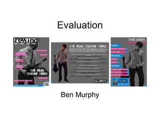
  • 2. 1. In what ways does your media product use, develop or challenge forms and conventions of real media products? Whilst creating my music magazines cover, contents and double page spread I had to take into account the forms and conventions from other music magazines. The main music magazine that I took conventions from was ‘NME’ which stands for ‘New Musical Express’. I chose this magazine because they are aimed at teenagers who like indie-rock music and this is the genre that my music magazine was focused on. The other two magazine that I took forms and conventions from were ‘Kerrang’ and ‘Q’. From studying these three music magazines I would gain ideas for my own magazine and used them to help create my front cover, contents and double page spread. Another way which makes my front cover conventional is the placement of the bar code, which is placed in the bottom right of the page. Most magazines will feature their bar code either here or on the back cover of their magazine. The way in which I have placed my bar code makes my magazine conventional. The Masthead of my magazine has been resized so that it can be place in the top left hand corner of my magazine cover. I took this idea from NME by following their convention. Personally I feel that this is the best place in which to situate my masthead. One thing I did do to also follow conventions was that I have placed my slogan directly underneath my masthead meaning that the reader would straight away recognise my magazine from the cover. Most music magazine will use this technique because the slogan will be featured on the magazine cover every time a new one is released. This makes my magazine conventional. The blue strip which runs along the bottom of my music magazines cover is featured on most magazines and tells the reader what else to expect if they were to read further into the magazine. This also makes my magazine look conventional. The way in which I have used one large image for my front cover was taken for NME, Kerrang and Q which makes my magazine follow conventions. However, I have used the effect of greyscale on my image; hence making my cover unusual and different from other magazines, making it unconventional. My magazine is unconventional because my masthead is layered above my image, making it look more important than the image. Most music magazines will have the image layered above their masthead.
  • 3. 1. In what ways does your media product use, develop or challenge forms and conventions of real media products? Nearly all of the music magazines that I have researched have the word ‘Contents’ written at the top of their contents. I however have opted for the unconventional option and I just wrote the words ‘This Week’ at the top the page. Also, I discovered that most headings on contents pages are usually placed in the top left hand side, where as you can see that mine is placed in the top right hand side, making my contents page seem unconventional. My music magazines contents page does not have many sub-headings on it. Most magazines that I have researched contained lots of subheading, telling the reader what to expect from the rest of the magazine and what page numbers the different stories are on. However I have made my contents very basic and simple so that it is easy for the reader to understand. This makes my contents page stand out from the crowd because of how different it looks. This makes my contents look unconventional. I have used page numbers for my contents page and have placed it in the bottom right hand corner which is very conventional meaning that I have followed the crowd. All of the music magazines that I have researched had lots to comment about on their colour scheme. Everyone had around three main colours for their contents page and this is similar to mine. My three main colours for my contents page are blue, pink and grey. Another method which I have used to make my music magazine unconventional is that I have only used one big image to cover the whole of the page. Now this is almost as if it is a front cover so this could either be good or bad. Either way, it makes my contents different and unconventional. Very conventional in the way in which I have put a subscribe advertisement on the contents page. These will usually be found here or near the back of the magazine.
  • 4. 1. In what ways does your media product use, develop or challenge forms and conventions of real media products? Page numbers have been used on the edge of both pages. They have been placed here because I have followed the way of conventions; hence making my double page spread conventional overall. I have linked the two pages together by spreading the text across both of the pages. Lots of magazines will link their double page spreads in different ways such text and images. However, these may not be the best choices because it makes it difficult for the reader to make out what the text is stating, or what the picture looks like. Overall though, most music magazines will use either one of the above to link their pages and this makes my magazine very conventional. Sunglasses make the image look unconventional as you do not expect somebody who is playing a guitar to be wearing a pair of sunglasses. ‘ rewind’ masthead/logo is placed in the bottom right hand corner of the double page spread. This helps to advertise the magazine even more meaning that they will gain more sales. It also helps largely to link the two pages together and hence creating the effect of the double page spread feel as one page, so that they both belong with each other. It makes this double page spread seem conventional. All of the best music magazines make their double page spreads linked together extremely well. For my music magazine I have used a popular choice of two thirds text and one third image. The way in which the text is spread across the both pages links them. The colour scheme has been kept basic and retro which is what you would expect from a indie-rock music magazine. The colours white, grey and black are very retro and because it has been kept simple it makes my double page spread very effective whilst also being conventional.
  • 5. 2. How does your media product represent particular social groups? The main two social groups which my music magazine can be defined by are the gender it represents and aims to attract and the age it represents and aims to attract. There are many ways in which different magazines can attract different social groups; as I found out in my research. Firstly, comes the image on the front cover of my magazine. This image is aimed to attract teenagers to young adults and this is mainly due to the genre of which my magazine is representing. The magazine which I have designed represents the genre of ‘indie-rock’, hence why there is a picture of a lad holding a guitar on the front cover. Also the majority of people who listen to indie-rock are most likely to be teenagers and if you performed a survey you would probably find this to be correct. Secondly, comes the colour. Straight away the colours blue and pink are seen to be very youthful colours. However, the background colour of my front cover, contents and double spread is grey, meaning that this magazine is seen to be very sophisticated in its own way and therefore attempting to attract the older generation. The colours blue and pink also suggest that my magazine is aimed at both boys and girls or women and men, blue for boys and pink for men. So this suddenly makes the audience for this magazine even bigger as it is aimed at both genders meaning you are doubling the chance of sales. Overall, my media product is aimed at both males and females who are in their late teens, because this is the age at where they will start to become more interested in music and will want to keep up with the latest news, views and reviews in the music world. The font below is used on my front cover and also my double page spread. From looking at the font you can tell that it appears to be tough, rough and scruffy. This could be used to suggest that the magazine appeals to rockers and also teenagers as a stereotype.
  • 6. 3. What kind of media institution might distribute your media product and why? My music magazine is called ‘rewind’ and because it is an independent music magazine, this means that it would be manufactured and produced by its own company, just like many magazines. I would then expect my music magazine to be advertised in local newsagents whilst also being sold there along side other music magazines such as NME. However, I would not expect my music magazine to advertised at any greater extent than just a local newsagents and this is because the company would not be able to afford any more than this as they are only a small company. For example rewind would never be advertised on the television because it would be too expensive, but there are hardly any music magazine which have advertisements on the television. There are many different ways in which a music magazine can be sold, however my music magazine’s genre is indie-rock meaning that it could narrow the options down of how my magazine could be sold. Personally I believe that my music magazine would sell the most in well known national shops such as WH Smiths and Superdrug. I believe that it would sell well here along side the likes of other music magazines such as NME and Q who are top selling among the music magazine community. Another great reason why I believe that my magazine would sell well is the price. The price is cheap at just £1.50 and this is also a very similar price to NME giving it even more reason to be sold here. I do not believe that my music magazine would be sold by companies who specialise in certain genres of music and I believe this because my magazine will attract all sorts of people who are into something different. After doing a little bit of research on the internet, I cam across a website which I could imagine selling my own music magazine. The website that I found is called ‘www.isubscribe.co.uk’ and it sells thousands of magazine titles including many music magazines. Isubscribe gives people the chance to subscribe to a certain magazine for usually 3 or 12 months. Personally, I can imagine rewind being distributed here mainly down to the fact that special offers could be put up such as discounts if you subscribe for long periods. Below is an image of the website isubscribe that I found.
  • 7. 4. Who would be the audience for your media product? When I proceeded with my researched, I focused on three main music magazines and these were ‘NME’, ‘Kerrang’ and ‘Q’. There are many ways in which you can decipher what genre of music a magazine is appealing to. The three ways in which you can decipher this are the colour scheme of the magazine, the images used on the magazine and how they are presented and the chosen overall layout of the page. In my research I tested all of these factors against every one of my music magazines that I studied. For example Kerrang’s genre is heavy metal and to show this there colour scheme is white with lots of jet black. NME is a magazine which has a genre as indie and I wanted to produce my media product with it having a genre of indie-rock; hence why I used NME quite a lot in my research. You can see that I have used NME a lot because many of my ideas on my music magazine have in actual fact come from there music magazines. As I wanted to attract the same target audience as NME this I understandable, so the things I focused on was the layout, colour scheme and images used on their magazines. Indie is a very retro style of music that is inventive and different. I have shown the retro side of indie by using the colour grey on my products and have also incorporated the inventive style by using the colours blue and pink which contrast each other to give my magazine a funky look. I feel that my music magazine attracts a niche audience and this is due to the style of music that indie is, people either like it, or they hate it. I believe that although my magazine is aimed at a niche audience, it is done successfully and this mainly because of the images and layout used. However, I do believe that my music magazine could also attract people who are into pop music. I believe this because of the use of the colours pink and blue which give my magazine a funky look. However this does not mean that somebody who was into pop music would like the content inside my magazine.
  • 8. 5. How did you attract/address your audience? After finishing my final media products I can look back through all of the research that I have done and make a note of which features from other magazines I have taken into account and incorporated into my own music magazine that I have designed. From my research, I can tell that there are many features on my own magazine of which I have gained the ideas from other music magazines. Below are a couple of examples of where I have done this. Firstly, I took the idea from NME magazine of having my masthead in the top left hand corner of my music magazine cover. I also chose to use NME’s idea of placing a slogan directly underneath the masthead, so that it is easy for the audience to spot and read. The only thing I didn’t take from NME was the idea of layering the main image above the masthead. I decided not to do this as I felt that my masthead was far more important than the image. Secondly, I used the idea taken from the Q music magazine of having a main image in the centre of my music magazine. I feel that this effect worked well for me as it gives the audience something to focus on. Another idea is one that I took from Q magazine again and this was the use of the strip along the bottom of the magazine giving hints to the reader of what to expect if they read further into the magazine.
  • 9. 6. What have you learnt about technologies from the process of constructing this product? I have many things tod with technologies when constructing my media product in full. I have learnt how to use blogger and how to upload posts with images on them to its website. I have learnt how to use another website called ‘Slideshare’ which I set up an account and then this account could be used to upload my presentations onto blogger as a post. I have used ‘Microsoft PowerPoint’ many times before, however I have become much more familiar with all of its options and uses as the process of designing my product has continued. But the main program which I have learnt how to use is ‘Macromedia Fireworks’. Macromedia Fireworks is a program which is very useful and was created to help you edit images and design things. It was the program in which I created my draft product and my final product. Below I am going to show you a few thing that I have learnt on fireworks whilst designing my product. Firstly, for the image on my front cover and my contents page I have used an affect called ‘greyscale’. This takes all of the colour from the image that you have selected and transforms it into black and white. Below are the steps I took to use the effect. Step 1: select the image you desire using the mouse and select the ‘Commands’ option from the selection bar located at the top of the page Step 2: After selecting the ‘Commands’ option, scroll down the options and hover your mouse over the ‘Creative’ option until another set of choices appears. Step 3: Finally, from the other set of choices that appear select the ‘Convert to Greyscale’ as your choice and then you image that you selected at the beginning will appear in black and white.
  • 10. 7. Looking back at your preliminary task, what do you feel you have learnt in the progression from it to the full product? The description that I have wrote on the previous slide basically sums up the majority of what I have learnt since I began this project and that is my knowledge on the programs that I have used to create my music magazine. The main computer program that I have learnt how to use was ‘Macromedia Fireworks’. This program was excellent once I had learnt how to use it with all its functions to edit images and rearrange the layers of certain objects. With me learning how to use Macromedia Fireworks I would have not been able to create as good as quality products as I created and they would have looked very cheap. My preliminary designs were a major step forward in terms of what I learnt during the making of this project. Firstly, when creating my preliminaries I learnt how to delete the background from images using a tool call the ‘magic wand’. The was really handy because without me learning how to use this tool then all of my images would have had a white background on them making my music magazine look very unprofessional. Secondly, I learnt how to use layering from creating my preliminaries, which is a skill that I also used on my final products. This was also a great skill that I learnt because I could make different objects stand out on my final magazine cover. In this case I decided to place my masthead in front of my main images because felt that it held more importance. However, on my final contents page I have decided to layer my image in front of heading because I feel that it has more importance on this page. A final skill that I used whilst making my preliminaries was an outer ‘glow’ effect. In my preliminaries I just played around with this effect using it on random object, but as you can see I have chosen my targets with much more care on my final products. This is the technique that I have excelled in using this most and it has also helped to make my designs look very professional. The next two slides show both my preliminaries and my final products. I have decided to put them together so that it is easier to compare them and see how I have improved. By looking at them you can see the improvements that I have made to my final products from my preliminaries. Overall you can tell that my final products are far more professional looking than my preliminaries. I feel that my main area of improvement between the two design is my layout and how I have placed objects around my pages. A good example of this would be my two front covers. My preliminary front cover looks as though it should be a contents page and the images that have been placed at the bottom of it just make the whole page look a mess. Where as my final products front cover looks far more professional with a main image that stands out and I have placed other features such as my masthead and headings in much more appealing positions.