

Recomendados
Recomendados
Más contenido relacionado
Destacado
Destacado (12)
College magazine analysis
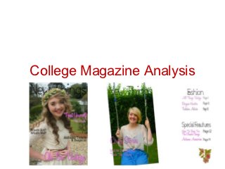
- 2. Front Cover • My front cover for ‘New Things’ is my second attempt, my first front cover looked completely different and it was just an ordinary college magazine; I wasn’t happy with my cover image or how the cover lines were positioned, I felt as though I could do better, so I deleted it and started all over again, with a new idea, a new image and a new name. I feel happy with my final front cover, and I believe that deciding to delete my old front cover and to start again, was a good idea. My inspiration for my front cover was ‘Vogue’ magazine.
- 3. Front Cover What works well on my front cover is the link between the cover image and ‘Oh, So Vintage’, this is my leading story, although it isn’t placed in the conventional place, the reader would be able to place a clear link between the cover image and the leading story. Also, I believe that having my masthead and cover lines in the same font, and colour makes them stand out and look unified.
- 4. • My inspiration for my leading line was from the Lana Del Rey edition of ‘Vogue’ magazine. I also got my colour scheme from this edition as well as it shows simple colours work well together. Although, ‘Vogue’ is full of cover lines, mine is minimalistic, I went for the more is less version, which I think is what makes my magazine look good.
- 5. The easiest part of creating my front cover was From this task I have learnt that coming up with taking the photograph to use for my main image, an idea of a magazine and actually creating it, however even this had it’s problems. I had to are two different things, by this I mean, coming find the right background, and style my model to up with an idea is a very simple task, but look the correct way I wanted her look; When I creating it and making it come alive is time later looked at the photo’s on the computer, I consuming and difficult. realised that none of them were any good, so we Also I have learnt how to use Photoshop in a lot then had to retake most of the photographs. more detail, before I created my magazine, I had The hardest part was making the front cover look very basic knowledge of Photoshop, but now after the way I had visualised in my mind, processing my completing my magazine, I feel as though I know a thoughts onto Photoshop was harder than I thought lot more than I did before, and my front cover can it would be, because I hadn’t previously used show this. Photoshop to create a magazine. For example, pushing my masthead behind the model’s head; I thought this would be a simple task, of placing the mast head layer, below the main image, when in actual fact, I had to cut and copy the model’s head, and then line it up correctly with the image below, and then rearranging the layers.
- 6. Contents Page I think what works best on my contents page is the main image, and how my stories are split into categories. By doing this, my contents page looks organised and is easy to find what the reader is looking for. However, what perhaps doesn’t look as good is all the white space on the page. I kept to the minimalistic look, and although it looked good on my front cover, it doesn’t look as good on my contents page. I chose to do a double page spread as I would have more space to put things, and I’d be able to make things stand out, and create a statement, which is what fashion is all about, but I think this idea didn’t turn out too well when put to paper as I didn’t come up with enough stories to fill enough of the page.
- 7. Just like my front cover, I used ‘Vogue’ layout as my inspiration for my contents page. I think looking at mine, you can tell. I used the idea of the image, and the split categories from ‘Vogue’ as I think they make the contents page look neat, I think using an image is connotes that the magazine, is a fashion