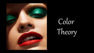
2. As a make-up artist, you are working with
products, tools, colors, textures, shapes, and
human faces (bone structure) all the time.
Because you are an artist, you must have a
good sense in coloring, so you can color
match correctly and create the best color
selection/scheme for your clients.
3.
4. Color Theory: in the visual arts is practical guidance to
color mixing and the visual impacts of color
combinations. A make-up artist should understand
the fundamentals of color application in order to know
how colors work with each other, and how one color
will influence another by placing it next to, or on top of
each other, or even how the color will result in when
you mix them together.
5. The color wheel is divided into three
categories: Primary, Secondary (or Intermediate), and Tertiary.
Primary: the three primary colors are: red, yellow and blue. These colors
are considered to be foundation colors because they are used to create all
other colors.
Secondary (or Intermediate): by combining two of the primary colors,
three secondary colors are formed. For example, when you mix red with
yellow, you will get an orange color. The Secondary colors
are: orange, green and violet.
Tertiary: the six tertiary colors are made by combining a primary and an
adjacent secondary color. These colors are: yellow – orange, orange –
red, red – violet, violet – blue, blue – green, and green – yellow.
6. Warm and Cool Colors
The color wheel can be divided
into warm and cool colors. By understanding the
differences of warm & cool colors, it will help you
better in foundation & concealer color matching on
different color skin tones.
7. Warm colors are bright, passionate and energetic, and tend
to be eye-popping colors. Warm colors include: red, orange,
and yellow, and variations of those three colors.
In make-up artistry, reds can be both cool and warm. If the
red is blue based (a red with purple or blue undertone), it is
cool. If the red is orange based, it is warm.
8. Cool Colors give an impression of calm, and create a soothing
impression. Cool colors include: violet, blue, and green.
In make-up artistry, the same theory applies with the color
green. If a green has more gold/yellow undertone, then it is
warm. If a green contains more blue undertone, then it is cool.
Whenever most colors have a blue undertone, they will always
be a cool color.
11. Cool Skin Tone
Cool Skintone – the skin has a little pink (rosiness) in
their skin. They tend to burn easily under the sun.
People who look good in silver jewelry & accessories.
When they wearing a cool undertone red lipstick, they
look brightened up. Most of the time, their veins are
in blue color (take a look at the wrist under natural
light).
12. Warm Skin Tone
Warm Skintone – the skin has a yellow undertone
or golden-olive undertone. They tend to tan easily
under the sun. People who look awesome
in gold jewelry & accessories than silver. When they
wearing a warm (orange) undertone red lipstick, they
look brightened up. Most of the time, their veins are
in green color (take a look at your wrist under natural
light).
13. Neutral Skin Tone
Neutral Skintone–the skin has
both pink and golden undertone. They look good
in both gold or silver jewelry. Most of the time,
their vain is in both blue-green color.
15. Analogous (or Adjacent) Colors are created by using three (or
more) colors that are next to each (side-by-side colors) on the
color wheel.
16. Complimentary Colors
Complementary color schemes are created by
combining colors from opposite sides of the
color wheel. They bring out each other, they
make a visual contrast, thus both colors appear
stronger against each other.
17.
18. When you mix complimentary colors together (eg. mix
red and green), they will combine to produce a neutral
gray. It doesn’t mean you want to produce gray color
on your face, it just means you will use other color(s) to
get rid of (or cancel out) the color you do not like on
your skin.
19. In color theory, a neutral color that is neither warm nor
cool. Neutral colors are classy, sophisticated, and
extremely wearable. They’re commonly worn on its
own, or combined with brighter accent colors–they can
easily be matched with every color. The meanings and
impressions of neutral colors are much more affected
by the colors that surround them than are warm and
cool colors.
20. Black is the strongest of the neutral colors. On the positive
side, it’s commonly associated with power, elegance, and
formality. On the negative side, it can be associated with evil,
death, and mystery.
White is at the opposite end of the spectrum from black,
but like black, it can work well with just about any other
color. White is often associated with purity, cleanliness, and
virtue. In the West, white is commonly worn by brides on
their wedding day. White is associated with goodness, and
angels are often depicted in white.
21. Brown is associated with the earth, wood, and stone. It’s a
completely natural color and a warm neutral. Brown can be
associated with dependability and reliability, with steadfastness, and
with earthiness. It can also be considered dull.
Beige is somewhat unique in the color spectrum, as it can take on
cool or warm tones depending on the colors surrounding it. It has the
warmth of brown and the coolness of white, and, like brown, is
sometimes seen as dull. It’s a conservative color in most instances,
and is usually reserved for backgrounds. It can also symbolize piety.
Ivory and Cream are sophisticated colors, with some of the warmth
of brown and a lot of the coolness of white. They’re generally quiet,
and can often evoke a sense of history. Ivory is a calm color, with
some of the pureness associated with white, though it’s a bit warmer.
23. Monochromatic Color
Monochromatic color schemes are made up of different
tones, shades and tints within one hue. For example, a
monochromatic scheme of the color blue would be the Blue
Color Family ranging from the lightest sky blue, to a medium
shade of ocean blue, to the darkest navy blue.
These are the simplest color schemes to create, as they’re
all taken from the same hue.