The document discusses redesigning Dr. Dario Pompili's website. It analyzes his original site and identifies key issues, such as a lack of hierarchy, too much redundant information, and navigation that scrolled within a single page rather than linking to separate pages. The redesign focuses the content on Pompili's biography and contact details on the main page. It differentiates information using font size, spacing, and case. Links are also used to separate content onto individual pages for clearer navigation.
2. What is it's purpose? The purpose of Dr. Dario Pompili's website is to let the audience know a little more about his background and the achievements he has made throughout his career, as well as helpful links.
3. Who is the target audience? The target audience is anyone that is interested in Dr. Dario Pompili's articles or publications or if they want to give a hold of him via email or phone. It's like a resume.
4. Redesign using Kuler Using Kuler, I found a picture of a computer board and based the colors of his website using those colors since he works with computers.
5. Using google fonts Using Google fonts, I used a condensed san-serif font since he does have a lot of writing on his page. I believe sans-serif looks better in big paragraphs like his and the condensed font allows me to put more in the little space that I gave for his biography.
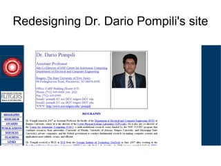
6. What navigation and info is essential? Pompili put too much information on his page. His links didn't go to separate pages. Instead, they were anchors and it just took you to a different part of the page. It didn't look good. The only information that was essential was his biography and his contact information – for the main page.
7. Is there a hierarchy of information? There is no significant hierarchy of information on his site. His contact information was slightly bigger than the rest of the text on the page and his headings are slightly bigger, but overall, it's all redundant and does not catch the eye. It was very difficult for me to differentiate between what I was reading.
8. How will this affect your design? When I made my design, I made sure that it was obvious that you were about to read his biography. I differentiated the text using spacing to my advantage as well as case and placement. I took all the information away and put them into links so everything wasn't just on one page.