The document discusses the cover design of a UK military vehicle magazine. It analyzes various design elements of the magazine cover including the masthead, main cover image, secondary images, puff/kicker text, date/barcode, and main cover line. The masthead uses orange and green colors in a gradient tone. The main cover image shows a military vehicle being driven with a serious expression. Secondary images and the puff text further promote the vehicles featured in the magazine to attract readers.
APM Welcome, APM North West Network Conference, Synergies Across Sectors
magazine cover page analysis
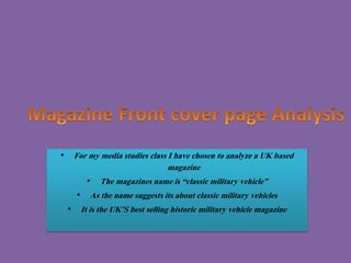
1. • For my media studies class I have chosen to analyze a UK based
magazine
• The magazines name is “classic military vehicle”
• As the name suggests its about classic military vehicles
• It is the UK’S best selling historic military vehicle magazine
3. Themasthead
The masthead is gradient toned, it includes white in the words classic
and vehicle. Then in the word military the orange shade is lighter from
the top and gets darker at the bottom. The word military is given a
different color to gain attention of the human eye, to ensure they
know what the magazine is about. To give the masthead a unique look
M and Y are written in capital.
Looking into other issues of their magazines I see orange and green color scheme is their house style for the masthead.
4. Main cover image
The main cover image is full shot a military vehicle, looking very elegant. It is being driven by possibly a army
officer, along with his two children. The expressions of the two children are portraying that they seem to be
worried or in some kind of problem. Same goes for the elderly man, he makes a very serious expression.
The lighting of the shot and the weather in the picture portrays a very gloomy image in our minds. The
background and surroundings show crops, so we can say that the shots taken somewhere in the country side.
The surroundings are shown to be pleasant.
5. Puff/ kicker
• The puff is very much related to the magazine. This image is of a tank which is very
much related to the magazine, as this was also used by the military. Military
machines is written in bold letters, in white with red behind it. The font has a look
of a stencil text which is commonly used in the army. This makes it very eye catching
for the reader. Just below the image there is a line talking about the tank. This is
promoting the tank, and may urge the readers to take notice of it. The color read in
the puff signifies how important the tank is in the picture and how powerful they
are trying to portray it.
6. Secondary images
• The secondary images are also of old military vehicles which are greatly asociated
with the main image and type of magazine it is. These make the cover page
interesting and attractive for the reader. These secondary images can be related to
other articles in the magazine.
•
7. • The M and Y is written in capital, this is a very classic way of making a logo. The masthead is in a shape
of a vintage number plate which suits the magazine because of it being related to vehicles. The
masthead also has an outline of two colors, they being white and orange. This makes it more colorful
and presentable to the reader, this may also make the magazine more attractive.
8. Strip
• The strip is present at the top of the magazine with a orange background and is written in the color white
to make it noticeable. The strip will attract people to buy the magazine as it mentions what different
artcles and features are in the magazine.
9. Date/ barcode/ price
The date is mentioned right above the masthead on the left in black colored font.
The price is shown on the top right of the masthead and is highlighted black. This is
to make it visible to the customers. The barcode in on the bottom right of the
magazine. The font size for date and issues are usually kept small as its not the
highlight of the issue but only formal information. The barcode is rotated so It does
not look like the part of the composition.
10. Date
masthead
Main cover line
Cover line
Main cover
photo
Barcode
Puff
advertisement
Tagline
Selling line
Highlights/ anchoring images
Website
address
11. Masthead
The masthead of the magazine is written in Bold red font, in capital letters on a
yellow background. This is in order to make the magazine title be noticeable. The
masthead in all the magazine issues are the same, and is the identity of the Autocar
magazine.
There is a tagline below the masthead in black and red. The tagline represents genre
of the magazine. The masthead is not spread from one end to another. It takes 70%
of the total width which is not a usual convention. The text has a 3D effect which
enchances the masthead and gives it a sporty feel.
12. • Main cover line
The main cover line is written in
a simple white font in capital
letters. The main cover line is
placed on the main image which
shows a blue sky. This gives the
main cover line a composed and
peaceful image. This is followed
by a strapline which describes
the content of the main cover
line. The main cover line is even
bigger than the masthead and
grabs all the attention. This again
is very unconventional in
magazines.
13. Puff/ buzzword
This magazine has puffs related to the genre of the magazine but the distinctive feature in the puffs is
that they consist of buzzwords also and a picture.
The puffs have a read masthead above, with the buzzwords written above as well in white and yellow.
The magazine all over used a uniform color pallate of red and yellow. The color combination which is
popular in automobile as they depict energy.