SlideShare una empresa de Scribd logo
1 de 104
101
pagesoftutorialsinside!
43
Issue 101 | May 2014
character
Create a dynamic
Tatianna Kolobukhova (SneznyBars) reveals her painting
process for creating vibrant characters
Learn to paint
standout
features
How to light a
midday scene
Digital art
for games
Nacho Yagüe provides a detailed
tutorial that covers the creation
of a room with morning light
Sabin Boykinov reveals what
exactly it was that fueled him
to break into the industry!
+plus • 10 of the best gallery images
• Digital Art Master: Alex Tiani
• Fernanda Suarez’s sketchbook
• Custom brush portraits
• and much more!
DEPICT
INTERESTING
LIGHT EFFECTS
Discover how to capture the
mood as Geoffrey Ernault
shares his speed painting
techniques
2 | 2DARTISTMAG.COM
2DARTIST MAGAZINE | ISSUE 101
Editor’sLetter
Contributors
STEPHEN LORENZO WALKES
Stephen is a freelance illustrator based in London,
England. His caricatures have been used in editorials,
advertising, and books. He is currently the creative
director of an independent clothing company.
SABIN BOYKINOV
SabinBoykinovwasborninRousse,Bulgaria.He
currentlyworksasaLeadConceptArtistinHaemimont
GamesstudioinSofiaandmakesfreelanceillustrations
foravarietyofprojects.
FERNANDA SUAREZ
Fernanda Suarez is a Freelance Illustrator and
Concept Artist. She is currently working on artwork for
a new board game by Plaid Hat Games, illustrations
for Paizo Publishing, and private commissions.
TATIANA KOLOBUKHOVA (SNEZNYBARS)
Tatiana is a 2D artist from Belarus. Though originally
trained as a Programmer, Tatiana moved over to
creating 2D art around 3.5 years ago and creates
artwork for a number of different companies.
HOUSTON SHARP
Houston Sharp currently works as a freelance concept
artist and Illustrator in the film and game industry,
when he is not in-term at school. He also enjoys
simply painting portraits.
GEOFFREY ERNAULT
GeoffreyErnaultiscurrentlyworkingatGuerillaGames
Cambridgeasacontractorconcept/visualizationartist.
Hehasbeenworkingasaconceptartistforaboutthree
yearsnow.
NACHO YAGÜE
Nacho Yagüe is a concept artist in the videogame
industry who has worked in projects such as Splinter
Cell Blacklist and the upcoming Assassin’s Creed
Unity. He currently works at Ubisoft Toronto (Canada).
Bursting with dynamic females, painterly portraits and
standout caricatures: issue 101 is full of impressive
characters! Fernanda Suarez flips open her sketchbook
and Sabin Boykinov gives us an insight into his career
creating digital art in the games industry!
Issue 101 also delves into tips for lighting your 2D
scenes, with top techniques from Nacho Yagüe and
Geoffrey Ernault! And there’s a wealth of inspirational
art from Tim Löchner, Laura Sava, Efflam Mercier and
more.
Enjoy!
Welcome to the May issue of
2dartist magazine!
JESS SERJENT-TIPPING
Deputy Editor
KEEP UP TO DATE
WITH 3DTOTAL!
facebook.com/3dtotal
facebook.com/layerpaint
twitter.com/3dtotal
twitter.com/layer_paint
youtube.
com/3dtotalpublishing
vimeo.com/3dtotal
vimeo.com/layerpaint
pinterest.com/3dtotal
instagram.com/3dtotal
WOULD YOU LIKE TO SUBMIT TO 2DARTIST?
We are always looking for tutorial artists, gallery
submissions, potential interviewees, writers and
more. For more information, please send a link to
your work to: jess@3dtotal.com.
Magazine.
Your
Getthemostoutofit!
2DARTIST MAGAZINE | ISSUE 101
If you’re having problems viewing the double-page spreads that we feature within
this magazine, then follow this handy little guide on how to set up your PDF reader!
Top tips for viewing
Foroptimumviewingofthemagazine,itisrecommendedthatyouhavethelatestversionof
AdobeAcrobatReaderinstalled.Youcandownloaditforfreehere:
Toviewthemanydouble-pagespreadsfeaturedin2dartistmagazine,youcansetthereader
todisplay“two-up”,whichwillshowdouble-pagespreadsasonelargelandscapeimage:
Jump to articles
IntheContentspages,wehavedirectlinkstoallarticleswithinthemagazine.Ifacertain
articlecatchesyoureye,simplyclick(ortaponhandhelddevices)onthepagenumberwithin
theContents,andyouwillbetakenstraighttothatarticle.
Download resources
Wheneveryouseethissymbol,besuretoclickitto
downloadfreeresourcestoaccompanythatarticle!
Visithttp://www.2dartistmag.com/resources.htmlif
viewingfromamobiledevice.
1.OpenthemagazineinReader;
2.GototheViewmenu,thenPage Display;
3.SelectTwo Page Scrolling,makingsure
thatShow Cover Page in Two Page View
isalsoselected.
www.layerpaint.com
Forlotsmoretutorialsandexclusivearticles,visit
2dartist magazine is available as a downloadable PDF magazine. If you have an iPad or iPhone, you can drag your
magazine into your iTunes library – it will automatically add the PDF to your bookshelf in your iBooks app!
DeputyEditor
Jess Serjent-Tipping
jess@3dtotal.com
SubEditor
Jenny Newell
GraphicDesigner
Aryan Pishneshin
PublishingCo-ordinator
Adam Smith
AdvertisingManager
George Lucas
george@3dtotal.com
StudioManager
Lynette Clee
lynette@3dtotal.com
ManagingDirector
Tom Greenway
Advertising
Mediapackandratesare
availableuponrequest.
ContactGeorgeLucas:
george@3dtotal.com
International
Translationopportunities
andinternationallicenses
areavailable.Contact
JessSerjent-Tipping:
jess@3dtotal.com
Subscriptions
Subscriptionscanbe
purchasedvia
2dartistmag.com.
12-monthsubscription–
£23.99($38.99USapprox.).
Toenquireabout
subscriptions,contact:
support@3dtotal.com
Distribution
2dartistisane-magazine
distributedasa
downloadablePDFandon
digitalnewsstands.
Disclaimer
Allartwork,unlessotherwise
stated,iscopyright©2014
3dtotal.comLtd.Artworkthat
isnotcopyright3dtotal.com
Ltdismarkedaccordingly.
Everyefforthasbeenmade
tolocatethecopyright
holdersofmaterialsincluded
inthisissueof2dartist
magazineinordertoobtain
permissionstopublishthem.
Special thanks to3DHype,
Hiperia3DandVeegraphfor
supporting3dcreativewith
banners.ContactGeorge
Lucasifyouwouldalso
liketoshowyoursupport:
george@3dtotal.com
4 | 2DARTISTMAG.COM
2DARTIST MAGAZINE | ISSUE 101
Contents Issue101
006_ Produce digital art for games
Sabin Boykinov reveals what it was that fueled
him to break into the industry!
021_ Sketching organic female forms
Fernanda Suarez opens up the pages of her
sketchbook, filled with female figures
034_ The gallery
Efflam Mercier and Laura Sava feature in this
issue’s gallery selection of our top 10 images
052_ Paint portraits with custom brushes
Houston Sharp shares techniques to create
custom brushes for painting skin, hair, and fabric
062_ Discover how to light a midday scene
Nacho Yagüe provides a detailed tutorial that
covers the creation of a room with morning light
072_ Learn to paint standout features
Stephen Lorenzo Walkes provides a step-by-step
guide for drawing and painting caricatures
080_ Depict interesting light effects
Discover how to capture the mood, as Geoffrey
Ernault shares his speed painting techniques
092_ Create a dynamic character
Tatianna Kolobukhova (SneznyBars) reveals her
painting process for creating vibrant characters
098_ Digital Art Master: Alex Tiani
Alex Tiani shares the process he used to create his
image, Angel Fight
SAVE 30%!
Subscribe today
Go to page 060 for details
2DARTIST MAGAZINE | ISSUE 101
5
2DARTISTMAG.COM
2DARTIST MAGAZINE | Produce digital art for games
Produce digital
art for gamesSabinBoykinovshareshisrouteintotheindustryandtalksaboutexactlywhatitwas
aboutthedigitalmediumthatmadehimwanttostartthejourney
TheArtist
Sabin Boykinov
sabinart.blogspot.com
Interviewed by:
Jess Serjent-Tipping
Starting as a traditional artist
many, many years ago, Sabin
now works as a lead concept
artist at Haemimont Games
studio in Sofia, Bulgaria.
Besides concept work, he also
makes freelance illustrations
for projects like Fantasy Flight
Games ‘ TheLordoftheRings:
TheCardGame , TheHobbit
and GameofThrones.
2DARTIST MAGAZINE | ISSUE 101
7
Sabin Boykinov was born in the small town of
Rousse, on the Danube River in Bulgaria, and
from an early age has always been drawn to
visual art. This led him to spend every moment
he had after school painting traditionally.
A spark was ignited the day Sabin read an
interview with two Bulgarian digital artists,
Svetlin Velinov and Kosta Atanasov, where they
talked about their work in the game industry, and
the process and techniques they use to create
their digital art. Completely inspired by these two
artists, Sabin went and bought himself a tablet,
the Trust, which was the only one he could find in
his hometown at the time! And there the journey
began. He started to explore Photoshop and
began the process of teaching himself (he has
never attended an art academy), which he found
a hard, but amazing experience!
With that very tablet he produced his first
tests for a game company, before making the
transition into digital art, and has since worked
on many titles, including the Tropico series, and
produced freelance illustrations for board and
card games. Sabin chats about his experiences
and inspirations!
2dartist:Whatisyourtypicalworkflow?What
techniquesdoyouuse?
Sabin Boykinov:UsuallyIstartwithalotofpencil
sketchesandalotofresearchandthenscanthe
finalsketchandcontinueinPhotoshop.Ilovetouse
custombrushesthatareclosetotraditionalones.
A personal piece titled SomewherebetweenHeavenandHell
LordoftheRingsLCG:EncounteratAmonDin Adventure Pack Card Game © Fantasy Flight Games
2DARTISTMAG.COM
2DARTIST MAGAZINE | Produce digital art for games
A concept scene created for Haemimont Games’
TheFirstTemplar action adventure game
© Haemimont Games
2DARTIST MAGAZINE | ISSUE 101
9
2DARTISTMAG.COM
2DARTIST MAGAZINE | Produce digital art for games
2da:Wheredoyoudrawyourinspirationsfromfor
yourwork?
SB:Ifindmyinspirationineverything–lookingat
nature,readingbooksorwatchingnicemovies.
Itdependsontheprojectyouareinvolvedin.
2da:Whatwasitaboutthedigitaltoolsthatmade
youwanttopursueacareerintheindustry?
SB:IreallylovetouseaWacomCintiqbecauseit
isclosertoatraditionalworkexperience.Youcan
domanythingsfasterthantraditionalmethods.
Workinginthegameindustryisgreatbecauseofthe
artisticfreedomandthevarietyofprojects.
2da:Howdoyoukeepyourportfoliouptodate?
Anytips?
SB:ItrytopostmyweeklysketchesonmyFacebook
pageandInstagram.Keepingablogisalsogood.I
thinkitisimportanttoshowyourworkasmuchas
youcan–thisinspiresyouandisachancetoseeif
youareontherightpath.
2da:Whoareyourfavoriteartistsandwhy?
SB:Theartistwhoprovokedmyimaginationfirst
andinspiredmeformanyyearsisthevisionary
masterMatiKlarwein.
Ihavemanyfavoriteartistsfromthegameindustry
now.Ilearnedalotfromthem,thoughitwouldbe
difficulttolistalltheirnameshere.
2da:Whathasbeenyourfavoriteprojecttoworkon
todateandwhy?
SB:TheSUBSTRATAbookprojectwasgreatbecause
Ilearnedalotandsharedideaswithamazingartists
formtheindustry.
PRO TIPS
Sketches
Makingasmanysketchesaspossible
willgiveyouachancetocreatebetter
ideasanddesigns.
Explore different
techniques
Trytoexploredifferentarttechniques,
usedifferentbrushesandexploreold
masters’paintings.Trytostartanew
conceptsorillustrationwithadifferent
approachtoyourtypicalone.
If you want to make
games, play games!
Exploreyourfavouritetitlesbyplaying
them,thentrytounderstandhowthe
worldofthegameiscreatedandfind
inspirationfromthedetails.
“I think it is important to
show your work as much as
you can – this inspires you
and is a chance to see if you
are on the right path”
Sabin reveals his fascination with
African myths and legends
2DARTIST MAGAZINE | ISSUE 101
11
This was an illustration for the SUBSTRATA project
2DARTISTMAG.COM
2DARTIST MAGAZINE | Produce digital art for games
Another concept created for Haemimont Games’ TheFirstTemplar action adventure game © Haemimont Games
2DARTIST MAGAZINE | ISSUE 101
13
2DARTISTMAG.COM
2DARTIST MAGAZINE | Produce digital art for gamesA personal piece titled ChristmasCard
2DARTIST MAGAZINE | ISSUE 101
15
Artist history
SabinBoykinov’scareer
uptothispoint...
2007: Sabin started working in the
game industry and slowly transitioned
over to digital art. This is when he made
his first illustrations on a PC
2012: Aside from concept artwork,
Sabin started making freelance
illustrations for board game companies.
He reveals that working on cards for
titles like The Lord of the Rings and The
Hobbit was really inspirational
2013: Sabin also started working
traditionally again after so many years,
showcasing his work in 2dartist
2013: Sabin became part of Paul
Richards’ book project SUBSTRATA. The
book will be released very soon in July
Sabin’s studio
A piece created for theLordoftheRingsLCG:HeirsofNumenor
Adventure Pack Card Game © Fantasy Flight Games
2DARTISTMAG.COM
2DARTIST MAGAZINE | Produce digital art for games
A personal piece entitled Harvester
A personal piece entitled HalloweenBlues
2DARTIST MAGAZINE | ISSUE 101
17
This is a part of series of illustrations for a
book called Hyperion by Dan Simmons
The idea was inspired by Sabin’s experience as a piano player. He wanted to
envision the difference between mechanical and organic sound in a music box
...spreading the nuclear angels of death all over the world
2DARTISTMAG.COM
2DARTIST MAGAZINE | Produce digital art for gamesSabin made this for a UbiWorkshop
contest that asked artists to create a
location they’d like to see the Assassin
in. His choice was Japan
2DARTIST MAGAZINE | ISSUE 101
19
2da:Canyoutelluswhatyou’recurrentlyworking
onatthemoment?
SB:OurstudiocurrentlyfinishedworkonTropico5
anditwillbeonthemarketthismonth.
2da:Whatadvicedoyouhaveforaspiringartists
whowanttomakeitintheindustry?
SB:First,tohavealotofpatienceandpassionfor
whattheydo,whetheritispainting,drawingor
playinggames!Belikeachildandexploreeverything
tofindinspiration.
2da:Finally,whatcanweexpecttoseefromyouin
thefuture?
SB:Ihavealotofplansandideasforfutureworks–I
hopetobeabletosharethemsoon!
A concept scene created for Haemimont Games’ TheFirstTemplaraction adventure game © Haemimont Games
A concept created for Haemimont Games’ TheFirstTemplar
action adventure game © Haemimont Games
Subscribetoday
and receive 4 free issues!
SAVE 30% • SIMPLE, EASY PAYMENT
NEVER MISS AN ISSUE • 12 ISSUES PER YEAR!
PLUS FREE
VIDEO
TRAINING!
Click here for more information and to read the Terms and Conditions
“Agreatsourceofinspirationandtipsonhowtoimproveyourskills
andspeedupyourpaintingprocess.Besidesverydetailedstep-by-step
tutorials,2dartistmagazinewillalsoensuretherearealargevarietyof
topicscoveredaswell.”
- Blaz Porenta, illustrator
Fernanda Suarez
Fromgeometricshapestoorganic
forms,FernandaSuarezsharesthe
ideasandinspirationbehindherfemale
filledsketchbook.
TheArtist
Fernanda Suarez
fernandasuarez.
carbonmade.com
Fernanda Suarez is a
freelance illustrator and
concept artist. Fernanda is
currently working on artwork
for a new board game by the
company Plaid Hat Games,
makes Illustrations for Paizo
Publishing, and commissions
for private clients.
Sketchbook of Fernanda Suarez
22
Discover the flowing lines
in Fernanda Suarez’s
sketchbook...
I love drawing in my sketchbook – it relaxes
me. It’s a moment when I can do things just for
myself, so in a way I feel more freedom when
I sketch. It’s also a great moment to develop
ideas that I can use later in a painting.
There is something in drawing with a pencil on
paper, that I can’t get with digital work. I love
how you can describe so much just with a line
and its different weights and pressure. I think
there is something just very raw and honest
about sketching with paper – there is no Ctrl+Z
function, it’s just what comes out naturally.
Inspiration and ideas
My inspiration a lot of the time is music. I sit down
and just listen to music, and from there I start
sketching and the idea for the drawings come out
of the feeling I get from the music I am listening
to. Apart from that, it’s pretty much everything
that I am in contact with – movies, books, fashion,
references, people – anything can be inspiring.
Materials
I use a Moleskin notebook with a soft cover; it’s
really comfortable for me as the paper is very soft
with almost no texture.
I draw with Graphite pencils (2B, 3B, 4B and so
on), and also a mechanical pencil (0.5), and a
regular eraser.
Sketching techniques
I don’t think that when you sketch you are
conscious of a technique. As I mentioned before,
sketching on paper is something that is very raw,
and the way you do it is something that comes
naturally, so the technique is not something you
think about it when doing it (at least in my case).
When I sketch, what comes out is something
created almost unconsciously.
I do like to do cross-hatching for shadows, but I
mix that with smoother work too. I like to develop
volumes on a figure using very geometric forms.
I like to start with simple shapes to get the basic
form and proportions, and from there work on a
more organic look. I like to leave all my lines and
traces on view too, so you can see the skeleton of
the drawing in a way.
Portrait from the movie Wuthering Heights
© Fernanda Suarez
23
2dartist magazine | issue 101
2dartistmag.com
Sketchbook of Fernanda Suarez
24
There is never rest from the tragedy of life and love
© Fernanda Suarez
Sketch inspired by Nickelback’s Savin’ Me
© Fernanda Suarez
25
2dartist magazine | issue 101
2dartistmag.com
Sketchbook of Fernanda Suarez
26
27
2dartist magazine | issue 101
Character design, owl-inspired lady
© Fernanda Suarez
Just playing around with ideas
© Fernanda Suarez
PRO TIPS
Inspiration advice
Some people ask me how or from where they can get inspiration, and what I say to them
is that inspiration should come from everywhere, from anything that surrounds you.
You should go around with your eyes open to see and catch anything that could work as
inspiration for you – you should be like a sponge and absorb everything that is around you,
that way you will have more tools in your mental library.
Also inspiration is something that will get to you as you work, you won’t get it while doing
nothing and just waiting for it. The best ideas come when you are working hard, so the
more you keep using your brain, the more it will work for you.
Building an image
When you are planning a painting, start with the general shape of it first. Try to make a
sketch or thumbnail or whatever you prefer, that helps you define all the important things
that need to be there, the basic structure of your idea. Once you get that and you see things
that work, you can move ahead with details and the rest of the image.
If you see that something is not working in the first stage, it will be much harder to fix once
you have moved on to a more advanced stage of development.
2dartistmag.com
Sketchbook of Fernanda Suarez
28
29
2dartist magazine | issue 101
Sketch inspired by Iron  Wine’s Sunset
Soon Forgotten
© Fernanda Suarez
Sketch inspired by Niki  The Dove’s DJ
Ease My Mind
© Fernanda Suarez
Inspired by one of my favorite stories, Alice
in Wonderland
© Fernanda Suarez
2dartistmag.com
Sketchbook of Fernanda Suarez
30
31
2dartist magazine | issue 101
PRO TIPS
Don’t skip steps
Don’t try to find easy ways to get to a place or to fix something. You should take the time to
learn and practice as needed, so that you learn everything that you need and you are not
leaving any empty gaps. If you have gaps in your skills it will show in the final product, so
take the time to learn.
I get people asking how to learn to draw for example, and there is only one answer:
practice. The learning process is different for each person so don’t try to adopt someone
else’s way of doing something – find your own methods. You can find this with practice and
hard work; perseverance and hard work is the best advice in my opinion.
Sketch inspired by Bat For Lashes’ Whats A
Girl Have To Do
© Fernanda Suarez
I love drawing and painting crows – I love
their symbolism
© Fernanda Suarez
Voodoo queen, character design
© Fernanda Suarez
We’re always on the lookout for talented artists
and their artwork to adorn the pages of our
magazine. If you think you have what it takes,
get in touch!
To submit, simply email Jess at
jess@3dtotal.com with a selection of your
images or a link to your portfolio online, plus a
little information about you.
We look forward to hearing from you!
Would you like to see your sketches
featured in 2dartist magazine?
LayerPaint allows you to browse the gallery, interviews, news, tutorials and products all dedicated to 2D digital art. On top of that, we have
included a free custom brushes library that is available to everyone.
We wish LayerPaint to be a definitive resource for digital painting, creating a friendly and educational environment that not only helps
budding and experienced CG artists alike, but also showcases some of the best computer generated artwork in the world.
PARTNERED WITH 3DTOTAL.COM | LAYERPAINT.COM | FACEBOOK.COM/LAYERPAINT | TWITTER.COM/LAYER_PAINT
Each issue the 2dartist team selects 10 of the best digital images from around the world. Enjoy!
Plains of Another World
Leon Tukker
Software used:
CINEMA4D,Photoshop
Year created:2014
Web:tryingtofly.deviantart.com
2DARTISTMAG.COM
2DARTIST MAGAZINE | The Gallery
Submit your images! Simply email jess@3dtotal.com
2DARTIST MAGAZINE | ISSUE 101
35
River Dragon
Efflam Mercier
Software used:
Photoshop
Year created:2014
Web:efflam.artstation.com
2DARTISTMAG.COM
2DARTIST MAGAZINE | The Gallery
2DARTIST MAGAZINE | ISSUE 101
37
Falling from High Places
Fernanda Suarez
Software used:
Photoshop
Year created:2014
Web:fernandasuarez.carbonmade.com
2DARTISTMAG.COM
2DARTIST MAGAZINE | The Gallery
Into the Forest
Miranda Meeks
Software used:
Photoshop
Year created:2014
Web:mirandameeks.com
2DARTIST MAGAZINE | ISSUE 101
39
Untamed Nature
ExidiumCorp
Software used:
Photoshop
Year created:2013
Web:exidiumcorp.com
©ExidiumCorpSpaceTravelFoundation
Allrightsreserved
2DARTISTMAG.COM
2DARTIST MAGAZINE | The Gallery
2DARTIST MAGAZINE | ISSUE 101
41
2DARTISTMAG.COM
2DARTIST MAGAZINE | The Gallery
River Valley
Raymond Lei Jin
Software used:
Photoshop
Year created:2007
Web:rayleijin.com
43
2DARTIST MAGAZINE | The Gallery
Overgrown Theatre
Ryan Ingram
Software used:
Photoshop
Year created:2014
Web:artofryaningram.com
2DARTIST MAGAZINE | ISSUE 101
45
Last Chance
Alex Heath
Software used:
Photoshop
Year created:2014
Web:artstation.com/artist/alexheath
2DARTISTMAG.COM
2DARTIST MAGAZINE | ISSUE 101
47
The Final Battle
Tim Löchner
Software used:
Photoshop
Year created:2013
Web:timloechner.com
Prototype
Laura Sava
Software used:
Photoshop
Year created:2013
Web:anotherwanderer.deviantart.com
© Copyright 2014 Advanced Micro Devices, Inc. All rights reserved. AMD, the AMD Arrow logo, FirePro, and combinations thereof are trademarks of Advanced Micro Devices, Inc. OpenCL and the OpenCL logo are
trademarks of Apple Inc. used by permission by Khronos. Other names are for informational purposes only and may be trademarks of their respective owners. 1. AMD FirePro™ W9100 features 16GB GDDR5 memory.
Nvidia’s highest memory card in the market as of April 2014 is the Quadro K6000 with 12GB GDDR5 memory. Visit http://www.nvidia.com/ content/PDF/line_card/6660-nv-prographicssolutions-linecard-july13-
final-lr.pdf for Nvidia product specs. FP-90. 2. LuxMark, BASEMARK CL test details: System Description: ASUS P9X79E-WS, Intel Xeon E5-2697 v2, 32GB Kingston DDR3-2133, 750GB SSD Samsung 840EVO, Corsair
AX1500i PSU, Corsair Obsidian 950D chassis, Corsair H100i CPU cooler. AMD Driver 13.35 | Nvidia Driver 332.50
Designed for the most demanding workflows and delivers the ultimate 4K experience in next-generation
workstations. Powered by OpenCL™, design and engineering professionals can work with multiple graphics
and compute-intense applications across up to six 4K displays.
www.fireprographics.com/w9100
• 2816 Stream processors (44 CUs)
• 16GB GDDR5 memory (320 GB/s)
• 5.24 TFLOPS peak single precision
• 2.62 TFLOPS peak double precision
• Designed to support OpenCL 2.02
• Six Mini DisplayPort 1.2 outputs (4160 x 2160)
AMD FIREPRO™ W9100 PROFFESSIONAL GRAPHICS CARD IS THE FIRST
4K GRAPHICS CARD TO OFFER 16GB OF ULTRA-FAST GDDR5 MEMORY.1
THE ULTIMATE
WORKSTATION
EXPERIENCE FOR
REAL-TIME 4K
For more information visit
Scan Computers
www.scan.co.uk
0871 472 4787
Workstation Specialists
www.workstationspecialist.com
0800 180 4801
Amari
www.armari.com
0192 322 5550
Now available at selected partners:
2DARTISTMAG.COM
2DARTIST MAGAZINE | Paint portraits with custom brushes
Paint portraits
with custom brushes
UsingPhotoshop,HoustonSharpgivesanin-depthguidetocreatinguseful
custombrushes,whichcanbeusedforskin,hairandfabrictohelpspeedupyour
portraitpaintingprocess!
TheArtist
Houston Sharp
artstation.com/artist/
HoustonSharp
Software Used:
Photoshop
Houston Sharp currently
works as a freelance
concept artist and
Illustrator for films and
videogames, when he
is not in-term at school.
He also enjoys simply
painting portraits.
Brushes
2DARTIST MAGAZINE | ISSUE 101
53
Speed up your portrait
painting process with the use
of custom brushes...
Custom brushes in Photoshop are powerful
tools that can help you achieve certain effects,
save time, or simply provide a new way to
apply paint. This tutorial will cover how to
create and utilize different types of custom
brushes for different sets of tasks within a
portrait painting. Along the way, I’ll also touch
upon general portrait painting and workflow
tips, so you can get a feel for how I typically
approach portraits, from the initial sketch all
the way to the final brushstroke.
When I work digitally, I tend to approach the
painting as if I am doing it in oils, at least
initially. When the time arises to create and
use custom brushes, I will utilize them in a
way that does not compromise the painterly
approach to the piece.
Aside from creating and using custom brushes,
other topics covered include: thinking about
composition; quickly setting up for a final
painting; and how to effectively deal with
complex forms. Hopefully you will learn
something new about creating custom
brushes from this tutorial. If you’re already a
pro with them, then I hope some aspects of my
workflow inspire you to try new approaches to
your work!
01Building a sustainable framework: If
an architect wants a house to both look
great and not collapse, it’s important that he sets
up a good foundation and framework to build
upon. This is also the case with us illustrators. I
try to plan my paintings almost completely (with
a little bit of room for ‘happy accidents’) before I
even begin.
In this case, I explore compositions by sketching
in only big black and white shapes, instead of
doing line drawings. This not only establishes
what type of subject I want to paint, it lets me see
the value grouping of the composition as well. I
also do many separate color sketches to settle
upon a color scheme.
02Creating a mess: Now that all of the
major decisions have been made
about what to paint, it’s time to start. I begin my
paintings with a warm, vibrant mess of color. The
purpose of this is to give a surface that isn’t white
to judge my values against while painting. The
colors also show through the brushstrokes I put
on top of it, which creates a richness in the colors
that can be seen when the painting is complete.
The values and colors are all planned,
so you don’t have to worry about
them later
Creating a vibrant underpainting to
paint on top of
2DARTISTMAG.COM
2DARTIST MAGAZINE | Paint portraits with custom brushes
Instead of drawing the idea I came up with in my
sketch onto the new canvas, I can simply drag the
value sketch onto this warm layer and set it to
Screen mode – an instant value-grouped under-
painting! There was another reason for not doing
a line drawing in step one!
03Sticking to the shadows: Starting
with the shadows and working your way
towards the light is not easy when inventing your
own colors and values, but it is rewarding. While
painting the shadows, I try not to let myself get
too uptight. It’s important to remain loose and
fluid at this stage; let your brushstrokes be messy,
and let some of that orange mess below seep
through the cracks.
It’s also important to consider the color and
direction of your light source, as it will affect
the color of the shadows. As a general tip for
inventing your own color, contrast warm light
sources with cool shadows. Also, be sure to
maintain your overall value shapes.
04Let there be light: After spending a
decent amount of time establishing the
shadows and dark areas, I do the same with the
light. I really slow down at this stage and pay
attention to the relationships between the colors
I’m putting down. For instance, is this part of her
cheek slightly more orange than that part? Is this
part slightly less saturated than that part? Cooler
or warmer? Faces don’t consist of one skin color,
so it is important to show these varying hues,
temperatures and values in relationship to each
other in order to create a convincing portrait.
Once again, consider the color and direction of
the light source.
05Custom brushes: Here is where I will
put energy into creating and using a
special custom brush. I want a silkier brush to
slap on my paint for the hair.
To do this, open a small new document (my
default for making brushes is 500 x 500 pixels at
150 dpi) and paint what you imagine the tip of
one of these brushes might look like if you were
staring straight down the tip of an actual brush.
Then, go to Edit  Define Brush Preset, and save
it. Lower the spacing in the Brush window, set the
flow to pen pressure, and it’s good to go! Don’t
forget to save its current settings by clicking New
Brush Preset.
06So smooth… Don’t think of using this
custom brush as a magical brush that
will make realistic-looking hair appear – we will
get to that magical brush later. This silky brush
was created simply so I can paint with a softer,
flowing touch. Long, flowing hair is, after all,
usually pretty smooth and soft.
That being said, don’t be afraid to use this brush
on other areas of the painting as well, just for the
2DARTIST MAGAZINE | ISSUE 101
55
sake of brush variety. I use it on her forehead, for
example. Also, it’s fun to use the eraser with this
preset to carve away at shapes with a softer feel.
Actually, it’s not a bad smudge brush either.
07Back to the framework: It’s time for
me to tackle the ruffled fabric, but it’s
far too complex to just start slapping paint down
and hope for the best. For these problem areas,
I create a layer on top of everything and simply
draw it out. I not only plan out the form of the
warping fabric, but the shadows that they cast
as well.
08Separating light and shadow: After
drawing out the complex folds of the
fabric, the next step is to paint the overall shadow
shape and overall light shape in their own
respective new layers. The way light reacts with
the type of fabric that I plan on painting is very
complicated, so it is best to start with the big
shapes and work my way into the little variations
within them.
Establishing shadow colors while
staying within the confines of the big,
dark value-grouping
Establishing colors of the lit areas
while staying within the confines of
the value grouping
Creating a silky custom brush to block
in soft materials, such as hair
Using the newly-created silky brush to
block in the colors of the hair and face
Drawing out the complicated fabric
folds and their resulting shadows
Simplifying the fabric colors into
simple shadow and light tones in
separate layers
2DARTISTMAG.COM
2DARTIST MAGAZINE | Paint portraits with custom brushes
Those variations are made simpler by having the
light and dark masses on their own layers. Create
a new layer for the variation above the light or
dark mass-shape layer, and then link it by Alt-
clicking between the two in the Layers window.
09Being lazy (a.k.a. ‘smart’): I am now in
need of another custom brush, but this
time it will be used for making repetitive objects
less tedious to paint; the condensed ruffles at the
top of the blouse, in this case.
On another small blank document, I paint the
shape of one ruffle, and define that as a brush
preset. In the brush settings, I adjust the spacing
between each ruffle generated until it is how I
desire it, and I enable the Angle Jitter, just so it
doesn’t produce a perfectly straight mechanical
rail of ruffles. It needs to look organic and natural.
10Color correction: Throughout these
steps, I am constantly jumping all over
the place in the painting, going back and forth,
refining, and repainting. Creating a painting is
not a straight ‘point A to B’ ordeal; there is a lot of
back and forth that happens.
At this point in the painting, I realize that the skin
is looking a bit too yellow when compared to the
color sketch I did in step one. In order to fix this, I
create a new layer and set it to Color mode on a
low opacity. In it, I paint a saturated red, and then
use a layer mask to hide the red where I don’t
want so much of it (click the circle within the
square icon on the Layers panel to apply a layer
mask to the currently active layer).
11Background check: The background
was feeling sort of flat and uninteresting,
so I change it at this stage. On a new layer on top
of everything (it’s probably smarter to make a
change like this on the existing background layers
at the bottom of the stack, but I did it this way
for the sake of keeping my steps in chronological
order and easy to follow for this tutorial).
I add some warm tones where I want the cools
to pop and some light tones where I want dark
shapes to pop.
Creating a custom brush to paint the
ruffles in the fabric
Adjusting the overall skin color with a
Color layer set to low opacity
Making the background more
interesting and integrated to
showcase the figure more effectively
2DARTIST MAGAZINE | ISSUE 101
57
PRO TIPS
Less really is more
Simplicity – or simplifying, rather – is
the key to successful compositions.
Paintings can have complex narratives
and a lot of objects or figures, but
if they are not arranged or grouped
well, it will be too chaotic and the
viewer could become overwhelmed.
That’s why it is important to break
down the image as simply as
possible, usually in the form of only
two or three values. If you can make
your compositions readable to a
viewer within one second of them
seeing it, then you’re definitely doing
something right.
Check your values
Believe it or not, achieving correct
color doesn’t matter too much in a
painting. Values, on the other hand,
are incredibly important. If your
values are flawless, you can use
practically any colors you want and
your image will still look good. That’s
why it’s important to constantly be
aware of your values.
One trick I use to monitor values is to
create a “Hue/Saturation” adjustment
layer at the top of my layers panel
that I can flick on or off at any time.
Having the adjustment layer’s
saturation setting all the way negative
will show you what your painting will
look like if it was in grayscale.
Using the Hue/Saturation adjustment layer is a
great way to keep an eye on your values
2DARTISTMAG.COM
2DARTIST MAGAZINE | Paint portraits with custom brushes
12Custom skin brush: Using the same
steps as before, I create a brush that can
be used to apply subtle texture to the skin. A few
simple dots on a small blank document, enables
scattering and a bit of color dynamics (all found
in the Brush window), and the brush is ready to
be used.
13The magical brush: The great part
about the skin brush I created in the
previous step is that it can be used as a hair-
strand brush if the settings are tweaked. Simply
turn off scattering, lower the spacing significantly,
and set the Jitter size to Pen Pressure. And voila!
Finding creative uses for similar brushes is a
valuable skill to have, and it’s fun discovering new
possibilities for brushes you’ve been using for a
long time. For creating different densities of hair-
strand brushes: the more dots the preset has, the
more strands it will create i.e. it will be denser.
14Last piece of the puzzle: The
composition still does not feel complete
to me at this point. To see the painting with new
eyes, I often flip the canvas horizontally (Image
 Image Rotation  Flip Horizontal). Balancing
issues can become much more apparent when
they are seen from a new perspective like this.
While in the flipped state, I try adding a few more
shapes to the composition: One more piece of red
fabric in the upper corner to keep our eye within
the composition, and floating air particles to add
small elements and give an even greater sense of
motion to the scene. I flip the canvas back to its
original orientation to see if I am satisfied with the
changes I have made.
15The finishing touches: The last things I
do to my paintings are routine for almost
every single painting I create.
1. Copy and merge all visible layers
(Cmd+Alt+Shift+E), apply a Smart Sharpen
filter (Filter  Sharpen  Smart Sharpen),
then apply a layer mask to it and paint out
areas that are not the focal points.
2. On top of everything, create a Curves
adjustment layer by clicking on the icon at
the bottom of the Layers panel that looks
most like the Yin/Yang symbol, then select
Curves from the drop-down menu that
pops up. You can then make adjustments
to the overall values.
I then put my signature on it and call it done! I
hope you enjoyed gaining a bit of insight into my
painting process, and hopefully you’ve learned
some new techniques to experiment with in your
own paintings!
Creating a skin texture brush
Changing the settings of the skin brush
to utilize it to create strands of hair
Flipping and/or rotating the canvas
makes issues within the painting
become more apparent
Adding finishing touches: a Sharpen
layer, adjusting the overall values, and
finally, my signature
2DARTIST MAGAZINE | ISSUE 101
59
TheArtist
Houston Sharp
artstation.com/artist/
HoustonSharp
101
pagesoftutorialsinside!
43
Issue 101 | May 2014
character
Create a dynamic
Tatianna Kolobukhova (SneznyBars) reveals her painting
process for creating characters with dynamic poses
Learn to paint
standout
features
Digital art for
games
New world
concepts
Sabin Boykinov reveals what
exactly is was about the digital
medium that fueled him to
break into the industry!
Discover industry techniques
for painting and presenting
environment concepts in Photoshop
+plus• 10 of the best gallery images
• How to light a midday scene
• Fernanda Suarez’s sketchbook
• Custom brush portraits
• and much more!
CREATE
INTERESTING
LIGHT EFFECTS
Discover how to capture the
mood with interesting lighting
effects, as Geoffrey Ernault
shares his speed painting
techniques
SAVE 30%!when you subscribe to today!
• Save a huge 30% – the equivalent of
four issues
• Hassle free – no need to visit
the shop every month
• Simple, easy payment options
with PayPal Subscriptions allowing
you to pay with your PayPal account
or credit/debit card
• Never miss an issue and no need
to re-subscribe each year
Subscribe online at
www.2dartistmag.com/subscribe
Offers are available worldwide. You will receive 12 issues in a year. Minimum subscription term is 12 months. If at anytime during the first 60 days you are
dissatisfied, you can email us support@3dtotal.com and we will refund you any undelivered issues. The PayPal recurring subscription can be cancelled
at anytime. Prices and offers are subject to change.
“Contemplated signing up for so long. Don't know why I waited
before signing up as this magazine offers an incredible insight
to the world of 2D art. Can’t wait for next release.”
3dtotal customer
Discover how to light
a midday scene
Aspartofaseriesthattakesalookatcreatinglightingeffectsfordifferenttimesofday,
NachoYagüeprovidesadetailed,step-by-steptutorialthatcoversthecreationofaroom
withmorninglightasabasetomakethreeothermoods:dusk,nightwithnaturallight
andnightwithartificiallight
TheArtist
Nacho Yagüe
nachoyague.net
Software Used:
Photoshop
Nacho Yagüe is a concept
artist in the videogame
industry who has worked on
projects such as SplinterCell
Blacklist and the upcoming
Assassin’sCreedUnity. He
currently works at Ubisoft
Toronto (Canada).
2DARTISTMAG.COM
2DARTIST MAGAZINE | Discover how to light a midday scene
Discover Photoshop
techniques to depict a scene lit
at midday...
In this tutorial, I will create a scene that will be
used as the base for three other moods with
the same content. The first scene depicts a
room in the early morning, and will change as
the time of day and lighting shift, keeping the
same subject.
Working in videogames requires you to work
quickly, and mood changes like these happen
often. I will show you how I organize my layers
to make this process easier and more efficient.
I will also teach you the techniques needed to
make these changes in a short period of time.
01Sketch: I don’t always start with a
sketch. Sometimes I use photos as a
reference or start from scratch. In this case, I want
to make a quick sketch to set the overall mood
and build up the scene with all the elements that
will help develop the other moods.
I thought an abandoned room would work with
what I wanted to achieve, with windows big
enough to add natural light and key elements
that will help distinguish the other moods.
02Color base and perspective: Following
the previous sketch, I start preparing the
piece by adding the color base and perspective
lines that will put all the elements into context. I
group the perspective layers, so that I can easily
hide them.
I work with big brushes with some texture,
focusing only on tone and values. I try not to get
crazy with shadows and light at this point, as I will
apply them later. Some elements may change,
but I try to stay as close to the original image as I
can. I switch the image to black and white several
times to see if the values are correct.
03Layer setup: This is one of the most
tedious, yet important, steps. I don’t
always work like this. In fact I consider myself
very messy when I organize layers in my personal
art, but when it’s work for a client, it’s better to
be organized so you’ll be able to make changes
without much effort.
Once I’m happy with the image, and before I
start detailing, I cut out the image and separate
every element into layers. The floor, background,
window frames, walls and so on, will be cut and
pasted in a new layer. Sometimes I’ll group some
layers (select layers and press Ctrl+G) for more
complex elements, for example the windows
of the left side are in a group of four layers
(background, frame, wall and curtain). I use the
Lasso tool to select the area I want to cut and
then copy it on a new layer (Ctrl+J).
I also make sure I name each layer so that they
will be easier to identify when I have a large
number of them.
Now that everything is well organized and
separated, it is very easy to render and have full
control of every single element on the screen.
04Polishing and texturing: I like to paint
with long and big brushstrokes, so I use
the Lasso tool to make sharp edges and leave the
inside loose with random brushstrokes. I never
paint on the same layer, instead I use Clipping
masks so I can paint only the visible areas of the
layer underneath, keeping its transparency and
shape. The original layer remains unaltered so
2DARTIST MAGAZINE | ISSUE 101
65
I can come back to its original state whenever I
want. I can reshape and edit the base layer, and
the changes are reflected with the clipping mask.
In addition, I can have more than one clipping
mask on the same layer.
At this stage, I also add some photo textures. I
don’t like the feel of a very polished image with
too much detail, so I add textures at an early
stage and then paint over them. I only use them
to add color information and some color noise.
The initial sketch to set the first mood, and building the scene with all the elements I want
to show
Adding the color base and perspective lines. The value range and tones should also be
defined here
Organizing the image by cutting and pasting all the elements into different layers
Adding the first textures and polishing the image using clipping masks and photo textures
2DARTISTMAG.COM
2DARTIST MAGAZINE | Discover how to light a midday scene
05Adding a narrative: While painting
the scene, I feel it lacks a storytelling
element. I always like to incorporate some sort of
story in my paintings, so the viewer can wander
through the image and ask questions about
what’s going on.
I want the room to look like it is decaying, but I
feel that the image alone isn’t strong enough to
catch the viewer’s eye, so I add a character. It is
very open to interpretation – it could be a kid or
the ghost of a kid wandering around the room.
The idea is strong enough to make the viewer
look at the image longer and think about the
nature of the character and the room he is in.
From there, I keep adding more elements to
polish and define the shapes. I apply shadows on
all the different layers, so I can easily modify them
when I have to change the mood.
06Material behavior: At this stage
I keep rendering all the elements,
paying attention to how the light reacts to the
environment.
Light affects material in so many different ways.
Concrete absorbs more light and won’t be very
reflective. The plastic ball illuminates some light
that will bounce on the floor, coloring its own
shadow. The lamp has metallic parts that are very
reflective, and so on. It’s very important to pay
close attention to these details, as they will make
your work look more believable.
The best thing you can do is look for pictures on
the internet and analyze how light interacts with
different surfaces. Here, I use a lot of layers in the
Overlay and Screen modes to emulate reflections
and bouncing light.
07Adding lights: Although I already added
some lights to the scene, I usually add
the main lights and shadows with adjustment
layers. For this image, I make a new adjustment
layer mask set in Curves mode. The benefits of
adding light and shadows this way is that you can
go back and tweak the effect whenever you want.
For example, if I feel that the light or shadow is
not strong enough – I just have to click on the
layer and modify the intensity. These layers work
as a mask, so the adjustment only affects the
areas you want. The more white you add to the
mask, the more visible the adjustment will be.
“It’s very important to
check your values and the
composition weight from
time to time”
I continue painting more lights with a soft brush
set in Overlay and Linear Dodge mode. Be careful
and try not to ‘burn’ the image.
08Last elements: I keep adding more
details to further build interest in the
room. I paint some papers all over the floor as
well as a new lamp on the right side.
I’ve been placing all the elements while thinking
about how I will light the scene in different
moods. I first think to turn on the ceiling lamp
for the night scene with artificial light, but feel
that this kind of light is boring. Then I think that
a lower light source could be a good touch, so I
paint a lamp in the right corner.
I keep adding more elements that will add more
flavor to the image, like some books and old
photos hanging on the fireplace wall. Then I paint
a face on the paper bag mask – my idea is to paint
a different face on every scene.
09Checking the values and
composition: I repeat this step over
and over again. It’s very important to check your
values and the composition weight from time to
time. I usually work with mid-range values and
2DARTIST MAGAZINE | ISSUE 101
67
use more contrasted ones on specific areas. If
the values don’t work, the image won’t work, no
matter how much detail you put in it. Try to be
clever and guide the eye to the areas you want by
adding more light.
I always have a layer set in Desaturation mode on
the top, so I can switch it on whenever I want and
check if the values are still working well.
Along with that, I also flip the image horizontally
(Image  Adjust  Flip horizontal) several times so
I can see if the composition is well balanced.
10Last touches: I feel that the painting
isn’t creepy enough, so I draw some kind
of religious symbol on the floor.
With a soft round brush and a layer set to Screen
mode and at 70% Opacity, I keep adding some
subtle atmospheric light that will tone down the
values a little bit. I try to keep the colors fresh
and cold because I want the feeling of an early
morning scene.
I correct the colors a little bit using Color Balance,
but always try to keep the original tones I set in
my previous sketch.
Finally I add some spare brushstrokes to give a
more painterly effect, and sharpen the edges a
little bit with the Unsharp Mask (Filter  Sharpen 
Unsharp Mask) before saving the files.
The image lacked a narrative so I add a
character to the scene
Adding reflections and shadows,
keeping in mind the nature of the
material being rendered
Using adjustment layer masks to add
light and shadow
Painting more assets that will enrich the
atmosphere of the scene
Check your values and flip the canvas
horizontally to detect possible mistakes
PRO TIP
Say something with your image
It’s not necessary to tell a story on every illustration you make, but it’s very important to keep a consistency. Ask yourself the ‘Why’ and ‘How’ of
everything you put into a scene. Why does this wall have this material and not another? What will the floor look like if the house is abandoned?
What kind of elements will tell the viewer that this room is abandoned and once belonged to a kid? It’s important to think about these details as
they will enrich your image and will give extra flavor.
TheArtist
Nacho Yagüe
nachoyague.net
ANIMATION
VISUALEFFECTS
Vancouver Film School
The New Animation  Visual Effects Campus / Now Open
Book a tour today / vfs.edu/3dtotal / 1.888.397.8820
• Master your art in the most advanced campus anywhere
• Learn from the pros at the school the industry prefers
• Launch your career just steps away from your future employers
Theworld’sbestvisualeffects
animationschooljustgotbetter.
Learn to paint standout
features in Photoshop
StephenLorenzoWalkesprovidesastep-by-stepguidefordrawingandpainting
acaricatureinPhotoshop.Withtoptipsoncreatingstandoutfeaturesthatdefine
caricatures,andusingbrushestocreateatraditionalfeeltoyourimage,you’llbepainting
likeaproinnotime!
TheArtist
Stephen Lorenzo Walkes
artbysteviewalkes.blogspot.co.uk
Software Used:
Photoshop
Stephen is a freelance illustrator
based in London, England. His
caricatures have been used in
editorials, advertising, album
covers and books. He is currently
the creative director of the
independent clothing company,
Doopsie Joint.
2DARTIST MAGAZINE | ISSUE 101
73
A step-by-step guide to
exaggerating female features
in Photoshop...
This tutorial will give you an in-depth look into
the process I normally use when drawing and
digitally painting a caricature.
The steps shared will not only give you an
idea of to how I exaggerate the features of the
model while maintaining her likeness, but also
show how the gradual building up of values
can change a quick rough sketch into a strong,
eye-catching digital illustration.
Using three standard Photoshop brushes, and
five layers, I develop the piece using low brush
opacities, and finish with a mixture of soft
and bold skin tone colors, directing the point
of focus to the model’s standout features. I
then conclude by using a free downloadable
‘dirty’ brush, which emphasizes the painting’s
traditional feeling.
Apart from my first initial sketch, all of
the work in this tutorial has been done in
Photoshop using the Wacom Cintiq 13HD. I’ve
chosen to use an A4 document size, with the
resolution at 300 pixels/inch, and the image
mode set to RGB.
01Rough sketches: Rough sketches
are kind of like little rehearsals for the
big event, but without the pressure. They’re
not supposed to be masterpieces, their sole
purpose is to simply allow you to familiarize
yourself with the subject’s features, and also for
you to experiment and explore with shape and
exaggeration while remaining true to the likeness.
The more reference photos there are to work
with, the better.
For preparation of my caricature of Regina, I did
three very brief thumbnails. The first sketch for
example was lightly drawn in my sketchbook
taking roughly around five minutes to do. The
outcome was clearly not very strong in likeness,
but it played its part by allowing me to see that
exaggerating the oval shape of her head, plus
pushing the space between her nose and mouth,
could potentially work. And that’s what these
sketches should do; show you new ways to make
your caricature work, all through simple shapes.
02Chosen sketch: After three sketches
figuring out how to exaggerate the
model’s features, I felt that the third sketch would
be enough to start my painting.
From studying five reference photos of Regina,
four immediate facial features stood out to me.
Her big eye lids, her small round mousy nose,
the space between her nose and mouth, and the
References used with permission from www.3d.sk
74 | 2DARTISTMAG.COM
2DARTIST MAGAZINE | Learn to paint standout features in Photoshop
slight prominence of her two front teeth. I realized
that I captured everything except her eyes with
my first attempt. But by my third sketch, I felt that
I had enough of her standout features to progress
with as my final.
03Mid-tones: At this stage I made a new
layer and placed it underneath my
sketch as the background layer. I then double-
clicked on my sketch layer to unlock it, and set it
to Multiply. Selecting the Hard Round brush and
lowering the Opacity to 43, I then started to lightly
paint in a fleshy pink-brown color on the layer
underneath my sketch.
At this point, while painting the areas that I
wanted to build my values around, I made sure
not to lift my stylus off the pad, simply because I
wanted to keep my saturated mid-tone value the
same. Taking my stylus off and on again would
have darkened the value, which is not what I
wanted at this stage.
This is just a personal preference as I feel this
gives me a little more control with where I want
to focus my color, but another option would be to
just fill the whole background layer with a chosen
color, and then lower the opacity to what you
intuitively feel is the right mid-tone.
04Blocking-in: A very useful tip
recommended by many experienced
traditional painters is to squint or defocus your
eyes in order to blur out distracting details and
simplify the image – this way you’ll see the lights
and darks of your reference.
This time I didn’t really need to do this, because
my reference photo was in a fairly low resolution.
Normally this is a hindrance, but sometimes it can
actually help lose over-dependence on references
and improve on your artistic intuition.
Still using the Hard Round brush with the Opacity
set to 43, I used the Color Picker to choose a
darker value of my chosen mid-tone color and
began to block in the darker tones of Regina’s
face, immediately adding more depth to my
previously flat sketch.
05Building tone: Personally I’ve found
creating a color palette next to my
painting a little distracting, so I normally target a
section of saturated values in the Color Picker’s
foreground, and softly paint it onto the image.
Looking at the reference photo, I noticed soft
yellows, pinks, greens and browns, so raising the
color slider, I searched for similar tones through
observation and intuition. It doesn’t matter if it’s
not identical to the reference photo. In fact my
main goal was for the colors not to be identical,
just similar.
With my brush opacity still set low, I don’t commit
to any strong values no matter how hard I apply
“A very useful tip
recommended by many
experienced traditional
painters is to squint or defocus
your eyes in order to blur
out distracting details and
simplify the image”
2DARTIST MAGAZINE | ISSUE 101
75
A fleshy mid-tone color on a layer
underneath the sketch to build upon
color values
Look for the simple shapes that the light
and dark values make
Using the actual main piece as the
palette to experiment and build upon
Slowly developing the painting on top of
the sketch instead of under it
pressure with my stylus. Plus it allows me to
experiment with other colors tentatively without
committing, sometimes resulting in nice mixtures
that add more to the block-in, but ultimately
using the painting itself as my palette from start
to finish.
06Getting stuck in: The block-in didn’t
take me too long – roughly around ten
minutes. Plus the reference only has a few colors,
allowing me to establish rough colors fairly
quickly. I felt that I had enough darks and lights
to work with. By switching off the sketch layer,
I could clearly see Regina’s likeness developing
through just a small number of warm color
choices, and soft light and dark values.
Up to this point I had only been painting
underneath my sketch, so the next step was to
create a new layer, this time on top of my sketch,
and then continue blocking-in. I still used the
PRO TIP
The caricaturist’s
first steps
Find a style of caricature art that
really inspires you, and then dedicate
time to practicing how to create
it. There are so many amazing
caricature artists out there for
inspiration, add them as ‘friends’ on
Facebook, and so on. Follow their
work. Try to emulate their techniques
as a guide for your own. Join
caricature communities on social
network sites. See how these artists
create, and market themselves.
Check out as many free tutorials
online as possible, and any related
videos on YouTube. But always find
some time to practice and improve,
until you have your own unique style
or the beginnings of one at least.
76 | 2DARTISTMAG.COM
2DARTIST MAGAZINE | Learn to paint standout features in Photoshop
Hard Round brush, constantly enlarging and
reducing its size with my left hand using the
square bracket keys, but never going too small. I
also began to play around with the brush opacity,
never really going over 70%, or below 50%.
07Harmonizing chosen colors: I began to
focus on blending and harmonizing my
main colors, painting on top of the sketch. Using
the main piece as my palette, I frequently use the
Eye Dropper tool to pick out the darks and lights.
At this point I also wanted to emphasize Regina’s
femininity by adding more saturated reds from
the Color Picker; lightly mixing it into darker hues
that otherwise appeared more as dark-brown and
black in her reference photo.
I also began to start using Brush #24 in order
to create a more traditional texture where
brushstrokes look more visible. I also haven’t
zoomed in at all. My prime focus in this step is still
mainly about harmonizing colors.
08Flipping and reversing: Gradually, I
began to focus more on painting Regina’s
main features. I constantly rotated between two
brushes, the Hard Round for shape, and Brush
#24 for texture. I still wasn’t completely convinced
about the exaggerations and likeness, and felt
that I could do a little more to emphasize her
facial characteristics.
When not convinced of likeness, one great tip that
I picked up from a few of my favorite caricaturists
is to reverse the image. Flipping or reversing the
artwork and reference photo immediately helps
to highlight any mistakes and discrepancies. It’s
all to do with how the dominant side of your brain
interprets the image. Ever since I began to do this,
my artwork has improved drastically. In this case,
it allowed me to notice that I was exaggerating
one side of Regina’s cheek bone way too much in
contrast with the other.
09Details and stronger values: I then
needed to zoom-in and tackle the
ingredients that would bring realism to my
painting. I first targeted detailing Regina’s eyes.
For eyes I always use the Soft Round brush, as
I’ve found that this creates the cloudy glassy
texture of eyes a lot better than my other chosen
brushes. I also use it to paint in pores and spots.
It’s amazing how one light dot on top of a darker
valued dot can create the illusion of a skin
pimple.
For hair and eyelashes I created another new
layer and used both the hard round and the soft
round brushes, with shape dynamics switched
on, giving the brushes the shape of a hair follicle.
For emphasizing the features, I turned my brush
Opacity up to 84% and began to paint bolder
values, but only in the areas where I wanted
to attract the viewer’s focus, in this case being
Regina’s deep-set eyes, mousy nose, lips and
prominent front teeth.
10Final touches: My digital painting is
almost complete. What I normally do
now is use one of my ‘dirty’ brushes, which were
a free download from a cool Photoshop brush
website. I love this brush as it allows me to push
the loose traditional feeling of the painting to the
next level.
Once selected, I created another new layer,
turned off the brush Pen Pressure and just
stamped the brush effect in an area of my choice.
How many stamps I do depends on the feeling
I’m trying to convey. I then used the eraser tool
as Brush #24, and softly erased where the stamp
overlapped the subject’s main features. Once
satisfied with the result, I studied the finished
piece both up close and from a distance, signed
it, and then saved it as a JPEG.
Building the painting around warm
feminine colors
Reversing the image to highlight any
mistakes helps to improve likeness
Adding every pimple and pore is
impossible – add subtle suggestions
Adding dirty brushstrokes emphasizes
the traditional feeling
2DARTIST MAGAZINE | ISSUE 101
77
TheArtist
Stephen Lorenzo Walkes
artbysteviewalkes.blogspot.co.uk
3DTotal presents the new issue of
3dcreative magazine, a downloadable
monthly magazine for digital artists for
only ₤2.99 (approx. $4.79/€3.69).
Visit www.3dcreativemag.com to see a full preview of the latest
issue, subscription offers, and to purchase back issues.
Nick G. Gizelis explains the first
stages of gathering and creating
textures for detailed characters
Koen Koopman explains how, moving
away from product visualization, he
developed his own recognizable style
Kurt Papstein reveals how he develops
imaginative and detailed character
models with speed and precision
John A. Martini shares his
texturing tips from unwrapping
to shading and lighting
Learn to
craft your
own style
Speed up
your ZBrush
workflow
Master
photoreal
texturing
Finalize
detailed
classic cars
105
Issue 105 | May 2014
Plus! Develop 2D concepts into a ZBrush mini ready for print...
3D-PRINTED
FASHION
World famous designer Francis
Bitonti on his career and Cloud
Collection of home printable
objects
Pablo Muñoz Gomez
ZBrush sculpting
techniques
Award-winning 3D generalist Pablo Muñoz Gomez
reveals the remarkable character speed sculpts
he creates while warming up his creative muscles
+plus
• 10 of the best digital images
• Perfect vintage car geometry
• Extract and refine texture maps
• Create mythological creatures
• Digital Art Master: BruceLee
• and much more!
NOW
available
shop.3dtotal.com
thefoundry.co.uk/mari
3D digital painting
Now available on Mac
Justin Holt
Imagined by
Created with
Depict interesting
light effects
Withpracticecomesspeed.Ifyouwanttolearnhowtocapturemoodusing
lightsourcesintheblinkofaneye,thenyou’lldefinitelywanttoreadon,
asGeoffreyErnault’sin-depthtutorialrevealstoptipsforchoosinglight
sources,colorpalettesandcompositions,whileusingtechniquestospeed
upyourpaintingprocess!
Brushes
TheArtist
Geoffrey Ernault
geoffreyernault.com
Software Used:
Photoshop
Geoffrey Ernault is currently
working at Guerilla Games
Cambridge as a contractor
concept/visualization artist.
He has been working as a
concept artist for about three
years now.
82 | 2DARTISTMAG.COM
2DARTIST MAGAZINE | Create interesting light effects
Learn the skills used to
establish atmosphere and
effective lighting...
Playing with lighting is one of the things I
enjoy doing the most. Making the right light
choices early on and being able to stick to
it during the whole painting process has a
drastic effect on your final image. A well-
detailed image with poor lighting will just
make your image boring and all the time you
will have spent on fine details will just end up
being useless.
In this tutorial, we will see how to make the
right choices (lighting-wise), approach volume
rendering, create mood using light sources,
and how it affects color. We may as well say
a thing or two on composition, shapes and
effects too!
The best thing with lighting is that it’s usually
easy to find and use references for it, and learn
it as well. Like a lot of aspects in art, creating
a specific lighting from mind can sometimes
be quite tricky. But the more you observe the
world around you and try to understand how
light actually works, the easier it will get.
Just open your eyes, and you’ll see that you
often have occasions to learn more about
lighting. Maybe there’s a flickering neon above
you that creates shadows you can actually
notice? A nice table light near your desk? A
beam of light being cast through the clouds in
the sky?
But for now, let’s get to work and have fun! Let
there be light…
01First sketch: Even though most of my
final images are digital, I often like to
sketch them out first in order to explore ideas.
This allows me to be more natural than on a
tablet, and not care too much for small details.
I’ve had this idea in the back of my head of
doing one of my favorite robot toys (a Monet
Armstrong 0G from TreeA), rusting near a beach.
While sketching, I usually focus on composition
and shapes, and see if I can already apply an
interesting mood and lighting in my mind.
It’s good to imagine what your image might
be like when it’s finished, so you know you can
actually go somewhere with it. If that doesn’t
work, just keep on sketching until you have that
little spark and you go “Hey, I can actually see
what I could do with that!”
02Generating chaos: Even though I
already have my pencil sketch, I like
starting off with random chaotic brushstrokes
and shapes. This allows me to get new ideas, and
actually put some stuff on the canvas, so that
I’m not stuck on an empty white canvas. I also
force myself to use different brushes to get some
textures, and be dynamic with my stylus.
Again, this stage is not meant to get something
‘constructed’, but more to get ideas and have
something to start from. From that, I use a photo
(www.cgtextures.com) on top which I usually set
on a Soft Light layer, and play around with it until
I get ideas and an early color palette.
03Composition check: At the beginning
of an image, I usually place guides
that I make depending on what I have in mind.
I’ve recently been experimenting with Loomis’
informal subdivision technique.
It’s useful to use guides like this at the beginning
as they’ll help you place important stuff in your
image, or simply guide you in placement choices
you might hesitate about while placing main
shapes. As every rule, it’s also good to know how
to break it. And sometimes if something feels
better than the guides actually recommend, it
doesn’t really matter, as long as your composition
still looks good.
2DARTIST MAGAZINE | ISSUE 101
83
The first pencil sketch
Generating chaos through random
brushstrokes and a picture set on a Soft
Light layer
Using Loomis’ informal subdivision
technique to create a composition grid
Going for a cold palette, which will
balance with warmer lights to define
the points of interest
Placing the main light sources, adding
depth, and starting to paint
04First color/mood pass: Before I start to
render anything, I like to define my color
palette. Even though I’ve got a picture mixed with
random brushstrokes as a base, I can modify that
to my liking. The picture is there mostly to get a
variety of hues from which I can pick from, while
sticking with a palette that works as a whole.
In this image, I simply fill in a layer with blue and
set it to Colorburn. I like starting from something
dark and then progressively add light to the
image, rendering them from every light source
like a 3D program. I also add a couple of rock
pictures from www.cgtextures.com.
05Depth, light and shapes: Now that I’ve
decided what my main color palette is
going to be, I start playing around with shapes
during the first painting pass. My composition
guidelines from earlier help a lot! I also copy and
shrink the whole middle part in order to add a bit
more depth.
PRO TIP
Go grayscale!
I often like to keep a grayscale version
of my image on top, to check for values.
For that, I use a color adjustment layer
and set the saturation slider all the way
to the left. This helps to be sure that your
values are correct, even without color
(notice the contrast around the house).
84 | 2DARTISTMAG.COM
2DARTIST MAGAZINE | Create interesting light effects
I place my main light source (a directional light
coming from the top-right of the image). I want
the lights to feel cavernous, so I make sure to
have a big rock in front of the light in the back.
I also use the Mixer brush with a Rake brush in
order to get a more painterly aspect overall. The
light source will help focus the attention on my
main focal point later on (which will be in the
center of the image).
06Silhouette, textures and light beam:
At this stage, I start dropping in my main
character and making sure he works in the image.
I play with the silhouette until it’s where it belongs
in space. I also place some placeholder beams
to get an idea of where my light is going, what it
hits, and where I’ll have shadows. It’s important to
think of the main areas you want to have in light,
and focus on that.
I’ve also dropped a couple more rock textures
from cgtextures. Notice the main shape/ light
change in the background, in order to make the
environment more cavernous.
07Saturation, more interesting shapes
and focal: I start working on each area
and add shapes for extra interest (circular areas
in the grass, pointy areas in the center mountain,
and more angular/ broken shapes on the right
mountain). Opening the top-right corner also
allows the image to breathe more and add more
light beams.
I mostly paint using the Mixer brush with a Rake
brush, or a soft blurry one, which I use with a
small radius (otherwise it blurs the image). The
rock on the right was taking too much attention
in the image, so I make the colors colder and
put a pass of low opacity blue on top to put it
more in the background. I also boost the overall
saturation a bit more.
08Horizontal flip, making lists: It’s easy
to lose yourself in an image and forget
about stuff. I often take breaks, stand further from
the image and see what I still need to work on.
I simply keep a layer on top of the image with
notes of what I still need to do, what I could do,
and basically any ideas that come to mind. I also
flip the image often (as you can see here) so that
my eye is ‘refreshed’ and sees mistakes more
easily. Painting for too long in the same image
orientation will sometimes cause your eye to
become ‘error-proof’.
09First character pass: Once I start to
know what my general environment will
look like and have the lighting in mind, I start
sketching out the main focal points and rendering
2DARTIST MAGAZINE | ISSUE 101
85
Placing the character, adding rock
textures and light beams for interest
First general render pass, letting the
image breath more, and making the
shapes more interesting
Keeping a layer with notes helps to
remind you what tasks are left to do.
Flipping the image also helps
Starting to render the main volumes of
the character, and trying to think in 3D
Simplifying shapes, and using a material
sphere for reference is very useful to
create light
them. The first thing I do on this character is add
an orange/blue gradient. I knew I wanted him to
be rusting, so adding a warm color helps adding
color contrast to the focal point (the character’s
legs in this case).
I start with rendering every main volume in a very
simple way .The whole torso is a cylinder, which
I basically start adding volume on with a simple
gradient from left to right (my light source being
on the left on this image). Try treating everything
as simple shapes. At this stage I use the Dodge
tool mostly, and a soft brush.
10Light rendering: I then add a gradient
from the bottom, reflecting the light rays
bouncing on the grass and becoming a secondary
light source.
1. Shows the main light source, the different
shapes used, and the secondary source.
2. Shows the lighting focusing more on the
bottom of the character, allowing for
stronger light/shadow impact near his arm.
It also leaves the top of the character in the
shadows a bit more.
3.Shows the same lighting but with added
textures and finer details. The texture is a
simple Rake brush used with the Mixer brush
tool. At the bottom of the second image,
you’ll also notice a material sphere which I
sometimes create to get an idea of how light
will play with the main object and textures.
These are useful as reference during the
rendering stage.
86 | 2DARTISTMAG.COM
2DARTIST MAGAZINE | Create interesting light effects
11Overall small render pass: At this
stage, I get back to my overall image and
check for things that shock me. The rock feels
too lonely, so I add a bit more detail that leads
towards the character. I also add a boat in the
bottom of the image in order to add scale and
life to the image a bit more. A bit more detail has
been put into the character too (glowing eyes,
thinner arm, and so on).
12Scale, storytelling and birds: I often
like to play on very simple details that
tell stories. The idea behind this one was this big
robot rusting in a massive cave, which someone
discovered and then tried to repair. I thought it’d
be funny to have the robot tied to a very small
rope, attached to the house (obviously, the rope
wouldn’t help if he tried to get away). The birds
also add some story, as the robot maybe dreams
of being able to fly away from the cave but it is
still broken. So poetic!
It also helps to give scale to the whole image.
Adding trees also helps with that, since we know
what a tree size usually is and can then compare
the robot to them.
13Reflection: A simple trick for achieving
a reflection is to simply duplicate what
you want mirrored, and add that on a Lighten
layer on the desired surface. That will only leave
the highlighted areas where you want them,
and keep the base value of the material you’re
applying that to. Keep in mind that you can adapt
that reflection by playing with curves and levels.
14Let there be light: The best part! This
is where everything pops. At this stage,
I create a couple of Color Dodge/Screen/Linear
layers and add beams on them with a soft brush.
The trick here is to not use color and values that
are too bright, as they’ll burn your image. Go
for something subtle rather than something too
powerful if you’re not sure, and go progressively.
You may also notice some fog in the background,
which is simply added on a screen layer with a
Cloud brush. Again, don’t make it too obvious and
go for something subtle.
You will get much better results if you take into
account what actually obstructs light and creates
projected beams of shadow. You can see an
example of this near the rock on the right and
towards the robot’s head.
2DARTIST MAGAZINE | ISSUE 101
87
15Let there be dust: Finally, I add a
couple of cool effects in the light beams
to make them more consistent. I want the
atmosphere to feel humid/dusty, so I just make
a selection of a couple of beams around the
shoulders and use a Cloud brush instead of a
simple soft one.
I also use a Cloud brush with the Eraser tool
to carve more details into it. Again, this is on a
Screen (or Color Dodge) layer. I also flatten the
whole image, and play a bit with the Dodge and
Burn tool in order to add a tiny bit more contrast
to some areas.
PRO TIP
Use real life reference
It’s very useful to have different light sources on your desk
that you can play around with for reference. For this image, I
had the robot near me most of the time, and tried to see how
light affected it by using a monitor light.
Observe stuff around you whenever you have time. In the
metro, in the street, while waiting for your game to load, in
the toilets, while taking the plane, while you’re bored during
work or something. Light is always different. Sources vary,
daytime changes, materials change and settings always
differ. It’s great to understand how all this works together.
Adding a few more rocks so the main
rock doesn’t take the viewer’s attention
too much
Adding the house and the rope tied to
the robot to add storytelling, as well as
trees for scale reference
Using a duplicated flipped image of the
robot on a lighten layer creates a quick
and efficient reflection in the water
Playing with light beams to add mood
and show the light source
Placing a couple of dust clouds in the
light beams helps to sell the mood
88 | 2DARTISTMAG.COM
2DARTIST MAGAZINE | Create interesting light effects
TheArtist
Geoffrey Ernault
geoffreyernault.com
101 issues of 2D
awesomeness
“From my point of view this is ‘must have it’
publication for every artist or illustrator or
newbie who would like to learn”
Srecko Bradicm, Serbia
2dartist
Welookbackoverthelast101issuestocheckoutsomeofourachievements…
2dartist is the magazine for CG and digital
artists around the globe, whether you already
work in 2D or are just getting started.
Each issue is packed with techniques, tutorials,
interviews, articles, project overviews and
galleries, providing you with the perfect
platform from which to improve your 2D skills,
learn from the pros and get inspired for your
next projects.
Here, we’ve compiled a collection of cool facts
about 2dartist to celebrate issue 101. Enjoy!
Since 2006 we have brought you over 1,000 fantastic gallery
images from a wide range of great artist across the world
1000
new suscribers in the last 6 months
We have had more than
240
“I love this magazine; I am only a hobbyist
but I read this magazine all of the time and
have purchased every issue. I look forward
to receiving the magazine each month”
Ken Schaefer, Lake in the Hills, Illinois
Top 3 geographical locations:
01 United States
02 Europe
03 Russian Federation
Magazine content
Global readership
*Increase recorded during March 2013  March 2014
subscription
increase*
91%
Interviews
189
Tutorials
416
Project Overviews
255
Articles
122
Create a dynamic
characterTatiannaKolobukhova(SneznyBars)takesusthroughherpaintingprocessfor
herimageMokosh.Shesharestipsandtricksoncreatingdynamicposes,and
turningline-artintoarenderedillustration
TheArtist
Tatiana Kolobukhova
(SneznyBars)
sneznybars.deviantart.com
Software Used:
Photoshop
Tatiana (SneznyBars) is
a 2D artist from Belarus.
Though originally trained
as a programmer, Tatiana
moved over to creating 2D
art around 3-and-a-half
years ago, and creates
artwork for a number of
different companies.
2DARTIST MAGAZINE | ISSUE 101
93
Learn how to paint a vibrant
goddess using helpful
techniques in Photoshop...
In this tutorial, I’m going to talk about my
latest artwork Mokosh. Mokosh is a Slavic
goddess, protector of women’s work and
destiny. I wanted to draw a beautiful woman,
so the first time I sketched her she looked like
a queen, but she became more magical during
the painting process. I emphasized the details
on her hands and spindle.
01A quick line-sketch: To create a good
working atmosphere I listen to music or
watch a film (yes, it doesn’t hinder).
To start this project, I drew a line drawing that
helped me to think about the character and
her story. I added a lot of detail, but was able to
change, delete or add new elements throughout
the process.
This was the same for the background – I initially
wanted to draw a big throne, but as she was
a fantasy character, she should have a more
fantasy-based location. I found that lots of fibers
was good for that.
02The variations of color: I don’t draw
black and white sketches – I tried, but
it’s not convenient for me. So I drew two or three
variations on the color palette. Sometimes I draw
the desired color first time, but sometimes I can
do a lot of edits until I’m satisfied with the result.
Here, the first color was more classic and her
clothes looked Slavic. I tried a few quick options,
but opted for a dark-blue dress. This helped to
highlight the arms and spindle better.
03Work with color: When I had chosen the
color I wanted, I started to choose the
lighting source. I drew different items of clothing
and her hair, and changed the background.
Initially, she had been sat on a throne, then on a
chair and in the end I left her shrouded with yarn.
I tried to choose colors that harmonized well with
each other and showed each other’s strengths.
The glowing red on her hands clearly stands out
over the darker blue.
Drawing detail is good because you can
create a new story or idea for your piece
Do not be afraid to try different options
until you are satisfied with the result
The different color and object choices
2DARTISTMAG.COM
2DARTIST MAGAZINE | Create a dynamic character
The tangle or spindle must also be recognized as
they’re important subjects as well. To highlight
her head, I added a circle behind the woman.
I usually create many layers, but I try not to make
too many because my computer will begin to
slow down.
04Dynamic pose: We are often confronted
with the fact that the characters are not
dynamic. To avoid this, you can use techniques
such as flying hair, floating cloth, particles blurred
in motion. In addition, it is important to pose
the character in such a way that he or she does
not look like they have muscle problems! Try
to position yourself in a similar pose to your
character. If you feel uncomfortable and it’s
difficult to do, this is probably something you
should change.
Here, I redrew the hands, making them more
elegant. Also, on the first scene the woman
looked hunched, so I corrected the position of her
back, arms and legs. With the Liquify tool (Filter 
Liquify or Shift+Ctrl+X), you can bend, stretch or
narrow the desired part. This is a helper tool; do
2DARTIST MAGAZINE | ISSUE 101
95
not use it too much, because the figure can lose
its natural state.
05Color of the skin: When I draw a face,
I pay attention to the skin. You’ll notice
that it is not one smooth color – there are a range
of yellow, green and even purple shades. In this
particular case, I highlighted the skin using a hot
orange tint in the nose, eyes, neck, armpits and
the folds of her elbows. This gave the picture
a brighter and more interesting color. On the
temples and cheeks I also added a little bit of
green. I usually do this with a translucent brush
for controlling color saturation.
Because the source of light was cold on her
shoulder, chest and forehead, I added a delicate
shade of blue. A second light source was warm so
the light and reflection from the side was hotter.
You can find great examples of skin tone in
realistic paintings.
06Spindle and yarn: The spindle was
one of the most important parts of the
picture. I wanted to draw a glowing tangle on her
knees with the same color as the yarn. However,
for a more interesting color scheme, I decided to
split the thread color on the spindle.
I used a Standard brush to create shapes and
shades and then made threads on the spindle
with the Smudge tool and added sparks. I made
the blue glow around the spindle with the Outer
Glow layer settings.
07Background: For me, it isn’t easy to
draw a background. I find that there
is no need to create a fictional background if
the emphasis of the piece is on a character. In
this scene, I got rid of the throne and hanging
draperies. Instead, I sat the woman on the yarn.
There was a broken sphere behind the head. This
recalled the idea of a halo and reinforced the
idea that she was a goddess. I also made more
interaction between the yarn and her dress. Wool
Switching the pose for a more
dynamic one
The skin had a few different shades
of color
Using the Smudge tool and layer
settings to add effects to the scene
The background was blurred in
places to emphasize the character
2DARTISTMAG.COM
2DARTIST MAGAZINE | Create a dynamic character
was woven into the folds of the skirt here and
there along the fabric. The patterns behind were
not expressed vividly and were slightly blurred –
this created a focus on the character.
08Draw a dress without stress: The next
step was to paint glare from reflections
on the spindle and yarn on the woman’s clothes.
I cut the bottom of the skirt to emphasize the
relationship with the background. I set the color
of the spindle and could then draw reflections on
her clothes and hands. The blue color was great
to highlight the red on her hands. I blurred some
of the threads on her dress with the Motion Blur
filter (Blur  Motion Blur) to make the scene much
more dynamic.
The basic cold light source was from the side,
so I added some bright spots on the face and
shoulders. I did this on a new layer and used the
Soft Light layer effect.
09Details: I paid a lot of attention to
the details in the drawing (especially
when doing the first line-sketch). Many things
were changed and removed in the process, but
drawing the elements was very exciting for me.
In the process of adding the color, I often make
notes and sketches on new layers.
In order not to repeat the texture materials in this
piece, I decided to create something similar to
crystals or the translucent wings of butterflies.
Consequently, I had the idea to draw a few
butterflies on her hair.
Texture brushes were very useful for drawing
the details – they eliminated unnecessary
smoothness and gloss on the figure (if that’s the
effect you wanted to create).
10Emphasis: The finishing line is near! I
critically looked at the picture and made
a few small corrections to the details. The final
important thing was to assign the correct accents
and divert the unnecessary details in the shadow.
I added bright rays from the side as her head was
in the shade – it helped to highlight her glowing
eyes and halo. Sometimes I use a little aberration
on small areas to emphasize this too.
I advise you to postpone finishing the work for a
couple of days. Take another look at it after taking
a rest from this piece. If after a few days you are
satisfied, then publish your work!
Adding reflections and gleams of blue
and orange in the folds of her skirt
Butterflies were added to her hair and a
crystal decoration on her shoulder
Saturated light and shadow helped to
distinguish major elements in the scene
PRO TIP
How to draw a decoration
You can use a texture brush for drawing some
crystals, butterfly wings or other necessary
decorations that you need.
First, create the general shape of the object
with a brush on 40% Opacity, and then add
progressively darker touches. Finally, do a
copy of a layer with the Color Dodge effect
with an Opacity of 20%. You can then draw
more details for an interesting effect.
2DARTIST MAGAZINE | ISSUE 101
97
TheArtist
Tatiana Kolobukhova
(SneznyBars)
sneznybars.deviantart.com
TheArtist
Alex Tiani
talexiart.com
Software Used:
Photoshop
Bio:
After studying illustration
and advertising in Genoa,
Italy, Alex moved to Milan to
begin a successful career as
a creative designer. He then
moved to England where he
worked on the award winning
LUMINAL. Alex joined Ninja
Theory in 2004, where he has
worked as a senior concept
artist and visual art director.
Angel Fight
AlexTianitakesusthroughhowhecreatedhisimageAngelFight,anearlyconcept
forDante,theprotagonistinthegameDmC:DevilMayCry.Herevealstheidea
behindtheimageandhowheusedphotoreferencestoachievearealisticfeel
DIGITAL ART MASTER:
byAlexTiani
2DARTIST MAGAZINE | ISSUE 101
99
20%
Digital Art Masters: V8
DiscountCode
Grab your exclusive 20%
discount code at the end of
this tutorial!
100 | 2DARTISTMAG.COM
2DARTIST MAGAZINE | Digital Art Master: Alex Tiani
This image was an early concept for Dante,
the protagonist in our latest game DmC: Devil
May Cry. I wanted to portray the atmosphere
of the whole game as well as the personality of
the character. Dante is young, rebellious and
doesn’t have a care in the world. Angels are
perceived to be pure, innocent and beautiful,
but even these higher beings are not beyond
Dante’s rebellion.
The image is intended to challenge
perceptions, mixing classical art with modern,
sexualized themes. The original image
included elements of violence and nudity, with
Dante pointing a gun at the angel before him.
Before public release the piece had to be
censored, for obvious reasons. We had to
think carefully about how to censor the image
without spoiling it. We thought it would be
good to set the scene in a modern night club
environment and play on the ambiguity of not
knowing whether the angels are real or just
normal girls in fancy dress.
Composition
For an image to work, it has to have a focus where
you want the viewer to look. This focal point
should then lead the viewer around the rest of the
image. In this case, Dante has to be the focus of
the image, drawing attention to his action.
His hand gesture leads the eye to the angel
below, who then leads you to the other two
angels on either side. This journey should lead
the viewer’s eyes around the entire picture.
Usually, I paint the main character looking
directly at the viewer to create intrigue, but in this
case it’s the action that creates interest. If your
attention is initially drawn to the angel’s gold
hotpants, your gaze is then lead straight back to
the action as she is looking directly at Dante.
In Photoshop, I added definition to the
composition by drawing pencil lines. Once the
composition was finalized, I made a mental note
of the areas where I needed to add further detail
such as the faces, the wings and Dante (Fig.01).
Using photographs
As I wanted the characters to be realistic, I found
the best technique was to photograph a model
in the same pose and use that as reference
(Fig.02). I then positioned the photograph over
the painting at roughly 50% opacity to create
realistic-looking skin.
I used the same technique for the wings. I found
that images of swan wings best matched my
vision of angel wings (Fig.03). I found suitable
2DARTIST MAGAZINE | ISSUE 101
101
photographs and overlaid them with the picture. I
then painted over the image using the Photoshop
Smudge tool. To give the skin a realistic, warm
fleshy effect, I added shadows in a light red color
set to Overlay (Fig.04).
Usually when I start an image I have a vision in
my mind of how the final piece will look and
every step I make from that point on contributes
towards this realization. However, as I paint the
image it rarely has the contrast that I want.
As a remedy, I have found that copying the rough
image and then pasting it back on top of itself
creates multiple layers and gives the image a lot
more contrast and intensity. I usually multiply by
around 50% as everything is made slightly darker
through this technique. I then paint the spotlights
over the top.
I have two techniques for this: I either mask the
Multiply layer and erase the dark layer to bring
the lighter layer through, or I put a black layer on
top of the image and with it set to Color Dodge
to make it transparent, I then paint on top with a
light color to create nice lighting (Fig.05).
As a final stage, I added a texture over the image
to give the impression of an aged painting. One
is a canvas texture and the other a cracked paint
texture (Fig.06 – 07). You have to be careful not
to make the image too dirty using this technique:
smooth the textures in the focal areas to avoid it
becoming a distraction.
Conclusion
I think using classical painting as a reference can
help people to understand a picture because they
already have a culturally ingrained familiarity with
this type of image. It is similar to basing a fantasy
creature on a real animal to give the viewer a
strong point of reference.
“Usually when I start an
image I have a vision in my
mind of how the final piece
will look”
HARDCOVER EDITION ONLY AVAILABLE FROM WWW.3DTOTAL.COM/SHOP
The classic Digital Art Masters series returns with another volume chocked
full of brilliant digital art, image breakdown tutorials and unique,
never-before-seen images.
Digital Art Masters: Volume 8 is not your typical digital art gallery book. While it does
showcase stunning work from 50 of the best international artists, it also includes detailed
tutorials explaining how each image was created. Each artist offers insight into their
workflow and the methods they employ when it comes to creating a professional piece,
from the early concept stage through to the final product. In addition, this year’s volume
boasts a selection of unique, never-before-seen images for your viewing pleasure. If you’re
looking to be inspired and learn something at the same time then Digital Art Masters:
Volume 8 ticks all of the boxes.
Hardback - 21.6cm x 27.9cm | 288 Full Colour Premium Paper Pages | ISBN: 978-0-956817198
“An integral part of my own
drive for self improvement
has always been admiring
and scrutinizing the work
of others. Getting to
see brilliant works of
art broken down and
explained step-by-step is
always a pleasure, and a
captivating glimpse into
the minds and processes of
the artists behind them.”
Charlie Bowater
Concept Artist
Visit www.3dtotal.com/shop to see our full range of products
NEXT MONTH
Industry professionals give an insight into
their careers
Lucy Mazel shares the pages of her inspiring
sketchbook
Learn top tips for painting caricatures
Darek Zabrocki shares techniques for
speeding up your painting process
Master new skills for lighting your scene with
Nacho Yagüe
A project overview of one of the most popular
images online today
Top industry tips for painting scenes
10 top-quality digital artworks
PLUS MORE!

Más contenido relacionado

La actualidad más candente

Computer arts collection
Computer arts collectionComputer arts collection
Computer arts collectionChanraksmey Ly
 
For Art Jewellers - The Antidote to CAD
For Art Jewellers - The Antidote to CADFor Art Jewellers - The Antidote to CAD
For Art Jewellers - The Antidote to CADAnarkik3D Ltd
 
ART by-ira portfolio paintings (eng)
ART by-ira portfolio paintings (eng)ART by-ira portfolio paintings (eng)
ART by-ira portfolio paintings (eng)iravanduykeren
 
ARE 494 Digital Ethnography Kayla Weston
ARE 494 Digital Ethnography Kayla WestonARE 494 Digital Ethnography Kayla Weston
ARE 494 Digital Ethnography Kayla WestonKayla Weston
 
Let out your Creative Beast
Let out your Creative BeastLet out your Creative Beast
Let out your Creative BeastDeepak Vaidya
 
Siddhartha Dharane`s portfolio 2018
Siddhartha Dharane`s portfolio 2018Siddhartha Dharane`s portfolio 2018
Siddhartha Dharane`s portfolio 2018Siddhartha Dharane
 

La actualidad más candente (11)

Computer arts collection
Computer arts collectionComputer arts collection
Computer arts collection
 
For Art Jewellers - The Antidote to CAD
For Art Jewellers - The Antidote to CADFor Art Jewellers - The Antidote to CAD
For Art Jewellers - The Antidote to CAD
 
ART by-ira portfolio paintings (eng)
ART by-ira portfolio paintings (eng)ART by-ira portfolio paintings (eng)
ART by-ira portfolio paintings (eng)
 
Smile with-caricature
Smile with-caricatureSmile with-caricature
Smile with-caricature
 
ARE 494 Digital Ethnography Kayla Weston
ARE 494 Digital Ethnography Kayla WestonARE 494 Digital Ethnography Kayla Weston
ARE 494 Digital Ethnography Kayla Weston
 
J. Sebastian Pinotti personal portfolio
J. Sebastian Pinotti personal portfolioJ. Sebastian Pinotti personal portfolio
J. Sebastian Pinotti personal portfolio
 
INK on PAPER
INK on PAPERINK on PAPER
INK on PAPER
 
2011-2014GD_Portfolio
2011-2014GD_Portfolio2011-2014GD_Portfolio
2011-2014GD_Portfolio
 
Let out your Creative Beast
Let out your Creative BeastLet out your Creative Beast
Let out your Creative Beast
 
Siddhartha Dharane`s portfolio 2018
Siddhartha Dharane`s portfolio 2018Siddhartha Dharane`s portfolio 2018
Siddhartha Dharane`s portfolio 2018
 
Linesheet_FW16
Linesheet_FW16Linesheet_FW16
Linesheet_FW16
 

Similar a Dynamic Characters and Scenes

digitalart-130320021310-phpapp01.pptx
digitalart-130320021310-phpapp01.pptxdigitalart-130320021310-phpapp01.pptx
digitalart-130320021310-phpapp01.pptxRoelTabuyo2
 
Bringing Video Games into Reality at Comic-Con Special Edition 2021
Bringing Video Games into Reality at Comic-Con Special Edition 2021Bringing Video Games into Reality at Comic-Con Special Edition 2021
Bringing Video Games into Reality at Comic-Con Special Edition 2021Lawrence Brenner
 
CDS studio profile 2015
CDS studio profile 2015CDS studio profile 2015
CDS studio profile 2015KC Ng
 
Docrafts creativity 072
Docrafts creativity   072Docrafts creativity   072
Docrafts creativity 072Projovem
 
A guide to animated explainer video styles
A guide to animated explainer video stylesA guide to animated explainer video styles
A guide to animated explainer video stylesFlikli
 
A guide to animated explainer video styles
A guide to animated explainer video stylesA guide to animated explainer video styles
A guide to animated explainer video stylesFlikli
 
Careers in art lesson
Careers in art lessonCareers in art lesson
Careers in art lessonGrace Moppett
 
TheBigD by Leonardo Iezzi
TheBigD by Leonardo IezziTheBigD by Leonardo Iezzi
TheBigD by Leonardo IezziLeonardo Iezzi
 
Chrissy erhayel portfolio fall 2013
Chrissy erhayel portfolio fall 2013Chrissy erhayel portfolio fall 2013
Chrissy erhayel portfolio fall 2013Chrissy Erhayel
 
Bill Ho - Portfolio 2019
Bill Ho - Portfolio 2019Bill Ho - Portfolio 2019
Bill Ho - Portfolio 2019Bill Ho
 
CPPC metamorphosis Art Show
CPPC metamorphosis Art ShowCPPC metamorphosis Art Show
CPPC metamorphosis Art ShowNancy Flemm
 
Introduction to Animation and its Thought Process
Introduction to Animation and its Thought ProcessIntroduction to Animation and its Thought Process
Introduction to Animation and its Thought ProcessSonia Guerra
 
Brand Union Paris - A Month Of Ideas - Summer 2017
Brand Union Paris - A Month Of Ideas - Summer 2017Brand Union Paris - A Month Of Ideas - Summer 2017
Brand Union Paris - A Month Of Ideas - Summer 2017BRAND UNION PARIS
 
Pornoffiti06
Pornoffiti06Pornoffiti06
Pornoffiti06melsca
 
Plan (1)
Plan (1)Plan (1)
Plan (1)eduriez
 
December Issue
December IssueDecember Issue
December IssuePicsArt
 

Similar a Dynamic Characters and Scenes (20)

digitalart-130320021310-phpapp01.pptx
digitalart-130320021310-phpapp01.pptxdigitalart-130320021310-phpapp01.pptx
digitalart-130320021310-phpapp01.pptx
 
Knockknock
KnockknockKnockknock
Knockknock
 
Bringing Video Games into Reality at Comic-Con Special Edition 2021
Bringing Video Games into Reality at Comic-Con Special Edition 2021Bringing Video Games into Reality at Comic-Con Special Edition 2021
Bringing Video Games into Reality at Comic-Con Special Edition 2021
 
CDS studio profile 2015
CDS studio profile 2015CDS studio profile 2015
CDS studio profile 2015
 
Docrafts creativity 072
Docrafts creativity   072Docrafts creativity   072
Docrafts creativity 072
 
A guide to animated explainer video styles
A guide to animated explainer video stylesA guide to animated explainer video styles
A guide to animated explainer video styles
 
A guide to animated explainer video styles
A guide to animated explainer video stylesA guide to animated explainer video styles
A guide to animated explainer video styles
 
Digital art
Digital artDigital art
Digital art
 
Careers in art lesson
Careers in art lessonCareers in art lesson
Careers in art lesson
 
TheBigD by Leonardo Iezzi
TheBigD by Leonardo IezziTheBigD by Leonardo Iezzi
TheBigD by Leonardo Iezzi
 
Chrissy erhayel portfolio fall 2013
Chrissy erhayel portfolio fall 2013Chrissy erhayel portfolio fall 2013
Chrissy erhayel portfolio fall 2013
 
Bill Ho - Portfolio 2019
Bill Ho - Portfolio 2019Bill Ho - Portfolio 2019
Bill Ho - Portfolio 2019
 
CPPC metamorphosis Art Show
CPPC metamorphosis Art ShowCPPC metamorphosis Art Show
CPPC metamorphosis Art Show
 
Introduction to Animation and its Thought Process
Introduction to Animation and its Thought ProcessIntroduction to Animation and its Thought Process
Introduction to Animation and its Thought Process
 
Brand Union Paris - A Month Of Ideas - Summer 2017
Brand Union Paris - A Month Of Ideas - Summer 2017Brand Union Paris - A Month Of Ideas - Summer 2017
Brand Union Paris - A Month Of Ideas - Summer 2017
 
Pornoffiti06
Pornoffiti06Pornoffiti06
Pornoffiti06
 
Plan (1)
Plan (1)Plan (1)
Plan (1)
 
All 3 ideas. final presentation pdf
All 3 ideas. final presentation pdfAll 3 ideas. final presentation pdf
All 3 ideas. final presentation pdf
 
All 3 ideas. final presentation pdf
All 3 ideas. final presentation pdfAll 3 ideas. final presentation pdf
All 3 ideas. final presentation pdf
 
December Issue
December IssueDecember Issue
December Issue
 

Último

Authentic # 00971556872006 # Hot Call Girls Service in Dubai By International...
Authentic # 00971556872006 # Hot Call Girls Service in Dubai By International...Authentic # 00971556872006 # Hot Call Girls Service in Dubai By International...
Authentic # 00971556872006 # Hot Call Girls Service in Dubai By International...home
 
Patrakarpuram ) Cheap Call Girls In Lucknow (Adult Only) 🧈 8923113531 𓀓 Esco...
Patrakarpuram ) Cheap Call Girls In Lucknow  (Adult Only) 🧈 8923113531 𓀓 Esco...Patrakarpuram ) Cheap Call Girls In Lucknow  (Adult Only) 🧈 8923113531 𓀓 Esco...
Patrakarpuram ) Cheap Call Girls In Lucknow (Adult Only) 🧈 8923113531 𓀓 Esco...akbard9823
 
Islamabad Call Girls # 03091665556 # Call Girls in Islamabad | Islamabad Escorts
Islamabad Call Girls # 03091665556 # Call Girls in Islamabad | Islamabad EscortsIslamabad Call Girls # 03091665556 # Call Girls in Islamabad | Islamabad Escorts
Islamabad Call Girls # 03091665556 # Call Girls in Islamabad | Islamabad Escortswdefrd
 
FULL ENJOY 🔝 8264348440 🔝 Call Girls in Pari Chowk | Noida
FULL ENJOY 🔝 8264348440 🔝 Call Girls in Pari Chowk | NoidaFULL ENJOY 🔝 8264348440 🔝 Call Girls in Pari Chowk | Noida
FULL ENJOY 🔝 8264348440 🔝 Call Girls in Pari Chowk | Noidasoniya singh
 
Young⚡Call Girls in Uttam Nagar Delhi >༒9667401043 Escort Service
Young⚡Call Girls in Uttam Nagar Delhi >༒9667401043 Escort ServiceYoung⚡Call Girls in Uttam Nagar Delhi >༒9667401043 Escort Service
Young⚡Call Girls in Uttam Nagar Delhi >༒9667401043 Escort Servicesonnydelhi1992
 
Charbagh ! (Call Girls) in Lucknow Finest Escorts Service 🥗 8923113531 🏊 Avai...
Charbagh ! (Call Girls) in Lucknow Finest Escorts Service 🥗 8923113531 🏊 Avai...Charbagh ! (Call Girls) in Lucknow Finest Escorts Service 🥗 8923113531 🏊 Avai...
Charbagh ! (Call Girls) in Lucknow Finest Escorts Service 🥗 8923113531 🏊 Avai...gurkirankumar98700
 
Lucknow 💋 Female Escorts Service in Lucknow | Service-oriented sexy call girl...
Lucknow 💋 Female Escorts Service in Lucknow | Service-oriented sexy call girl...Lucknow 💋 Female Escorts Service in Lucknow | Service-oriented sexy call girl...
Lucknow 💋 Female Escorts Service in Lucknow | Service-oriented sexy call girl...anilsa9823
 
Deconstructing Gendered Language; Feminist World-Making 2024
Deconstructing Gendered Language; Feminist World-Making 2024Deconstructing Gendered Language; Feminist World-Making 2024
Deconstructing Gendered Language; Feminist World-Making 2024samlnance
 
Gomti Nagar & High Profile Call Girls in Lucknow (Adult Only) 8923113531 Esc...
Gomti Nagar & High Profile Call Girls in Lucknow  (Adult Only) 8923113531 Esc...Gomti Nagar & High Profile Call Girls in Lucknow  (Adult Only) 8923113531 Esc...
Gomti Nagar & High Profile Call Girls in Lucknow (Adult Only) 8923113531 Esc...gurkirankumar98700
 
Call Girl Service In Dubai #$# O56521286O #$# Dubai Call Girls
Call Girl Service In Dubai #$# O56521286O #$# Dubai Call GirlsCall Girl Service In Dubai #$# O56521286O #$# Dubai Call Girls
Call Girl Service In Dubai #$# O56521286O #$# Dubai Call Girlsparisharma5056
 
Hazratganj ] (Call Girls) in Lucknow - 450+ Call Girl Cash Payment 🧄 89231135...
Hazratganj ] (Call Girls) in Lucknow - 450+ Call Girl Cash Payment 🧄 89231135...Hazratganj ] (Call Girls) in Lucknow - 450+ Call Girl Cash Payment 🧄 89231135...
Hazratganj ] (Call Girls) in Lucknow - 450+ Call Girl Cash Payment 🧄 89231135...akbard9823
 
Aminabad @ Book Call Girls in Lucknow - 450+ Call Girl Cash Payment 🍵 8923113...
Aminabad @ Book Call Girls in Lucknow - 450+ Call Girl Cash Payment 🍵 8923113...Aminabad @ Book Call Girls in Lucknow - 450+ Call Girl Cash Payment 🍵 8923113...
Aminabad @ Book Call Girls in Lucknow - 450+ Call Girl Cash Payment 🍵 8923113...akbard9823
 
Jeremy Casson - Top Tips for Pottery Wheel Throwing
Jeremy Casson - Top Tips for Pottery Wheel ThrowingJeremy Casson - Top Tips for Pottery Wheel Throwing
Jeremy Casson - Top Tips for Pottery Wheel ThrowingJeremy Casson
 
AaliyahBell_themist_v01.pdf .
AaliyahBell_themist_v01.pdf             .AaliyahBell_themist_v01.pdf             .
AaliyahBell_themist_v01.pdf .AaliyahB2
 
Call girls in Kanpur - 9761072362 with room service
Call girls in Kanpur - 9761072362 with room serviceCall girls in Kanpur - 9761072362 with room service
Call girls in Kanpur - 9761072362 with room servicediscovermytutordmt
 
Alex and Chloe by Daniel Johnson Storyboard
Alex and Chloe by Daniel Johnson StoryboardAlex and Chloe by Daniel Johnson Storyboard
Alex and Chloe by Daniel Johnson Storyboardthephillipta
 
Lucknow 💋 Call Girls Service Lucknow ₹7.5k Pick Up & Drop With Cash Payment 8...
Lucknow 💋 Call Girls Service Lucknow ₹7.5k Pick Up & Drop With Cash Payment 8...Lucknow 💋 Call Girls Service Lucknow ₹7.5k Pick Up & Drop With Cash Payment 8...
Lucknow 💋 Call Girls Service Lucknow ₹7.5k Pick Up & Drop With Cash Payment 8...anilsa9823
 

Último (20)

Authentic # 00971556872006 # Hot Call Girls Service in Dubai By International...
Authentic # 00971556872006 # Hot Call Girls Service in Dubai By International...Authentic # 00971556872006 # Hot Call Girls Service in Dubai By International...
Authentic # 00971556872006 # Hot Call Girls Service in Dubai By International...
 
Pakistani Deira Call Girls # 00971589162217 # Pakistani Call Girls In Deira D...
Pakistani Deira Call Girls # 00971589162217 # Pakistani Call Girls In Deira D...Pakistani Deira Call Girls # 00971589162217 # Pakistani Call Girls In Deira D...
Pakistani Deira Call Girls # 00971589162217 # Pakistani Call Girls In Deira D...
 
Patrakarpuram ) Cheap Call Girls In Lucknow (Adult Only) 🧈 8923113531 𓀓 Esco...
Patrakarpuram ) Cheap Call Girls In Lucknow  (Adult Only) 🧈 8923113531 𓀓 Esco...Patrakarpuram ) Cheap Call Girls In Lucknow  (Adult Only) 🧈 8923113531 𓀓 Esco...
Patrakarpuram ) Cheap Call Girls In Lucknow (Adult Only) 🧈 8923113531 𓀓 Esco...
 
Islamabad Call Girls # 03091665556 # Call Girls in Islamabad | Islamabad Escorts
Islamabad Call Girls # 03091665556 # Call Girls in Islamabad | Islamabad EscortsIslamabad Call Girls # 03091665556 # Call Girls in Islamabad | Islamabad Escorts
Islamabad Call Girls # 03091665556 # Call Girls in Islamabad | Islamabad Escorts
 
FULL ENJOY 🔝 8264348440 🔝 Call Girls in Pari Chowk | Noida
FULL ENJOY 🔝 8264348440 🔝 Call Girls in Pari Chowk | NoidaFULL ENJOY 🔝 8264348440 🔝 Call Girls in Pari Chowk | Noida
FULL ENJOY 🔝 8264348440 🔝 Call Girls in Pari Chowk | Noida
 
Young⚡Call Girls in Uttam Nagar Delhi >༒9667401043 Escort Service
Young⚡Call Girls in Uttam Nagar Delhi >༒9667401043 Escort ServiceYoung⚡Call Girls in Uttam Nagar Delhi >༒9667401043 Escort Service
Young⚡Call Girls in Uttam Nagar Delhi >༒9667401043 Escort Service
 
Charbagh ! (Call Girls) in Lucknow Finest Escorts Service 🥗 8923113531 🏊 Avai...
Charbagh ! (Call Girls) in Lucknow Finest Escorts Service 🥗 8923113531 🏊 Avai...Charbagh ! (Call Girls) in Lucknow Finest Escorts Service 🥗 8923113531 🏊 Avai...
Charbagh ! (Call Girls) in Lucknow Finest Escorts Service 🥗 8923113531 🏊 Avai...
 
Lucknow 💋 Female Escorts Service in Lucknow | Service-oriented sexy call girl...
Lucknow 💋 Female Escorts Service in Lucknow | Service-oriented sexy call girl...Lucknow 💋 Female Escorts Service in Lucknow | Service-oriented sexy call girl...
Lucknow 💋 Female Escorts Service in Lucknow | Service-oriented sexy call girl...
 
Indian Deira Call Girls # 0522916705 # Indian Call Girls In Deira Dubai || (UAE)
Indian Deira Call Girls # 0522916705 # Indian Call Girls In Deira Dubai || (UAE)Indian Deira Call Girls # 0522916705 # Indian Call Girls In Deira Dubai || (UAE)
Indian Deira Call Girls # 0522916705 # Indian Call Girls In Deira Dubai || (UAE)
 
Deconstructing Gendered Language; Feminist World-Making 2024
Deconstructing Gendered Language; Feminist World-Making 2024Deconstructing Gendered Language; Feminist World-Making 2024
Deconstructing Gendered Language; Feminist World-Making 2024
 
Independent UAE Call Girls # 00971528675665 # Independent Call Girls In Dubai...
Independent UAE Call Girls # 00971528675665 # Independent Call Girls In Dubai...Independent UAE Call Girls # 00971528675665 # Independent Call Girls In Dubai...
Independent UAE Call Girls # 00971528675665 # Independent Call Girls In Dubai...
 
Gomti Nagar & High Profile Call Girls in Lucknow (Adult Only) 8923113531 Esc...
Gomti Nagar & High Profile Call Girls in Lucknow  (Adult Only) 8923113531 Esc...Gomti Nagar & High Profile Call Girls in Lucknow  (Adult Only) 8923113531 Esc...
Gomti Nagar & High Profile Call Girls in Lucknow (Adult Only) 8923113531 Esc...
 
Call Girl Service In Dubai #$# O56521286O #$# Dubai Call Girls
Call Girl Service In Dubai #$# O56521286O #$# Dubai Call GirlsCall Girl Service In Dubai #$# O56521286O #$# Dubai Call Girls
Call Girl Service In Dubai #$# O56521286O #$# Dubai Call Girls
 
Hazratganj ] (Call Girls) in Lucknow - 450+ Call Girl Cash Payment 🧄 89231135...
Hazratganj ] (Call Girls) in Lucknow - 450+ Call Girl Cash Payment 🧄 89231135...Hazratganj ] (Call Girls) in Lucknow - 450+ Call Girl Cash Payment 🧄 89231135...
Hazratganj ] (Call Girls) in Lucknow - 450+ Call Girl Cash Payment 🧄 89231135...
 
Aminabad @ Book Call Girls in Lucknow - 450+ Call Girl Cash Payment 🍵 8923113...
Aminabad @ Book Call Girls in Lucknow - 450+ Call Girl Cash Payment 🍵 8923113...Aminabad @ Book Call Girls in Lucknow - 450+ Call Girl Cash Payment 🍵 8923113...
Aminabad @ Book Call Girls in Lucknow - 450+ Call Girl Cash Payment 🍵 8923113...
 
Jeremy Casson - Top Tips for Pottery Wheel Throwing
Jeremy Casson - Top Tips for Pottery Wheel ThrowingJeremy Casson - Top Tips for Pottery Wheel Throwing
Jeremy Casson - Top Tips for Pottery Wheel Throwing
 
AaliyahBell_themist_v01.pdf .
AaliyahBell_themist_v01.pdf             .AaliyahBell_themist_v01.pdf             .
AaliyahBell_themist_v01.pdf .
 
Call girls in Kanpur - 9761072362 with room service
Call girls in Kanpur - 9761072362 with room serviceCall girls in Kanpur - 9761072362 with room service
Call girls in Kanpur - 9761072362 with room service
 
Alex and Chloe by Daniel Johnson Storyboard
Alex and Chloe by Daniel Johnson StoryboardAlex and Chloe by Daniel Johnson Storyboard
Alex and Chloe by Daniel Johnson Storyboard
 
Lucknow 💋 Call Girls Service Lucknow ₹7.5k Pick Up & Drop With Cash Payment 8...
Lucknow 💋 Call Girls Service Lucknow ₹7.5k Pick Up & Drop With Cash Payment 8...Lucknow 💋 Call Girls Service Lucknow ₹7.5k Pick Up & Drop With Cash Payment 8...
Lucknow 💋 Call Girls Service Lucknow ₹7.5k Pick Up & Drop With Cash Payment 8...
 

Dynamic Characters and Scenes

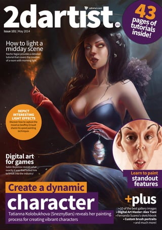
  • 1. 101 pagesoftutorialsinside! 43 Issue 101 | May 2014 character Create a dynamic Tatianna Kolobukhova (SneznyBars) reveals her painting process for creating vibrant characters Learn to paint standout features How to light a midday scene Digital art for games Nacho Yagüe provides a detailed tutorial that covers the creation of a room with morning light Sabin Boykinov reveals what exactly it was that fueled him to break into the industry! +plus • 10 of the best gallery images • Digital Art Master: Alex Tiani • Fernanda Suarez’s sketchbook • Custom brush portraits • and much more! DEPICT INTERESTING LIGHT EFFECTS Discover how to capture the mood as Geoffrey Ernault shares his speed painting techniques
  • 2. 2 | 2DARTISTMAG.COM 2DARTIST MAGAZINE | ISSUE 101 Editor’sLetter Contributors STEPHEN LORENZO WALKES Stephen is a freelance illustrator based in London, England. His caricatures have been used in editorials, advertising, and books. He is currently the creative director of an independent clothing company. SABIN BOYKINOV SabinBoykinovwasborninRousse,Bulgaria.He currentlyworksasaLeadConceptArtistinHaemimont GamesstudioinSofiaandmakesfreelanceillustrations foravarietyofprojects. FERNANDA SUAREZ Fernanda Suarez is a Freelance Illustrator and Concept Artist. She is currently working on artwork for a new board game by Plaid Hat Games, illustrations for Paizo Publishing, and private commissions. TATIANA KOLOBUKHOVA (SNEZNYBARS) Tatiana is a 2D artist from Belarus. Though originally trained as a Programmer, Tatiana moved over to creating 2D art around 3.5 years ago and creates artwork for a number of different companies. HOUSTON SHARP Houston Sharp currently works as a freelance concept artist and Illustrator in the film and game industry, when he is not in-term at school. He also enjoys simply painting portraits. GEOFFREY ERNAULT GeoffreyErnaultiscurrentlyworkingatGuerillaGames Cambridgeasacontractorconcept/visualizationartist. Hehasbeenworkingasaconceptartistforaboutthree yearsnow. NACHO YAGÜE Nacho Yagüe is a concept artist in the videogame industry who has worked in projects such as Splinter Cell Blacklist and the upcoming Assassin’s Creed Unity. He currently works at Ubisoft Toronto (Canada). Bursting with dynamic females, painterly portraits and standout caricatures: issue 101 is full of impressive characters! Fernanda Suarez flips open her sketchbook and Sabin Boykinov gives us an insight into his career creating digital art in the games industry! Issue 101 also delves into tips for lighting your 2D scenes, with top techniques from Nacho Yagüe and Geoffrey Ernault! And there’s a wealth of inspirational art from Tim Löchner, Laura Sava, Efflam Mercier and more. Enjoy! Welcome to the May issue of 2dartist magazine! JESS SERJENT-TIPPING Deputy Editor KEEP UP TO DATE WITH 3DTOTAL! facebook.com/3dtotal facebook.com/layerpaint twitter.com/3dtotal twitter.com/layer_paint youtube. com/3dtotalpublishing vimeo.com/3dtotal vimeo.com/layerpaint pinterest.com/3dtotal instagram.com/3dtotal WOULD YOU LIKE TO SUBMIT TO 2DARTIST? We are always looking for tutorial artists, gallery submissions, potential interviewees, writers and more. For more information, please send a link to your work to: jess@3dtotal.com.
  • 3. Magazine. Your Getthemostoutofit! 2DARTIST MAGAZINE | ISSUE 101 If you’re having problems viewing the double-page spreads that we feature within this magazine, then follow this handy little guide on how to set up your PDF reader! Top tips for viewing Foroptimumviewingofthemagazine,itisrecommendedthatyouhavethelatestversionof AdobeAcrobatReaderinstalled.Youcandownloaditforfreehere: Toviewthemanydouble-pagespreadsfeaturedin2dartistmagazine,youcansetthereader todisplay“two-up”,whichwillshowdouble-pagespreadsasonelargelandscapeimage: Jump to articles IntheContentspages,wehavedirectlinkstoallarticleswithinthemagazine.Ifacertain articlecatchesyoureye,simplyclick(ortaponhandhelddevices)onthepagenumberwithin theContents,andyouwillbetakenstraighttothatarticle. Download resources Wheneveryouseethissymbol,besuretoclickitto downloadfreeresourcestoaccompanythatarticle! Visithttp://www.2dartistmag.com/resources.htmlif viewingfromamobiledevice. 1.OpenthemagazineinReader; 2.GototheViewmenu,thenPage Display; 3.SelectTwo Page Scrolling,makingsure thatShow Cover Page in Two Page View isalsoselected. www.layerpaint.com Forlotsmoretutorialsandexclusivearticles,visit 2dartist magazine is available as a downloadable PDF magazine. If you have an iPad or iPhone, you can drag your magazine into your iTunes library – it will automatically add the PDF to your bookshelf in your iBooks app! DeputyEditor Jess Serjent-Tipping jess@3dtotal.com SubEditor Jenny Newell GraphicDesigner Aryan Pishneshin PublishingCo-ordinator Adam Smith AdvertisingManager George Lucas george@3dtotal.com StudioManager Lynette Clee lynette@3dtotal.com ManagingDirector Tom Greenway Advertising Mediapackandratesare availableuponrequest. ContactGeorgeLucas: george@3dtotal.com International Translationopportunities andinternationallicenses areavailable.Contact JessSerjent-Tipping: jess@3dtotal.com Subscriptions Subscriptionscanbe purchasedvia 2dartistmag.com. 12-monthsubscription– £23.99($38.99USapprox.). Toenquireabout subscriptions,contact: support@3dtotal.com Distribution 2dartistisane-magazine distributedasa downloadablePDFandon digitalnewsstands. Disclaimer Allartwork,unlessotherwise stated,iscopyright©2014 3dtotal.comLtd.Artworkthat isnotcopyright3dtotal.com Ltdismarkedaccordingly. Everyefforthasbeenmade tolocatethecopyright holdersofmaterialsincluded inthisissueof2dartist magazineinordertoobtain permissionstopublishthem. Special thanks to3DHype, Hiperia3DandVeegraphfor supporting3dcreativewith banners.ContactGeorge Lucasifyouwouldalso liketoshowyoursupport: george@3dtotal.com
  • 4. 4 | 2DARTISTMAG.COM 2DARTIST MAGAZINE | ISSUE 101 Contents Issue101 006_ Produce digital art for games Sabin Boykinov reveals what it was that fueled him to break into the industry! 021_ Sketching organic female forms Fernanda Suarez opens up the pages of her sketchbook, filled with female figures 034_ The gallery Efflam Mercier and Laura Sava feature in this issue’s gallery selection of our top 10 images 052_ Paint portraits with custom brushes Houston Sharp shares techniques to create custom brushes for painting skin, hair, and fabric 062_ Discover how to light a midday scene Nacho Yagüe provides a detailed tutorial that covers the creation of a room with morning light 072_ Learn to paint standout features Stephen Lorenzo Walkes provides a step-by-step guide for drawing and painting caricatures 080_ Depict interesting light effects Discover how to capture the mood, as Geoffrey Ernault shares his speed painting techniques 092_ Create a dynamic character Tatianna Kolobukhova (SneznyBars) reveals her painting process for creating vibrant characters 098_ Digital Art Master: Alex Tiani Alex Tiani shares the process he used to create his image, Angel Fight SAVE 30%! Subscribe today Go to page 060 for details
  • 5. 2DARTIST MAGAZINE | ISSUE 101 5
  • 6. 2DARTISTMAG.COM 2DARTIST MAGAZINE | Produce digital art for games Produce digital art for gamesSabinBoykinovshareshisrouteintotheindustryandtalksaboutexactlywhatitwas aboutthedigitalmediumthatmadehimwanttostartthejourney TheArtist Sabin Boykinov sabinart.blogspot.com Interviewed by: Jess Serjent-Tipping Starting as a traditional artist many, many years ago, Sabin now works as a lead concept artist at Haemimont Games studio in Sofia, Bulgaria. Besides concept work, he also makes freelance illustrations for projects like Fantasy Flight Games ‘ TheLordoftheRings: TheCardGame , TheHobbit and GameofThrones.
  • 7. 2DARTIST MAGAZINE | ISSUE 101 7 Sabin Boykinov was born in the small town of Rousse, on the Danube River in Bulgaria, and from an early age has always been drawn to visual art. This led him to spend every moment he had after school painting traditionally. A spark was ignited the day Sabin read an interview with two Bulgarian digital artists, Svetlin Velinov and Kosta Atanasov, where they talked about their work in the game industry, and the process and techniques they use to create their digital art. Completely inspired by these two artists, Sabin went and bought himself a tablet, the Trust, which was the only one he could find in his hometown at the time! And there the journey began. He started to explore Photoshop and began the process of teaching himself (he has never attended an art academy), which he found a hard, but amazing experience! With that very tablet he produced his first tests for a game company, before making the transition into digital art, and has since worked on many titles, including the Tropico series, and produced freelance illustrations for board and card games. Sabin chats about his experiences and inspirations! 2dartist:Whatisyourtypicalworkflow?What techniquesdoyouuse? Sabin Boykinov:UsuallyIstartwithalotofpencil sketchesandalotofresearchandthenscanthe finalsketchandcontinueinPhotoshop.Ilovetouse custombrushesthatareclosetotraditionalones. A personal piece titled SomewherebetweenHeavenandHell LordoftheRingsLCG:EncounteratAmonDin Adventure Pack Card Game © Fantasy Flight Games
  • 8. 2DARTISTMAG.COM 2DARTIST MAGAZINE | Produce digital art for games A concept scene created for Haemimont Games’ TheFirstTemplar action adventure game © Haemimont Games
  • 9. 2DARTIST MAGAZINE | ISSUE 101 9
  • 10. 2DARTISTMAG.COM 2DARTIST MAGAZINE | Produce digital art for games 2da:Wheredoyoudrawyourinspirationsfromfor yourwork? SB:Ifindmyinspirationineverything–lookingat nature,readingbooksorwatchingnicemovies. Itdependsontheprojectyouareinvolvedin. 2da:Whatwasitaboutthedigitaltoolsthatmade youwanttopursueacareerintheindustry? SB:IreallylovetouseaWacomCintiqbecauseit isclosertoatraditionalworkexperience.Youcan domanythingsfasterthantraditionalmethods. Workinginthegameindustryisgreatbecauseofthe artisticfreedomandthevarietyofprojects. 2da:Howdoyoukeepyourportfoliouptodate? Anytips? SB:ItrytopostmyweeklysketchesonmyFacebook pageandInstagram.Keepingablogisalsogood.I thinkitisimportanttoshowyourworkasmuchas youcan–thisinspiresyouandisachancetoseeif youareontherightpath. 2da:Whoareyourfavoriteartistsandwhy? SB:Theartistwhoprovokedmyimaginationfirst andinspiredmeformanyyearsisthevisionary masterMatiKlarwein. Ihavemanyfavoriteartistsfromthegameindustry now.Ilearnedalotfromthem,thoughitwouldbe difficulttolistalltheirnameshere. 2da:Whathasbeenyourfavoriteprojecttoworkon todateandwhy? SB:TheSUBSTRATAbookprojectwasgreatbecause Ilearnedalotandsharedideaswithamazingartists formtheindustry. PRO TIPS Sketches Makingasmanysketchesaspossible willgiveyouachancetocreatebetter ideasanddesigns. Explore different techniques Trytoexploredifferentarttechniques, usedifferentbrushesandexploreold masters’paintings.Trytostartanew conceptsorillustrationwithadifferent approachtoyourtypicalone. If you want to make games, play games! Exploreyourfavouritetitlesbyplaying them,thentrytounderstandhowthe worldofthegameiscreatedandfind inspirationfromthedetails. “I think it is important to show your work as much as you can – this inspires you and is a chance to see if you are on the right path” Sabin reveals his fascination with African myths and legends
  • 11. 2DARTIST MAGAZINE | ISSUE 101 11 This was an illustration for the SUBSTRATA project
  • 12. 2DARTISTMAG.COM 2DARTIST MAGAZINE | Produce digital art for games Another concept created for Haemimont Games’ TheFirstTemplar action adventure game © Haemimont Games
  • 13. 2DARTIST MAGAZINE | ISSUE 101 13
  • 14. 2DARTISTMAG.COM 2DARTIST MAGAZINE | Produce digital art for gamesA personal piece titled ChristmasCard
  • 15. 2DARTIST MAGAZINE | ISSUE 101 15 Artist history SabinBoykinov’scareer uptothispoint... 2007: Sabin started working in the game industry and slowly transitioned over to digital art. This is when he made his first illustrations on a PC 2012: Aside from concept artwork, Sabin started making freelance illustrations for board game companies. He reveals that working on cards for titles like The Lord of the Rings and The Hobbit was really inspirational 2013: Sabin also started working traditionally again after so many years, showcasing his work in 2dartist 2013: Sabin became part of Paul Richards’ book project SUBSTRATA. The book will be released very soon in July Sabin’s studio A piece created for theLordoftheRingsLCG:HeirsofNumenor Adventure Pack Card Game © Fantasy Flight Games
  • 16. 2DARTISTMAG.COM 2DARTIST MAGAZINE | Produce digital art for games A personal piece entitled Harvester A personal piece entitled HalloweenBlues
  • 17. 2DARTIST MAGAZINE | ISSUE 101 17 This is a part of series of illustrations for a book called Hyperion by Dan Simmons The idea was inspired by Sabin’s experience as a piano player. He wanted to envision the difference between mechanical and organic sound in a music box ...spreading the nuclear angels of death all over the world
  • 18. 2DARTISTMAG.COM 2DARTIST MAGAZINE | Produce digital art for gamesSabin made this for a UbiWorkshop contest that asked artists to create a location they’d like to see the Assassin in. His choice was Japan
  • 19. 2DARTIST MAGAZINE | ISSUE 101 19 2da:Canyoutelluswhatyou’recurrentlyworking onatthemoment? SB:OurstudiocurrentlyfinishedworkonTropico5 anditwillbeonthemarketthismonth. 2da:Whatadvicedoyouhaveforaspiringartists whowanttomakeitintheindustry? SB:First,tohavealotofpatienceandpassionfor whattheydo,whetheritispainting,drawingor playinggames!Belikeachildandexploreeverything tofindinspiration. 2da:Finally,whatcanweexpecttoseefromyouin thefuture? SB:Ihavealotofplansandideasforfutureworks–I hopetobeabletosharethemsoon! A concept scene created for Haemimont Games’ TheFirstTemplaraction adventure game © Haemimont Games A concept created for Haemimont Games’ TheFirstTemplar action adventure game © Haemimont Games
  • 20. Subscribetoday and receive 4 free issues! SAVE 30% • SIMPLE, EASY PAYMENT NEVER MISS AN ISSUE • 12 ISSUES PER YEAR! PLUS FREE VIDEO TRAINING! Click here for more information and to read the Terms and Conditions “Agreatsourceofinspirationandtipsonhowtoimproveyourskills andspeedupyourpaintingprocess.Besidesverydetailedstep-by-step tutorials,2dartistmagazinewillalsoensuretherearealargevarietyof topicscoveredaswell.” - Blaz Porenta, illustrator
  • 21. Fernanda Suarez Fromgeometricshapestoorganic forms,FernandaSuarezsharesthe ideasandinspirationbehindherfemale filledsketchbook. TheArtist Fernanda Suarez fernandasuarez. carbonmade.com Fernanda Suarez is a freelance illustrator and concept artist. Fernanda is currently working on artwork for a new board game by the company Plaid Hat Games, makes Illustrations for Paizo Publishing, and commissions for private clients.
  • 22. Sketchbook of Fernanda Suarez 22 Discover the flowing lines in Fernanda Suarez’s sketchbook... I love drawing in my sketchbook – it relaxes me. It’s a moment when I can do things just for myself, so in a way I feel more freedom when I sketch. It’s also a great moment to develop ideas that I can use later in a painting. There is something in drawing with a pencil on paper, that I can’t get with digital work. I love how you can describe so much just with a line and its different weights and pressure. I think there is something just very raw and honest about sketching with paper – there is no Ctrl+Z function, it’s just what comes out naturally. Inspiration and ideas My inspiration a lot of the time is music. I sit down and just listen to music, and from there I start sketching and the idea for the drawings come out of the feeling I get from the music I am listening to. Apart from that, it’s pretty much everything that I am in contact with – movies, books, fashion, references, people – anything can be inspiring. Materials I use a Moleskin notebook with a soft cover; it’s really comfortable for me as the paper is very soft with almost no texture. I draw with Graphite pencils (2B, 3B, 4B and so on), and also a mechanical pencil (0.5), and a regular eraser. Sketching techniques I don’t think that when you sketch you are conscious of a technique. As I mentioned before, sketching on paper is something that is very raw, and the way you do it is something that comes naturally, so the technique is not something you think about it when doing it (at least in my case). When I sketch, what comes out is something created almost unconsciously. I do like to do cross-hatching for shadows, but I mix that with smoother work too. I like to develop volumes on a figure using very geometric forms. I like to start with simple shapes to get the basic form and proportions, and from there work on a more organic look. I like to leave all my lines and traces on view too, so you can see the skeleton of the drawing in a way. Portrait from the movie Wuthering Heights © Fernanda Suarez
  • 24. 2dartistmag.com Sketchbook of Fernanda Suarez 24 There is never rest from the tragedy of life and love © Fernanda Suarez Sketch inspired by Nickelback’s Savin’ Me © Fernanda Suarez
  • 27. 27 2dartist magazine | issue 101 Character design, owl-inspired lady © Fernanda Suarez Just playing around with ideas © Fernanda Suarez PRO TIPS Inspiration advice Some people ask me how or from where they can get inspiration, and what I say to them is that inspiration should come from everywhere, from anything that surrounds you. You should go around with your eyes open to see and catch anything that could work as inspiration for you – you should be like a sponge and absorb everything that is around you, that way you will have more tools in your mental library. Also inspiration is something that will get to you as you work, you won’t get it while doing nothing and just waiting for it. The best ideas come when you are working hard, so the more you keep using your brain, the more it will work for you. Building an image When you are planning a painting, start with the general shape of it first. Try to make a sketch or thumbnail or whatever you prefer, that helps you define all the important things that need to be there, the basic structure of your idea. Once you get that and you see things that work, you can move ahead with details and the rest of the image. If you see that something is not working in the first stage, it will be much harder to fix once you have moved on to a more advanced stage of development.
  • 29. 29 2dartist magazine | issue 101 Sketch inspired by Iron Wine’s Sunset Soon Forgotten © Fernanda Suarez Sketch inspired by Niki The Dove’s DJ Ease My Mind © Fernanda Suarez Inspired by one of my favorite stories, Alice in Wonderland © Fernanda Suarez
  • 31. 31 2dartist magazine | issue 101 PRO TIPS Don’t skip steps Don’t try to find easy ways to get to a place or to fix something. You should take the time to learn and practice as needed, so that you learn everything that you need and you are not leaving any empty gaps. If you have gaps in your skills it will show in the final product, so take the time to learn. I get people asking how to learn to draw for example, and there is only one answer: practice. The learning process is different for each person so don’t try to adopt someone else’s way of doing something – find your own methods. You can find this with practice and hard work; perseverance and hard work is the best advice in my opinion. Sketch inspired by Bat For Lashes’ Whats A Girl Have To Do © Fernanda Suarez I love drawing and painting crows – I love their symbolism © Fernanda Suarez Voodoo queen, character design © Fernanda Suarez
  • 32. We’re always on the lookout for talented artists and their artwork to adorn the pages of our magazine. If you think you have what it takes, get in touch! To submit, simply email Jess at jess@3dtotal.com with a selection of your images or a link to your portfolio online, plus a little information about you. We look forward to hearing from you! Would you like to see your sketches featured in 2dartist magazine?
  • 33. LayerPaint allows you to browse the gallery, interviews, news, tutorials and products all dedicated to 2D digital art. On top of that, we have included a free custom brushes library that is available to everyone. We wish LayerPaint to be a definitive resource for digital painting, creating a friendly and educational environment that not only helps budding and experienced CG artists alike, but also showcases some of the best computer generated artwork in the world. PARTNERED WITH 3DTOTAL.COM | LAYERPAINT.COM | FACEBOOK.COM/LAYERPAINT | TWITTER.COM/LAYER_PAINT
  • 34. Each issue the 2dartist team selects 10 of the best digital images from around the world. Enjoy! Plains of Another World Leon Tukker Software used: CINEMA4D,Photoshop Year created:2014 Web:tryingtofly.deviantart.com 2DARTISTMAG.COM 2DARTIST MAGAZINE | The Gallery
  • 35. Submit your images! Simply email jess@3dtotal.com 2DARTIST MAGAZINE | ISSUE 101 35
  • 36. River Dragon Efflam Mercier Software used: Photoshop Year created:2014 Web:efflam.artstation.com 2DARTISTMAG.COM 2DARTIST MAGAZINE | The Gallery
  • 37. 2DARTIST MAGAZINE | ISSUE 101 37
  • 38. Falling from High Places Fernanda Suarez Software used: Photoshop Year created:2014 Web:fernandasuarez.carbonmade.com 2DARTISTMAG.COM 2DARTIST MAGAZINE | The Gallery
  • 39. Into the Forest Miranda Meeks Software used: Photoshop Year created:2014 Web:mirandameeks.com 2DARTIST MAGAZINE | ISSUE 101 39
  • 40. Untamed Nature ExidiumCorp Software used: Photoshop Year created:2013 Web:exidiumcorp.com ©ExidiumCorpSpaceTravelFoundation Allrightsreserved 2DARTISTMAG.COM 2DARTIST MAGAZINE | The Gallery
  • 41. 2DARTIST MAGAZINE | ISSUE 101 41
  • 43. River Valley Raymond Lei Jin Software used: Photoshop Year created:2007 Web:rayleijin.com 43
  • 44. 2DARTIST MAGAZINE | The Gallery
  • 45. Overgrown Theatre Ryan Ingram Software used: Photoshop Year created:2014 Web:artofryaningram.com 2DARTIST MAGAZINE | ISSUE 101 45
  • 46. Last Chance Alex Heath Software used: Photoshop Year created:2014 Web:artstation.com/artist/alexheath 2DARTISTMAG.COM
  • 47. 2DARTIST MAGAZINE | ISSUE 101 47
  • 48. The Final Battle Tim Löchner Software used: Photoshop Year created:2013 Web:timloechner.com
  • 49. Prototype Laura Sava Software used: Photoshop Year created:2013 Web:anotherwanderer.deviantart.com
  • 50.
  • 51. © Copyright 2014 Advanced Micro Devices, Inc. All rights reserved. AMD, the AMD Arrow logo, FirePro, and combinations thereof are trademarks of Advanced Micro Devices, Inc. OpenCL and the OpenCL logo are trademarks of Apple Inc. used by permission by Khronos. Other names are for informational purposes only and may be trademarks of their respective owners. 1. AMD FirePro™ W9100 features 16GB GDDR5 memory. Nvidia’s highest memory card in the market as of April 2014 is the Quadro K6000 with 12GB GDDR5 memory. Visit http://www.nvidia.com/ content/PDF/line_card/6660-nv-prographicssolutions-linecard-july13- final-lr.pdf for Nvidia product specs. FP-90. 2. LuxMark, BASEMARK CL test details: System Description: ASUS P9X79E-WS, Intel Xeon E5-2697 v2, 32GB Kingston DDR3-2133, 750GB SSD Samsung 840EVO, Corsair AX1500i PSU, Corsair Obsidian 950D chassis, Corsair H100i CPU cooler. AMD Driver 13.35 | Nvidia Driver 332.50 Designed for the most demanding workflows and delivers the ultimate 4K experience in next-generation workstations. Powered by OpenCL™, design and engineering professionals can work with multiple graphics and compute-intense applications across up to six 4K displays. www.fireprographics.com/w9100 • 2816 Stream processors (44 CUs) • 16GB GDDR5 memory (320 GB/s) • 5.24 TFLOPS peak single precision • 2.62 TFLOPS peak double precision • Designed to support OpenCL 2.02 • Six Mini DisplayPort 1.2 outputs (4160 x 2160) AMD FIREPRO™ W9100 PROFFESSIONAL GRAPHICS CARD IS THE FIRST 4K GRAPHICS CARD TO OFFER 16GB OF ULTRA-FAST GDDR5 MEMORY.1 THE ULTIMATE WORKSTATION EXPERIENCE FOR REAL-TIME 4K For more information visit Scan Computers www.scan.co.uk 0871 472 4787 Workstation Specialists www.workstationspecialist.com 0800 180 4801 Amari www.armari.com 0192 322 5550 Now available at selected partners:
  • 52. 2DARTISTMAG.COM 2DARTIST MAGAZINE | Paint portraits with custom brushes Paint portraits with custom brushes UsingPhotoshop,HoustonSharpgivesanin-depthguidetocreatinguseful custombrushes,whichcanbeusedforskin,hairandfabrictohelpspeedupyour portraitpaintingprocess! TheArtist Houston Sharp artstation.com/artist/ HoustonSharp Software Used: Photoshop Houston Sharp currently works as a freelance concept artist and Illustrator for films and videogames, when he is not in-term at school. He also enjoys simply painting portraits. Brushes
  • 53. 2DARTIST MAGAZINE | ISSUE 101 53 Speed up your portrait painting process with the use of custom brushes... Custom brushes in Photoshop are powerful tools that can help you achieve certain effects, save time, or simply provide a new way to apply paint. This tutorial will cover how to create and utilize different types of custom brushes for different sets of tasks within a portrait painting. Along the way, I’ll also touch upon general portrait painting and workflow tips, so you can get a feel for how I typically approach portraits, from the initial sketch all the way to the final brushstroke. When I work digitally, I tend to approach the painting as if I am doing it in oils, at least initially. When the time arises to create and use custom brushes, I will utilize them in a way that does not compromise the painterly approach to the piece. Aside from creating and using custom brushes, other topics covered include: thinking about composition; quickly setting up for a final painting; and how to effectively deal with complex forms. Hopefully you will learn something new about creating custom brushes from this tutorial. If you’re already a pro with them, then I hope some aspects of my workflow inspire you to try new approaches to your work! 01Building a sustainable framework: If an architect wants a house to both look great and not collapse, it’s important that he sets up a good foundation and framework to build upon. This is also the case with us illustrators. I try to plan my paintings almost completely (with a little bit of room for ‘happy accidents’) before I even begin. In this case, I explore compositions by sketching in only big black and white shapes, instead of doing line drawings. This not only establishes what type of subject I want to paint, it lets me see the value grouping of the composition as well. I also do many separate color sketches to settle upon a color scheme. 02Creating a mess: Now that all of the major decisions have been made about what to paint, it’s time to start. I begin my paintings with a warm, vibrant mess of color. The purpose of this is to give a surface that isn’t white to judge my values against while painting. The colors also show through the brushstrokes I put on top of it, which creates a richness in the colors that can be seen when the painting is complete. The values and colors are all planned, so you don’t have to worry about them later Creating a vibrant underpainting to paint on top of
  • 54. 2DARTISTMAG.COM 2DARTIST MAGAZINE | Paint portraits with custom brushes Instead of drawing the idea I came up with in my sketch onto the new canvas, I can simply drag the value sketch onto this warm layer and set it to Screen mode – an instant value-grouped under- painting! There was another reason for not doing a line drawing in step one! 03Sticking to the shadows: Starting with the shadows and working your way towards the light is not easy when inventing your own colors and values, but it is rewarding. While painting the shadows, I try not to let myself get too uptight. It’s important to remain loose and fluid at this stage; let your brushstrokes be messy, and let some of that orange mess below seep through the cracks. It’s also important to consider the color and direction of your light source, as it will affect the color of the shadows. As a general tip for inventing your own color, contrast warm light sources with cool shadows. Also, be sure to maintain your overall value shapes. 04Let there be light: After spending a decent amount of time establishing the shadows and dark areas, I do the same with the light. I really slow down at this stage and pay attention to the relationships between the colors I’m putting down. For instance, is this part of her cheek slightly more orange than that part? Is this part slightly less saturated than that part? Cooler or warmer? Faces don’t consist of one skin color, so it is important to show these varying hues, temperatures and values in relationship to each other in order to create a convincing portrait. Once again, consider the color and direction of the light source. 05Custom brushes: Here is where I will put energy into creating and using a special custom brush. I want a silkier brush to slap on my paint for the hair. To do this, open a small new document (my default for making brushes is 500 x 500 pixels at 150 dpi) and paint what you imagine the tip of one of these brushes might look like if you were staring straight down the tip of an actual brush. Then, go to Edit Define Brush Preset, and save it. Lower the spacing in the Brush window, set the flow to pen pressure, and it’s good to go! Don’t forget to save its current settings by clicking New Brush Preset. 06So smooth… Don’t think of using this custom brush as a magical brush that will make realistic-looking hair appear – we will get to that magical brush later. This silky brush was created simply so I can paint with a softer, flowing touch. Long, flowing hair is, after all, usually pretty smooth and soft. That being said, don’t be afraid to use this brush on other areas of the painting as well, just for the
  • 55. 2DARTIST MAGAZINE | ISSUE 101 55 sake of brush variety. I use it on her forehead, for example. Also, it’s fun to use the eraser with this preset to carve away at shapes with a softer feel. Actually, it’s not a bad smudge brush either. 07Back to the framework: It’s time for me to tackle the ruffled fabric, but it’s far too complex to just start slapping paint down and hope for the best. For these problem areas, I create a layer on top of everything and simply draw it out. I not only plan out the form of the warping fabric, but the shadows that they cast as well. 08Separating light and shadow: After drawing out the complex folds of the fabric, the next step is to paint the overall shadow shape and overall light shape in their own respective new layers. The way light reacts with the type of fabric that I plan on painting is very complicated, so it is best to start with the big shapes and work my way into the little variations within them. Establishing shadow colors while staying within the confines of the big, dark value-grouping Establishing colors of the lit areas while staying within the confines of the value grouping Creating a silky custom brush to block in soft materials, such as hair Using the newly-created silky brush to block in the colors of the hair and face Drawing out the complicated fabric folds and their resulting shadows Simplifying the fabric colors into simple shadow and light tones in separate layers
  • 56. 2DARTISTMAG.COM 2DARTIST MAGAZINE | Paint portraits with custom brushes Those variations are made simpler by having the light and dark masses on their own layers. Create a new layer for the variation above the light or dark mass-shape layer, and then link it by Alt- clicking between the two in the Layers window. 09Being lazy (a.k.a. ‘smart’): I am now in need of another custom brush, but this time it will be used for making repetitive objects less tedious to paint; the condensed ruffles at the top of the blouse, in this case. On another small blank document, I paint the shape of one ruffle, and define that as a brush preset. In the brush settings, I adjust the spacing between each ruffle generated until it is how I desire it, and I enable the Angle Jitter, just so it doesn’t produce a perfectly straight mechanical rail of ruffles. It needs to look organic and natural. 10Color correction: Throughout these steps, I am constantly jumping all over the place in the painting, going back and forth, refining, and repainting. Creating a painting is not a straight ‘point A to B’ ordeal; there is a lot of back and forth that happens. At this point in the painting, I realize that the skin is looking a bit too yellow when compared to the color sketch I did in step one. In order to fix this, I create a new layer and set it to Color mode on a low opacity. In it, I paint a saturated red, and then use a layer mask to hide the red where I don’t want so much of it (click the circle within the square icon on the Layers panel to apply a layer mask to the currently active layer). 11Background check: The background was feeling sort of flat and uninteresting, so I change it at this stage. On a new layer on top of everything (it’s probably smarter to make a change like this on the existing background layers at the bottom of the stack, but I did it this way for the sake of keeping my steps in chronological order and easy to follow for this tutorial). I add some warm tones where I want the cools to pop and some light tones where I want dark shapes to pop. Creating a custom brush to paint the ruffles in the fabric Adjusting the overall skin color with a Color layer set to low opacity Making the background more interesting and integrated to showcase the figure more effectively
  • 57. 2DARTIST MAGAZINE | ISSUE 101 57 PRO TIPS Less really is more Simplicity – or simplifying, rather – is the key to successful compositions. Paintings can have complex narratives and a lot of objects or figures, but if they are not arranged or grouped well, it will be too chaotic and the viewer could become overwhelmed. That’s why it is important to break down the image as simply as possible, usually in the form of only two or three values. If you can make your compositions readable to a viewer within one second of them seeing it, then you’re definitely doing something right. Check your values Believe it or not, achieving correct color doesn’t matter too much in a painting. Values, on the other hand, are incredibly important. If your values are flawless, you can use practically any colors you want and your image will still look good. That’s why it’s important to constantly be aware of your values. One trick I use to monitor values is to create a “Hue/Saturation” adjustment layer at the top of my layers panel that I can flick on or off at any time. Having the adjustment layer’s saturation setting all the way negative will show you what your painting will look like if it was in grayscale. Using the Hue/Saturation adjustment layer is a great way to keep an eye on your values
  • 58. 2DARTISTMAG.COM 2DARTIST MAGAZINE | Paint portraits with custom brushes 12Custom skin brush: Using the same steps as before, I create a brush that can be used to apply subtle texture to the skin. A few simple dots on a small blank document, enables scattering and a bit of color dynamics (all found in the Brush window), and the brush is ready to be used. 13The magical brush: The great part about the skin brush I created in the previous step is that it can be used as a hair- strand brush if the settings are tweaked. Simply turn off scattering, lower the spacing significantly, and set the Jitter size to Pen Pressure. And voila! Finding creative uses for similar brushes is a valuable skill to have, and it’s fun discovering new possibilities for brushes you’ve been using for a long time. For creating different densities of hair- strand brushes: the more dots the preset has, the more strands it will create i.e. it will be denser. 14Last piece of the puzzle: The composition still does not feel complete to me at this point. To see the painting with new eyes, I often flip the canvas horizontally (Image Image Rotation Flip Horizontal). Balancing issues can become much more apparent when they are seen from a new perspective like this. While in the flipped state, I try adding a few more shapes to the composition: One more piece of red fabric in the upper corner to keep our eye within the composition, and floating air particles to add small elements and give an even greater sense of motion to the scene. I flip the canvas back to its original orientation to see if I am satisfied with the changes I have made. 15The finishing touches: The last things I do to my paintings are routine for almost every single painting I create. 1. Copy and merge all visible layers (Cmd+Alt+Shift+E), apply a Smart Sharpen filter (Filter Sharpen Smart Sharpen), then apply a layer mask to it and paint out areas that are not the focal points. 2. On top of everything, create a Curves adjustment layer by clicking on the icon at the bottom of the Layers panel that looks most like the Yin/Yang symbol, then select Curves from the drop-down menu that pops up. You can then make adjustments to the overall values. I then put my signature on it and call it done! I hope you enjoyed gaining a bit of insight into my painting process, and hopefully you’ve learned some new techniques to experiment with in your own paintings! Creating a skin texture brush Changing the settings of the skin brush to utilize it to create strands of hair Flipping and/or rotating the canvas makes issues within the painting become more apparent Adding finishing touches: a Sharpen layer, adjusting the overall values, and finally, my signature
  • 59. 2DARTIST MAGAZINE | ISSUE 101 59 TheArtist Houston Sharp artstation.com/artist/ HoustonSharp
  • 60. 101 pagesoftutorialsinside! 43 Issue 101 | May 2014 character Create a dynamic Tatianna Kolobukhova (SneznyBars) reveals her painting process for creating characters with dynamic poses Learn to paint standout features Digital art for games New world concepts Sabin Boykinov reveals what exactly is was about the digital medium that fueled him to break into the industry! Discover industry techniques for painting and presenting environment concepts in Photoshop +plus• 10 of the best gallery images • How to light a midday scene • Fernanda Suarez’s sketchbook • Custom brush portraits • and much more! CREATE INTERESTING LIGHT EFFECTS Discover how to capture the mood with interesting lighting effects, as Geoffrey Ernault shares his speed painting techniques
  • 61. SAVE 30%!when you subscribe to today! • Save a huge 30% – the equivalent of four issues • Hassle free – no need to visit the shop every month • Simple, easy payment options with PayPal Subscriptions allowing you to pay with your PayPal account or credit/debit card • Never miss an issue and no need to re-subscribe each year Subscribe online at www.2dartistmag.com/subscribe Offers are available worldwide. You will receive 12 issues in a year. Minimum subscription term is 12 months. If at anytime during the first 60 days you are dissatisfied, you can email us support@3dtotal.com and we will refund you any undelivered issues. The PayPal recurring subscription can be cancelled at anytime. Prices and offers are subject to change. “Contemplated signing up for so long. Don't know why I waited before signing up as this magazine offers an incredible insight to the world of 2D art. Can’t wait for next release.” 3dtotal customer
  • 62. Discover how to light a midday scene Aspartofaseriesthattakesalookatcreatinglightingeffectsfordifferenttimesofday, NachoYagüeprovidesadetailed,step-by-steptutorialthatcoversthecreationofaroom withmorninglightasabasetomakethreeothermoods:dusk,nightwithnaturallight andnightwithartificiallight
  • 63. TheArtist Nacho Yagüe nachoyague.net Software Used: Photoshop Nacho Yagüe is a concept artist in the videogame industry who has worked on projects such as SplinterCell Blacklist and the upcoming Assassin’sCreedUnity. He currently works at Ubisoft Toronto (Canada).
  • 64. 2DARTISTMAG.COM 2DARTIST MAGAZINE | Discover how to light a midday scene Discover Photoshop techniques to depict a scene lit at midday... In this tutorial, I will create a scene that will be used as the base for three other moods with the same content. The first scene depicts a room in the early morning, and will change as the time of day and lighting shift, keeping the same subject. Working in videogames requires you to work quickly, and mood changes like these happen often. I will show you how I organize my layers to make this process easier and more efficient. I will also teach you the techniques needed to make these changes in a short period of time. 01Sketch: I don’t always start with a sketch. Sometimes I use photos as a reference or start from scratch. In this case, I want to make a quick sketch to set the overall mood and build up the scene with all the elements that will help develop the other moods. I thought an abandoned room would work with what I wanted to achieve, with windows big enough to add natural light and key elements that will help distinguish the other moods. 02Color base and perspective: Following the previous sketch, I start preparing the piece by adding the color base and perspective lines that will put all the elements into context. I group the perspective layers, so that I can easily hide them. I work with big brushes with some texture, focusing only on tone and values. I try not to get crazy with shadows and light at this point, as I will apply them later. Some elements may change, but I try to stay as close to the original image as I can. I switch the image to black and white several times to see if the values are correct. 03Layer setup: This is one of the most tedious, yet important, steps. I don’t always work like this. In fact I consider myself very messy when I organize layers in my personal art, but when it’s work for a client, it’s better to be organized so you’ll be able to make changes without much effort. Once I’m happy with the image, and before I start detailing, I cut out the image and separate every element into layers. The floor, background, window frames, walls and so on, will be cut and pasted in a new layer. Sometimes I’ll group some layers (select layers and press Ctrl+G) for more complex elements, for example the windows of the left side are in a group of four layers (background, frame, wall and curtain). I use the Lasso tool to select the area I want to cut and then copy it on a new layer (Ctrl+J). I also make sure I name each layer so that they will be easier to identify when I have a large number of them. Now that everything is well organized and separated, it is very easy to render and have full control of every single element on the screen. 04Polishing and texturing: I like to paint with long and big brushstrokes, so I use the Lasso tool to make sharp edges and leave the inside loose with random brushstrokes. I never paint on the same layer, instead I use Clipping masks so I can paint only the visible areas of the layer underneath, keeping its transparency and shape. The original layer remains unaltered so
  • 65. 2DARTIST MAGAZINE | ISSUE 101 65 I can come back to its original state whenever I want. I can reshape and edit the base layer, and the changes are reflected with the clipping mask. In addition, I can have more than one clipping mask on the same layer. At this stage, I also add some photo textures. I don’t like the feel of a very polished image with too much detail, so I add textures at an early stage and then paint over them. I only use them to add color information and some color noise. The initial sketch to set the first mood, and building the scene with all the elements I want to show Adding the color base and perspective lines. The value range and tones should also be defined here Organizing the image by cutting and pasting all the elements into different layers Adding the first textures and polishing the image using clipping masks and photo textures
  • 66. 2DARTISTMAG.COM 2DARTIST MAGAZINE | Discover how to light a midday scene 05Adding a narrative: While painting the scene, I feel it lacks a storytelling element. I always like to incorporate some sort of story in my paintings, so the viewer can wander through the image and ask questions about what’s going on. I want the room to look like it is decaying, but I feel that the image alone isn’t strong enough to catch the viewer’s eye, so I add a character. It is very open to interpretation – it could be a kid or the ghost of a kid wandering around the room. The idea is strong enough to make the viewer look at the image longer and think about the nature of the character and the room he is in. From there, I keep adding more elements to polish and define the shapes. I apply shadows on all the different layers, so I can easily modify them when I have to change the mood. 06Material behavior: At this stage I keep rendering all the elements, paying attention to how the light reacts to the environment. Light affects material in so many different ways. Concrete absorbs more light and won’t be very reflective. The plastic ball illuminates some light that will bounce on the floor, coloring its own shadow. The lamp has metallic parts that are very reflective, and so on. It’s very important to pay close attention to these details, as they will make your work look more believable. The best thing you can do is look for pictures on the internet and analyze how light interacts with different surfaces. Here, I use a lot of layers in the Overlay and Screen modes to emulate reflections and bouncing light. 07Adding lights: Although I already added some lights to the scene, I usually add the main lights and shadows with adjustment layers. For this image, I make a new adjustment layer mask set in Curves mode. The benefits of adding light and shadows this way is that you can go back and tweak the effect whenever you want. For example, if I feel that the light or shadow is not strong enough – I just have to click on the layer and modify the intensity. These layers work as a mask, so the adjustment only affects the areas you want. The more white you add to the mask, the more visible the adjustment will be. “It’s very important to check your values and the composition weight from time to time” I continue painting more lights with a soft brush set in Overlay and Linear Dodge mode. Be careful and try not to ‘burn’ the image. 08Last elements: I keep adding more details to further build interest in the room. I paint some papers all over the floor as well as a new lamp on the right side. I’ve been placing all the elements while thinking about how I will light the scene in different moods. I first think to turn on the ceiling lamp for the night scene with artificial light, but feel that this kind of light is boring. Then I think that a lower light source could be a good touch, so I paint a lamp in the right corner. I keep adding more elements that will add more flavor to the image, like some books and old photos hanging on the fireplace wall. Then I paint a face on the paper bag mask – my idea is to paint a different face on every scene. 09Checking the values and composition: I repeat this step over and over again. It’s very important to check your values and the composition weight from time to time. I usually work with mid-range values and
  • 67. 2DARTIST MAGAZINE | ISSUE 101 67 use more contrasted ones on specific areas. If the values don’t work, the image won’t work, no matter how much detail you put in it. Try to be clever and guide the eye to the areas you want by adding more light. I always have a layer set in Desaturation mode on the top, so I can switch it on whenever I want and check if the values are still working well. Along with that, I also flip the image horizontally (Image Adjust Flip horizontal) several times so I can see if the composition is well balanced. 10Last touches: I feel that the painting isn’t creepy enough, so I draw some kind of religious symbol on the floor. With a soft round brush and a layer set to Screen mode and at 70% Opacity, I keep adding some subtle atmospheric light that will tone down the values a little bit. I try to keep the colors fresh and cold because I want the feeling of an early morning scene. I correct the colors a little bit using Color Balance, but always try to keep the original tones I set in my previous sketch. Finally I add some spare brushstrokes to give a more painterly effect, and sharpen the edges a little bit with the Unsharp Mask (Filter Sharpen Unsharp Mask) before saving the files. The image lacked a narrative so I add a character to the scene Adding reflections and shadows, keeping in mind the nature of the material being rendered Using adjustment layer masks to add light and shadow Painting more assets that will enrich the atmosphere of the scene Check your values and flip the canvas horizontally to detect possible mistakes PRO TIP Say something with your image It’s not necessary to tell a story on every illustration you make, but it’s very important to keep a consistency. Ask yourself the ‘Why’ and ‘How’ of everything you put into a scene. Why does this wall have this material and not another? What will the floor look like if the house is abandoned? What kind of elements will tell the viewer that this room is abandoned and once belonged to a kid? It’s important to think about these details as they will enrich your image and will give extra flavor.
  • 69.
  • 70.
  • 71. ANIMATION VISUALEFFECTS Vancouver Film School The New Animation Visual Effects Campus / Now Open Book a tour today / vfs.edu/3dtotal / 1.888.397.8820 • Master your art in the most advanced campus anywhere • Learn from the pros at the school the industry prefers • Launch your career just steps away from your future employers Theworld’sbestvisualeffects animationschooljustgotbetter.
  • 72. Learn to paint standout features in Photoshop StephenLorenzoWalkesprovidesastep-by-stepguidefordrawingandpainting acaricatureinPhotoshop.Withtoptipsoncreatingstandoutfeaturesthatdefine caricatures,andusingbrushestocreateatraditionalfeeltoyourimage,you’llbepainting likeaproinnotime! TheArtist Stephen Lorenzo Walkes artbysteviewalkes.blogspot.co.uk Software Used: Photoshop Stephen is a freelance illustrator based in London, England. His caricatures have been used in editorials, advertising, album covers and books. He is currently the creative director of the independent clothing company, Doopsie Joint.
  • 73. 2DARTIST MAGAZINE | ISSUE 101 73 A step-by-step guide to exaggerating female features in Photoshop... This tutorial will give you an in-depth look into the process I normally use when drawing and digitally painting a caricature. The steps shared will not only give you an idea of to how I exaggerate the features of the model while maintaining her likeness, but also show how the gradual building up of values can change a quick rough sketch into a strong, eye-catching digital illustration. Using three standard Photoshop brushes, and five layers, I develop the piece using low brush opacities, and finish with a mixture of soft and bold skin tone colors, directing the point of focus to the model’s standout features. I then conclude by using a free downloadable ‘dirty’ brush, which emphasizes the painting’s traditional feeling. Apart from my first initial sketch, all of the work in this tutorial has been done in Photoshop using the Wacom Cintiq 13HD. I’ve chosen to use an A4 document size, with the resolution at 300 pixels/inch, and the image mode set to RGB. 01Rough sketches: Rough sketches are kind of like little rehearsals for the big event, but without the pressure. They’re not supposed to be masterpieces, their sole purpose is to simply allow you to familiarize yourself with the subject’s features, and also for you to experiment and explore with shape and exaggeration while remaining true to the likeness. The more reference photos there are to work with, the better. For preparation of my caricature of Regina, I did three very brief thumbnails. The first sketch for example was lightly drawn in my sketchbook taking roughly around five minutes to do. The outcome was clearly not very strong in likeness, but it played its part by allowing me to see that exaggerating the oval shape of her head, plus pushing the space between her nose and mouth, could potentially work. And that’s what these sketches should do; show you new ways to make your caricature work, all through simple shapes. 02Chosen sketch: After three sketches figuring out how to exaggerate the model’s features, I felt that the third sketch would be enough to start my painting. From studying five reference photos of Regina, four immediate facial features stood out to me. Her big eye lids, her small round mousy nose, the space between her nose and mouth, and the References used with permission from www.3d.sk References used with permission from www.3d.sk
  • 74. 74 | 2DARTISTMAG.COM 2DARTIST MAGAZINE | Learn to paint standout features in Photoshop slight prominence of her two front teeth. I realized that I captured everything except her eyes with my first attempt. But by my third sketch, I felt that I had enough of her standout features to progress with as my final. 03Mid-tones: At this stage I made a new layer and placed it underneath my sketch as the background layer. I then double- clicked on my sketch layer to unlock it, and set it to Multiply. Selecting the Hard Round brush and lowering the Opacity to 43, I then started to lightly paint in a fleshy pink-brown color on the layer underneath my sketch. At this point, while painting the areas that I wanted to build my values around, I made sure not to lift my stylus off the pad, simply because I wanted to keep my saturated mid-tone value the same. Taking my stylus off and on again would have darkened the value, which is not what I wanted at this stage. This is just a personal preference as I feel this gives me a little more control with where I want to focus my color, but another option would be to just fill the whole background layer with a chosen color, and then lower the opacity to what you intuitively feel is the right mid-tone. 04Blocking-in: A very useful tip recommended by many experienced traditional painters is to squint or defocus your eyes in order to blur out distracting details and simplify the image – this way you’ll see the lights and darks of your reference. This time I didn’t really need to do this, because my reference photo was in a fairly low resolution. Normally this is a hindrance, but sometimes it can actually help lose over-dependence on references and improve on your artistic intuition. Still using the Hard Round brush with the Opacity set to 43, I used the Color Picker to choose a darker value of my chosen mid-tone color and began to block in the darker tones of Regina’s face, immediately adding more depth to my previously flat sketch. 05Building tone: Personally I’ve found creating a color palette next to my painting a little distracting, so I normally target a section of saturated values in the Color Picker’s foreground, and softly paint it onto the image. Looking at the reference photo, I noticed soft yellows, pinks, greens and browns, so raising the color slider, I searched for similar tones through observation and intuition. It doesn’t matter if it’s not identical to the reference photo. In fact my main goal was for the colors not to be identical, just similar. With my brush opacity still set low, I don’t commit to any strong values no matter how hard I apply “A very useful tip recommended by many experienced traditional painters is to squint or defocus your eyes in order to blur out distracting details and simplify the image”
  • 75. 2DARTIST MAGAZINE | ISSUE 101 75 A fleshy mid-tone color on a layer underneath the sketch to build upon color values Look for the simple shapes that the light and dark values make Using the actual main piece as the palette to experiment and build upon Slowly developing the painting on top of the sketch instead of under it pressure with my stylus. Plus it allows me to experiment with other colors tentatively without committing, sometimes resulting in nice mixtures that add more to the block-in, but ultimately using the painting itself as my palette from start to finish. 06Getting stuck in: The block-in didn’t take me too long – roughly around ten minutes. Plus the reference only has a few colors, allowing me to establish rough colors fairly quickly. I felt that I had enough darks and lights to work with. By switching off the sketch layer, I could clearly see Regina’s likeness developing through just a small number of warm color choices, and soft light and dark values. Up to this point I had only been painting underneath my sketch, so the next step was to create a new layer, this time on top of my sketch, and then continue blocking-in. I still used the PRO TIP The caricaturist’s first steps Find a style of caricature art that really inspires you, and then dedicate time to practicing how to create it. There are so many amazing caricature artists out there for inspiration, add them as ‘friends’ on Facebook, and so on. Follow their work. Try to emulate their techniques as a guide for your own. Join caricature communities on social network sites. See how these artists create, and market themselves. Check out as many free tutorials online as possible, and any related videos on YouTube. But always find some time to practice and improve, until you have your own unique style or the beginnings of one at least.
  • 76. 76 | 2DARTISTMAG.COM 2DARTIST MAGAZINE | Learn to paint standout features in Photoshop Hard Round brush, constantly enlarging and reducing its size with my left hand using the square bracket keys, but never going too small. I also began to play around with the brush opacity, never really going over 70%, or below 50%. 07Harmonizing chosen colors: I began to focus on blending and harmonizing my main colors, painting on top of the sketch. Using the main piece as my palette, I frequently use the Eye Dropper tool to pick out the darks and lights. At this point I also wanted to emphasize Regina’s femininity by adding more saturated reds from the Color Picker; lightly mixing it into darker hues that otherwise appeared more as dark-brown and black in her reference photo. I also began to start using Brush #24 in order to create a more traditional texture where brushstrokes look more visible. I also haven’t zoomed in at all. My prime focus in this step is still mainly about harmonizing colors. 08Flipping and reversing: Gradually, I began to focus more on painting Regina’s main features. I constantly rotated between two brushes, the Hard Round for shape, and Brush #24 for texture. I still wasn’t completely convinced about the exaggerations and likeness, and felt that I could do a little more to emphasize her facial characteristics. When not convinced of likeness, one great tip that I picked up from a few of my favorite caricaturists is to reverse the image. Flipping or reversing the artwork and reference photo immediately helps to highlight any mistakes and discrepancies. It’s all to do with how the dominant side of your brain interprets the image. Ever since I began to do this, my artwork has improved drastically. In this case, it allowed me to notice that I was exaggerating one side of Regina’s cheek bone way too much in contrast with the other. 09Details and stronger values: I then needed to zoom-in and tackle the ingredients that would bring realism to my painting. I first targeted detailing Regina’s eyes. For eyes I always use the Soft Round brush, as I’ve found that this creates the cloudy glassy texture of eyes a lot better than my other chosen brushes. I also use it to paint in pores and spots. It’s amazing how one light dot on top of a darker valued dot can create the illusion of a skin pimple. For hair and eyelashes I created another new layer and used both the hard round and the soft round brushes, with shape dynamics switched on, giving the brushes the shape of a hair follicle. For emphasizing the features, I turned my brush Opacity up to 84% and began to paint bolder values, but only in the areas where I wanted to attract the viewer’s focus, in this case being Regina’s deep-set eyes, mousy nose, lips and prominent front teeth. 10Final touches: My digital painting is almost complete. What I normally do now is use one of my ‘dirty’ brushes, which were a free download from a cool Photoshop brush website. I love this brush as it allows me to push the loose traditional feeling of the painting to the next level. Once selected, I created another new layer, turned off the brush Pen Pressure and just stamped the brush effect in an area of my choice. How many stamps I do depends on the feeling I’m trying to convey. I then used the eraser tool as Brush #24, and softly erased where the stamp overlapped the subject’s main features. Once satisfied with the result, I studied the finished piece both up close and from a distance, signed it, and then saved it as a JPEG. Building the painting around warm feminine colors Reversing the image to highlight any mistakes helps to improve likeness Adding every pimple and pore is impossible – add subtle suggestions Adding dirty brushstrokes emphasizes the traditional feeling
  • 77. 2DARTIST MAGAZINE | ISSUE 101 77 TheArtist Stephen Lorenzo Walkes artbysteviewalkes.blogspot.co.uk
  • 78. 3DTotal presents the new issue of 3dcreative magazine, a downloadable monthly magazine for digital artists for only ₤2.99 (approx. $4.79/€3.69). Visit www.3dcreativemag.com to see a full preview of the latest issue, subscription offers, and to purchase back issues. Nick G. Gizelis explains the first stages of gathering and creating textures for detailed characters Koen Koopman explains how, moving away from product visualization, he developed his own recognizable style Kurt Papstein reveals how he develops imaginative and detailed character models with speed and precision John A. Martini shares his texturing tips from unwrapping to shading and lighting Learn to craft your own style Speed up your ZBrush workflow Master photoreal texturing Finalize detailed classic cars 105 Issue 105 | May 2014 Plus! Develop 2D concepts into a ZBrush mini ready for print... 3D-PRINTED FASHION World famous designer Francis Bitonti on his career and Cloud Collection of home printable objects Pablo Muñoz Gomez ZBrush sculpting techniques Award-winning 3D generalist Pablo Muñoz Gomez reveals the remarkable character speed sculpts he creates while warming up his creative muscles +plus • 10 of the best digital images • Perfect vintage car geometry • Extract and refine texture maps • Create mythological creatures • Digital Art Master: BruceLee • and much more! NOW available shop.3dtotal.com
  • 79. thefoundry.co.uk/mari 3D digital painting Now available on Mac Justin Holt Imagined by Created with
  • 81. TheArtist Geoffrey Ernault geoffreyernault.com Software Used: Photoshop Geoffrey Ernault is currently working at Guerilla Games Cambridge as a contractor concept/visualization artist. He has been working as a concept artist for about three years now.
  • 82. 82 | 2DARTISTMAG.COM 2DARTIST MAGAZINE | Create interesting light effects Learn the skills used to establish atmosphere and effective lighting... Playing with lighting is one of the things I enjoy doing the most. Making the right light choices early on and being able to stick to it during the whole painting process has a drastic effect on your final image. A well- detailed image with poor lighting will just make your image boring and all the time you will have spent on fine details will just end up being useless. In this tutorial, we will see how to make the right choices (lighting-wise), approach volume rendering, create mood using light sources, and how it affects color. We may as well say a thing or two on composition, shapes and effects too! The best thing with lighting is that it’s usually easy to find and use references for it, and learn it as well. Like a lot of aspects in art, creating a specific lighting from mind can sometimes be quite tricky. But the more you observe the world around you and try to understand how light actually works, the easier it will get. Just open your eyes, and you’ll see that you often have occasions to learn more about lighting. Maybe there’s a flickering neon above you that creates shadows you can actually notice? A nice table light near your desk? A beam of light being cast through the clouds in the sky? But for now, let’s get to work and have fun! Let there be light… 01First sketch: Even though most of my final images are digital, I often like to sketch them out first in order to explore ideas. This allows me to be more natural than on a tablet, and not care too much for small details. I’ve had this idea in the back of my head of doing one of my favorite robot toys (a Monet Armstrong 0G from TreeA), rusting near a beach. While sketching, I usually focus on composition and shapes, and see if I can already apply an interesting mood and lighting in my mind. It’s good to imagine what your image might be like when it’s finished, so you know you can actually go somewhere with it. If that doesn’t work, just keep on sketching until you have that little spark and you go “Hey, I can actually see what I could do with that!” 02Generating chaos: Even though I already have my pencil sketch, I like starting off with random chaotic brushstrokes and shapes. This allows me to get new ideas, and actually put some stuff on the canvas, so that I’m not stuck on an empty white canvas. I also force myself to use different brushes to get some textures, and be dynamic with my stylus. Again, this stage is not meant to get something ‘constructed’, but more to get ideas and have something to start from. From that, I use a photo (www.cgtextures.com) on top which I usually set on a Soft Light layer, and play around with it until I get ideas and an early color palette. 03Composition check: At the beginning of an image, I usually place guides that I make depending on what I have in mind. I’ve recently been experimenting with Loomis’ informal subdivision technique. It’s useful to use guides like this at the beginning as they’ll help you place important stuff in your image, or simply guide you in placement choices you might hesitate about while placing main shapes. As every rule, it’s also good to know how to break it. And sometimes if something feels better than the guides actually recommend, it doesn’t really matter, as long as your composition still looks good.
  • 83. 2DARTIST MAGAZINE | ISSUE 101 83 The first pencil sketch Generating chaos through random brushstrokes and a picture set on a Soft Light layer Using Loomis’ informal subdivision technique to create a composition grid Going for a cold palette, which will balance with warmer lights to define the points of interest Placing the main light sources, adding depth, and starting to paint 04First color/mood pass: Before I start to render anything, I like to define my color palette. Even though I’ve got a picture mixed with random brushstrokes as a base, I can modify that to my liking. The picture is there mostly to get a variety of hues from which I can pick from, while sticking with a palette that works as a whole. In this image, I simply fill in a layer with blue and set it to Colorburn. I like starting from something dark and then progressively add light to the image, rendering them from every light source like a 3D program. I also add a couple of rock pictures from www.cgtextures.com. 05Depth, light and shapes: Now that I’ve decided what my main color palette is going to be, I start playing around with shapes during the first painting pass. My composition guidelines from earlier help a lot! I also copy and shrink the whole middle part in order to add a bit more depth. PRO TIP Go grayscale! I often like to keep a grayscale version of my image on top, to check for values. For that, I use a color adjustment layer and set the saturation slider all the way to the left. This helps to be sure that your values are correct, even without color (notice the contrast around the house).
  • 84. 84 | 2DARTISTMAG.COM 2DARTIST MAGAZINE | Create interesting light effects I place my main light source (a directional light coming from the top-right of the image). I want the lights to feel cavernous, so I make sure to have a big rock in front of the light in the back. I also use the Mixer brush with a Rake brush in order to get a more painterly aspect overall. The light source will help focus the attention on my main focal point later on (which will be in the center of the image). 06Silhouette, textures and light beam: At this stage, I start dropping in my main character and making sure he works in the image. I play with the silhouette until it’s where it belongs in space. I also place some placeholder beams to get an idea of where my light is going, what it hits, and where I’ll have shadows. It’s important to think of the main areas you want to have in light, and focus on that. I’ve also dropped a couple more rock textures from cgtextures. Notice the main shape/ light change in the background, in order to make the environment more cavernous. 07Saturation, more interesting shapes and focal: I start working on each area and add shapes for extra interest (circular areas in the grass, pointy areas in the center mountain, and more angular/ broken shapes on the right mountain). Opening the top-right corner also allows the image to breathe more and add more light beams. I mostly paint using the Mixer brush with a Rake brush, or a soft blurry one, which I use with a small radius (otherwise it blurs the image). The rock on the right was taking too much attention in the image, so I make the colors colder and put a pass of low opacity blue on top to put it more in the background. I also boost the overall saturation a bit more. 08Horizontal flip, making lists: It’s easy to lose yourself in an image and forget about stuff. I often take breaks, stand further from the image and see what I still need to work on. I simply keep a layer on top of the image with notes of what I still need to do, what I could do, and basically any ideas that come to mind. I also flip the image often (as you can see here) so that my eye is ‘refreshed’ and sees mistakes more easily. Painting for too long in the same image orientation will sometimes cause your eye to become ‘error-proof’. 09First character pass: Once I start to know what my general environment will look like and have the lighting in mind, I start sketching out the main focal points and rendering
  • 85. 2DARTIST MAGAZINE | ISSUE 101 85 Placing the character, adding rock textures and light beams for interest First general render pass, letting the image breath more, and making the shapes more interesting Keeping a layer with notes helps to remind you what tasks are left to do. Flipping the image also helps Starting to render the main volumes of the character, and trying to think in 3D Simplifying shapes, and using a material sphere for reference is very useful to create light them. The first thing I do on this character is add an orange/blue gradient. I knew I wanted him to be rusting, so adding a warm color helps adding color contrast to the focal point (the character’s legs in this case). I start with rendering every main volume in a very simple way .The whole torso is a cylinder, which I basically start adding volume on with a simple gradient from left to right (my light source being on the left on this image). Try treating everything as simple shapes. At this stage I use the Dodge tool mostly, and a soft brush. 10Light rendering: I then add a gradient from the bottom, reflecting the light rays bouncing on the grass and becoming a secondary light source. 1. Shows the main light source, the different shapes used, and the secondary source. 2. Shows the lighting focusing more on the bottom of the character, allowing for stronger light/shadow impact near his arm. It also leaves the top of the character in the shadows a bit more. 3.Shows the same lighting but with added textures and finer details. The texture is a simple Rake brush used with the Mixer brush tool. At the bottom of the second image, you’ll also notice a material sphere which I sometimes create to get an idea of how light will play with the main object and textures. These are useful as reference during the rendering stage.
  • 86. 86 | 2DARTISTMAG.COM 2DARTIST MAGAZINE | Create interesting light effects 11Overall small render pass: At this stage, I get back to my overall image and check for things that shock me. The rock feels too lonely, so I add a bit more detail that leads towards the character. I also add a boat in the bottom of the image in order to add scale and life to the image a bit more. A bit more detail has been put into the character too (glowing eyes, thinner arm, and so on). 12Scale, storytelling and birds: I often like to play on very simple details that tell stories. The idea behind this one was this big robot rusting in a massive cave, which someone discovered and then tried to repair. I thought it’d be funny to have the robot tied to a very small rope, attached to the house (obviously, the rope wouldn’t help if he tried to get away). The birds also add some story, as the robot maybe dreams of being able to fly away from the cave but it is still broken. So poetic! It also helps to give scale to the whole image. Adding trees also helps with that, since we know what a tree size usually is and can then compare the robot to them. 13Reflection: A simple trick for achieving a reflection is to simply duplicate what you want mirrored, and add that on a Lighten layer on the desired surface. That will only leave the highlighted areas where you want them, and keep the base value of the material you’re applying that to. Keep in mind that you can adapt that reflection by playing with curves and levels. 14Let there be light: The best part! This is where everything pops. At this stage, I create a couple of Color Dodge/Screen/Linear layers and add beams on them with a soft brush. The trick here is to not use color and values that are too bright, as they’ll burn your image. Go for something subtle rather than something too powerful if you’re not sure, and go progressively. You may also notice some fog in the background, which is simply added on a screen layer with a Cloud brush. Again, don’t make it too obvious and go for something subtle. You will get much better results if you take into account what actually obstructs light and creates projected beams of shadow. You can see an example of this near the rock on the right and towards the robot’s head.
  • 87. 2DARTIST MAGAZINE | ISSUE 101 87 15Let there be dust: Finally, I add a couple of cool effects in the light beams to make them more consistent. I want the atmosphere to feel humid/dusty, so I just make a selection of a couple of beams around the shoulders and use a Cloud brush instead of a simple soft one. I also use a Cloud brush with the Eraser tool to carve more details into it. Again, this is on a Screen (or Color Dodge) layer. I also flatten the whole image, and play a bit with the Dodge and Burn tool in order to add a tiny bit more contrast to some areas. PRO TIP Use real life reference It’s very useful to have different light sources on your desk that you can play around with for reference. For this image, I had the robot near me most of the time, and tried to see how light affected it by using a monitor light. Observe stuff around you whenever you have time. In the metro, in the street, while waiting for your game to load, in the toilets, while taking the plane, while you’re bored during work or something. Light is always different. Sources vary, daytime changes, materials change and settings always differ. It’s great to understand how all this works together. Adding a few more rocks so the main rock doesn’t take the viewer’s attention too much Adding the house and the rope tied to the robot to add storytelling, as well as trees for scale reference Using a duplicated flipped image of the robot on a lighten layer creates a quick and efficient reflection in the water Playing with light beams to add mood and show the light source Placing a couple of dust clouds in the light beams helps to sell the mood
  • 88. 88 | 2DARTISTMAG.COM 2DARTIST MAGAZINE | Create interesting light effects TheArtist Geoffrey Ernault geoffreyernault.com
  • 89.
  • 90. 101 issues of 2D awesomeness “From my point of view this is ‘must have it’ publication for every artist or illustrator or newbie who would like to learn” Srecko Bradicm, Serbia 2dartist Welookbackoverthelast101issuestocheckoutsomeofourachievements… 2dartist is the magazine for CG and digital artists around the globe, whether you already work in 2D or are just getting started. Each issue is packed with techniques, tutorials, interviews, articles, project overviews and galleries, providing you with the perfect platform from which to improve your 2D skills, learn from the pros and get inspired for your next projects. Here, we’ve compiled a collection of cool facts about 2dartist to celebrate issue 101. Enjoy! Since 2006 we have brought you over 1,000 fantastic gallery images from a wide range of great artist across the world 1000 new suscribers in the last 6 months We have had more than 240
  • 91. “I love this magazine; I am only a hobbyist but I read this magazine all of the time and have purchased every issue. I look forward to receiving the magazine each month” Ken Schaefer, Lake in the Hills, Illinois Top 3 geographical locations: 01 United States 02 Europe 03 Russian Federation Magazine content Global readership *Increase recorded during March 2013 March 2014 subscription increase* 91% Interviews 189 Tutorials 416 Project Overviews 255 Articles 122
  • 92. Create a dynamic characterTatiannaKolobukhova(SneznyBars)takesusthroughherpaintingprocessfor herimageMokosh.Shesharestipsandtricksoncreatingdynamicposes,and turningline-artintoarenderedillustration TheArtist Tatiana Kolobukhova (SneznyBars) sneznybars.deviantart.com Software Used: Photoshop Tatiana (SneznyBars) is a 2D artist from Belarus. Though originally trained as a programmer, Tatiana moved over to creating 2D art around 3-and-a-half years ago, and creates artwork for a number of different companies.
  • 93. 2DARTIST MAGAZINE | ISSUE 101 93 Learn how to paint a vibrant goddess using helpful techniques in Photoshop... In this tutorial, I’m going to talk about my latest artwork Mokosh. Mokosh is a Slavic goddess, protector of women’s work and destiny. I wanted to draw a beautiful woman, so the first time I sketched her she looked like a queen, but she became more magical during the painting process. I emphasized the details on her hands and spindle. 01A quick line-sketch: To create a good working atmosphere I listen to music or watch a film (yes, it doesn’t hinder). To start this project, I drew a line drawing that helped me to think about the character and her story. I added a lot of detail, but was able to change, delete or add new elements throughout the process. This was the same for the background – I initially wanted to draw a big throne, but as she was a fantasy character, she should have a more fantasy-based location. I found that lots of fibers was good for that. 02The variations of color: I don’t draw black and white sketches – I tried, but it’s not convenient for me. So I drew two or three variations on the color palette. Sometimes I draw the desired color first time, but sometimes I can do a lot of edits until I’m satisfied with the result. Here, the first color was more classic and her clothes looked Slavic. I tried a few quick options, but opted for a dark-blue dress. This helped to highlight the arms and spindle better. 03Work with color: When I had chosen the color I wanted, I started to choose the lighting source. I drew different items of clothing and her hair, and changed the background. Initially, she had been sat on a throne, then on a chair and in the end I left her shrouded with yarn. I tried to choose colors that harmonized well with each other and showed each other’s strengths. The glowing red on her hands clearly stands out over the darker blue. Drawing detail is good because you can create a new story or idea for your piece Do not be afraid to try different options until you are satisfied with the result The different color and object choices
  • 94. 2DARTISTMAG.COM 2DARTIST MAGAZINE | Create a dynamic character The tangle or spindle must also be recognized as they’re important subjects as well. To highlight her head, I added a circle behind the woman. I usually create many layers, but I try not to make too many because my computer will begin to slow down. 04Dynamic pose: We are often confronted with the fact that the characters are not dynamic. To avoid this, you can use techniques such as flying hair, floating cloth, particles blurred in motion. In addition, it is important to pose the character in such a way that he or she does not look like they have muscle problems! Try to position yourself in a similar pose to your character. If you feel uncomfortable and it’s difficult to do, this is probably something you should change. Here, I redrew the hands, making them more elegant. Also, on the first scene the woman looked hunched, so I corrected the position of her back, arms and legs. With the Liquify tool (Filter Liquify or Shift+Ctrl+X), you can bend, stretch or narrow the desired part. This is a helper tool; do
  • 95. 2DARTIST MAGAZINE | ISSUE 101 95 not use it too much, because the figure can lose its natural state. 05Color of the skin: When I draw a face, I pay attention to the skin. You’ll notice that it is not one smooth color – there are a range of yellow, green and even purple shades. In this particular case, I highlighted the skin using a hot orange tint in the nose, eyes, neck, armpits and the folds of her elbows. This gave the picture a brighter and more interesting color. On the temples and cheeks I also added a little bit of green. I usually do this with a translucent brush for controlling color saturation. Because the source of light was cold on her shoulder, chest and forehead, I added a delicate shade of blue. A second light source was warm so the light and reflection from the side was hotter. You can find great examples of skin tone in realistic paintings. 06Spindle and yarn: The spindle was one of the most important parts of the picture. I wanted to draw a glowing tangle on her knees with the same color as the yarn. However, for a more interesting color scheme, I decided to split the thread color on the spindle. I used a Standard brush to create shapes and shades and then made threads on the spindle with the Smudge tool and added sparks. I made the blue glow around the spindle with the Outer Glow layer settings. 07Background: For me, it isn’t easy to draw a background. I find that there is no need to create a fictional background if the emphasis of the piece is on a character. In this scene, I got rid of the throne and hanging draperies. Instead, I sat the woman on the yarn. There was a broken sphere behind the head. This recalled the idea of a halo and reinforced the idea that she was a goddess. I also made more interaction between the yarn and her dress. Wool Switching the pose for a more dynamic one The skin had a few different shades of color Using the Smudge tool and layer settings to add effects to the scene The background was blurred in places to emphasize the character
  • 96. 2DARTISTMAG.COM 2DARTIST MAGAZINE | Create a dynamic character was woven into the folds of the skirt here and there along the fabric. The patterns behind were not expressed vividly and were slightly blurred – this created a focus on the character. 08Draw a dress without stress: The next step was to paint glare from reflections on the spindle and yarn on the woman’s clothes. I cut the bottom of the skirt to emphasize the relationship with the background. I set the color of the spindle and could then draw reflections on her clothes and hands. The blue color was great to highlight the red on her hands. I blurred some of the threads on her dress with the Motion Blur filter (Blur Motion Blur) to make the scene much more dynamic. The basic cold light source was from the side, so I added some bright spots on the face and shoulders. I did this on a new layer and used the Soft Light layer effect. 09Details: I paid a lot of attention to the details in the drawing (especially when doing the first line-sketch). Many things were changed and removed in the process, but drawing the elements was very exciting for me. In the process of adding the color, I often make notes and sketches on new layers. In order not to repeat the texture materials in this piece, I decided to create something similar to crystals or the translucent wings of butterflies. Consequently, I had the idea to draw a few butterflies on her hair. Texture brushes were very useful for drawing the details – they eliminated unnecessary smoothness and gloss on the figure (if that’s the effect you wanted to create). 10Emphasis: The finishing line is near! I critically looked at the picture and made a few small corrections to the details. The final important thing was to assign the correct accents and divert the unnecessary details in the shadow. I added bright rays from the side as her head was in the shade – it helped to highlight her glowing eyes and halo. Sometimes I use a little aberration on small areas to emphasize this too. I advise you to postpone finishing the work for a couple of days. Take another look at it after taking a rest from this piece. If after a few days you are satisfied, then publish your work! Adding reflections and gleams of blue and orange in the folds of her skirt Butterflies were added to her hair and a crystal decoration on her shoulder Saturated light and shadow helped to distinguish major elements in the scene PRO TIP How to draw a decoration You can use a texture brush for drawing some crystals, butterfly wings or other necessary decorations that you need. First, create the general shape of the object with a brush on 40% Opacity, and then add progressively darker touches. Finally, do a copy of a layer with the Color Dodge effect with an Opacity of 20%. You can then draw more details for an interesting effect.
  • 97. 2DARTIST MAGAZINE | ISSUE 101 97 TheArtist Tatiana Kolobukhova (SneznyBars) sneznybars.deviantart.com
  • 98. TheArtist Alex Tiani talexiart.com Software Used: Photoshop Bio: After studying illustration and advertising in Genoa, Italy, Alex moved to Milan to begin a successful career as a creative designer. He then moved to England where he worked on the award winning LUMINAL. Alex joined Ninja Theory in 2004, where he has worked as a senior concept artist and visual art director. Angel Fight AlexTianitakesusthroughhowhecreatedhisimageAngelFight,anearlyconcept forDante,theprotagonistinthegameDmC:DevilMayCry.Herevealstheidea behindtheimageandhowheusedphotoreferencestoachievearealisticfeel DIGITAL ART MASTER: byAlexTiani
  • 99. 2DARTIST MAGAZINE | ISSUE 101 99 20% Digital Art Masters: V8 DiscountCode Grab your exclusive 20% discount code at the end of this tutorial!
  • 100. 100 | 2DARTISTMAG.COM 2DARTIST MAGAZINE | Digital Art Master: Alex Tiani This image was an early concept for Dante, the protagonist in our latest game DmC: Devil May Cry. I wanted to portray the atmosphere of the whole game as well as the personality of the character. Dante is young, rebellious and doesn’t have a care in the world. Angels are perceived to be pure, innocent and beautiful, but even these higher beings are not beyond Dante’s rebellion. The image is intended to challenge perceptions, mixing classical art with modern, sexualized themes. The original image included elements of violence and nudity, with Dante pointing a gun at the angel before him. Before public release the piece had to be censored, for obvious reasons. We had to think carefully about how to censor the image without spoiling it. We thought it would be good to set the scene in a modern night club environment and play on the ambiguity of not knowing whether the angels are real or just normal girls in fancy dress. Composition For an image to work, it has to have a focus where you want the viewer to look. This focal point should then lead the viewer around the rest of the image. In this case, Dante has to be the focus of the image, drawing attention to his action. His hand gesture leads the eye to the angel below, who then leads you to the other two angels on either side. This journey should lead the viewer’s eyes around the entire picture. Usually, I paint the main character looking directly at the viewer to create intrigue, but in this case it’s the action that creates interest. If your attention is initially drawn to the angel’s gold hotpants, your gaze is then lead straight back to the action as she is looking directly at Dante. In Photoshop, I added definition to the composition by drawing pencil lines. Once the composition was finalized, I made a mental note of the areas where I needed to add further detail such as the faces, the wings and Dante (Fig.01). Using photographs As I wanted the characters to be realistic, I found the best technique was to photograph a model in the same pose and use that as reference (Fig.02). I then positioned the photograph over the painting at roughly 50% opacity to create realistic-looking skin. I used the same technique for the wings. I found that images of swan wings best matched my vision of angel wings (Fig.03). I found suitable
  • 101. 2DARTIST MAGAZINE | ISSUE 101 101 photographs and overlaid them with the picture. I then painted over the image using the Photoshop Smudge tool. To give the skin a realistic, warm fleshy effect, I added shadows in a light red color set to Overlay (Fig.04). Usually when I start an image I have a vision in my mind of how the final piece will look and every step I make from that point on contributes towards this realization. However, as I paint the image it rarely has the contrast that I want. As a remedy, I have found that copying the rough image and then pasting it back on top of itself creates multiple layers and gives the image a lot more contrast and intensity. I usually multiply by around 50% as everything is made slightly darker through this technique. I then paint the spotlights over the top. I have two techniques for this: I either mask the Multiply layer and erase the dark layer to bring the lighter layer through, or I put a black layer on top of the image and with it set to Color Dodge to make it transparent, I then paint on top with a light color to create nice lighting (Fig.05). As a final stage, I added a texture over the image to give the impression of an aged painting. One is a canvas texture and the other a cracked paint texture (Fig.06 – 07). You have to be careful not to make the image too dirty using this technique: smooth the textures in the focal areas to avoid it becoming a distraction. Conclusion I think using classical painting as a reference can help people to understand a picture because they already have a culturally ingrained familiarity with this type of image. It is similar to basing a fantasy creature on a real animal to give the viewer a strong point of reference. “Usually when I start an image I have a vision in my mind of how the final piece will look”
  • 102.
  • 103. HARDCOVER EDITION ONLY AVAILABLE FROM WWW.3DTOTAL.COM/SHOP The classic Digital Art Masters series returns with another volume chocked full of brilliant digital art, image breakdown tutorials and unique, never-before-seen images. Digital Art Masters: Volume 8 is not your typical digital art gallery book. While it does showcase stunning work from 50 of the best international artists, it also includes detailed tutorials explaining how each image was created. Each artist offers insight into their workflow and the methods they employ when it comes to creating a professional piece, from the early concept stage through to the final product. In addition, this year’s volume boasts a selection of unique, never-before-seen images for your viewing pleasure. If you’re looking to be inspired and learn something at the same time then Digital Art Masters: Volume 8 ticks all of the boxes. Hardback - 21.6cm x 27.9cm | 288 Full Colour Premium Paper Pages | ISBN: 978-0-956817198 “An integral part of my own drive for self improvement has always been admiring and scrutinizing the work of others. Getting to see brilliant works of art broken down and explained step-by-step is always a pleasure, and a captivating glimpse into the minds and processes of the artists behind them.” Charlie Bowater Concept Artist Visit www.3dtotal.com/shop to see our full range of products
  • 104. NEXT MONTH Industry professionals give an insight into their careers Lucy Mazel shares the pages of her inspiring sketchbook Learn top tips for painting caricatures Darek Zabrocki shares techniques for speeding up your painting process Master new skills for lighting your scene with Nacho Yagüe A project overview of one of the most popular images online today Top industry tips for painting scenes 10 top-quality digital artworks PLUS MORE!