
Recomendados
Recomendados
Más contenido relacionado
La actualidad más candente
La actualidad más candente (19)
Similar a Screen shot of change to final front cover
Similar a Screen shot of change to final front cover (20)
Más de charliehopcutt12
Más de charliehopcutt12 (10)
Screen shot of change to final front cover
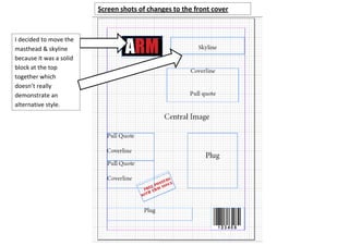
- 1. Screen shots of changes to the front cover I decided to move the masthead & skyline because it was a solid block at the top together which doesn’t really demonstrate an alternative style.
- 2. I decided to make the header longer so that it didn’t take up as much room if it went down also the colours help the words stand out. I moved the plug down and the barcode smaller, in regards to moving the plug I did it because I wanted to make room for the central image.
- 3. I switched round the pull quote and cover line. I thought it would look better I just need to insert a picture of apple products into the box
- 4. I have moved all this down to make space for the central image
- 5. Picture of apple products inserted. I’ve added another cover line instead of a plug
- 6. I moved the header because I didn’t realise that it would cover the faces of the people in the picture.
- 7. I rotated and increased the size of the main header Made it smaller to draw attention to Made it smaller to the bigger main draw attention to feature the bigger main feature
- 8. Changed the font so that there was only 2 font types on the front cover Impact & Stencil Std. also I had to change the size to fit them on the page.