Karnal Call Girls 8860008073 Dyal Singh Colony Call Girls Service in Karnal E...
Evaluation 2
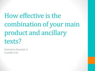
1. How effective is the
combination of your main
product and ancillary
texts?
Evaluation Question 2
Crystalle Cox
2. Brand Identity
Through my trailer and ancillary production piece (a film poster and
magazine cover), I wanted to create a recognisable brand identity
for my film. I did this by using the same font for the film title on all
my forms of marketing in order to create a brand and increase the
success of my media product. I decided that I should keep
consistency through house style and typography for the brand.
FILM POSTER
FILM MAGAZINE
TRAILER
I adapted the film title slightly for the
film magazine so it would stand out on
the background through adding a stroke
effect on PhotoShop. I used the same
font, BebasNeue from dafont.com,
which I used on both the trailer and film
poster. I think it is a simple yet
recognisable font that is eye-catching
towards the audience.
3. Ancillary Products
Firstly, I chose to research the codes and conventions of film posters
and magazines in order to ensure I had the right approach with
correct structure in how they should appear. For the film magazine I
considered that the target audience may be broader or slightly
different to the one my film has, and therefore would have to tailor
the product to suit this.
Roland Barthes Engima Theory
The way the tension is built up and the
audience is left guessing what happens next.
The audience is left asking themselves
what and who is the protagonist trying to
hide from? The engimais that the audience
want to find out who the antagonist is and
why they are doing what they are.
4. Film Poster
The purpose of a film poster is to raise awareness for a film as well
as give a small incline into the storyline adding curiosity, making
them want to see the film themselves. After researching the film
poster of Prom Night (HERE), I decided to use a similar layout, with
the main character being in the centre of the triangle of focus. I
also liked the minimalistic look it had, with little bold typography
across the page yet still being very successful in drawing audience
focus.
5. Film Poster
My main image is very effective, using
direct mode of address to pull the
audiences attention straight away,
already showing a character from the
film. The colour scheme is very simple
and consistent, being similar to the film
magazine which reinforces the brands
identity.
TE Perkins 1979 describes stereotypes as
complex and not a single person. The image I
have used presents the stereotype of how
women are perceived as the weaker gender
therefore easily targeted by the antagonist.
6. Film Magazine
My magazine ‘Film Flash’ is meant to be similar to the film magazine
‘Empire’, despite this magazine having a broader target audience to
my film(LINK HERE TO EMPIRE ANALYSIS). The genre of the film is
represented by the red typography which connotes danger as well
as the character holding the knife prop. ‘EXCLUSIVE’ implies this is a
special edition with information that is not known openly, therefore
the magazine may be purchased in order for the audience to
discover more information.
7. Cross Platform Marketing
I would use social networking sites, such
as Twitter and Facebook as a viral
marketing campaign for this film. I would
use this post the link to the trailer and its
posters. Henry Jenkins is a theorist who
states that individuals combine
numerous different media sources with
convergence, which is the ‘flow of
content across multiple media platforms’.
My audience can access information
about the films release and interviews
with the stars through these forms of
media.
LINK TO ‘YOU CAN’T HIDE’ TWITTER PAGE – HERE
8. Overall I think that I have successfully created a brand for my film
‘You Can’t Hide’, through my typography and the colour scheme I
have used.
I think that the genre is clear from my poster, magazine and trailer.
The protagonists are introduced to give the audience a clear insight
into the film. The clear flow of standardisation of the typography
and colour scheme link each of my production pieces together. My
trailer shows the codes and conventions of horror which include
fast-paced editing and eeiremusic (LINK HERE TO CONVENTIONS), which
adds to the package. I think that this consistency ensures the
success of my film, supported by social media marketing to gain
access to a wider audience. My poster and magazine cover would
not market my film alone, however, would be successful in
supporting marketing.