

Recomendados
Recomendados
Más contenido relacionado
Más de Diane Loviglio
Más de Diane Loviglio (10)
Good & Bad User Experiences -Nov 2010
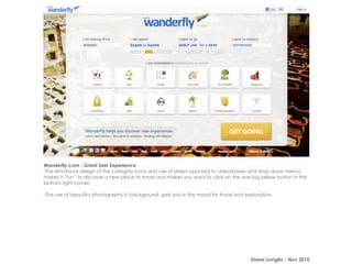
- 1. Wanderfly.com - Great User Experience -The emotional design of the category icons and use of sliders opposed to checkboxes and drop down menus, makes it “fun” to discover a new place to travel and makes you want to click on the one big yellow button in the bottom right corner. -The use of beautiful photography in background, gets you in the mood for travel and exploration. Diane Loviglio - Nov 2010
- 2. ModCloth - Great User Experience -When women shop for one of a kind items, such as retro clothing they are more likely to want to favorite it and share it with a friend and ModCloth makes it easy to take those social actions here. -The free shipping qualification and subtotal are still seen even though the user is in a dress detail view, which gives the user the appropriate amount of context. Diane Loviglio - Nov 2010
- 3. Tumblr.com - Great User Experience -Bloggers are given a choice of 7 types of posts to choose from, which should happen before they start their post, because each one has different attributes. The top navigation is clean and easy to choose from - just one click. -The dashboard includes the past posts of the blog, and important links such as the actual blog, drafts, followers, and scheduled posts. There is nothing else cluttering the page as the main purpose is to create another post. Diane Loviglio - Nov 2010
- 4. NextMuni.com - Less than Great User Experience -This site makes assumptions that the MUNI rider thinks about routes, directions and stops the same way that a MUNI employee would. Most users are only familiar with a few stops on a handful of routes. It’s be nice if you could save the routes you use most as tabs within this page. -The page layout is not optimized well. The arrival times are important, but equally important is a live map view, both of these should be omnipresent. Diane Loviglio - Nov 2010
- 5. Yelp.com - Less than Great User Experience -Yelp knows who my friends are, and since friend’s reviews hold more weight than stranger’s reviews, the logged-in homepage would be most useful if there was a newsfeed that included my friend’s actions such as recent reviews, photo uploads and newly opened restaurants in my city. -The ratio of text to photos is not balanced appropriately for a site that provides thousands of restaurant reviews. Diane Loviglio - Nov 2010
- 6. Honeyfund.com - Less than Great User Experience -The navigation is less than obvious on this site. There is no “Create your Registry” button in the top half of the screen. The buttons that pop up out you are the “ADD” buttons and they are part of a screenshot, which means they aren’t clickable and yet they look like the main action on the page. -The ads running across top of the page actually look like they are the main navigation for the site, which are again misleading. The testimonial on the right side of the page is sandwiched in between two ads, which makes it look like an ad in itself. Diane Loviglio - Nov 2010