
Recomendados
Más contenido relacionado
Último
Último (20)
Destacado
Destacado (20)
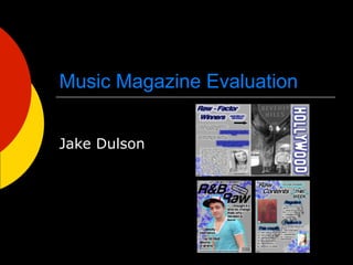
Music Magazine Evaluation
- 1. Music Magazine Evaluation Jake Dulson
- 2. In what way does your media product use, develop or challenge forms and conventions of real media products? My front cover uses very typical conventions if you compare it to the professional magazine on the right. Cropping out both the people band making them centre of the page. This draws the focus towards the celebrity and not the music magazine name. another convention used is to have the picture overlapping the magazine name this also makes the attention set on the person at the centre of the page. This also widens the target audience because a lot more people would be attracted to the celebrity rather than the music magazine names. Audiences only by a magazine for its name if it is bought regularly and often this isn’t the case. If a person sees an artist they like on a magazine they will instantly be attracted to it. In terms of the layout as you can see it is very conventional they are almost identical. Font wise it is very basic but bold, I think this is conventional because a lot of magazine front covers do not use very detailed graphic fonts because they don’t like to take the focus away from the actual cover. They do however make them bold so the audience do notice them, this is because if the buyer likes the magazine they can buy the same magazine frequently. The colour scheme I think isn’t however conventional because I have researched a lot of magazines and none used the same colour scheme as my design. I think this is a good thing because when it is competing on shelves with other magazines colours help it to stand out more this will draw more of an audience although just because the colour scheme is different doesn’t mean everyone will like my design. Another thing that is unconventional is the detail in the background, I think this will make it unique and also help my design to stand out from all the other magazine designs. As you can see from the areas circled on my product you can see the similar conventions.
- 3. Contents The layout I have used on my contents page is unconventional. The reason I think this is because I have compared it to a lot of different music magazine contents pages and none were similar. I think it is good that it is unconventional as it separates my design from all other designs. This would give me an advantage as my magazine wouldn’t be the same as other designs making it unique. However the pictures I have used on my contents page are conventional if you notice the first picture with the two boys in it they are posing like you would see in a music magazine with that cocky like celebrity attitude. In the background I used the magazines name to make the page feel les basic this is also unconventional as most magazines use a kind of logo or keep the name quite small in a corner. The reason I did this is to keep the music magazines name kind of repeated throughout so that it sticks in the audiences mind. It’s a kind of strategy to keep the magazine name in the readers mind that way they do not forget about it and therefore remember the magazine name.
- 4. Double page spread My double page spread is conventional reasons for this are because of the layout. If you look at the professional magazine on the right it has a large picture for the reader to focus on, my magazine also uses this same effect. Another part of my magazine that is conventional is the way my title links to the picture on the other page a lot of magazines use this on double page spreads. One thing that is unconventional is the highlight behind the text. The reason i used this is to make the text not only look more interesting but to also make it easier to read when overlapping the background detail in the bottom left corner. Also the text used about both picture (“B.I.G and HOLLYWOOD”) is conventional in a lot of double page spreads.
- 5. How does your media product represent particular social groups? From my research and planning the genre i chose was R&B and be representing a younger target audience. Younger people/teenagers are less formal than older more mature people. Also in my design i wouldn’t be attracting a specific kind of sex because it would reduce my target audience. The way my magazine suggests about these particular social groups is through being informal and more modern also using unisex photos with young people in them because younger people are interested in younger celebrities etc. My media product represents different types of social groups. One type of social group it would represent is a modern more younger generation of any gender. The layout of my magazine is very informal using larger pictures and less text. An older generation being more mature would prefer more writing and a younger generation preferring more pictures. The colours I have used also represent a younger generation using a basic background colour but then bright bright colours to surround the text makes it more appealing to the younger generation. All the pictures I have used are young teenagers this I think makes the younger generation link to them feeling that the magazine represents younger people. Also the pictures contain girls and also boys therefore representing any sex. Another social group that my magazine would represent is people who like or are interested in R&B music. The reason for this is because my product is based entirely on R&B music. The name of my product uses the most representation through having R&B in it. Also i felt that the articles used are also important to the younger generation, my reason for this is because they can easily lose interest simply because it is a bad title etc.
- 6. What kind of media institution might distribute your media product and why? The kind of media institution that could distribute my product would be a music magazine publisher.There could be opportunities for a music magazine publisher to publish my magazine because that is what they do. I believe my product would attract buyers because i have specifically designed it for a strong audience in the music industry. Also i have included headlines and articles about celebrities gossip competitions etc to interest the younger generation which largely populate the audience that buy magazines. The pictures i have used would also appeal to the younger generation as they would be close to if not the same age as the audience buying my product. The pictures i used are of both sex’s so therefore appealing to both young boys and girls. The genre i have used also attracts a big chunk of the music magazine market and most number one’s in the charts in this modern day and age are R&B based songs, this will therefore appeal to the younger generation of today. Although there may be a problem with this industry being so large and popular a music magazine distributor might think that there isn’t a space for my genre of magazine in the market. I then took this idea and found this music magazine publisher on the internet. The music magazine publishers http://www.musicmags.net/ association (MMPA)
- 7. I have print screened the publishers website of magazines that they currently publish now and as you can see they cover a very wide range of the market. The majority of the genres of the magazine are hip-hop and mainly rock therefore i do think there is a gap in the market for my product. Also all of the magazines look very formal maybe for an older generation to my product so i think my product could be unique to any other. I think it is good to be unique in such a huge market as it will help my product stand out from the others. However all of these magazine look well professionally made compared to my product. Although they will have an advantage of having better quality photos and also better editing software to use. I think if i was to pitch my product i would keep the design the same but improve on it to make it look more professional to compete with all of the bigger names in the industry.
- 8. Who would be the audience for your media product? From my research and planning the genre i chose was R&B my reason for this was because i felt that R&B was very popular in music but not a lot of magazines covered that specific genre. You can instantly see what genre a magazine is from its front cover a lot of elements effect this but they are very basic for example: the colours used such as dark colours for a more gothic rock type magazine. Another element would be pictures, pictures of a rapper wearing a hooded jumper with baggy jeans instantly says to the viewer hip-hop/rap. Another could be the name or text used for example like my product R&B-RAW instantly addresses the reader that this magazines is about R&B music. My inspiration for my magazine mainly come from the magazine “vibe” the genre for this magazine was R&B/hip-hop. So i tried to use different elements from this magazine for my design, also vibe’s target audience was for people aged around 15-21 therefore i thought my target audience would be the younger generation around the same age. I also chose my name of my magazine for the specific audience which was people that listened to R&B music so included R&B in the actual name of my product. From this i believe that a niche target audience would be attracted to my product. From all the elements on my magazine such as genre, name, articles, pictures, and colours used i think it would attract people that listen or are interested in R&B and of any sex due to having both types of sex in my pictures. Also using an informal look with a small amount of text attracts a younger generation of people to my product.
- 9. How did you attract/address your audience? From my product i believe that my magazines audience would be the teenagers of any sex who listen to or like R&B music. Once i had chosen my genre i researched different magazines with the same genre and looked at the different elements to see how they attracted there target audience. The main elements i believe that attracts/addresses an audience is name, articles/text, pictures, colours, and sometimes fonts. The name of my magazine was the first thing that would attract my audience through being called R&B RAW it instantly makes the reader assume that my magazine is about R&B music therefore attracting people that like R&B music. Articles i used such as “Top 50 R&B albums of all time” and “B.E.P group split” talking about famous bands etc using celebrity interviews also to attract my target audience. The reason i think it attracts them is because if they see an article about there favourite band etc they will be attracted towards purchasing my product almost instantly. The colours i used was mainly to make my product more unique top others when competing with other magazines as i think it will make it stand out and draw attention to my target audiences eye. The pictures i used i felt was very important to use both sex’s and also top make sure that the people in the photos were not dressed badly or in a different what younger people call “style” to R&B. Also when creating my double page spread i used language that addressed the reader and made them feel as if they had an impact on the magazine. i feel this is important as it engages with the reader that the magazine is especially unique and made for them. This keeps people not just buying one issue they will come back for more and more.
- 10. What have you learnt about technologies from the process of constructing this product? When constructing my product i used many different technologies to accomplish different things. Blogger was one of the main types of technologies i used to make a portfolio of planning researching and designing my product. Blogger was useful because this way it meant that my work could be completed on any computer with internet access and also meant that if i needed to look at my research to help me while designing my product it was easy to get hold of my work. It also meant that my work couldn’t get lost like it usually does keeping it in a traditional folder etc. Slideshare was also another technology i used on blogger. This was useful because i learnt how to add power point presentations to my blog, the reason this was useful was because a power point presentation would take up less room on my blog but contain the same amount of information. Other technologies i have used is the types of hardware i used while creating my portfolio and also my product. One type of hardware i used was a Digital camera. I used digital camera to take the photos for my magazine. It was important that i used a good quality digital camera luckily the one i used was 14 megapixel which produced a good picture quality. I learnt that using a digital camera meant that i could control certain elements in the photo such as how much light there was and the mise-en-scene this proved to my advantage as you can see from my double page spread. Also another type of hardware i used was was a memory stick i didn’t think that it would be of much use but i later learnt this was one of the most important pieces of technology i would use. My reasons for this was because it meant that i could store my work on the memory stick and complete unfinished work at home, or on a different computer. This technology gave me a big advantage when designing my product as it give me more time to spend on it improving and giving my final product a better more professional look. Da-font is also another technology I used. Through this technology I was able to learn how to download and install a font of my choice. This was useful to me when designing my final products because the basic fonts that are available were very limited but using this software gave me a wider variety and enabled me to give a more professional look to my final product.
- 11. The main technology i used was a software called Adobe fireworks. With this technology not only could you edit photos but also create designs etc. This was the software i used to create my final products and probably the most important technology i used. When using fireworks I used many different tools to give my final product a look that I thought was good and looked professional. Although I didn’t know how to use this technology very well but after designing my prelims and mock-ups I come to grips with the technology and was able to use it to my advantage. One of the main tools I used was the cropping tool. When cropping my image I used mainly the magic wand tool and also the lasso tool. The magic wand tool automatically edits a colour from the background where as the lasso tool I could use the mouse to draw around the outline I wanted then crop it out to delete the background. The lasso tool proved more useful when having photos with busy like backgrounds and the magic wand tool when a picture had a basic background. Before lasso tool After lasso tool Before magic wand tool After magic wand tool
- 12. Another effect I used was the glow tool this proved very important as it made my text a lot easier to read over a background with a lot of detail. For example if you look at my double page spread all the texts have glow behind them. As you can see without the glow it would be a lot more difficult to read with all the detail in the background. Glow around the picture also helped to draw the viewer towards my pictures and make them look more interesting. Another tool I used was the grey scale two I thought this give the picture a more professional authentic look. The grey scale tool basically turned the picture from coloured to an old like photo with just black and white. The arrange tool proved to be very important as it allowed me to chose what could be show on top of a photo etc. It basically put different elements in layers that I wanted them to be in which gave my product a better more professional look. As you can see from the photo there are 3 layers The text being at the front followed by the cropped photo followed by the detail on the background One of the most basic tools I used was the paint brush tool this allowed me to create detail in the background which I later learnt that this was important to have on a magazine to attract the buyers attention. As you can see I feel that since starting my media portfolio I have learnt a great deal about technology and the effects it can give to a product by making it look more professional and better made.
- 13. Looking back at your preliminary task’ what do you feel you have learnt in the progression from it to the full product? As you can see from the past slide there has been a vast improvement from my preliminary task to my final product. When creating my prelim i didn’t know much about the technology i was going to use such as fireworks etc. For my prelim i just used a basic photos throughout the cover without cropping or anything. i also used two text boxes and that was it. Once i became more accustomed to the editing software i then became more skilled using glows around text and images also cropping pictures and a lot more. Also giving my magazine an authentic look. Looking at my prelim it doesn’t look like a magazine it looks more like a poster. From my planning and research i grew more skilled at knowing what a magazine should look like. The major element of a magazine would be the layout to have the picture as the centre and headlines around it showing the audience tasters of whats inside my product. As you can see on my prelim the picture isn’t at the centre of attention neither at the centre of the page basically making it look very different to a magazine cover. Conventions are things you would typically find on a product in this case a music magazine so you would expect certain elements such as having barcodes, the price and date all basic essentials of a magazine cover but my prelim contains none of these typical conventions which are also very basic. I think from this you can see since my research i have learnt a lot more improving as you can see on my final design it contains all conventions you would expect on a well made product. Also on my prelim there that targets and audience neither attracts them. On my product there is constant tasters trying to get people to pick up my magazine and read such as “celebrity interviews” and more. Also using exclusive to try and make the reader think that the magazine isn’t just a basic one it is something they may not have seen before and more. I personally think i already knew how to target/attract my target audience when designing the prelim but rushed it to quickly, as a result i spent more time on my final product. I do believe that the longer i spent on my product the better it would look and still think now if i spent more time on my product i could make it look even better. Communication on my prelims was minimal, i didn’t think that communication played such a big part in a magazine. Although from my research i later learnt that communication plays a big part in my product and i thick you can see that from looking at all of my final designs as there is a lot more text on all of my products engaging with the reader making them feel as if the magazine was made for them and addressed to them. Overall i think based on going from my prelims to my final product i think it shows i have learnt and improved a great deal since designing my first prelim product to my final finished product.
- 14. Front cover prelim to final product.
- 15. Contents prelim to final product.