
Recomendados
Más contenido relacionado
La actualidad más candente
La actualidad más candente (19)
Similar a Digipak Comparison
Similar a Digipak Comparison (20)
Más de emilybarrett16
Último
Último (20)
Digipak Comparison
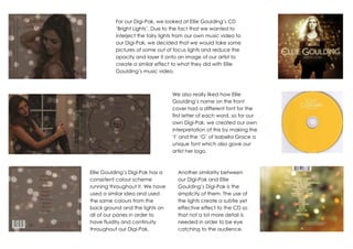
- 1. For our Digi-Pak, we looked at Ellie Goulding’s CD ‘Bright Lights’. Due to the fact that we wanted to interject the fairy lights from our own music video to our Digi-Pak, we decided that we would take some pictures of some out of focus lights and reduce the opacity and layer it onto an image of our artist to create a similar effect to what they did with Ellie Goulding’s music video. We also really liked how Ellie Goulding’s name on the front cover had a different font for the first letter of each word, so for our own Digi-Pak, we created our own interpretation of this by making the ‘I’ and the ‘G’ of Isabella Grace a unique font which also gave our artist her logo. Ellie Goulding’s Digi-Pak has a consistent colour scheme running throughout it. We have used a similar idea and used the same colours from the back ground and the lights on all of our panes in order to have fluidity and continuity throughout our Digi-Pak. Another similarity between our Digi-Pak and Ellie Goulding’s Digi-Pak is the simplicity of them. The use of the lights create a subtle yet effective effect to the CD so that not a lot more detail is needed in order to be eye catching to the audience.