
Recommended
More Related Content
What's hot
What's hot (19)
Viewers also liked
Viewers also liked (14)
Similar to OCR Media Studies - AS Level Unit G321: Foundation Portfolio in Media
Similar to OCR Media Studies - AS Level Unit G321: Foundation Portfolio in Media (20)
More from emilyvaughan2000
More from emilyvaughan2000 (20)
Recently uploaded
Recently uploaded (20)
OCR Media Studies - AS Level Unit G321: Foundation Portfolio in Media
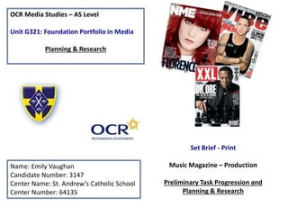
- 1. OCR Media Studies – AS Level Unit G321: Foundation Portfolio in Media Planning & Research Name: Emily Vaughan Candidate Number: 3147 Center Name: St. Andrew’s Catholic School Center Number: 64135 Set Brief - Print Music Magazine – Production Preliminary Task Progression and Planning & Research
- 2. Section 1) – Preliminary Task
- 3. Preliminary Task Progression– Evidence Front Cover Step-by-step
- 4. In this work I had to create a transparent template with a header at the top with the St. Andrews logo and a blue top with yellow underneath as this fits my colour scheme In my magazine and I created a stroke by selecting blending options then stroke which creates a boarder between the blue and yellow ad I created one around the St. Andrews logo which means it stands out more.
- 5. To create this I had to select the gradient tool on Photoshop and create a new layer which had the background gradient on it then I h to select the blue colour but not make it too dark so you can still see text on the page so it starts a bit lighter then the top this makes the page more appealing as it has more colour and looks much more interesting.
- 6. To create this image I had to create a new layer saying main image and the I dragged I this image of a teacher and I used the quick selection tool to select the image then I press refine edge ad I selected overlay this meant it was much easier to edit as the background hen re so it was easier for me to edit the picture then I used the brush tool and by using black I could reveal the image and using white I concealed the image so I only selected that part. After this I inverted the image so that it selected the background a delete it.
- 7. To create this text I created a new layer and put it under the main image so that the main image stood out. I created the text big so that it could be seen more clearly and I made sure it was white so it stands out so if you were in a shop you would see the comparison of white to the blue which catches peoples eyes more then colours like black.
- 8. In this step I have started to create the barcode which means in shops they can scan the magazine to show it has gone. In order to do this I created a shape are selected white then I turned the shape around so it was portrait and selected the blending options stroke and choose a small size so there was a small outline.
- 9. To complete the next part of the barcode I found a good barcode which was longer and pressed place then I found the barcode in my folders and it placed the image on the document so I turned it around so it was portrait and moved it into the shape in order to change the size I pressed control then I held down shift down and made the barcode smaller by pressing shift it meant the image still had good quality.
- 10. In this part I added text to the barcode and made it bold so it stood out more and wrote “Issue 1 November 2016” I put this on the bottom of the barcode so people know what issue it is if they have lots of the magazine I turned this so it was portrait so it fitted in my barcode. I also added a line either side of my barcode which makes it look better quality as it has good finish and looks more professional.
- 11. To finish off the barcode I added social media links this is good for a school magazine as teenagers are increasingly getting more social media so I put on the twitter, Instagram and Facebook logos. This means that people con connect with the school and see any thing they could be involved in. Furthermore, I added the name of the social media so people know where to find the school and the email in case anyone wants to get in contact with people in the school.
- 12. In this I added the logo of a bus company so I can write some cover lines of thigs which the magazine is going to cover this is good as it means that people know which bus company the magazine is talking about. To do this I pressed place and resized the image.
- 13. In this image I added a shape which was a circle and selected it to be yellow using the paint bucket tool and I created this to the size I wanted and pressed blending options stroke and set a higher size so it outlined the shape much more as it was going to be a puff promotion.
- 14. In this step I added the word “WIN” in capitals as it stands out more as it is my puff promotion so people can see it more clearly which might make them buy the magazine as it has a competition. I created a stroke around the word in white which makes it stand out more as the text is blue which means peoples eyes are drawn to it even more.
- 15. In this I added text to the puff promotion saying “6 MONTH SPOTIFY ACCOUNT” this is good as lots of teenagers use Spotify to listen to music so it’s a good prize I put this inside the circle and made it dark blue so it stood out against the yellow and I added the Spotify logo so that people can see the brand more so they want to carry on reading the magazine.
- 16. In this slide I added the main title which says “A* grade workshop with Mr crafts!” this is good as it is in big writing and it says “A*” which draws students in as they want to have good grades so they could go to the workshop and as it doesn’t specify what its for which means people read the magazine for further information.
- 17. In this page I have added the strapline this promotes the magazine as it demonstrates that it’s a school magazine as it motivates the students so they do well on their work. I used “engage together, strive for success” this connotes that students and teachers should work together and strive for the best and to become the best people they can be by being kind and thinking of others.
- 18. In this I added sub stories which appealed to students as it has relatable things for sixth formers. For example “ Bus prices increase by double!” this illustrates why the prices have increased which people will want to know about. Other things which interest people is the fashion tips for sixth formers and trips like safe drive stay alive. Finally, I used a rhetorical question which is “who is student of the month?” this makes readers want to get the magazine as it is a question so people are not sure who is the student of the month.
- 19. I have added a rectangle on the magazine with an stroke in yellow around the edge so it matches the rest of the magazine and the shape is dark blue so it matches the logo and banner as the background is white at the bottom so it stands out more.
- 20. I have added writing in the rectangle which says “A grade tips for GCSE A- level success” this stands out as the “A” has a bigger text size so it stands out more as it is the most important part. This matches the magazine as it has the same colour scheme so it don’t reinvent the wheel.
- 21. I added photos on this by pressing file place and selecting the images and then I used the magic wand tool to get rid of the background and I changed the size by pressing command T so I could make them smaller then I moved them so they were near their stories.
- 22. In order to complete the magazine I changed the font type as it didn’t stand out much and I made the text bold so it stood out even more. Then I spread some of the letters out so it want so stuck together and it filled the magazine so it looks more striking . Furthermore, I made the star on the A yellow so it stood out more as the rest of the text is white. Finally, I added a stroke to some of the text so it stood out more.
- 23. Preliminary Task Progression– Evidence Contents Page Step-by-step
- 24. To create my contents page I added a gradient o my background and I added the header to the page so it matches with the front cover this means they can look similar. I also have added a bleed so when I add text and shapes it is equal.
- 25. I took my main image for my contents page and I pressed file place and then I pressed command T then I resized the image. Also, I added text and added a stroke around the outside in blue and the text was white.
- 26. In this I used the bleed to make sure the lines were straight and organized then I added shapes in yellow to organize the page more into sections.
- 27. I added a curved shape at the top connected to the header in yellow so it matched. Also, I added “WIN 6 MONTH SPOTIFY ACCOUNT” in bold letters so it stood out and in capitals then I added a white stroke around the blue letter so it matched my colour scheme and I placed the spofify logo so people noticed its brand. This is a good puff promotion as lots of students use spotify.
- 28. I added the issue not by creating a white circle in shapes and then adding dark blue letters which say “issue 001” this is good as it “informs and educates”(Katz) so the reader knows what issue it is so they have the most up- to-date issue. I also added white lines to make it more athletically pleasing.
- 29. I added the editorial image here and the text to tell you a bit about the editor and what they are doing and then I added white text with the social media and email link with space to add the name of the magazine.
- 30. I have added The title “FEATURES” on the contents page which is white so it stands out compared to the blue background and it has a dark blue stroke which means it can stand out more. I have added the social media logos which added brand identity meaning that students are drawn to this as they use it quite a lot.
- 31. I have added the page numbers here where I will put sublines of several pages and descriptions of what has happened in the magazine. To create this I added a dark blue shape to match the colour scheme and I added a white number on top so its very clear. At the bottom right had side there is also the page number so the magazines organised.
- 32. I added a photo taken of the 668 bus which is the school bus as it relates to the stories in my magazine and there is a picture of the front of the school with the chapel showing it’s a Catholic School and there are sixth formers walking into sixth form.
- 33. I added the Sublines to finish the features with the features on the front of my magazine the subline is good as it means students can get a short description of each page so they know what is happening and which pages they want to see the most. Furthermore I added the signature to the editorial which makes it more personal.
- 34. I added the name of the magazine in the gaps which has a stoke so it matches my magazine name so its consistent throughout and it makes it more interesting and detailed.
- 35. Lastly, I have added the school website to the bottom right hand side so people know where to find the school if they need information even though its in the editorial it means that is more clear if students are looking for it.
- 36. Section 2) – Log Book
- 37. This connotes that rock is the biggest genre of music as 34.8% of the music market is taken over by it with the next lowest being R and B which is only 17.5% of the market share this demonstrated that when I choose my own magazine I should choose a rock magazine as it should be the most popular magazine type. During 2013 Rock was the most popular genre of magazine again this highlights that there is a trend demonstrating that rock is always popular which emphasis that I should do a rock magazine like Kerrang! as it should be popular as shown in the statistics throughout the whole page. This pie chart is from 2009 so it is 7 years old but it demonstrates that the trend for rock has increased as in 2009 it was 25.% and it has increased in 2013 to 33.8% which illustrates that the demand for rock in market share is increasing so it is the most successful out of all the genres. This further demonstrates how rock is always the most popular genre of music so the magazine being rock will ensure it has the most market share as the next lowest is 8% less then the next lowest genre of music. Music Magazine – Genre research
- 38. References • Graph 1 -https://www.statista.com/chart/1783/album- sales-in-the-us-by-genre/ • Pie Chart 2: http://www.digitalmusicnews.com/2016/04/07/most- popular-music-genres-america/ • Chart 3: https://musicandcopyright.wordpress.com/2010/08/11 /pop-is-still-king-of-the-world’s-music-genres/ • Chart 4: https://www.statista.com/statistics/188910/us-music- album-sales-by-genre-2010/
- 39. This depicts the amount of people who are buying Kerrang! magazine which is illustrated in ages and parts of the county so we know how many people are buying the magazine this means I know how to appeal to my target audience at its adults 15+ with 673 thousand and more men with 362 thousand compared to the 292 thousand women who have the magazine. Also the magazine should appeal to ABC1 adults with 369 thousand people buying the magazine so it should appeal to them. This demonstrates Kerrang! is one of the most popular magazines as it was top on a list of magazines which shows rock is very popular on the list of magazines. This statement emphasis how important Kerrang! is in the music industry being one of the biggest rock magazines In the Uk.http://www.pressgazette.co.uk/uk-magazine-combined-printdigital-sales- figures-first-half-2014-complete-breakdown/ https://www.statista.com/statistics/413642/kerrang-monthly-reach-uk/
- 40. Established Magazine for my Research Pull Quote: In comic style writing in speech bubbles with a black outline around them so the text stands out more and its in red writing which demonstrates something bad has happened . Main image: The picture is in the middle and has hands over their mouth so it draws the reader in because they can see he has done something bad and as he has his mouth open which means it stands out from other magazines. Also because its Robbie Williams it adds “star appeal” (Richard Dyer) as he is the only one on the front cover it means more people are attracted as the image stands out. Main Headline : Different text styles and colours make the magazine stand out and emphasis that something bad has happened. Cover lines: Down the right hand side some text is bigger and some is smaller to show the selling points of the magazine and names of celebrities in bold dark colours so people know what the most important things in the magazine are. The Masthead and strapline : is grey with black, red and white writing which makes you look at the white writing saying “All the backstage drama” which makes you want to read on to see if there is drama and gossip . Main image: The red on the t-shirt matches the logo and some of the writing so it stands out from other magazines. Which connotes something bad has happened as red symbolises death.
- 41. Target Audience – Katz, Maslow, Hartley and/or socio-economic needs The target audience of the Q magazine is the older generation from middle aged about 30-40 years old. The target audience is usually targeted to men of middle- class and upper class such as A and B of he socio-economic needs which is higher management and middle management. Furthermore, according to Maslow's Hierarchy of Needs they are care givers as the consumers are emotionally engaged and subjective to the subject matter and in Katz’ Uses and Gratifications theory the reader can have personal identification and a personal relationship with the writer because of the issues discussed and the subject matter so they could have gone through the same struggles so they can immerse them self's with the text. What is the USP of this magazine? From the research completed into this media product, I think the USP is personal stories with celebrities who have all sorts of things in life with both good and bad situations and pictures of the celebrities throughout there lives as they have detailed interviews which is shown on the front cover through the selling lines and through the main image as it shows Robbie is surprised so it makes you wonder what he has done through the star appeal (Richard Dyer) of the magazine.
- 42. Publisher Research Q’s publisher is Bauer they are the number one selling magazine in the United Kingdom along with one of the most successful media company's in the world . More then 600 magazines, over 400 digital products and 100 radio and TV stations reach millions of people around the globe. The company have a huge portfolio with printing company's , postal services , fields of distribution , marketing and media sales. (from Bauer media website) The turnover is 2 billion euros . Moreover, the slogan is “We think popular “ is used to motivate workers for its 11,000 employees in its 20 separate countries this connotes that Bauer strive for the best in becoming the biggest publisher in many countries and is demonstrates their aim is to sell the most magazines. Bauer magazines publish more then 570 magazines around 20 different countries some of Bauer's top magazines are in touch, closer, life and style and Q magazine. The magazine is sold in retail outlets in shops such as WH-Smiths, supermarkets and newsagents but one of the biggest places to get magazines is online subscriptions which are sent to your house. But one trend which has been going up is reading magazines on smartphones and tablets as its much cheaper and quicker then having a real life copy of the magazine this has meant that thee need for paper copies has gone down (shown in the diagram below) Reference
- 43. Main Image: There is a picture of a person in the middle which is big appeals to the audience as its centred which denotes you can see who the main focus is in the article which draws peoples attention then there magazines as it just has one big picture. Masthead: The logo is white compared to the black background as they are opposite colours connotes that they want the logo stand out more so you know what magazine is . Anchorage text/Main headline: There is a rhetorical question so it makes you want to read on in the article to see if he is the god of rock. This is also in a different colour to the name of the band to draw in attention. Puffs: The five posters is in different colours again to demonstrate how many different things there are in the magazine with 5 small pictures down the left hand side to emphasis the magazine is packed full of different rock stars. Cover lines: The plus near the bottom is white with red coming out of I to draw you to it to connote how much there is in the magazine. Cover lines: The writing at the right down the edge is separated in to 4 to emphasis the amount of material the magazine covers which is a lot and all the sentences have an exclamation mark or a question mark to make you want to carry on reading. Conventions of a Music Magazine
- 44. Target Audience The target audience of the magazine according too Hartley's 7 subjectives is young adults about 17-24 and the gender is both females and males but mostly males who enjoy rock music the are usually middle class and British the sort of person is rocky and goth like most of the audience is British/Americans. This is because they magazine is too expensive for students then students cant afford it. The consumers read this because of diversion like competitions which is part of Katz uses and gratifications theory. People who enjoy bands are the target audience as they want to see when concerts are on and the posters in the magazines they can relate to the characters music and the magazine is there to tell your more about their favorite singers and relate to there situation as according to Maslow's Hierarchy of needs the consumers of Kerrang! is explores influenced by social change. Also ABC1 from socio-economic needs like doctors, teachers, junior managers because of the magazine being more expensive so only older people can afford it rather then teenagers. What is the USP of this magazine? The unique selling point of the magazine is the cover lines which include posters to put in your house/ wall which is good for their target audience as its teenagers who enjoy posters and decorating there walls as they are just growing up and have idols so they know they can strive for things when they are older and it makes them want to pursue there dreams. The posters are famous rock stars so this makes tem want to purchase the magazine as it shows pictures on the front to make people want to purchase it more. Further more the magazines include competitions which is a type of puff promotion as people purchase the magazine to win tickets to gigs.
- 45. Publisher research The publisher of Kerrang! magazine is Bauer who are also the publishers of another 570 magazines “ foundered thirty-four years ago, an event that was seismic as events go within the publishing industry, let alone music, today we’re a magazine.” Bauer media group also have things such as a TV channel and a TV show. Bauer media group say “ and we’re a tour” the most popular music magazine is Kerrang! this is mainly because they have made a radio station which means the magazine has a very large subscription and following. The magazine can be purchased in newsagents and WH-smiths but it can also be brought from subscriptions online. The slogan is “we think popular” which demonstrates how hard Bauer work to be the biggest they can be which is why the Bauer media group have different parts like TV ,radio and magazines. This denotes hat Kerrang! magazine should get much bigger as Bauer aim for to be big and become very popular. The target audience is around 17-24 years old and the socio-economic needs are ABC1 which is higher management, middle management and the sort of people who work in an office and in the Maslow's hierarchy of need they are explorers as they are influenced by social change. Also the target audience are very dedicated to band members and concerts so Bauer putting competitions for gigs means the magazine is more popular because of fans being so dedicated. Bauer was foundered in 1875 and is now in the fifth generation of ownership and it is in 19 countries with 11,000 employees and the company reach 25 million consumers they are Britons biggest publisher with starting the radio station in 1990 they claim their aim is “To connect audiences with excellent content through our broad multi-touchpoint brand platforms. Wherever, whenever and however they want” this means people are treated fairly no matter their sexuality, gender, marital status, age, race, colour, nationality, ethnic origin, religion, disability. This demonstrates how hard Bauer work to make sure customers needs are met.
Editor's Notes
- You need to add name and candidate number AND center number
- Fantastic – you just need to add in conventions e.g. Masthead, Strapline, Cover lines, barcode. The word exclusive connotes…. What do the colours connote?
- ADD in Katz, Maslow, Hartley, Socio-economic needs – we will go through these in class. Sentence starter – according to Hartley the target audience……. USP - Refer to specific conventions e.g. Masthead/Coverlines/Strapline – Is it ‘star appeal’ (Richard Dyer)?
- Fantastic – add in conventions Add in words such as connotes and denotes – The colour black connotes..... The colour red connotes….. The colour yellow connotes…… Take the Q logo out
- USP – refer to specific conventions – e.g. Masthead/Coverlines ADD in Katz, Maslow, Hartley, Socio-economic needs – we will go through these in class. Sentence starter – according to Hartley the target audience…….
- Do this for Kerrang! – Research their publisher like you did for Q.