
Recomendados
Más contenido relacionado
La actualidad más candente
La actualidad más candente (18)
Destacado
Similar a Evaluation
Similar a Evaluation (20)
Último
Último (20)
Evaluation
- 1. In what ways does your product use, develop and challenge forms and conventions of real media products?
- 2. What are the forms and conventions of a children’s magazine? When researching for my coursework, I analysed the covers of three children’s magazines. In doing this, I was able to find out the forms on conventions of the products, which helped me when I was constructing my own magazine cover. The three covers I analysed were; The Jacqueline Wilson Magazine, Balamory Magazine, and Hannah Montana. Here are the analysis’ of the front covers that I have completed: Please Click Here Magazine title at Variety of colours – Price, issue number the top of the appealing to young and barcode in a magazine. children corner. Main image is of a Key forms and main character(s) in Variety of fun and conventions of a the programme cool fonts used. children’s magazine A selection of smaller images A free gift or offer, related to the cover Catchy cover lines again appealing to lines. young children.
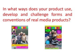
- 3. How are these conventions used in my magazine cover? Magazine name at the top Free Gift, which is a of the magazine in bright big factor in colours to appeal to target enticing children. audience. Variety of bright, Selection of fun fonts that and vibrant colours are appealing and will in unisex colours, entice young children used to draw in both genders. Main image of the main characters in the programme, Smaller images so that children recognise relating to the them, and this will draw them cover line in. Barcode, price and Catchy cover lines that issue date in corner relate to the characters of magazine and are fun, therefore appealing to young children.
- 4. What are the forms and conventions of children’s DVD covers? When researching for my coursework, I analysed the covers of three children’s DVD’s. In doing this, I was able to find out the forms on conventions of the products, which helped me when I was constructing my own DVD cover. The three covers I analysed were; Bernard’s Watch, Balamory and Lizzie McGuire. Here are the analysis’ of the three DVD covers: Please Click Here Simple layout Central Focus Series Information DVD title at the top of Key forms and Main image of the the cover conventions of a characters children’s DVD cover Clear and organised layout DVD and age Variety of font certification logo colours and sizes
- 5. How are these conventions used in my DVD cover? Title at the top of the DVD cover, so it is immediately recognised by children Clear and simple layout, which is conventional for a DVD Fun and vibrant cover. colours used to appeal to young children and make the Main image of the cover stand out. characters so that children recognise them, and are drawn in. Smaller images of the cast to make the DVD cover more interesting Series information so and appealing. parents and children know which episodes the DVD includes. DVD logo and age Variety of font types certification. and sizes to make the cover interesting and appealing
- 6. How have the forms and conventions been used in my ancillary tasks? In my ancillary tasks, I tried to follow as many forms and conventions as possible. The reason I did this, was so that my products were appealing to my target audience. When comparing my final products to existing magazines and DVD’s, there are many clear similarities in terms of conventions, for example the main focus of both my magazine and DVD covers is the image across the front, these are both of the main characters, this ensures that the audience will instantly see, and recognise them, drawing them into the product . The images show the cast happy and smiling, insinuating that the programme is fun and friendly. My magazine follows the forms and conventions, as the cover lines are conveniently located around the main image, and they are written in fun and colourful fonts – this is something that will attract the target audience and be appealing to them. I also used a variety of bubbles and shapes, as they break up the cover lines more, and make the overall look of the magazine more interesting and fun. Both my magazine and DVD cover feature a logo – the programme title, this is so that all the products relate to each other, and the programme can become a recognised brand. These are placed at the top of the magazine and DVD covers, so that it is the first item visible along the route of the eye, and it’s bold and stands out. The magazine cover lines are written in a tone suitable for young children, and are all short and to the point so as not to lose the readers interest. I have included a barcode, issue date and price on the magazine cover to make the overall design look professional. The DVD cover has an age certification logo, along with the DVD logo and series information, all following the conventions of typical children’s DVD covers. The DVD cover has also been kept simple, following the conventions, with the main image and mast head being the focal point.
- 7. What are the forms and conventions of a children’s TV opening sequence? When researching for my coursework, I analysed three opening sequences to children’s TV programmes. In doing this, I was able to find out the forms on conventions of the products, which helped me when I was constructing my own opening sequence. The three opening sequences I analysed were; Bernard’s Watch, Balamory and Lizzie McGuire Here are the analysis’ of the three DVD covers: Please Click Here Editing such as Very little camera movement cuts, fading's Fast paced editing and wipes Close up shot of Key forms and each individual Theme tune that is conventions of a character upbeat and catchy – children’s opening sometimes with lyrics. sequence Transition between shots Each character introduced Bright and vibrant colours for the individually logo and any writing in the opening sequence
- 8. Conventions in my final product Again, in the opening sequence to ‘Run Around’ I follow the forms and conventions , this helps ensure that my product will be successful and appealing to my target market. The most notable convention that my product follows is that of the stereotypes. You often find in children’s programmes that each character fits a stereotype, this is so that the younger audience can relate to the characters and gain a better understanding of the programme. In ‘Run Around’ we’ve chosen to include; sporty, girly, geeky and funny as the four stereotypes. We thought carefully about how each character was introduced in order for the audience to understand and recognise the personality trait. The sporty character is dressed in typical sportswear and is playing with a football, the girly character is shown to be applying makeup and posing in a mirror, the geeky character is wearing nerd glasses and studying and the funny character is shown to be trying to fit into a small box and is laughing As you can see from the screen shots to the left this it is conventional to use vibrant titles, and in our opening sequence, the programme title ‘Run Around’ is displayed in a rainbow font at the end, this will appeal to the target audience as it’s fun and vibrant, and it also matches up with the rainbow effect that I used on my magazine and DVD cover. The combination of colourful and fun fonts throughout the opening sequence will keep the audience members attention, something which is key if you want the product to be successful. When we introduced each character, we displayed their name on the screen next to them, this is so that the target audience knew who each character was and would remember them. We chose suitable colouring for the names, such as the girly characters name being written in pink to show femininity, again helping the audience identify with the character. The fonts we used were fun and childish, but also clear to read – which is suitable for the young audience. This convention is used in programmes such as Sadie J, which is shown to the left. Another convention my product followed, was the limited camera movement, this is important in an opening sequence to children’s programmes as too much camera movement can confuse young audience members, to ensure the sequence wasn’t ‘boring’ we included panning and zooming, simple camera movements that make the overall opening sequence more exciting to view. The opening and closing shots of the opening sequence show the cast members having fun and messing about, this is done to entice the audience in, as they will recognise that the characters are fun and enjoying themselves, and this will make them want to continue watching the programme. Another convention that my opening sequence follows are the transitions between each slide and each character, I used a chequered transition between each character, this ensured the sequence flowed and each character could be distinguished, then between shots of the same character I used a fade, this is so the shots fitted together smoothly. Finally, the audio to my opening sequence is fun, upbeat and catchy. This is so that the theme tune will be remembered by people that hear it, and also it reflects the mood of the programme and entices you audience members in.
- 9. In what ways does your media product use, develop and challenge forms and conventions of real media products? When producing my three products; a magazine cover, DVD cover and an opening sequence for ‘Run Around’ I tried to include as many forms and conventions of real media products as possible. This is to ensure that my products worked well as a whole, and were appealing to my target audience. All three of my products are fun and exciting, appealing to the target audience of young children, and grabbing their attention. I did challenge some conventions in the opening sequence, but I still feel it worked well and the product was successful. For example, the conventional way to film an opening sequence is with a still camera, however this wasn’t possible for some parts of ours, so we had to film by hand, which is shown by shaky hand movements in the final product. Also, we chose not to use a theme tune with lyrics, as we felt this would be too distracting for the target audience, and also it was incredibly difficult to find theme songs that were copyright free, that we could use for our opening sequence. Overall, I think that my products work well together as they all follow the main conventions, and compliment each other. The use of vibrant colours and fun fonts are appealing to the target audience and overall the designs and layouts are very eye-catching.