SlideShare una empresa de Scribd logo
1 de 3
Sell-Lines
                          May help encourage the reader to read further id they
                          aren't already interested in the main sell-line. Small text,
                          shows that it isn't as important as the main sell-line or the
                          mast head. Mix of bright colour (Red) and plain colour             Mast head
                          (White) stands out from its black background. Reader may           Big, Bold and in capitals
                          be encouraged to buy the magazine knowing the will get 7           which stands out to the
                          posters.                                                           reader of the magazine.
Main image
                                                                                             Throws the name of the
Gives more info about the
                                                                                             magazine at you when you
main sell-line, stands out to
                                                                                             look at it. Awesome but
the reader, partially covers
                                                                                             simple font which doesn’t
masthead showing its more
                                                                                             look overdone. Black text
important, explodes on the
                                                                                             stands out from the rest of
page. All of the band are
                                                                                             the text showing it is quite
wearing the same colour
                                                                                             important.
which brings the whole thing
together. It’s the biggest thing
                                                                                           Main Sell-Line
on the page and takes up
                                                                                           Bigger than mast
most of the space.
                                                                                           head, showing it’s the most
Sub-Heading                                                                                important thing on the
Gives extra information to the                                                             page, simply tells the
reader, tells them more about the                                                          audience what its about and
main sell-line. Bright yellow                                                              attracts fans of The Blackout.
colour stands out, makes the                                                               Simple font, doesn’t look to
reader look at it. Doesn’t give                                                            fancy or snazzy, still looks
away too much information about                                                            pretty awesome. White text
the main sell-line which makes        Essential Info                                       stands out, makes it the first
the reader want to read further.      Gives the issue number and the date so the           thing the reader looks at.
Covers the main image showing it      reader know which one they are buying Very
goes with the picture.                small text shows it’s the least important thing to
                                      the reader on the whole page.
Sell-Lines
                   Gives the reader more
                   reason to read. Doesn’t
                   stand out as much as
                   main sell-line.


                                                                           Mast Head
                                                                           Big and bold, explodes
                                                                           out of the page, metal
                                                                           texture and the magazine
Main Image                                                                 is called metal hammer.
Covers whole                                                               Also implies that it’s a
page, stands                                                               metal magazine.
out, attracts
the reader.
Gives extra
info for main
sell-line.

                                                                           Main Sell-line
                                                                           Big and red, stands
Sub-Heading                                                                out from the rest.
Stands out, red                                                            Tells the reader
background                                                                 what the main
makes it look                                                              story is, makes
brighter                                                                   them want to read
                                    Essential info is usually on plastic
compared to rest                                                           further.
                                    cover
of page.
Main Image          Mast-Head
Covers all of       Covered by
page, shows         main image,
its most            not as
important.          important as
                    the main
                    image.


Sub-Heading             Main Sell-Line
Stands out from         Covers main
rest on page, red       image, shows it
text stands out         goes with the
from white              image. Yellow
background              text makes it
                        stand out.

                     Essential Info
                     Smallest on the
 Sell-Lines
                     page, least
 Smaller than
                     important to
 main sell-
                     reader
 line, show it
 isn't as
 important

Más contenido relacionado

Destacado

Picture powerpoint
Picture powerpointPicture powerpoint
Picture powerpoint689201
 
HEZTEKO OBJEKTU DIGITALA
HEZTEKO OBJEKTU DIGITALAHEZTEKO OBJEKTU DIGITALA
HEZTEKO OBJEKTU DIGITALAmagisdonosti
 
Trumpet / Brand is music / Agency presentation
Trumpet / Brand is music / Agency presentationTrumpet / Brand is music / Agency presentation
Trumpet / Brand is music / Agency presentationTrumpetSerbia
 

Destacado (8)

Leadership
Leadership Leadership
Leadership
 
Picture powerpoint
Picture powerpointPicture powerpoint
Picture powerpoint
 
Bab iii wandik
Bab iii wandikBab iii wandik
Bab iii wandik
 
HOD
HODHOD
HOD
 
Ance Overview
Ance OverviewAnce Overview
Ance Overview
 
HEZTEKO OBJEKTU DIGITALA
HEZTEKO OBJEKTU DIGITALAHEZTEKO OBJEKTU DIGITALA
HEZTEKO OBJEKTU DIGITALA
 
Trumpet / Brand is music / Agency presentation
Trumpet / Brand is music / Agency presentationTrumpet / Brand is music / Agency presentation
Trumpet / Brand is music / Agency presentation
 
Filler Chin
Filler ChinFiller Chin
Filler Chin
 

Magazine deconstruction

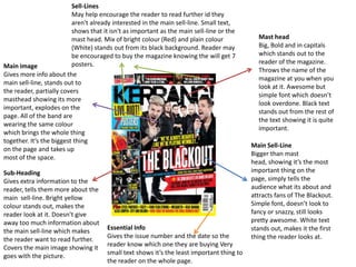
  • 1. Sell-Lines May help encourage the reader to read further id they aren't already interested in the main sell-line. Small text, shows that it isn't as important as the main sell-line or the mast head. Mix of bright colour (Red) and plain colour Mast head (White) stands out from its black background. Reader may Big, Bold and in capitals be encouraged to buy the magazine knowing the will get 7 which stands out to the posters. reader of the magazine. Main image Throws the name of the Gives more info about the magazine at you when you main sell-line, stands out to look at it. Awesome but the reader, partially covers simple font which doesn’t masthead showing its more look overdone. Black text important, explodes on the stands out from the rest of page. All of the band are the text showing it is quite wearing the same colour important. which brings the whole thing together. It’s the biggest thing Main Sell-Line on the page and takes up Bigger than mast most of the space. head, showing it’s the most Sub-Heading important thing on the Gives extra information to the page, simply tells the reader, tells them more about the audience what its about and main sell-line. Bright yellow attracts fans of The Blackout. colour stands out, makes the Simple font, doesn’t look to reader look at it. Doesn’t give fancy or snazzy, still looks away too much information about pretty awesome. White text the main sell-line which makes Essential Info stands out, makes it the first the reader want to read further. Gives the issue number and the date so the thing the reader looks at. Covers the main image showing it reader know which one they are buying Very goes with the picture. small text shows it’s the least important thing to the reader on the whole page.
  • 2. Sell-Lines Gives the reader more reason to read. Doesn’t stand out as much as main sell-line. Mast Head Big and bold, explodes out of the page, metal texture and the magazine Main Image is called metal hammer. Covers whole Also implies that it’s a page, stands metal magazine. out, attracts the reader. Gives extra info for main sell-line. Main Sell-line Big and red, stands Sub-Heading out from the rest. Stands out, red Tells the reader background what the main makes it look story is, makes brighter them want to read Essential info is usually on plastic compared to rest further. cover of page.
  • 3. Main Image Mast-Head Covers all of Covered by page, shows main image, its most not as important. important as the main image. Sub-Heading Main Sell-Line Stands out from Covers main rest on page, red image, shows it text stands out goes with the from white image. Yellow background text makes it stand out. Essential Info Smallest on the Sell-Lines page, least Smaller than important to main sell- reader line, show it isn't as important