Responsive Web Design Tutorial
•Descargar como PPTX, PDF•
1 recomendación•1,667 vistas

Learn all about responsive web design. how to use media queries and fluid grid techniques, tools & strategies.
Denunciar
Compartir
Denunciar
Compartir

Recomendados
Recomendados
Mtp kit in kuwait௹+918133066128....) @abortion pills for sale in Kuwait City ✒Abortion CLINIC In Kuwait ?Kuwait pills +918133066128௵) safe Abortion Pills for sale in Salmiya, Kuwait city,Farwaniya-cytotec pills for sale in Kuwait city. Kuwait pills +918133066128WHERE I CAN BUY ABORTION PILLS IN KUWAIT, CYTOTEC 200MG PILLS AVAILABLE IN KUWAIT, MIFEPRISTONE & MISOPROSTOL MTP KIT FOR SALE IN KUWAIT. Whatsapp:+Abortion Pills For Sale In Mahboula-abortion pills in Mahboula-abortion pills in Kuwait City- .Kuwait pills +918133066128)))abortion pills for sale in Mahboula …Mtp Kit On Sale Kuwait pills +918133066128mifepristone Tablets available in Kuwait?Zahra Kuwait pills +918133066128Buy Abortion Pills Cytotec Misoprostol 200mcg Pills Brances and now offering services in Sharjah, Abu Dhabi, Dubai, **))))Abortion Pills For Sale In Ras Al-Khaimah(((online Cytotec Available In Al Madam))) Cytotec Available In muscat, Cytotec 200 Mcg In Zayed City, hatta,Cytotec Pills௵+ __}Kuwait pills +918133066128}— ABORTION IN UAE (DUBAI, SHARJAH, AJMAN, UMM AL QUWAIN, ...UAE-ABORTION PILLS AVAILABLE IN DUBAI/ABUDHABI-where can i buy abortion pillsCytotec Pills௵+ __}Kuwait pills +918133066128}}}/Where can I buy abortion pills in KUWAIT , KUWAIT CITY, HAWALLY, KUWAIT, AL JAHRA, MANGAF , AHMADI, FAHAHEEL, In KUWAIT ... pills for sale in dubai mall and where anyone can buy abortion pills in Abu Dhabi, Dubai, Sharjah, Ajman, Umm Al Quwain, Ras Al Khaimah ... Abortion pills in Dubai, Abu Dhabi, Sharjah, Ajman, Fujairah, Ras Al Khaimah, Umm Al Quwain…Buy Mifepristone and Misoprostol Cytotec , Mtp KitABORTION PILLS _ABORTION PILLS FOR SALE IN ABU DHABI, DUBAI, AJMAN, FUJUIRAH, RAS AL KHAIMAH, SHARJAH & UMM AL QUWAIN, UAE ❤ Medical Abortion pills in ... ABU DHABI, ABORTION PILLS FOR SALE ----- Dubai, Sharjah, Abu dhabi, Ajman, Alain, Fujairah, Ras Al Khaimah FUJAIRAH, AL AIN, RAS AL KHAIMAMedical Abortion pills in Dubai, Abu Dhabi, Sharjah, Al Ain, Ajman, RAK City, Ras Al Khaimah, Fujairah, Dubai, Qatar, Bahrain, Saudi Arabia, Oman, ...Where I Can Buy Abortion Pills In Al ain where can i buy abortion pills in #Dubai, Exclusive Abortion pills for sale in Dubai ... Abortion Pills For Sale In Rak City, in Doha, Kuwait.௵ Kuwait pills +918133066128₩ Abortion Pills For Sale In Doha, Kuwait,CYTOTEC PILLS AVAILABLE Abortion in Doha, ꧁ @ ꧂ ☆ Abortion Pills For Sale In Ivory park,Rabie Ridge,Phomolong. ] Abortion Pills For Sale In Ivory Park, Abortion Pills+918133066128In Ivory Park, Abortion Clinic In Ivory Park,Termination Pills In Ivory Park,. *)][(Abortion Pills For Sale In Tembisa Winnie Mandela Ivory Park Ebony Park Esangweni Oakmoor Swazi Inn Whats'app...In Ra al Khaimah,safe termination pills for sale in Ras Al Khaimah. | Dubai.. @Kuwait pills +918133066128Abortion Pills For Sale In KuwaAbortion Pills in Oman (+918133066128) Cytotec clinic buy Oman Muscat
Abortion Pills in Oman (+918133066128) Cytotec clinic buy Oman MuscatAbortion pills in Kuwait Cytotec pills in Kuwait
Top Rated Pune Call Girls Koregaon Park ⟟ 6297143586 ⟟ Call Me For Genuine Sex Service At Affordable Rate
Booking Contact Details
WhatsApp Chat: +91-6297143586
pune Escort Service includes providing maximum physical satisfaction to their clients as well as engaging conversation that keeps your time enjoyable and entertaining. Plus they look fabulously elegant; making an impressionable.
Independent Escorts pune understands the value of confidentiality and discretion - they will go the extra mile to meet your needs. Simply contact them via text messaging or through their online profiles; they'd be more than delighted to accommodate any request or arrange a romantic date or fun-filled night together.
We provide -
01-may-2024(v.n)
Top Rated Pune Call Girls Koregaon Park ⟟ 6297143586 ⟟ Call Me For Genuine S...
Top Rated Pune Call Girls Koregaon Park ⟟ 6297143586 ⟟ Call Me For Genuine S...Call Girls in Nagpur High Profile
Top Rated Pune Call Girls Saswad ⟟ 6297143586 ⟟ Call Me For Genuine Sex Service At Affordable Rate
Booking Contact Details
WhatsApp Chat: +91-6297143586
pune Escort Service includes providing maximum physical satisfaction to their clients as well as engaging conversation that keeps your time enjoyable and entertaining. Plus they look fabulously elegant; making an impressionable.
Independent Escorts pune understands the value of confidentiality and discretion - they will go the extra mile to meet your needs. Simply contact them via text messaging or through their online profiles; they'd be more than delighted to accommodate any request or arrange a romantic date or fun-filled night together.
We provide -
01-may-2024(v.n)
Top Rated Pune Call Girls Saswad ⟟ 6297143586 ⟟ Call Me For Genuine Sex Serv...
Top Rated Pune Call Girls Saswad ⟟ 6297143586 ⟟ Call Me For Genuine Sex Serv...Call Girls in Nagpur High Profile
Más contenido relacionado
Último
Mtp kit in kuwait௹+918133066128....) @abortion pills for sale in Kuwait City ✒Abortion CLINIC In Kuwait ?Kuwait pills +918133066128௵) safe Abortion Pills for sale in Salmiya, Kuwait city,Farwaniya-cytotec pills for sale in Kuwait city. Kuwait pills +918133066128WHERE I CAN BUY ABORTION PILLS IN KUWAIT, CYTOTEC 200MG PILLS AVAILABLE IN KUWAIT, MIFEPRISTONE & MISOPROSTOL MTP KIT FOR SALE IN KUWAIT. Whatsapp:+Abortion Pills For Sale In Mahboula-abortion pills in Mahboula-abortion pills in Kuwait City- .Kuwait pills +918133066128)))abortion pills for sale in Mahboula …Mtp Kit On Sale Kuwait pills +918133066128mifepristone Tablets available in Kuwait?Zahra Kuwait pills +918133066128Buy Abortion Pills Cytotec Misoprostol 200mcg Pills Brances and now offering services in Sharjah, Abu Dhabi, Dubai, **))))Abortion Pills For Sale In Ras Al-Khaimah(((online Cytotec Available In Al Madam))) Cytotec Available In muscat, Cytotec 200 Mcg In Zayed City, hatta,Cytotec Pills௵+ __}Kuwait pills +918133066128}— ABORTION IN UAE (DUBAI, SHARJAH, AJMAN, UMM AL QUWAIN, ...UAE-ABORTION PILLS AVAILABLE IN DUBAI/ABUDHABI-where can i buy abortion pillsCytotec Pills௵+ __}Kuwait pills +918133066128}}}/Where can I buy abortion pills in KUWAIT , KUWAIT CITY, HAWALLY, KUWAIT, AL JAHRA, MANGAF , AHMADI, FAHAHEEL, In KUWAIT ... pills for sale in dubai mall and where anyone can buy abortion pills in Abu Dhabi, Dubai, Sharjah, Ajman, Umm Al Quwain, Ras Al Khaimah ... Abortion pills in Dubai, Abu Dhabi, Sharjah, Ajman, Fujairah, Ras Al Khaimah, Umm Al Quwain…Buy Mifepristone and Misoprostol Cytotec , Mtp KitABORTION PILLS _ABORTION PILLS FOR SALE IN ABU DHABI, DUBAI, AJMAN, FUJUIRAH, RAS AL KHAIMAH, SHARJAH & UMM AL QUWAIN, UAE ❤ Medical Abortion pills in ... ABU DHABI, ABORTION PILLS FOR SALE ----- Dubai, Sharjah, Abu dhabi, Ajman, Alain, Fujairah, Ras Al Khaimah FUJAIRAH, AL AIN, RAS AL KHAIMAMedical Abortion pills in Dubai, Abu Dhabi, Sharjah, Al Ain, Ajman, RAK City, Ras Al Khaimah, Fujairah, Dubai, Qatar, Bahrain, Saudi Arabia, Oman, ...Where I Can Buy Abortion Pills In Al ain where can i buy abortion pills in #Dubai, Exclusive Abortion pills for sale in Dubai ... Abortion Pills For Sale In Rak City, in Doha, Kuwait.௵ Kuwait pills +918133066128₩ Abortion Pills For Sale In Doha, Kuwait,CYTOTEC PILLS AVAILABLE Abortion in Doha, ꧁ @ ꧂ ☆ Abortion Pills For Sale In Ivory park,Rabie Ridge,Phomolong. ] Abortion Pills For Sale In Ivory Park, Abortion Pills+918133066128In Ivory Park, Abortion Clinic In Ivory Park,Termination Pills In Ivory Park,. *)][(Abortion Pills For Sale In Tembisa Winnie Mandela Ivory Park Ebony Park Esangweni Oakmoor Swazi Inn Whats'app...In Ra al Khaimah,safe termination pills for sale in Ras Al Khaimah. | Dubai.. @Kuwait pills +918133066128Abortion Pills For Sale In KuwaAbortion Pills in Oman (+918133066128) Cytotec clinic buy Oman Muscat
Abortion Pills in Oman (+918133066128) Cytotec clinic buy Oman MuscatAbortion pills in Kuwait Cytotec pills in Kuwait
Top Rated Pune Call Girls Koregaon Park ⟟ 6297143586 ⟟ Call Me For Genuine Sex Service At Affordable Rate
Booking Contact Details
WhatsApp Chat: +91-6297143586
pune Escort Service includes providing maximum physical satisfaction to their clients as well as engaging conversation that keeps your time enjoyable and entertaining. Plus they look fabulously elegant; making an impressionable.
Independent Escorts pune understands the value of confidentiality and discretion - they will go the extra mile to meet your needs. Simply contact them via text messaging or through their online profiles; they'd be more than delighted to accommodate any request or arrange a romantic date or fun-filled night together.
We provide -
01-may-2024(v.n)
Top Rated Pune Call Girls Koregaon Park ⟟ 6297143586 ⟟ Call Me For Genuine S...
Top Rated Pune Call Girls Koregaon Park ⟟ 6297143586 ⟟ Call Me For Genuine S...Call Girls in Nagpur High Profile
Top Rated Pune Call Girls Saswad ⟟ 6297143586 ⟟ Call Me For Genuine Sex Service At Affordable Rate
Booking Contact Details
WhatsApp Chat: +91-6297143586
pune Escort Service includes providing maximum physical satisfaction to their clients as well as engaging conversation that keeps your time enjoyable and entertaining. Plus they look fabulously elegant; making an impressionable.
Independent Escorts pune understands the value of confidentiality and discretion - they will go the extra mile to meet your needs. Simply contact them via text messaging or through their online profiles; they'd be more than delighted to accommodate any request or arrange a romantic date or fun-filled night together.
We provide -
01-may-2024(v.n)
Top Rated Pune Call Girls Saswad ⟟ 6297143586 ⟟ Call Me For Genuine Sex Serv...
Top Rated Pune Call Girls Saswad ⟟ 6297143586 ⟟ Call Me For Genuine Sex Serv...Call Girls in Nagpur High Profile
Último (20)
❤Personal Whatsapp Number 8617697112 Samba Call Girls 💦✅.
❤Personal Whatsapp Number 8617697112 Samba Call Girls 💦✅.
UI:UX Design and Empowerment Strategies for Underprivileged Transgender Indiv...
UI:UX Design and Empowerment Strategies for Underprivileged Transgender Indiv...
Call Girls Basavanagudi Just Call 👗 7737669865 👗 Top Class Call Girl Service ...
Call Girls Basavanagudi Just Call 👗 7737669865 👗 Top Class Call Girl Service ...
Pooja 9892124323, Call girls Services and Mumbai Escort Service Near Hotel Th...
Pooja 9892124323, Call girls Services and Mumbai Escort Service Near Hotel Th...
Abortion Pills in Oman (+918133066128) Cytotec clinic buy Oman Muscat
Abortion Pills in Oman (+918133066128) Cytotec clinic buy Oman Muscat
Brookefield Call Girls: 🍓 7737669865 🍓 High Profile Model Escorts | Bangalore...
Brookefield Call Girls: 🍓 7737669865 🍓 High Profile Model Escorts | Bangalore...
Top Rated Pune Call Girls Koregaon Park ⟟ 6297143586 ⟟ Call Me For Genuine S...
Top Rated Pune Call Girls Koregaon Park ⟟ 6297143586 ⟟ Call Me For Genuine S...
Recommendable # 971589162217 # philippine Young Call Girls in Dubai By Marina...
Recommendable # 971589162217 # philippine Young Call Girls in Dubai By Marina...
Anamika Escorts Service Darbhanga ❣️ 7014168258 ❣️ High Cost Unlimited Hard ...
Anamika Escorts Service Darbhanga ❣️ 7014168258 ❣️ High Cost Unlimited Hard ...
FULL ENJOY Call Girls In Mahipalpur Delhi Contact Us 8377877756
FULL ENJOY Call Girls In Mahipalpur Delhi Contact Us 8377877756
call girls in Kaushambi (Ghaziabad) 🔝 >༒8448380779 🔝 genuine Escort Service 🔝...
call girls in Kaushambi (Ghaziabad) 🔝 >༒8448380779 🔝 genuine Escort Service 🔝...
Top Rated Pune Call Girls Saswad ⟟ 6297143586 ⟟ Call Me For Genuine Sex Serv...
Top Rated Pune Call Girls Saswad ⟟ 6297143586 ⟟ Call Me For Genuine Sex Serv...
Hire 💕 8617697112 Meerut Call Girls Service Call Girls Agency
Hire 💕 8617697112 Meerut Call Girls Service Call Girls Agency
Abortion pill for sale in Muscat (+918761049707)) Get Cytotec Cash on deliver...
Abortion pill for sale in Muscat (+918761049707)) Get Cytotec Cash on deliver...
Whitefield Call Girls Service: 🍓 7737669865 🍓 High Profile Model Escorts | Ba...
Whitefield Call Girls Service: 🍓 7737669865 🍓 High Profile Model Escorts | Ba...
Destacado
Destacado (20)
Product Design Trends in 2024 | Teenage Engineerings
Product Design Trends in 2024 | Teenage Engineerings
How Race, Age and Gender Shape Attitudes Towards Mental Health
How Race, Age and Gender Shape Attitudes Towards Mental Health
AI Trends in Creative Operations 2024 by Artwork Flow.pdf
AI Trends in Creative Operations 2024 by Artwork Flow.pdf
Content Methodology: A Best Practices Report (Webinar)
Content Methodology: A Best Practices Report (Webinar)
How to Prepare For a Successful Job Search for 2024
How to Prepare For a Successful Job Search for 2024
Social Media Marketing Trends 2024 // The Global Indie Insights
Social Media Marketing Trends 2024 // The Global Indie Insights
Trends In Paid Search: Navigating The Digital Landscape In 2024
Trends In Paid Search: Navigating The Digital Landscape In 2024
5 Public speaking tips from TED - Visualized summary
5 Public speaking tips from TED - Visualized summary
Google's Just Not That Into You: Understanding Core Updates & Search Intent
Google's Just Not That Into You: Understanding Core Updates & Search Intent
The six step guide to practical project management
The six step guide to practical project management
Beginners Guide to TikTok for Search - Rachel Pearson - We are Tilt __ Bright...
Beginners Guide to TikTok for Search - Rachel Pearson - We are Tilt __ Bright...
Responsive Web Design Tutorial
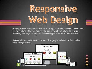
- 1. A responsive website is one that adapts to the screen size of the device where the website is being served. So when the page resizes, the layout adjusts according to the fit of the screen. Here’s a brief overview of the technical jargon related to Responsive Web Design (RWD).
- 2. A fluid grid is a way of defining a layout in terms of proportions. Thus, when the dimensions of a screen are shrunk, the layout with all elements will reduce in proportion.
- 3. RWD allows you to design flexible screen resolution that is fluid and adapts to multiple screen sizes (such as ultrabooks, iPads, iPhones, HDTVs, android phones and tablets), and is compatible with most popular browsers. Flexible Screen Browser Compatibility
- 4. With the help of media queries, you can also add flexible image sizes and embed flexible video displays on your responsive website. Adjust Images Flexible Images
- 5. Without media queries, responsive websites wouldn’t have been where they are today. With CSS3 media queries, you can conditionally apply CSS styles depending on the screen size. Media queries are applied to the CSS code to load specific style elements according to the width of the screen. Screen Resolution Layouts
- 6. How a website is structured, how information is spread through the website and how critical is the content for the particular purpose of the website are some key considerations while designing navigational elements for a responsive website. Coming up with a great navigation style for a responsive website requires out-of-the-box thinking. Component Of Website Home About Us Products Gallery Contact
- 7. Flauntresponsive.com offers cost effective responsive web design services that allow businesses to adapt their websites to multiple screen sizes and browser widths thereby providing an optimal experience to clients and users, no matter what device they access the content on.