SlideShare una empresa de Scribd logo
1 de 9
Masthead- shown in a harsh bold
                                                      Buzz word- used the word ‘exclusive’ to attract
         font, using capital letters which jumps                                                           Plug- using this to stand out from the rest of
                                                      the reader into the magazine feeling more
         out more to the reader and                                                                        the cover to draw attention to it straight away,
                                                      involved and interested in what it has to offer.
         communicates across that this is the                                                              also being at the top above the masthead
                                                      Temps the reader more to open the magazine or
         name of the magazine. Using the                                                                   makes this the first thing that you see on the
                                                      purchase it. Suits the genre of people that are
         colour red also stands out from the
                                                      interested in Nirvana’s style of music.              cover so the audience is automatically pulled in
         black and white background tying in                                                               by seeing a well known groups name first.
         with the colour scheme also.
Date and price- the date of the magazine issue                                                                            Sub image- images showing what is
and price is displayed in a small font, this could                                                                        featured inside the magazine, acts as a
indicate that the publisher doesn’t want the price                                                                        sneak preview of what you could see if you
to be the first thing that you see as an audience                                                                         purchased it. Relates to the buzz word and
as it is more on the expensive side at £2.50. The                                                                         adds to the attraction that it gives to buying
fact that everything other than the price stands                                                                          the issue.
out in the cover would be the publisher wanting
to make the reader feel that it is worth the price.                                                                       Sub heading- using a quote from inside
This also indicates that the magazine is of a                                                                             the magazine as a heading on the cover
higher value and quality.                                                                                                 gives the audience an indication of the
                                                                                                                          many things that they can see inside the
Buzz word- using a second buzz word ‘win’ on                                                                              issue. Highlighting this how it would appear
the cover attracts the audience more to the                                                                               in the article gives the reader a trust that
issue. Using a bold background with yellow text                                                                           there will be more information inside. The
to highlight a well known band also gives an                                                                              text below being in different colours to
attraction towards whatever contest that the                                                                              stand out with well known names boosts
audience could get involved in. Using a direct                                                                            the eye catching nature.
reference to what page the contest would be
                                                                                                                     The main feature of the magazine cover
found on gives the reader instant access to
                                                                                                                     is communicated through the name ‘Jake
being within a chance of winning.
                                                                                                                     Bugg’ written in capital letters in a similar
Main image- the fact that he is holding a none                                                                       style to the masthead, this could indicate
alcoholic drink in the cover of a magazine known                                                                     that he is just as important as the
for sex, alcohol and drugs indicates that he goes                                                                    magazine itself and the main feature in
against the stereotypical rock star. It also                                                                         this edition.
appeals to the audience as they would want to
learn more about why he has chosen to do this
so publically and controversially. The main                                                                          Barcode- indicates the
image also is shown to be in black and white                                                                         magazine is made to be bought
which shows him to almost fade into the                     Layout- the placing of the text over the                 by its audience.
background compared to the text that is bright              main image introduces us right to the artist
and actually over his body only emphasising his             as his name is shown in capitals and bright              The placement of the text also could be to
facial expression and the drink he is holding.              colours. It is quite different to the                    the magazines benefit due to the fact that
Representing that he is quite mysterious and the            placement of text in most magazines as we                he isn't well known so before the audience
fact that he is new to the music world also                 would expect the headings to be around                   dismisses who he is they are drawn in by
supports this idea what we would want to learn              the main image than over it. This is                     the large text and mysterious nature of the
more about him as an audience.                              connotative of that he goes against the                  cover.
                                                            norms and isn't all about the attention.
Buzz word- the word ‘free’ attracts the                      Plug- made to stand out from the rest of the
audiences attention to buy the issue due                     magazine with a harsh background colour to
to it feeling more of a special issue                        catch the audiences attention towards this part
compared to others they may have seen                        of the cover. The use of a popular band that is
of the same genre. It persuades the                          well known to the specific audience of the issue
audience to purchase this magazine and                       makes the plug more noticeable to the rest of the
stands out from the rest of the magazine                     stories on the cover.
due to it being bold and noticeable.                                                                                   Sub image- images shown on the right hand side
                                                                                                                       of the magazine act as a sneak peak of what you
                                                                                                                       can find as an audience inside the issue. These
Masthead- the name of the magazine is shown
                                                                                                                       images act as a boost to give the audience more
in a bold font as always in every issue. The
                                                                                                                       of an attraction communicating the sort of things
colour of the masthead is different as it blends
                                                                                                                       they can find inside the magazine. They would
into the background compared to the main
                                                                                                                       mostly be of smaller size so that the audience
feature of the magazine that stands out from the
                                                                                                                       would want to have a closer look.
rest of the text. The way that it is overlapped by
a sub heading pulls away from the masthead
and focus’ on what it holds inside.

Date issued and price- the date is shown in a
                                                                                                                        Main image- the main image of this cover is
smaller font due to it not being major information
                                                                                                                        mainly of the name of the band in big letters to
compared to the rest of the cover. This cover
                                                                                                                        stand out from the rest of the surroundings, the
doesn’t show the price next to the date as it
                                                                                                                        band members are placed around their name
normally would be placed. This could indicate that
                                                                                                                        which could indicate that the band is quite equal
the issue may be more expensive than other
                                                                                                                        as no member stands out from the rest or is in
magazines or they wanted to hide the price so that
                                                                                                                        front of another, they are all in quite not serious
the audience would not be put off by this straight
                                                                                                                        positions around the font which could show that
away without having time to see other aspects of
                                                                                                                        they are not very serious and quite individual.
the magazine.

     Anchorage- this sub heading is used as a
     last minute pull for the audience to purchase
     the issue. The bold large font could be used
     to make the heading more eye catching and                                                                        Barcode- indicates that the
     therefore have more of a chance of the                                                                           magazine is made to be
     reader noticing this when they first look but                                                                    purchased by the audience.
     not really paying attention to its meaning until
     the rest of the cover is acknowledged.                                            Kicker- the range of well known artists
                                        Buzz word- the word ‘plus’ is used as a        listed at the bottom of the cover boosts
                                        pull to the audience to see that there’s       the audiences interest into the
                                        even more than what the cover shows,           magazine and acts as a last minute
                                        well known artists being shown below the       persuading device to make them buy
                                        ‘plus’ attracts the audience to read more      the issue if everything else on the
                                        into the magazine as not much is given         cover has not yet already done so.
                                        away by the buzz word in this sense.
Date and price- the price of the issue along        Masthead- traditional NME colour and font         Buzz word- using the word exclusive within the
with the date are quite small on this cover. This   shown by harsh colours that stand out from a      top of the cover as is shown gives the readers the
could insinuate that the price could be quite       white background and also match the colour        benefit of seeing this information one of the first
high compared to other magazines so instead         scheme of the cover. The white background in      glances at the cover. The word exclusive also
of revealing the price of £2.40 straight away to    this issue makes the masthead the first thing     brings a feeling of value to the customers that
the audience they are distracting them with all     that you see within the cover.                    would be purchasing the magazine and that they
this bold and colourful text more noticeable                                                          are important to the publishers that they would
than the price to make them feel that it is worth                                                     deserve this information that nobody yet has.
the money for what the issue contains.
                                                                                                                           Sub image- the way that the buzz word is
    Sub heading- this second subheading                                                                                    accompanied with a sub image gives the
    acts as a kicker to the cover of the issue.                                                                            readers all the more reason to purchase the
    Using a very well known artist in this genre                                                                           issue. With the plug over is of ‘big interview
    of music such as The Rolling Stones and                                                                                inside’ indicates to the audience that in order to
    pairing it with an exclusive story such as                                                                             learn more about this exclusive information they
    Glastonbury attracts the audience as they                                                                              will have no other option but to buy the issue.
    would want to know the latest information                                                                              The way that the font is different for ‘inside’
    that is clearly inside. The white background                                                                           gives an urgency to the audience that they
    makes this information stand out more.                                                                                 need this news now.

      Buzz word- the word ‘free’ would
      automatically grab the readers attention                                                                             Kicker- using the plus sign in this part of the
      within the cover as it has a value to the                                                                            cover gives the indication that along with all
      audience that they are getting free                                                                                  these other parts of the issue there is also more
      merchandise or a gift a long with the                                                                                that you can get, the kicker using summarising
      magazine. It also is used to make the                                                                                words to boost the audience into purchasing the
      audience feel special and that they are                                                                              piece.
      valued to the magazine by getting more for
      their money.

        Sub heading- this sub heading could also                                                                          Barcode- a legal convention in order for the
        be used as an anchorage to the issue. It is                                                                       audience to purchase the magazine issue. This is
        shown as a quote so could be used to pull                                                                         commonly found on all magazines of this kind.
        the reader in as it is advertising what could
        be found inside this issue with a clear theme
        of Crystal Castles. This area of the cover is                                 Main image- the way that the text is around each of the artists indicates that they
        crucial to dragging the readers attention to                                  have confidence and that they are the centre of the issue for the magazine. The
        inside the piece. Without a quote or a                                        pose that the woman is doing is not serious and not trying to go with the male
        subheading of what to expect they will most                                   gaze of other magazines featuring women on the cover. This relates to her genre
        likely not read into more of the issue and just                               of music being individual and knowing that her audience of music will know that
        dismiss it, The size of the font makes it more                                this is her personality already. It looks as though she is quite vampire like and
        noticeable as it’s a bigger size compared to                                  deadly as she is wiping her mouth as if she has just taken a bite out of something.
        any other parts of the cover apart from the                                   The male in the cover is behind her not making eye contact with the camera
        masthead so communicates that it is an                                        which could indicate that he is not the main artist in the band and not really
        important part of the feature.                                                interested in being focused on in this cover.
The page shows to have a clear heading to it to
    communicate to the audience of the issue that this is
    where they can get information about what to find
    inside the issue from what they have seen on the
    cover. This gives an organisation to the magazine
    and a clear structure for the audience to gain easier
    access.


        The main image within this contents page is of The
        Courteeners, this could communicate that they are the
        main feature of this issue and are the priority and best
        story to look at within the magazine. The way that they
        stand out from the rest of the pages makes the audience
        more drawn to them as an interest rather then the plain
        text down the left.

The font colour being different in this area of the
contents page gives the impression that it is exclusive.
Including the word special in the sub heading makes
the audience more drawn towards this part of the
magazine and pay more attention to it due to having a
different font and colour compared to the normal Q
Magazine style and colour code. The fact that it is a
well known band that it is featured on gives the reader
more of an interest compared to if it was an unknown
band new to the magazine.

          Using the sub heading here ‘every month’ with
          such a bold and eye catching background tells the
          audience that every month they will receive this
          information below and gives them something to
          come back to the magazine for. This guarantees
          the magazine a return of regular customers as they
          are already putting aspects of their next issues into
          the current magazine being read.
This heading to the contents page is
 different in the way that it does not
 communicate straight away that this
 is a contents page but allows the
 readers to assume so. We
 automatically assume with the
 wording that this is the contents
 page due to the date issued and the      Different to the contents page of the other
 bold wording being shown.                magazine analysed, this one displays a
                                          variety of images relating to each part of
                                          the magazine. This is a good way of
                                          giving the reader more to look at on this
                                          page and giving a clear idea of what to
                                          find inside the magazine if they choose to
                                          have a quick look at the contents page
                                          before buying. It is also quite cramped in
                                          the layout not leaving any space which
                                          shows the audience that there is plenty to
                                          read and take in within the issue.

The way that each feature is
supported by quotes from the article
or the artists shown gives the idea
that the magazine is speaking to you
as an individual and giving the reader
more of an exclusive feel to it
compared to other magazines that
may not do this. It makes the reader
feel more valued as a customer.

                                         Using Christmas gift ideas in the contents
                                         page using festive colours gives the
                                         audience a chance to receive a years worth
                                         of the magazine the following year stating a
                                         discount price. Guaranteeing customers for
                                         the next year for the magazine keeping the
                                         issues popular. The font is displayed in
                                         capitals so that the reader is most likely
                                         going to notice it within a few seconds of
                                         looking at the contents page even though it
                                         is not advertising what it inside the issue for
                                         the week.
Using a well known guitarist like Slash as
                                                 the main image for the contents page gives
                                                 the audience something to recognise. He
                                                 needs no description just an image
                                                 because of how iconic he shows to be to
  The masthead of the page is clearly            the audience of this genre of magazine.
  stated in bold font shown to be in capitals.
  The colour of the font stands out from the
  black theme of colouring for this page         Although In the main image he is
  normally similar to what the cover of the      shown quite dark in comparison to
  issue used. The page feels official due to     the rest of the page which shows
  the date released and the issue number         yellow more than the more black
  being displayed below the heading for          space Slash has the opposite
  this issue so communicates that the            effect.
  magazine can be trusted in this way.


A long with the image of slash the
contents shows the actual pages that you
will find inside the magazine. This shows a      Below the heading the publisher has
more accurate perception of what to find         shown the layout the magazine into
inside the magazine from a graphology            different sections rather than just
point of view.                                   stating page numbers. This gives a
                                                 more organised approach to the
                                                 contents and gives the audience a
                                                 clearer perspective of what they can
                                                 find in the magazine and where.


    Showing a signature at the end of this
    paragraph by the deputy editor gives a
    sense of officiality to the edition of the
    magazine as he has given the readers a
    direct address which is not normally
    seen in this scale on a magazine only
    by local columnist's. Showing his title
    underneath his signature also gives a
    more formal element to this page and
    also lets the reader know that what they
    are reading are straight from the main
    people behind the magazines
    production.
The artist is shown to take up half of the double page spread                                            The main heading contains a pun including the
with one image. The way that she is posed is quite elegant                                               artists name. This stands out from your
and the camera is straight on her but her face is facing                                                 average article and accompanied with the
upwards. This could indicate that she has power as we are                                                images through the two pages the audience is
looking up from under her jaw line, this could be connotative                                            drawn into reading more about the artist. The
that she is a well known artist and respected within the music                                           bold black font contrasts with its background
business. Also her brightly coloured hair indicates that she is                                          highly and is complimented by the bright
quite eccentric and individual, doesn’t play by the rules and                                            colours that the artist is shown wearing and the
norms of society.                                                                                        colour edited pictures.


   The way that she is dressed could reflect her personality in this
   image. Her dress is shown to be tight over her right breast being
   quite promiscuous towards the camera although her left side is          The double page shows to be divided into two equal parts,
   completely covered by fabric in quite a futuristic style of clothing.   one half being for the text about the artist and the other
   This could show that although she may reveal herself to the             dedicated to the article. This shows the importance of the
   camera she does like to cover up aspects of herself and leave           artists that they take up two pages of the issue and that one
   some of it to the imagination of the audience. She draws attention      page is taken up solely by a picture of them. The text shows
   to herself in this image but not so much that the audience wont         a main heading, a sub heading and then an article that is in
   notice the texts like on a cover. She is also covered up by an          quite a large quantity.
   object that looks unrecognisable that covers up part of the tighter
   side of her outfit.
The blank space in the double page is not a normal
    thing to be found in this genre of magazine, it
                                                               Main Image- the theme of black and white from the cover is kept
    relates to the retro feel to the artist so the black and
                                                               which indicates that he has a retro and old style to him which could
    white theme is still apparent within the background
                                                               relate to his music style. He has a Beatles level to his look which
    of the text page and within the main image of the
                                                               could be also incorporated in his sound. He is looking down on his
    magazine. The page is quite simple apart from the
                                                               guitar which could indicate that he is passionate about it and holds
    red colouring shown in parts over the black and
                                                               control over his own music which he probably writes himself.
    white colour scheme to make it more interesting for
    the reader. The colour scheme attracts the reader
    to the magazine due to the sharp bold colours
    being eye catching .


The heading uses a quote from
Bob Dylan lyrics, this is relevant
to the piece but also could
suggest that he is compared to
this artist in the way that he
makes music and could set a
trend with the retro throwback
that he is creating for himself
within the charts. The style of
music that he produces has
been compared to Bob Dylan
and The Beatles because of
how retro he is when he
performs and produces
photographs.


   The main text is shown to not be the main                                             Showing the small page number in the corner
   feature of this double page as the main image                                         gives organisation to the magazine, this relates
   and space around the masthead are the main                                            back to the contents page within the issue that
   point of the page to draw the reader into wanting                                     will have given the audience information in
   to read into the main text. This could indicate                                       order for them to find this main feature.
   that it only takes the masthead to make the
   audience of the magazine want to know more
   about the artist as he is new to this genre so has
   a sense of mystery around him.
The main heading ‘underneath her
brassiness’ indicates that this
article is going where no magazine
has gone before and the audience
would be more interested due to                                                                    In the main image Katy Perry is quite
wanting to see a side of her that                                                                  provocatively shown which goes against
they never have seen, the                                                                          how we normally see her inside other
provocative picture accompanied                                                                    magazines aimed mostly at teenagers.
with this indicates that the article                                                               This image relates to the stereotypes of
will be unique and reveal a lot                                                                    women as she is shown to be inside a
about the singer and that she is not                                                               kitchen which is what men would see
all what she seems.                                                                                her as normally. This relates to the male
                                                                                                   gaze of the magazine issue with the
                                                                                                   way she is stood and what she is
                                                                                                   wearing. We would not normally see
                                                                                                   Katy Perry in this way so to see her
                                                                                                   away from the music and award shows.
                                                                                                   The angle of the camera being straight
                                                                                                   on to her eye line in this image makes it
                                                                                                   seem like she is looking the reader in
                                                                                                   the eye and communicating completely
                                                                                                   with the audience in this shot, the way
                                                                                                   her eyes are shown is quite seductive
                                                                                                   so could show the audience of the issue
                                                                                                   being older than her normal one.
The talk of drugs relates to the target
audience of adults within this
magazine. There wouldn’t be any
young teenagers to be expected to
read this article. She wouldn’t expect
her younger audience of her music to
read this article as she is quite open
about her younger days and this
could put some people off that aren't
normal readers of the magazine.
This stands out from the main text
and gives the reader an insight to the    There is no text over the main image of Katy Perry which gives no distraction to
singer that they did not know would       what she is wearing and where she is. Male audience members would normally
exist. Gives more information than        skip a double page of Katy Perry due to her girliness normally but in this magazine
we would normally associate with her      it is the opposite. The Rolling Stone magazine is normally showing celebrities in
as an artist and a young woman.           quite a complimentary and sexual way even though its target audience wouldn’t be
                                          looking specifically for this.

Más contenido relacionado

La actualidad más candente

Acoustic magazine powerpoint
Acoustic magazine powerpointAcoustic magazine powerpoint
Acoustic magazine powerpointdanielleedavies
 
Conventions of a music magazine
Conventions of a music magazineConventions of a music magazine
Conventions of a music magazinephillipsrebecca
 
Planning for ‘In tune’ magazine
Planning for ‘In tune’ magazinePlanning for ‘In tune’ magazine
Planning for ‘In tune’ magazine014207
 
Media studies evaluation
Media studies evaluationMedia studies evaluation
Media studies evaluationpoppydodgsonx
 
Magazine cover analysis
Magazine cover analysis Magazine cover analysis
Magazine cover analysis emilylivesey
 
Media Evaluation.
Media Evaluation.Media Evaluation.
Media Evaluation.Tamara Ogbe
 
Deconstruction od magazine front covers
Deconstruction od magazine front coversDeconstruction od magazine front covers
Deconstruction od magazine front coversNiamh1996
 
Magazine Analysis Front Covers
Magazine Analysis Front CoversMagazine Analysis Front Covers
Magazine Analysis Front CoversCallumCarmichael
 
Magazines
MagazinesMagazines
Magazinesdapaz93
 
Music magazine evaluation
Music magazine evaluationMusic magazine evaluation
Music magazine evaluationchloewelshprior
 
Main magazine research covers
Main magazine research coversMain magazine research covers
Main magazine research covers957820
 
Front cover analysis
Front cover analysisFront cover analysis
Front cover analysisAnitahoxha
 
Music magazine comparison
Music magazine comparisonMusic magazine comparison
Music magazine comparisonasiyam
 
Evaluation questions 5 and 6.
Evaluation questions 5 and 6.Evaluation questions 5 and 6.
Evaluation questions 5 and 6.Lauren2004
 
Music covers
Music coversMusic covers
Music coversDragonium
 

La actualidad más candente (20)

Acoustic magazine powerpoint
Acoustic magazine powerpointAcoustic magazine powerpoint
Acoustic magazine powerpoint
 
Conventions of a music magazine
Conventions of a music magazineConventions of a music magazine
Conventions of a music magazine
 
Planning for ‘In tune’ magazine
Planning for ‘In tune’ magazinePlanning for ‘In tune’ magazine
Planning for ‘In tune’ magazine
 
Media studies evaluation
Media studies evaluationMedia studies evaluation
Media studies evaluation
 
Magazine cover analysis
Magazine cover analysis Magazine cover analysis
Magazine cover analysis
 
Media Evaluation.
Media Evaluation.Media Evaluation.
Media Evaluation.
 
Deconstruction od magazine front covers
Deconstruction od magazine front coversDeconstruction od magazine front covers
Deconstruction od magazine front covers
 
Q magazine
Q magazineQ magazine
Q magazine
 
conventions
conventionsconventions
conventions
 
Magazine Analysis Front Covers
Magazine Analysis Front CoversMagazine Analysis Front Covers
Magazine Analysis Front Covers
 
Media mags
Media magsMedia mags
Media mags
 
Magazines
MagazinesMagazines
Magazines
 
Question 5
Question 5Question 5
Question 5
 
Music magazine evaluation
Music magazine evaluationMusic magazine evaluation
Music magazine evaluation
 
Main magazine research covers
Main magazine research coversMain magazine research covers
Main magazine research covers
 
Front cover analysis
Front cover analysisFront cover analysis
Front cover analysis
 
Music magazine comparison
Music magazine comparisonMusic magazine comparison
Music magazine comparison
 
Evaluation questions 5 and 6.
Evaluation questions 5 and 6.Evaluation questions 5 and 6.
Evaluation questions 5 and 6.
 
Music covers
Music coversMusic covers
Music covers
 
Magazine analysis
Magazine analysisMagazine analysis
Magazine analysis
 

Destacado (16)

Flat plans
Flat plansFlat plans
Flat plans
 
About Pendulum
About PendulumAbout Pendulum
About Pendulum
 
Pitch
PitchPitch
Pitch
 
Media Audience Research Analysis
Media Audience Research AnalysisMedia Audience Research Analysis
Media Audience Research Analysis
 
Pendulum publicity and magazine features
Pendulum publicity and magazine featuresPendulum publicity and magazine features
Pendulum publicity and magazine features
 
Choosing images
Choosing imagesChoosing images
Choosing images
 
Flat plans
Flat plansFlat plans
Flat plans
 
Initial ideas & mood board
Initial ideas & mood boardInitial ideas & mood board
Initial ideas & mood board
 
Evaluationquestion5
Evaluationquestion5Evaluationquestion5
Evaluationquestion5
 
EVALUATIONQ1
EVALUATIONQ1EVALUATIONQ1
EVALUATIONQ1
 
Evaluationquestion6
Evaluationquestion6Evaluationquestion6
Evaluationquestion6
 
Layouts
LayoutsLayouts
Layouts
 
Pitch feedback
Pitch feedbackPitch feedback
Pitch feedback
 
Music video analysis
Music video analysisMusic video analysis
Music video analysis
 
Evaluationquestion2
Evaluationquestion2Evaluationquestion2
Evaluationquestion2
 
Suzanne Presentation
Suzanne PresentationSuzanne Presentation
Suzanne Presentation
 

Similar a Magazine analysis

Question 1-7
Question 1-7Question 1-7
Question 1-7shaqsuave
 
Music magazine cover and contents analysis
Music magazine cover and contents analysisMusic magazine cover and contents analysis
Music magazine cover and contents analysiskimberleysarahsmart
 
Analysis of front covers
Analysis of front coversAnalysis of front covers
Analysis of front coversLUCYcrowther
 
Analysis of front covers
Analysis of front coversAnalysis of front covers
Analysis of front coversLUCYcrowther
 
Question 1
Question 1Question 1
Question 1pillowww
 
Analysis of music magazines
Analysis of music magazinesAnalysis of music magazines
Analysis of music magazinesClaire_Smith
 
Evaluation task 1
Evaluation task 1Evaluation task 1
Evaluation task 1asmediae12
 
Analysis of my Final Products
Analysis of my Final ProductsAnalysis of my Final Products
Analysis of my Final Productskpnpensby
 
Case study music_magazine
Case study music_magazineCase study music_magazine
Case study music_magazineniamhlees
 
Deconstruction of music magazines finished
Deconstruction of music magazines finishedDeconstruction of music magazines finished
Deconstruction of music magazines finishedannaloynsasmedia
 
Music magazine research
Music magazine researchMusic magazine research
Music magazine researchdavid-hill
 
Music magazine research
Music magazine researchMusic magazine research
Music magazine researchdavid-hill
 
M magazines analysis
M magazines analysisM magazines analysis
M magazines analysisLouisha26
 
Inspiration for the magazine film cover
Inspiration for the magazine film coverInspiration for the magazine film cover
Inspiration for the magazine film coverHG17
 
Music magazine reviews front cover
Music magazine reviews front coverMusic magazine reviews front cover
Music magazine reviews front coverTheSupaPablo
 

Similar a Magazine analysis (20)

Question 1-7
Question 1-7Question 1-7
Question 1-7
 
Magazine Analysis
Magazine AnalysisMagazine Analysis
Magazine Analysis
 
Music magazine cover and contents analysis
Music magazine cover and contents analysisMusic magazine cover and contents analysis
Music magazine cover and contents analysis
 
Front cover analysis
Front cover analysisFront cover analysis
Front cover analysis
 
Analysis of front covers
Analysis of front coversAnalysis of front covers
Analysis of front covers
 
Analysis of front covers
Analysis of front coversAnalysis of front covers
Analysis of front covers
 
Question 1
Question 1Question 1
Question 1
 
Analysis of music magazines
Analysis of music magazinesAnalysis of music magazines
Analysis of music magazines
 
Evaluation task 1
Evaluation task 1Evaluation task 1
Evaluation task 1
 
Analysis of my Final Products
Analysis of my Final ProductsAnalysis of my Final Products
Analysis of my Final Products
 
Case study music_magazine
Case study music_magazineCase study music_magazine
Case study music_magazine
 
Deconstruction of music magazines finished
Deconstruction of music magazines finishedDeconstruction of music magazines finished
Deconstruction of music magazines finished
 
Music magazine research
Music magazine researchMusic magazine research
Music magazine research
 
Music magazine research
Music magazine researchMusic magazine research
Music magazine research
 
M magazines analysis
M magazines analysisM magazines analysis
M magazines analysis
 
Task 8
Task 8Task 8
Task 8
 
Inspiration for the magazine film cover
Inspiration for the magazine film coverInspiration for the magazine film cover
Inspiration for the magazine film cover
 
Evaluation 1
Evaluation 1Evaluation 1
Evaluation 1
 
Research
ResearchResearch
Research
 
Music magazine reviews front cover
Music magazine reviews front coverMusic magazine reviews front cover
Music magazine reviews front cover
 

Más de Francesca Emmingham (8)

About pendulum
About pendulumAbout pendulum
About pendulum
 
Music Video Analysis
Music Video AnalysisMusic Video Analysis
Music Video Analysis
 
Evaluationquestion7
Evaluationquestion7Evaluationquestion7
Evaluationquestion7
 
Evaluationquestion3
Evaluationquestion3Evaluationquestion3
Evaluationquestion3
 
Photography plan
Photography planPhotography plan
Photography plan
 
Layouts
LayoutsLayouts
Layouts
 
Magazine research
Magazine researchMagazine research
Magazine research
 
Final style sheet
Final style sheetFinal style sheet
Final style sheet
 

Magazine analysis

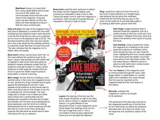
  • 1. Masthead- shown in a harsh bold Buzz word- used the word ‘exclusive’ to attract font, using capital letters which jumps Plug- using this to stand out from the rest of the reader into the magazine feeling more out more to the reader and the cover to draw attention to it straight away, involved and interested in what it has to offer. communicates across that this is the also being at the top above the masthead Temps the reader more to open the magazine or name of the magazine. Using the makes this the first thing that you see on the purchase it. Suits the genre of people that are colour red also stands out from the interested in Nirvana’s style of music. cover so the audience is automatically pulled in black and white background tying in by seeing a well known groups name first. with the colour scheme also. Date and price- the date of the magazine issue Sub image- images showing what is and price is displayed in a small font, this could featured inside the magazine, acts as a indicate that the publisher doesn’t want the price sneak preview of what you could see if you to be the first thing that you see as an audience purchased it. Relates to the buzz word and as it is more on the expensive side at £2.50. The adds to the attraction that it gives to buying fact that everything other than the price stands the issue. out in the cover would be the publisher wanting to make the reader feel that it is worth the price. Sub heading- using a quote from inside This also indicates that the magazine is of a the magazine as a heading on the cover higher value and quality. gives the audience an indication of the many things that they can see inside the Buzz word- using a second buzz word ‘win’ on issue. Highlighting this how it would appear the cover attracts the audience more to the in the article gives the reader a trust that issue. Using a bold background with yellow text there will be more information inside. The to highlight a well known band also gives an text below being in different colours to attraction towards whatever contest that the stand out with well known names boosts audience could get involved in. Using a direct the eye catching nature. reference to what page the contest would be The main feature of the magazine cover found on gives the reader instant access to is communicated through the name ‘Jake being within a chance of winning. Bugg’ written in capital letters in a similar Main image- the fact that he is holding a none style to the masthead, this could indicate alcoholic drink in the cover of a magazine known that he is just as important as the for sex, alcohol and drugs indicates that he goes magazine itself and the main feature in against the stereotypical rock star. It also this edition. appeals to the audience as they would want to learn more about why he has chosen to do this so publically and controversially. The main Barcode- indicates the image also is shown to be in black and white magazine is made to be bought which shows him to almost fade into the Layout- the placing of the text over the by its audience. background compared to the text that is bright main image introduces us right to the artist and actually over his body only emphasising his as his name is shown in capitals and bright The placement of the text also could be to facial expression and the drink he is holding. colours. It is quite different to the the magazines benefit due to the fact that Representing that he is quite mysterious and the placement of text in most magazines as we he isn't well known so before the audience fact that he is new to the music world also would expect the headings to be around dismisses who he is they are drawn in by supports this idea what we would want to learn the main image than over it. This is the large text and mysterious nature of the more about him as an audience. connotative of that he goes against the cover. norms and isn't all about the attention.
  • 2. Buzz word- the word ‘free’ attracts the Plug- made to stand out from the rest of the audiences attention to buy the issue due magazine with a harsh background colour to to it feeling more of a special issue catch the audiences attention towards this part compared to others they may have seen of the cover. The use of a popular band that is of the same genre. It persuades the well known to the specific audience of the issue audience to purchase this magazine and makes the plug more noticeable to the rest of the stands out from the rest of the magazine stories on the cover. due to it being bold and noticeable. Sub image- images shown on the right hand side of the magazine act as a sneak peak of what you can find as an audience inside the issue. These Masthead- the name of the magazine is shown images act as a boost to give the audience more in a bold font as always in every issue. The of an attraction communicating the sort of things colour of the masthead is different as it blends they can find inside the magazine. They would into the background compared to the main mostly be of smaller size so that the audience feature of the magazine that stands out from the would want to have a closer look. rest of the text. The way that it is overlapped by a sub heading pulls away from the masthead and focus’ on what it holds inside. Date issued and price- the date is shown in a Main image- the main image of this cover is smaller font due to it not being major information mainly of the name of the band in big letters to compared to the rest of the cover. This cover stand out from the rest of the surroundings, the doesn’t show the price next to the date as it band members are placed around their name normally would be placed. This could indicate that which could indicate that the band is quite equal the issue may be more expensive than other as no member stands out from the rest or is in magazines or they wanted to hide the price so that front of another, they are all in quite not serious the audience would not be put off by this straight positions around the font which could show that away without having time to see other aspects of they are not very serious and quite individual. the magazine. Anchorage- this sub heading is used as a last minute pull for the audience to purchase the issue. The bold large font could be used to make the heading more eye catching and Barcode- indicates that the therefore have more of a chance of the magazine is made to be reader noticing this when they first look but purchased by the audience. not really paying attention to its meaning until the rest of the cover is acknowledged. Kicker- the range of well known artists Buzz word- the word ‘plus’ is used as a listed at the bottom of the cover boosts pull to the audience to see that there’s the audiences interest into the even more than what the cover shows, magazine and acts as a last minute well known artists being shown below the persuading device to make them buy ‘plus’ attracts the audience to read more the issue if everything else on the into the magazine as not much is given cover has not yet already done so. away by the buzz word in this sense.
  • 3. Date and price- the price of the issue along Masthead- traditional NME colour and font Buzz word- using the word exclusive within the with the date are quite small on this cover. This shown by harsh colours that stand out from a top of the cover as is shown gives the readers the could insinuate that the price could be quite white background and also match the colour benefit of seeing this information one of the first high compared to other magazines so instead scheme of the cover. The white background in glances at the cover. The word exclusive also of revealing the price of £2.40 straight away to this issue makes the masthead the first thing brings a feeling of value to the customers that the audience they are distracting them with all that you see within the cover. would be purchasing the magazine and that they this bold and colourful text more noticeable are important to the publishers that they would than the price to make them feel that it is worth deserve this information that nobody yet has. the money for what the issue contains. Sub image- the way that the buzz word is Sub heading- this second subheading accompanied with a sub image gives the acts as a kicker to the cover of the issue. readers all the more reason to purchase the Using a very well known artist in this genre issue. With the plug over is of ‘big interview of music such as The Rolling Stones and inside’ indicates to the audience that in order to pairing it with an exclusive story such as learn more about this exclusive information they Glastonbury attracts the audience as they will have no other option but to buy the issue. would want to know the latest information The way that the font is different for ‘inside’ that is clearly inside. The white background gives an urgency to the audience that they makes this information stand out more. need this news now. Buzz word- the word ‘free’ would automatically grab the readers attention Kicker- using the plus sign in this part of the within the cover as it has a value to the cover gives the indication that along with all audience that they are getting free these other parts of the issue there is also more merchandise or a gift a long with the that you can get, the kicker using summarising magazine. It also is used to make the words to boost the audience into purchasing the audience feel special and that they are piece. valued to the magazine by getting more for their money. Sub heading- this sub heading could also Barcode- a legal convention in order for the be used as an anchorage to the issue. It is audience to purchase the magazine issue. This is shown as a quote so could be used to pull commonly found on all magazines of this kind. the reader in as it is advertising what could be found inside this issue with a clear theme of Crystal Castles. This area of the cover is Main image- the way that the text is around each of the artists indicates that they crucial to dragging the readers attention to have confidence and that they are the centre of the issue for the magazine. The inside the piece. Without a quote or a pose that the woman is doing is not serious and not trying to go with the male subheading of what to expect they will most gaze of other magazines featuring women on the cover. This relates to her genre likely not read into more of the issue and just of music being individual and knowing that her audience of music will know that dismiss it, The size of the font makes it more this is her personality already. It looks as though she is quite vampire like and noticeable as it’s a bigger size compared to deadly as she is wiping her mouth as if she has just taken a bite out of something. any other parts of the cover apart from the The male in the cover is behind her not making eye contact with the camera masthead so communicates that it is an which could indicate that he is not the main artist in the band and not really important part of the feature. interested in being focused on in this cover.
  • 4. The page shows to have a clear heading to it to communicate to the audience of the issue that this is where they can get information about what to find inside the issue from what they have seen on the cover. This gives an organisation to the magazine and a clear structure for the audience to gain easier access. The main image within this contents page is of The Courteeners, this could communicate that they are the main feature of this issue and are the priority and best story to look at within the magazine. The way that they stand out from the rest of the pages makes the audience more drawn to them as an interest rather then the plain text down the left. The font colour being different in this area of the contents page gives the impression that it is exclusive. Including the word special in the sub heading makes the audience more drawn towards this part of the magazine and pay more attention to it due to having a different font and colour compared to the normal Q Magazine style and colour code. The fact that it is a well known band that it is featured on gives the reader more of an interest compared to if it was an unknown band new to the magazine. Using the sub heading here ‘every month’ with such a bold and eye catching background tells the audience that every month they will receive this information below and gives them something to come back to the magazine for. This guarantees the magazine a return of regular customers as they are already putting aspects of their next issues into the current magazine being read.
  • 5. This heading to the contents page is different in the way that it does not communicate straight away that this is a contents page but allows the readers to assume so. We automatically assume with the wording that this is the contents page due to the date issued and the Different to the contents page of the other bold wording being shown. magazine analysed, this one displays a variety of images relating to each part of the magazine. This is a good way of giving the reader more to look at on this page and giving a clear idea of what to find inside the magazine if they choose to have a quick look at the contents page before buying. It is also quite cramped in the layout not leaving any space which shows the audience that there is plenty to read and take in within the issue. The way that each feature is supported by quotes from the article or the artists shown gives the idea that the magazine is speaking to you as an individual and giving the reader more of an exclusive feel to it compared to other magazines that may not do this. It makes the reader feel more valued as a customer. Using Christmas gift ideas in the contents page using festive colours gives the audience a chance to receive a years worth of the magazine the following year stating a discount price. Guaranteeing customers for the next year for the magazine keeping the issues popular. The font is displayed in capitals so that the reader is most likely going to notice it within a few seconds of looking at the contents page even though it is not advertising what it inside the issue for the week.
  • 6. Using a well known guitarist like Slash as the main image for the contents page gives the audience something to recognise. He needs no description just an image because of how iconic he shows to be to The masthead of the page is clearly the audience of this genre of magazine. stated in bold font shown to be in capitals. The colour of the font stands out from the black theme of colouring for this page Although In the main image he is normally similar to what the cover of the shown quite dark in comparison to issue used. The page feels official due to the rest of the page which shows the date released and the issue number yellow more than the more black being displayed below the heading for space Slash has the opposite this issue so communicates that the effect. magazine can be trusted in this way. A long with the image of slash the contents shows the actual pages that you will find inside the magazine. This shows a Below the heading the publisher has more accurate perception of what to find shown the layout the magazine into inside the magazine from a graphology different sections rather than just point of view. stating page numbers. This gives a more organised approach to the contents and gives the audience a clearer perspective of what they can find in the magazine and where. Showing a signature at the end of this paragraph by the deputy editor gives a sense of officiality to the edition of the magazine as he has given the readers a direct address which is not normally seen in this scale on a magazine only by local columnist's. Showing his title underneath his signature also gives a more formal element to this page and also lets the reader know that what they are reading are straight from the main people behind the magazines production.
  • 7. The artist is shown to take up half of the double page spread The main heading contains a pun including the with one image. The way that she is posed is quite elegant artists name. This stands out from your and the camera is straight on her but her face is facing average article and accompanied with the upwards. This could indicate that she has power as we are images through the two pages the audience is looking up from under her jaw line, this could be connotative drawn into reading more about the artist. The that she is a well known artist and respected within the music bold black font contrasts with its background business. Also her brightly coloured hair indicates that she is highly and is complimented by the bright quite eccentric and individual, doesn’t play by the rules and colours that the artist is shown wearing and the norms of society. colour edited pictures. The way that she is dressed could reflect her personality in this image. Her dress is shown to be tight over her right breast being quite promiscuous towards the camera although her left side is The double page shows to be divided into two equal parts, completely covered by fabric in quite a futuristic style of clothing. one half being for the text about the artist and the other This could show that although she may reveal herself to the dedicated to the article. This shows the importance of the camera she does like to cover up aspects of herself and leave artists that they take up two pages of the issue and that one some of it to the imagination of the audience. She draws attention page is taken up solely by a picture of them. The text shows to herself in this image but not so much that the audience wont a main heading, a sub heading and then an article that is in notice the texts like on a cover. She is also covered up by an quite a large quantity. object that looks unrecognisable that covers up part of the tighter side of her outfit.
  • 8. The blank space in the double page is not a normal thing to be found in this genre of magazine, it Main Image- the theme of black and white from the cover is kept relates to the retro feel to the artist so the black and which indicates that he has a retro and old style to him which could white theme is still apparent within the background relate to his music style. He has a Beatles level to his look which of the text page and within the main image of the could be also incorporated in his sound. He is looking down on his magazine. The page is quite simple apart from the guitar which could indicate that he is passionate about it and holds red colouring shown in parts over the black and control over his own music which he probably writes himself. white colour scheme to make it more interesting for the reader. The colour scheme attracts the reader to the magazine due to the sharp bold colours being eye catching . The heading uses a quote from Bob Dylan lyrics, this is relevant to the piece but also could suggest that he is compared to this artist in the way that he makes music and could set a trend with the retro throwback that he is creating for himself within the charts. The style of music that he produces has been compared to Bob Dylan and The Beatles because of how retro he is when he performs and produces photographs. The main text is shown to not be the main Showing the small page number in the corner feature of this double page as the main image gives organisation to the magazine, this relates and space around the masthead are the main back to the contents page within the issue that point of the page to draw the reader into wanting will have given the audience information in to read into the main text. This could indicate order for them to find this main feature. that it only takes the masthead to make the audience of the magazine want to know more about the artist as he is new to this genre so has a sense of mystery around him.
  • 9. The main heading ‘underneath her brassiness’ indicates that this article is going where no magazine has gone before and the audience would be more interested due to In the main image Katy Perry is quite wanting to see a side of her that provocatively shown which goes against they never have seen, the how we normally see her inside other provocative picture accompanied magazines aimed mostly at teenagers. with this indicates that the article This image relates to the stereotypes of will be unique and reveal a lot women as she is shown to be inside a about the singer and that she is not kitchen which is what men would see all what she seems. her as normally. This relates to the male gaze of the magazine issue with the way she is stood and what she is wearing. We would not normally see Katy Perry in this way so to see her away from the music and award shows. The angle of the camera being straight on to her eye line in this image makes it seem like she is looking the reader in the eye and communicating completely with the audience in this shot, the way her eyes are shown is quite seductive so could show the audience of the issue being older than her normal one. The talk of drugs relates to the target audience of adults within this magazine. There wouldn’t be any young teenagers to be expected to read this article. She wouldn’t expect her younger audience of her music to read this article as she is quite open about her younger days and this could put some people off that aren't normal readers of the magazine. This stands out from the main text and gives the reader an insight to the There is no text over the main image of Katy Perry which gives no distraction to singer that they did not know would what she is wearing and where she is. Male audience members would normally exist. Gives more information than skip a double page of Katy Perry due to her girliness normally but in this magazine we would normally associate with her it is the opposite. The Rolling Stone magazine is normally showing celebrities in as an artist and a young woman. quite a complimentary and sexual way even though its target audience wouldn’t be looking specifically for this.