1. Looking back at your preliminary task, what do you feel you have learnt in the progression from it
to the full product?
This is my front cover I made for my preliminary task. I decided
to keep the name of my magazine simple and not complex so
that the reader can tell straight away what the genre of my
magazine is based on. The masthead is based at the top of the
magazine like my contents page so that the reader can clearly
tell what the magazine is called and about. I kept the masthead
in a simple font so that the target audience have no difficulties
trying to work out what letters what, and that they have no
trouble stating that the text is too small.
Just below the masthead I included the price and the issue
number as this is a necessity and is never not included on any
magazine supplied. This is a must have piece of information
when producing any genre magazine as the audience always
wants to know the price of the product that they have an
interest in. Once again I stuck to simple colours and large enough
fonts so the amount of bad feedback is reduced.
All the text included on the front page has been made sure that it has kept to the house style of the
magazine (only using whites, blues and blacks.) Sticking to a house style is vital when making a
successful magazine as the target audience will only purchase a product that sticks to a sophisticated
and professional look, they will not spend their money on a product that looks tacky and too
complicated. On the front cover of 'Haydon News' I decided to include a main bleed (main image)
that took up the majority of the page. The image illustrates a student on the school grounds, which
links in with the rest of the context that the sell lines portray.
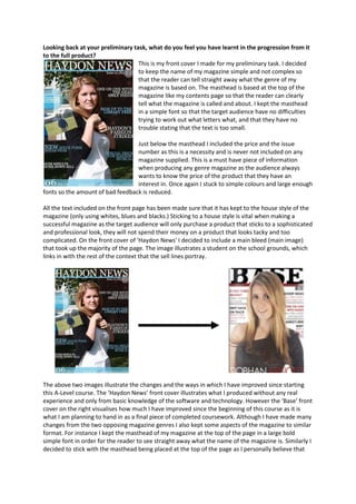
The above two images illustrate the changes and the ways in which I have improved since starting
this A-Level course. The ‘Haydon News’ front cover illustrates what I produced without any real
experience and only from basic knowledge of the software and technology. However the ‘Base’ front
cover on the right visualises how much I have improved since the beginning of this course as it is
what I am planning to hand in as a final piece of completed coursework. Although I have made many
changes from the two opposing magazine genres I also kept some aspects of the magazine to similar
format. For instance I kept the masthead of my magazine at the top of the page in a large bold
simple font in order for the reader to see straight away what the name of the magazine is. Similarly I
decided to stick with the masthead being placed at the top of the page as I personally believe that
2. the specific area of the page is the most effective and successful when wanting to achieve a
professional outcome and standard. Likewise similarities that stayed reasonably the same were the
sell lines as I made sure that they didn’t distract the audience from the main bleed by aligning them
around however I kept to the sell lines being on both the right and left hand side.
Throughout the process of producing my final magazine I felt myself improving on not only
knowledge based items however on the skilful side from getting to know the technology better and
in further depth. I felt like I improved on the production side when trying to create a professional
piece of coursework as I got to know what colours and fonts were acceptable in order to be
successful. Therefore I ensured that once again like my preliminary task I stuck to keeping a house
style which in my final case ended up to be black, white and red. By only having a few colours has a
larger impact on success in comparison to using a wide variety as it doesn’t confuse the reader and
it influences them to interpret that they are more likely to buy a trustworthy and professional style
magazine as they have a presentable format.
Furthermore I feel whilst going through the drafting process of my magazine that I have improved
and developed many new and existing skills throughout the software and technology. I feel a lot
more confident on using certain programmes such as photoshop and indesign as these were
significantly important when producing a successful magazine, and were a necessity when wanting
to achieve a higher grade. When I first made my preliminary task I had no idea how to use indesign
therefore just made a basic magazine on photoshop, however as the course progressed we were
introduced to new programmes such as indesign where we learned new skills such as text wrapping
etc. Learning these new skills such as the text wrapping was very beneficial as it made the
production side of the magazine a whole lot easier when wanting to layout particular images around
the page, and when we wanted to move something the way it automatically reacted and moved the
text around the image or layer.
The two images above display the ways in which I had learned to apply the text wrapping technique
in order for paragraphs to make sense and follow on effectively in order for the reader to easily
navigate themselves from section to section.
Overall I believe that I have made a massive progression from my preliminary task to the final piece
as I have been able to expand, improve and develop on my knowledge enough so to make a
professional looking final piece. This is all due to the fact that I have learnt about new software and
technology which includes photoshop and indesign and was able to apply my newly found
knowledge to improve on the basic skills that I had when producing the preliminary task.