
Recomendados
Más contenido relacionado
Destacado
Gsk 2 3 12 C
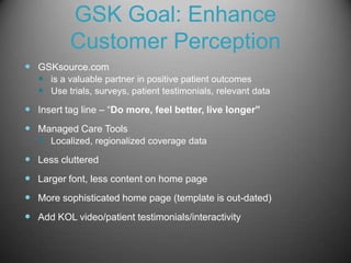
- 1. GSK Goal: Enhance Customer Perception GSKsource.com is a valuable partner in positive patient outcomes Use trials, surveys, patient testimonials, relevant data Insert tag line – “Do more, feel better, live longer” Managed Care Tools Localized, regionalized coverage data Less cluttered Larger font, less content on home page More sophisticated home page (template is out-dated) Add KOL video/patient testimonials/interactivity
Notas del editor
- Consider Mobile application and tablet when redoing the site. This is the trend of the future. Get people to register on website, then send updates via mobile application. Also, HCPs are tech friendly now, so any digital assets should be considered for both HCPs and Consumers. Think bold we need to consider a modern state-of-the art digital platform for GSK. Need more interactivity (per my neighbor a physician assistant).
- Update it with a more modern look, this is an old style template. Like to use navigation bars on the left under the most important information on the site (again in the best real-estate) Again, more interactivity on site, find box takes up too much space, that’s where your most important message should be, perhaps mission statement or the latest and greatest new product from GSK. Needs real patient photos too. The photos are not at all engaging, the sites does not illicit any emotion. Instead of drop down menus – roll-overs are preferred by users.
- Sites I like….for obvious reasons….
- 3D graphic, move, many sites using motion carousels that rotate, across the top is common, this site uses 3D moving graphics that change, the tags is I brush, I celebrate, I live, with appropriate graphics to represent each activity. This is clean, and a big hit by top management at Sunovion (I worked on this site at MRM Princeton).