

Recomendados
Más contenido relacionado
La actualidad más candente
La actualidad más candente (19)
Similar a Final Evaluation
Similar a Final Evaluation (20)
Final Evaluation
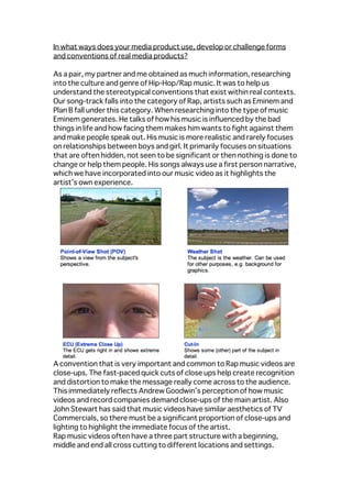
- 1. In what ways does your media product use, develop or challenge forms and conventions of real media products? As a pair, my partner and me obtained as much information, researching into the culture and genre of Hip-Hop/Rap music. It was to help us understand the stereotypical conventions that exist within real contexts. Our song-track falls into the category of Rap, artists such as Eminem and Plan B fall under this category. When researching into the type of music Eminem generates. He talks of how his music is influenced by the bad things in life and how facing them makes him wants to fight against them and make people speak out. His music is more realistic and rarely focuses on relationships between boys and girl. It primarily focuses on situations that are often hidden, not seen to be significant or then nothing is done to change or help them people. His songs always use a first person narrative, which we have incorporated into our music video as it highlights the artist’s own experience. A convention that is very important and common to Rap music videos are close-ups. The fast-paced quick cuts of close ups help create recognition and distortion to make the message really come across to the audience. This immediately reflects Andrew Goodwin’s perception of how music videos and record companies demand close-ups of the main artist. Also John Stewart has said that music videos have similar aesthetics of TV Commercials, so there must be a significant proportion of close-ups and lighting to highlight the immediate focus of the artist. Rap music videos often have a three part structure with a beginning, middle and end all cross cutting to different locations and settings.
- 2. Eminem often cuts to different locations during his chorus to signify the main message to his mainstream listeners which is what I have incorporated through the repetitive chorus ‘You can’t stop this’ which was shot in-front of a green screen and later edited with a image of a brick wall. I recognized the need for building a relationship between the music video and the audience, the lyrics and the visuals and the music with the visuals. We have developed a relationship between our target audience primarily young people aged 15-35 year olds and the artist through the direct address. The direct contact the rapper uses really addresses the issue of how life can be a struggle but you can always to a better place, as the person that is stopping you from doing that is only you. This correlation between the lyrics and the visuals has been developed by the constant repeatability of the chorus towards the end of our music video, which then slowly fades to black. This is a very familiar convention of this genre as many music videos use this open narrative so that the viewers themselves can think and make assumptions on what the ending portrayed and its significant meaning. The strong relationship between our lyrics and visuals, are the essence of our music video as this is what makes the music video so hard-hitting as so many words are constantly repeated and this again uses and develops upon the codes and conventions of real music videos. Overall the majority of our music video relies heavily on existing conventions and our target audience already knowing them and being bale to recognize them from our production, but the visuals do challenge somewhat the codes of conventions of existing media products. Our editing doesn’t rely on the beat of the music track, and the fast paced editing illustrates the speed of the song itself. John Stewart said; that if you incorporated something that is recognizable and reconstructed it so that it is still familiar, it would generate nostalgic associations among the audience. I have used this and applied it myself in the music video through the bench scenes at the end of our music video. The artist raps the chorus, which is conveyed through three different cuts and shots lengths, however the lyrics convey the point of the narrative as the artist slowly begins to walk away down the edge of the hill which is when the lyrics suggest he is ‘moving to a better place’. This has created, a relationship between the lyrics and the visuals. The mise-en-scene of the music video has been kept continuous and the same to ensure there is no error or change to make the viewers seem disorientated or dazzled. The clothing of the artist has been kept the same expect for when the bench scene and the starting sequence of the artist coming out of the car has been shot without him with his hat on. This
- 3. inconsistency may be minor but is an error on our part, if we had longer this would have been addressed and resolved by re-shooting. Regardless of this error the use of different locations, shots, angles, quick cuts, scenery and direct address has all been used in our music video to help us relate to real music productions and this has been developed quite successfully in our own music video production. How effective is the combination of your main product and ancillary texts? I attempted to create a similar message and an obvious link between my main music video and ancillary tasks. I achieved this through the artist’s appearance, as the outfits he wears are similar to those shown on the magazine advert and Digi-Pak The type of clothing is contemporary Rap such as those of plan B’s. The location we shot in meant the outfit had to be casual which was beneficial as the stereotypical outfit is more ‘chavvy’ and laid back with a hat and trainers, which allowed me to reach out and appeal more to the viewers as the artist seems more relatable. The direct address on the album cover again relates to the albums title ‘You can’t stop this’ which suggests that the artist is coming and you cant stop him form speaking out which is what the audience should be doing too. This is emphasized further through the close-up and the image for the front cover of the Digi-Pak is also used in the music video as part of a night sequence in black and white to highlight the darkness but you need to come out of that and make your voice heard. This furthermore creates and establishes audience recognition through the link between the cover and video. On the inside left panel, the artist is still looking to the side wearing glasses which has been edited through Photoshop adding a 3D effect which has been used by Rapper Drake, for his front cover of ‘Thank me
- 4. Later’. The lack of direct mode of address signifies his anonymity. The close-up enables the audience to recognize the similarity between this and real media products as this burred and many artists when marketing their music to their target audience use this 3D effect. Once again the back cover uses direct address but the artist is seen more formally with a scarf and sweater without glasses on. His hands are just placed below the frame that has been cut to use a mid shot of his body. The pose in this photo makes him seem very serious and solemn. Reflective of the songs the audience would be hearing, or even their feedback, I used the same back cover image form the Digi-Pak for the magazine advert but I changed it slightly to ensure the whole of the artist was portrayed instead of just his waist upwards, it gives the audience an insight about what’s inside the music album. The consistencies between the ancillary tasks and magazine advert album, uses the same font as the back of the album, to create a obvious link to the audience. The font of the album title and artist name is kept the same to connect both. To further audience recognition, I
- 5. have included a small image of the Digipak front cover on the Advert so the audience would know what product they are buying. The color blue is used as a repetitive theme on my Digi-Pak and magazine advert as it has connotations of peace, calmness and no violence. It has strong connotations and many symbolisms which are associated to the music lyrics which is why I chose to incorporate this idea, but also because Eminem uses this color which strikes our against a white backdrop, which I found would be effective against a black backdrop too, so I developed this convention and established it in my own way. Additionally, the font used on both the Advert and the Digipak for the album title and artists name use blue to reflect this ideology The font is bold and serif and doesn’t use any extra flare, the minimal use of text adds to the sincerity and uniqueness of the music advert and Digi-Pak, to make it look more professional. In my music video, I have represented the artist’s emotions, as well as the mood of the narrative, through the use of light and dark, using the setting of the video. It is daylight for most of the scenes such as those when the rapper walks up the path but each scene gradually becomes darker as it gets to the end. This gave me the opportunity to include of shot of the artist at the end walking off down the edge of the hill with the sun going down showing a small hint of sunset. The green screen sequences all go back to being bright each time the scene cuts to that sequence which reflects how slowly the rapper will become
- 6. stronger and eventually strong enough to ‘move to a better place’. The way the video fades to black at the end is something I played about with and later kept as I have done something similar with the Digipak. The front and back have a black background, portraying him as mysterious, also hinting to the cliché ‘tall and dark’ which is why I used a close up on the front and a mid shot on the back. Inside the Digipak the backgrounds have completely changed to black and white, showing him in darkness and slight light, reflecting on how the audience will be able to get to know him once they’ve opened the album. This contrast in color shows how the artist has more than just one side to him, and yes he made the bad decisions in life at first but he can change them and become a better person, which is reflective of his music. What have you learned from your audience feedback? The music video was shared onto the social networking sites Facebook and Twitter, to increase the amount of my target audience who saw it. This was successful, it received many views and the analytics provided from YouTube, enabled me to see who, where, how and when my video was watched. This confirmed my target audience was predominantly people of my age from as young as 14 up-to 40 something I had hoped to achieve when I had planned my music video, trying to get the correct appearance of the artist which is what would in the end make people want to watch. As well as YouTube and the social networking sites, I posted my video onto my blog, which has been the greatest record of all my research, planning and production. Blogger helped me progress my work, as teachers and other students commented on my pieces of work. My first questionnaire was also uploaded onto her whilst I was planning and researching into the Rap genre. It was based on where and what types of music they found relatable and significantly popular in this day and age, but also if I should use an open or closed narrative. I asked what Rap music video conventions they would expect to see to ensure I was involving them. It was most helpful, as I learnt whether people enjoyed watching music video and why such as the narrative behind the lyrics and greater depth of meaning behind the whole production of the video and ancillary tasks. How did you use media technologies in the construction and research, planning and evaluation stages? Whilst planning the music video concept, I watched other various music
- 7. videos such as those of Eminem’s ‘Not Afraid’ and Devlin’s ‘Watchtower’. These generated the basis of my ideas, which I further developed and established throughout my music video production. All the planning and research was recorded and uploaded on to my blog through different software programs such as Prezzi, Slide Share and Flickr in chronological order. These ideas were then transferred and uploaded onto my blog and through Blogger I incorporated the links. I used Google as my main search engine and the features it allowed me to use such as Google Maps when print screening possible locations for where to shoot the artist, but to also see the time it would take to get there and possible transport options; which was then uploaded onto the blog. Google Images also helped me to compare my work with those of existing media productions. Another important stage of my planning included researching the artist and genre of the song, as well as conventions of Rap music videos. In order to create my basis for analysis, I used mainly Google, IMDB, You Tube for researching, however another way I found the information was on Slide Share which allowed me to access other peoples work and share my own with people across the world. Before shooting anything I storyboarded every frame, sequence and any little alteration, which helped I creating the plot of the music video. I drafted the initial ideas, and then later the narrative and how each scene and sequence would continue and flow into one. I then scanned the storyboard and uploaded them onto Blogger. This was so much more beneficial than just shooting as we had a clear idea and everything was planned such as the time we would take, the locations, and even the props we would require. Additionally, when we had begun planning, it was in autumn, which meant we had to have back-up plans and be prepared for the rain or snow, but we used this to our advantage and used the rain in the sequence when the artist walks up the path, to add a autumn/winter effect, which made the video’s message come across more such as the bad place the artist was in at that time. iMovie was the program we used to upload and edit our music videos with, once we had done our first set of filming – using a Canon HD video camera - we created a rough cut of our video. This enabled us to have a better idea of how our video would look and there were a few things we decided to alter such as the quick cuts, scene order and saturation of each frame. We changed the what we felt would make the video look more professional as there was either rot much interference or the camera would jolt too much so we planned and re- filmed sequences using a tripod that required this such as the scene when the artist walks down the hill at the end but also the night sequence but as it was too dark we changed the entire sequence to black and white. When editing the final video we moved onto Final Cut Express, as by this
- 8. time we had learnt how to use it and it gives a much more professional finish with a greater variety of effects. In our music video, I had the music stop and restart, so it would match the miming of the actor and the music lyrics at the correct timings to make it seem much smoother. Finally, after our music video was finished, we uploaded it onto YouTube. It was then shared on twitter, Facebook and blogger, in order to allow the maximum amount of people to see it. In order to create my ancillary texts – the Digi Pak and Music Advert – I used Photoshop and Adobe Illustrator. When editing the images I had taken of my artist, I used Photoshop, since it has a larger range of effects and due to the use of layers; you are able to modify the image in greater depth and context. When putting my Digi Pak together, the pictures, the texts, the logos and the layout, I used Illustrator. It was much easier to use for this part than Photoshop, as I didn’t need any effect, I was just directing on the layout and arrangement. It was easy to make modifications and alterations to positioning of images and text, it was better to do on Illustrator as after you have placed an image or text, you can still move and change it without having to place it again.