
Recomendados
Más contenido relacionado
La actualidad más candente
La actualidad más candente (19)
Similar a Presentation MFS
Similar a Presentation MFS (20)
Último
Último (20)
Presentation MFS
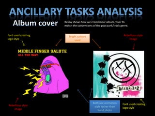
- 1. Ancillary tasks analysis Album cover Below shows how we created our album cover to match the conventions of the pop punk/ rock genre. Font used creating logo style Rebellious style image Bright colours used Both use animation style rather than band photo Font used creating logo style Rebellious style image
- 2. Inside cover: The band Mug shot style and expression portrays their sense of humour Photos in black and white relating to the use of desturate throughout our project Name of band member and job so audiences can get to know them more Costume choices authentic and fitting for the bands image
- 3. Inside cover: The band Poses reflecting the band performance Use of lighting linking to the front cove of the album Bright colours used reflecting the pop punk genre Use of colour and black and white relating to the project Colour emphasising the intruments played representing their brand Pink background used to emphasise the subject of the band.
- 4. The back Pose emphasises the bands sense of humour and personality Songs from album linking to conventions of albums Lighting used reflecting the band image Used of colour and black and white linking to the whole brand image Band in colour makes them stand out Gorilla used reflecting the band image
- 5. Magazine Advert Name of band well recognisable Band image used Personality of band shown through pose Picture of item to sell album cover