The document summarizes a poster that promotes a "Fish Free Friday" campaign. It uses simple, short sentences and bold fonts to catch attention. The overall design is seen as dull with limited colors. The layout effectively draws attention to the heading and central image while placing less important details like the logo in less prominent positions.
1. Writing Styles
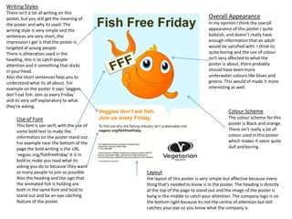
There isn't a lot of writing on this
poster, but you still get the meaning of Overall Appearance
the poster and why its used. The In my opinion I think the overall
writing style is very simple and the appearance of this poster I quite
sentences are very short, the babyish, and doesn’t really have
impression I get is that the poster is enough information that an adult
targeted at young people. would be satisfied with. I think its
There is alliteration used in the quite boring and the use of colour
heading, this is to catch people isn't very affected to what the
attention and it something that sticks poster is about, there probably
in your head. should have been more
Also the short sentences help you to underwater colours like blues and
understand what its all about. For greens. This would of made it more
example on the poster it says ‘veggies interesting as well.
don’t eat fish. Join us every Friday.’
and its very self explanatory to what
they’re asking.
Colour Scheme
Use of Font The colour scheme for this
This font is san serif, with the use of poster is Black and orange.
some bold text to make the There isn't really a lot of
information on the poster stand out. colour used in this poster
For example near the bottom of the which makes it seem quite
page the bold writing is the URL dull and boring.
‘vegsoc.org/fishfreefriday’ It is in
bold to make you read what its
asking you do to because they want
as many people to join as possible. Layout
Also the heading and the sign that the layout of this poster is very simple but affective because every
the animated fish is holding are thing that’s needed to know is in the poster. The heading is directly
both in the same font and bold to at the top of the page to stand out and the image of the poster is
stand out and be an eye catching bang in the middle to catch your attention. The company logo is on
feature of the poster. the bottom right because its not the centre of attention but still
catches your eye so you know what the company is.