
Recomendados
Más contenido relacionado
La actualidad más candente
La actualidad más candente (20)
Destacado
Destacado (12)
Similar a 10 Tips để có bài thuyết trình chuyên nghiệp
Similar a 10 Tips để có bài thuyết trình chuyên nghiệp (20)
Último
Último (20)
10 Tips để có bài thuyết trình chuyên nghiệp
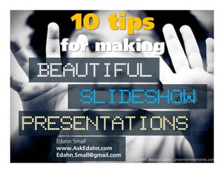
- 1. SLIDESHOW BEAUTIFUL 10 tips for making SLIDESHOW PRESENTATIONS Edahn Small www.AskEdahn.com Edahn.Small@gmail.com Credit: Jessica Castro, unwrittenmemories.com
- 2. Tip #1 KNOW YOURKNOW YOUR Be clear about the goal of your presentation before your begin composing it. GOAL
- 3. Presentations, like cats, fall into two categories:
- 4. Presentations, like cats, fall into two categories: Ugly Beautiful Credit: Pete Hunt, Flickr
- 5. Presentations, like cats, fall into two categories: Ugly Beautiful Credit: Pete Hunt, Flickr Just Kidding.
- 6. Presentations fall into two main categories: Technical presentations teach people about a topic. The topic can be anything. Persuasive presentations make people see something (like your brand) a certain way.
- 7. Most presentations will combine elements of both.
- 8. Be focused, but not too dull or repetitive. Don’t bore them! It’s hard to communicateIt’s hard to communicate when people are busy playing on their phones... trust me.
- 9. Tip #2 PLAN IT OUTPLAN IT OUT Create an outline or storyboard of the major topics you want to address.
- 10. Sketch the basics Outline your main 1111 Sequence your slides 3333 your main points Add detail to your outline until you figure out what you want to say in each slide 2222 your slides effectively
- 11. Make sure your presentation follows a logical or chronological sequence.
- 12. Show restraint Resist the urge to cram everything you know about your topic into your show.know about your topic into your show.
- 13. If you try and tell them everything,everything, they won’t remember anything.
- 14. Tip #3 AVOID STOCKAVOID STOCK Run away! Run away! TEMPLATES
- 15. Pop quiz, hotshot: Which slide is more memorable? (in a good way) Exhibit A Exhibit B
- 16. Trick question. They’re both vomit.They’re both vomit. And both templates.
- 17. The Problems with Stock Templates • They lead to infinite bullet point syndrome (IBPS) • They discourage graphics • Every slide ends up looking the same • The designs are usually hideous• The designs are usually hideous • The presentation looks like every slideshow presentation you’ve ever seen • Your audience will lose interest and focus after slide number one zero • It reminds people of the 90s (that’s bad)
- 18. Build your own theme instead. Color LayoutFonts Tip #4 Tip #5 Tip #6 theme instead. But h-h-how?
- 19. Tip #4 CHOOSE ACHOOSE A COLOR SCHEME Choose 5 colors that look good together and match the tone of your presentation.
- 20. Pick 5 colors and alternate them in your slides. Choose one accent color that stands out from the rest.
- 21. Choose colors that reflect the tone of your presentation. ColourLovers.com
- 22. Mellow and modern Choose colors that reflect the tone of your presentation. ColourLovers.com
- 23. Mellow and modern Choose colors that reflect the tone of your presentation. ColourLovers.com Passionate and aggressive
- 24. Mellow and modern Choose colors that reflect the tone of your presentation. ColourLovers.com Passionate and aggressive Something about scarves
- 25. http://www.colourlovers.com User-generated color palettes and more Websites to help you pick color schemes (for free) http://www.colorschemedesigner.com/ http://www.colorhunter.com/ http://kuler.adobe.com/ Computer-generated color palettes Upload a picture and it pulls out the main colors Similar to the above
- 26. Tip #5 CHOOSE ACHOOSE A FONT SCHEME Don’t get too crazy with fonts. Pick 3 and stick to them.
- 27. Choose one font One font for body copy. One font for body copy. for titles. One font for body copy. One font for body copy. And one font for accents. Fonts on this page: Frutiger LT 95 UltraBlack (Title), Frutiger CE 45 Light (Body, Footnote), Airport (Accents)
- 28. Like color, your fonts should also match the tone of your presentation. Good topicFont name Not so good topic Glamour Chiller Nasalization The 50s Hockey Horror Movies Daffodils, Ballet Space, Tron, Techno Music Estate Planning
- 29. Tip #6 CHOOSE ACHOOSE A LAYOUT SCHEME Develop a few layouts and repeat them throughout the presentation for cohesion and clarity.
- 30. Use the same layouts for slides that have the same purpose. transition The layout tells your audience where the slide fits into the big picture. content
- 31. You can sometimes get away with just one layout, but in general, you’ll need a few basic layouts: Transitional slidesTransitional slides Image only slides Text only slides Mixed slides
- 32. Text Text Text Big Text Big Text Image Text Text Text Text A few samples Big Text Impact QuoteTransition Subtitle Title Text Text Text Text Text Text Content Impact Image Image Text Text Text Text Text Text Content Subtitle Title Challenge yourself to avoid using any bullet points.
- 33. In addition to repeating layouts, you can also repeat more subtle elements. Remember me? Yeah you do.Yeah you do.
- 34. Tip #7 USE IMAGESUSE IMAGES (WISELY) After a 30 60 minute presentation, no one’s going to remember what you said; they’re going to remember meaningful imagery and quotes.
- 35. Let the images tell the story
- 36. If you’re using a full page image, find some room in the picture where the text can contrast against the background.
- 37. If an image is too “busy” add a semi transparent background behind the text for contrast.
- 38. If an image is too “busy” add a semi transparent background behind the text for contrast. Like This!
- 39. Use images where the background of the image blends into the background of the page. The white space around it makes it look clean and makes the image pop. If you can see theIf you can see the background, the effect is ruined. (In this case, you might consider making the background black.) Protip: In Google images, you can filter images by color in the left hand column. Choose white and you’re more likely to find images with white backgrounds. You can also try searching for “<query> white background.”
- 40. http://www.sxc.hu/ Stock exchange has beautiful images. Sites with free high quality stock images http://www.everystockphoto.com/ http://flickr.com/creativecommons http://www.morguefile.com Compiles images from other sites. Requires that you include an attribution. Almost no restrictions on these files. Don’t forget to give credit when required.
- 41. Tip #8 15 WORDS15 WORDS OR LESS For live presentations
- 42. In general, if you’re giving a presentation live keep your slides to 15 words or less.
- 43. Limit one main point per slide.point per slide.
- 44. Limit one main point per slide. When you start to overload a slide… point per slide.overload a slide…
- 45. Limit one main point per slide. When you start to overload a slide… point per slide.overload a slide… Your audience can get distracted…
- 46. Limit one main point per slide. When you start to overload a slide… And may begin to wonder… point per slide.overload a slide… Your audience can get distracted…
- 47. Limit one main point per slide. When you start to overload a slide… And may begin to wonder… What the hell 60 Pomeranians… point per slide.overload a slide… Your audience can get distracted…
- 48. Limit one main point per slide. When you start to overload a slide… And may begin to wonder… What the hell 60 Pomeranians… Are doing in a slideshow about point per slide.overload a slide… Your audience can get distracted… slideshow about slideshows anyway
- 49. And then your main point is lost.main point is lost.
- 50. Tip #9 PLAY WITHPLAY WITH TYPOGRAPHY It’s an easy way to spice up slides with text
- 51. Content is what the text says; typography is how it appears. By manipulating attributes like Typography how it appears. By manipulating attributes like color, font, size, weight, and position you can enhance the impact and visual interest of your slides and create hierarchy.
- 52. Impact A quote splashed across the screen breaks up thebreaks up the monotony and looks interesting.
- 53. Interest By moving you can create text around interesting effects create
- 54. By moving text around you can create Interest interesting effects
- 55. Interest By moving you can create text around interesting effects you can create
- 56. Hierarchy color, and placement of the text affects Changing the type, of the text affects how it’s interpreted and the order in which it’s read.
- 57. Tip #10 DON’TDON’T OVERDO IT Remember white space
- 58. Design like the Google Not like Yahoo
- 59. http://thedegreys.blogspot.com/ A slide can’t function right if there’s too much stuff on it.
- 60. The white space that surrounds the object adds emphasis and gives the page a clean, fresh feeling. Credit: Ramzi Hashisho
- 61. The white space that surrounds the object adds emphasis and gives the page a clean, fresh feeling. X X X X XX X X XX X X X X X X X X X X X X X X X X X X X X X X X X Credit: Ramzi Hashisho
- 62. Summary 1. Know your goal | make each slide count 2. Plan it out | in some detail 3. Avoid templates | they have the uglies 4. Choose a color scheme | 4 colors, 1 accent4. Choose a color scheme | 4 colors, 1 accent 5. Choose a font scheme | match tone 6. Choose a layout scheme | comprehension 7. Use images (wisely) | they’re more memorable 8. 15 words per slide | this slide had 16 words 9. Play with typography | impact, interest, hierarchy 10.Don’t overdo it | white space
- 64. BREAK THE RULES don’t be afraid to
- 65. Edahn Small is a content manager and writer in Los Angeles, California. About the author Email: edahn.small@gmail.com Web: http://www.AskEdahn.com Twitter: @askedahn
- 66. The End.The End.