Emotions movement
•Descargar como PPTX, PDF•
10 recomendaciones•2,483 vistas

The presentation introduces new concepts of emotions. These include emotions isotopes, emotions risk grid and emotions investment curve.

Recomendados
Recomendados
Más contenido relacionado
Más de Ali Anani, PhD
Más de Ali Anani, PhD (20)
Último
Último (20)
Emotions movement
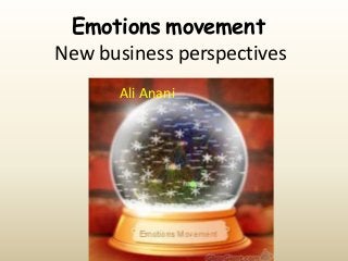
- 1. Emotions movement New business perspectives Ali Anani
- 2. Cover slide made by http://www.glassgiant.com/snowglobes/
- 3. We are moving from product dominance to service prevailing markets
- 4. Services require healthy relationships
- 5. Healthy emotions are the precursors for healthy relationships Emotions Relationship
- 6. A true relationship is a tolerant one
- 7. It is accepting the past of others, bonding them to you and opening up future possibilities for them
- 8. For emotions to function as effective precursors to healthy actions they have to have…
- 9. The right balance between strong and weak emotional ties to propagate social networks
- 10. You need a visual proof for that…
- 11. See the movement of emotions over time in the next slide
- 12. Positive emotions. The size of nodes represents how common a given emotion is. The thickness of the edges is proportional to how often people travel between two given emotions. http://www.kanjoya.com/blog/kanjoyaeng/building-a-roadmap-of-humanemotion-part-1/
- 13. The previous graph shows that the links between emotions are not evenly distributed, but are clustered Natural clusters are similar
- 14. The graph shows also that there are emotion hubsemotions that are massively linked to other emotions These clusters can be described with five color labels. Green → Positive/Blissful/Energetic Blue → Low energy/Depressed/Sad Red → Anxious/Angry/Scared Orange → Physical discomfort/Neutral/Circumstantial Yellow → Sexual/Aroused
- 15. True emotional relationships base themselves on….
- 16. Their valences, wherein positively and negatively charged emotions may form bonds like ionic bonds in elements
- 17. And neutral emotions may form shared bonds like covalent bonds among elements
- 18. Is the next step forming a periodic table of emotions to understand their movements and clustering and mode of bonding?
- 19. 112 elements in the periodic table So, 112 emotions in the emotions periodic table!!!
- 20. Should we consider having emotion isotopes? Closely similar emotions
- 21. Emotions have their risk as well Depending on the frequency and impact of the emotion
- 23. These facts show that the probability of moving from one cluster to another is much less than moving within the same cluster This helps in identifying the probability of an emotion in the emotions risk grid
- 24. Jumping between emotions in the same cluster “joy” → “humor”) is easier than jumping between nodes in completely different clusters (“joy” → “joy” → “sadness”). Joy Sadness Difficult Joy Humor Easy
- 25. Apparently emotions need a visa to travel between clusters
- 26. As for the impact, the larger connection an emotion has, the greater is its impact
- 27. Hot emotions are expected to have the highest impact
- 28. These findings may require revising our understandings in many fields such as the stock market
- 29. Should this curve be revised in view of the new findings? Emotions preferential movements
- 30. Many possibilities of movement and not necessarily straight to the denial stage as is shown in the previous slides http://www.kanjoya.com/blog/kanjoya-eng/building-a-roadmapof-human-emotion-part-1/
- 31. Emotions trigger action We need to better the understanding of our emotions to improve our actions
- 32. Hi Dr. Anani, yes you have permission with appropriate credit. Thanks Mr. Armen Berjikly for your permission to republish your emotion map.