Más contenido relacionado
Más de Andrew Chow ✯ Keynote Speaker ✯ (20)
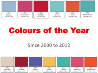
Colour of the Year (2000-2012)
- 4. The colour was chosen as consumers were seen
as seeking inner peace and spiritual fulfilment in
the new millenium
- 6. This colour was drastically different from the sky blue
Cerulean that was chosen the year before.
- 9. True Red was a different variation of
the previous year's reddish colour.
- 10. True Red was chosen to symbolise the impact
of the September 11 attacks
- 13. Pantone chose the Aqua Sky
colour as a cool colour was
meant to restore hope and
serenity.
- 28. The mix of purple and blue suggests
dependability and magic.
- 31. The colour was chosen because
it is warm, cheerful, and sparks
imagination and innovation.
- 33. It was a return to turquoise in
2005
- 34. The colour was chosen because it is an
inviting, luminous hue inspiring
soothing thoughts and tropical water.
- 36. The pink hue is extremely
feminine but not too over the
top.
- 40. The reddish orange Tangerine Tango
was chosen to provide the energy
boost needed to recharge and move
forward.