1. Also, the clothing and makeup of the characters are also significant as they portray
the characters personality. The “sexy girl” has brown eyes, mascara & black eye liner
to emphasise her pretty eyes and make them stand out; blusher applied on her
cheeks to add a little colour and make her cheekbones more noticeable; lipstick to
make her lips stand out and look more alluring. Tight black and white dress: This
shows her curvaceous figure and she’s also wearing black heels to make her look
taller. The main guy “Jignesh” has more of a Casual dress sense, grey hooded
jumper with denim blue jeans, and trainers.
However, when he is shown in the dream sequence, he wears jeans
and a smart black jumper, which emphasises that he is no longer a
cleaner and looks more attractive to girls. The “bucktooth geek”
Wears big glasses, clothes’ braces and a bow tie with a purple long
sleeved cardigan underneath; emphasising the fact that she likes to
dress as a nerd. Her plain facial expressions suggest that she’s shy
and nervous. The attitude of the ‘buck tooth’ is
quite laid back. Her buckteeth are exposed slowly,
when she smiles, which then shocks the main
character, leading him on to the next ‘girl’ who
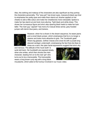
turns out to be a transvestite. The transvestite
wears a long brown curly wig with a long black
moustache, which adds to the humour involved in our music video.
2. 1. How effective is the combination of your media product and
ancillary texts?
The song we chose was “Move it to the drum”. From the name of the song, we knew
that our product would have to involve a colourful dance theme throughout the
product. Our Digipack, CD cover & advert consisted of a bright multi coloured
background. We were influenced by other music video advert which has the same
genre as ours; it influenced our group because we wanted to think of something
original as we decided not to make our digipak cover too simplistic, which as the
research suggested, normally are. We then contrasted other Digipack covers such as
Benny Benassi and David Guetta. We found a frequent convention which the CD
covers consisted of having the main artist on the front cover.
ADVERT FRONT & BACK OF INSIDE
LEAFLET
FRONT & BACK COVER
Multi-coloured background-continual theme throughout
Our digipak cover, inside leaflet, advert and music video all go well together, as there
is a continual theme throughout; we developed characteristics from the video into the
digipak. For example, the concept of bright lights that were in the music video was
followed by the use of bright colours as the backgrounds of our ancillary texts. Both
the music video and digipak should compliment each other; there is a continuation of
the mood from what the music video gives to what the digipak gives. It’s important for
them both to complement each other as they have to link in, because if a viewer
wanted to buy the digipak after watching our music video, they would be anticipating
that the digipak ties in with what they have seen.
My ancillary text encloses and presents full attention to the main artist, with the main
guy being the centre of attention; which makes him easily identifiable. The digipak
3. cover consists of the four main characters, however the artist is slightly enlarged,
which helps to recognize the main person, this is different to the advert as it’s only
got the main guy on it; I have related all three of the ancillary texts together. Within
my final productions, I have mentioned a major record label; ‘Sony BMG music
entertainment’, this would help in order for attracting a larger audience as it is such a
big well known label. Having the logo on the ancillary texts shows that the artists
must be really good; this is because they are signed to such a well known
established company.
I think my ancillary texts help greatly to promote my music video; the public can
easily identify the artist and genre of the music video due to the conventions that I
have used within my CD Case and Advert. As it is easily recognisable it will help the
targeted audience be attracted to my products which will inevitably lead to more CD's
being sold and even more profit coming in; after the promotion of the main product it
will help become more successful around the world which will make the targeted
audience become greater. Our digipak follows several established forms and
conventions, for example, the image of the main character/artist, name of the song,
and a track listing.
With regards to the magazine advert, we tried to achieve branding by keeping a
consistent theme. The magazine advert and digipak both use the same font type
which is on all the ancillary texts, it makes it stand out and eye-catching for viewers.
It also gives a sense to what is expected in the video. The viewers should be able to
recognise that the two ancillary texts come from the same music video as we felt it
was important to create a sense of permanence, continuity and immovability.
3) What have you learned from your audience feedback?
Our initial target audience were male and female aged 14-40. When looking at target
audience research, from the results received, it is clearly shown that people
thoroughly enjoyed our music video. From the questionnaire results we conducted
before we made our video, it was apparent that our target audience prefer narrative
based videos that have a story-line to the music video, this makes it more interesting
as it feels like a movie and is easier to sit and watch without getting tedious. The
majority of people also said that they would only watch the video if the liked the
songs, our feedback after they watched the video was that they would watch the
video again but not download it.
The results from the interview tell us that both the music and lyrics are very important
to the success of a song. In our music video the lyrics of the song are limited, there is
one phrase sung at various stages of the song to which adds as a constant reminder
to the audience. The phrase is “Ah damn girl, I like the way you move it to the drum”,
since this phrase is replayed a number of times it makes it easier for the audience to
remember. Also the phrase links to the name of the song, also creating an easy way
for the person listening to the song to get excess easily through downloading sites
such as ‘iTunes’, which makes it easier to gain views and sale. This helps the profit
margins and helps the song travel higher in music charts.
4. The lyrics of the song make the audience think of girls dancing sexually, the word
“Ah” itself acts as a sexual motif to make the song more likeable with the male
gender.
From our audience feedback after they viewed our music video, the majority of
people thoroughly enjoyed it and thought that it all fitted together really well.
However, they did not really understand the concept properly, the majority of people
interviewed also said that it was in the middle of the video where they tended to get
slightly confused and why the main character was dancing with those three other
characters. The 7 people I interviewed all said that the ancillary products resemble
and link to the video, rating it a 7 or above. All of the 7 people interviewed also said
that all three ancillary texts relate to the music video really well.
Constructive criticism is crucial from our audience feedback, so if we were to produce
the music video again, we would definitely do things differently and take on board
what the respondent’s opinions were. When we asked what they wanted to change in
our music video, a lot of people said to make the concept clearer so that they
understood it better. They also wanted more dance elements and for the onstage
chemistry between the characters to be more publicized. One other negative
comment was mainly that the text colour/font used in the music video did not
compliment the video, other than that, there was overall positive comments
throughout. In conclusion, I think that we have met the OCR brief of the forms and
conventions for our music video and print work, as it appeals to our target audience.
We were also able to demonstrate great technical skills, for example, holding a still
camera for steady shots and also editing skills which made the music video clear in
some way, rather than having rough cuts, it ran smoothly.
4) How did you use new media technologies in the research,
planning, construction and evaluation stages?
Most of our planning and research was
accomplished by getting information from search
engines and the internet. Search engines such as
www.google.com provided us with many images
and videos to help us with our research.
Also www.youtube.com was
used to help us with our similar textual analysis, as we selected
which videos we wanted to analyse.
I also used www.facebook.com, this was to get the
audience feedback results after they viewed our music
video. To complete our music video successfully I had
to research several other music videos of the same
genre. This helped me with the development of my own
ideas.
5. Researching music videos was the most significant in getting my own ideas as it
gave me a clear vision of the types of things I could include and it also showed what
elements make it enjoyable to watch. Also using primary research which was
conducting questionnaires was very useful as it showed what most people would
want to see in a music video and what they expect.
The difficulties I had encountered whilst conducting my research was putting all the
individual thoughts in the group all together and fitting it into the final proposal. The
planning was all very useful when we got to the production phase. For the edifice of
our music video, we used the Canon XM2 camcorder. To make sure our recording
was clear; we had to set up a few controls. By using manual focus, it enabled us to
capture very clear shots from a distance.
One of the main digital technologies that I have
used for the process of my project was
‘Blogger’ itself. ‘Blogger’ enabled me to store
my work efficiently and it was easy to access.
‘Blogger’ enabled us to upload our video clips
of our final cut. When it came to blogging I felt
that I was very creative as I changed the text formats and inserted images. However,
we decided to upload our evaluation via slideshare, which then went on to our blog.
Another digital technology which I have used are the search engines on the internet;
websites such as ‘Wikipedia’ to find out about the artists. With these I was able to
research the music video genre.
I used these search engines for my research as well as my evaluation as I have been
linking these websites to the different films
mentioned throughout my evaluation. We used
Apples’ Final cut pro to upload our footage. The
upload to final cut pro was quick and easy. Once
our footage was on it we were able to sort out our
clips, deciding which clips we were going to use.
After we had done this we were then able to cut
and edit our clips using the cutting tool which was
fairly easy to use. Final cut pro also enabled us to
add filters, transitions, visual effects, sound effects and text on to our music video.
Whilst taking our footage we used camera XM2 camcorders.
This enabled us to take footage efficiently and we were able
to capture the shots we wanted. However one problem we did
find with these camcorders was that the sound that we
captured on them was not very clear.
However I was able to zoom in and out of
a shot smoothly using the zoom tool. I also used a scanner to
upload storyboards that we had done on paper. This was fast
and efficient and meant we were able to include our storyboards
within our blog.
6. All of the software I have mentioned above was used through a Mac computer. The
Macs enabled us to use the software’s, whereas if we had been using a PC we
wouldn’t have been able to use them. I was also able to upload footage and photos
onto the Mac computers quick and efficiently as well as storing our work in our
individual folders.
Most of the technology techniques used were learnt during
AS. Whilst importing all of our clips onto Final Cut Pro, in
which we used the log and capture feature. One of the new
techniques we learnt was adding visual effects and
transitions into our video. As for the construction of our
digipak and magazine adverts, we captured still images
from Final Cut Pro whilst we were editing, and used them in
our ancillary texts. Our advert, inside leaflet, front and back
cover were all designed on Adobe Photoshop, we knew how
to use it because we were taught the basic from tutorials
given in lesson.