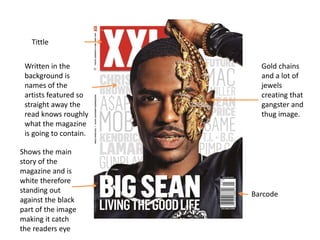
1. Written in the
background is
names of the
artists featured so
straight away the
read knows roughly
what the magazine
is going to contain.
Shows the main
story of the
magazine and is
white therefore
standing out
against the black
part of the image
making it catch
the readers eye
Barcode
Tittle
Gold chains
and a lot of
jewels
creating that
gangster and
thug image.
2. Text is black on a white background
making it easy to read.
2 black men
with a quote
on the next
page about
what they
have said.
This is the
main part of
the story as
it is bigger
than all
other text
making it a
tittle or
headline The tittle shows the life style they live and how
they have each others backs.
3. Black and white used
in the background to
make the tittle and
image stand out.
Sub headings in
black making
them easy to
read against the
background
Tittle big and bold
and is written the
wrong way round
making it
interesting, it is also
in white so it
doesn’t clash with
the background
Magazine aimed
at men therefore
use a women as a
attraction to the
page.
4. Short summary's on the
side of the page and
important info in yellow
Date, price and
website.
Barcode in bottom left of
the page, needs this so it
can be purchased
Bright eye catching
picture as eyes look
like they are looking
at the reader, the
image is the most
important part of the
cover as nothing
overlaps it and it
dominates the page
Main cover story in big
bold text letting the
reader know straight
away what the main
story's about.
Black white and yellow are
main colours, they are good
colours as they don’t clash.
Tittle or brand image of
magazine in big and bold text
but covered by model
Model Taylor Swift in the middle
of the page, this is a close up shot.
5. This tittle
isn't pleasant
as it sais “we
have booted
the doors off
its hinges”
this appeals
to a certain
audience, it
is also
attention
grabbing as it
is big bold
and don’t
clash with
the
background.
Writing in bold and white
with a quote and in light
green a name (Liam
Gallagher) who wrote the
quote.
Text reading information about the quote above, and
the letter BS standing out going for a rebellion look this
is also shown in the image of him smoking
6. The same layout
and theme
throughout
keeping the same
image retaining it.
Tittle or headline is
big black and bold
catching the
readers eye. The
tittle shows signs of
disrespect and
rebellion.
Date
Image of the
people
performing
mentioned in
the headline
relating the
image to the
story.
Colours are very
simple and the
layout is like a
news paper
making it look very
old school.
Promoting and advertising the magazine
Black on
white=clear
and easy to
read
7. Tittle is big and
bold to stand out it
is also black
meaning it doesn’t
clash with the
background. It is
the biggest text on
the page as it is the
most important.
The text here on the
page is all the same
font, important text
is in a brighter colour
(pink) to draw
attention. The text in
pink is normally a
artist or band.
Katy Perry is the
most important
part of the page as
she over laps
everything
including the tittle,
she is also the
larges graphic on
the page making
her stand out, this
could be because
the main article is
about her.
Advertising new
songs, these songs
could link to who
the magazine is
aiming at(target
audience)
8. Man takes up most
of the page making
him the centre of
attention in this
contents page. If
he wasn’t on the
page the page
would be very
boring so it livens
the page up.
The only part
of the page in a
bright colour
drawing
attention to it.
The tittle is big and
bold as it is the
main title and part
of the page.
Different colour
text in different
fonts, the black
bold text is the
most important
information and
the blue text isnt
as important.
9. Title the biggest text
this is to automatically
tell the reader what or
who the articles
about.
Sub
headings in
black and
bold and a
larger font
so they
stand out.
Text in black onto a pink
background making it easy
to read therefore it is
effective.
Background is pink and matches the
theme and personality of the person
the article is talking about. Also the
background matches her lipstick.
Image is the main part of the page and
nothing overlaps it, also the background
matches Nicki Minajs lipstick.