SlideShare una empresa de Scribd logo
1 de 1
Magazines generally have a colour
                                             2ND CONTENTS PAGE ANALYSIS
scheme and house style which runs
constantly throughout the magazine.          The editor has chosen to put the name of the magazine in          The issue number is placed in small
Q has carried this out and used red,         a red banner at the top left of the contents page. ‘Q’ is in      font at the right of the title. It is
black and white for the contents page,       large, white font on a red banner. The white contrasts with       there, just so people know what
which is consistent with the house           the red, therefore stands out and catches the readers eye.        number magazine they have got. It
style for this magazine. The colour red      The editor wants people to see the name of the magazine,          is small so that it doesn’t draw
represents the danger and rebellion of       that’s why it is placed at the top, left of the page, because     people away from the important
the music, which may relate to the           people read from left to right, so it will be seen first. He      things.
people reading it. Also red is very          does this so that it will stick in their mind thus bringing
                                             them to buy the magazine more often.                              The editor has used a conventional
bright and stands out, therefore
                                                                                                               name for the contents page, which is
people will not want to skip this page,
                                                                                                               ‘contents’. Many magazines tend to
because it will catch their eye. The
                                                                                                               use this title for the contents page,
white and black are neat, and look
                                                                                                               mainly based on the fact that the
fairly sophisticated. The colours go
                                                                                                               reader’s straight away know what
well together and don’t look tacky or
                                                                                                               they are looking at. Contents are a
cheap.
                                                                                                               vital part of a magazine because
This contents page just has one column                                                                         reader’s like to skip straight to their
of information. This is the ‘features’                                                                         favourite artist, instead of flicking
column. The numbers are placed at the                                                                          through each page to find it. Also
left of the heading. Underneath the                                                                            reader’s like to know what is in their
number and heading is a sentence                                                                               magazine, so the title ‘contents’ will
giving a little information on what the                                                                        attract the reader straight away
article is all about. This will inform the                                                                     because it’s what they want to see.
reader, allowing the reader to decide                                                                          There are 3 smaller images on this
whether the article will interest them                                                                         contents page. There is an image of
and whether they will want to read it.                                                                         The Beatles in the ‘features’ column
The numbers and headings are in bold,                                                                          with the first page number and
black font, which contrasts with the                                                                           heading. This is included just so
white background, making it easy to                                                                            people have an insight to the inside
read. However the sentence                                                                                     of the magazine, and also because
underneath is in smaller, black font so                                                                        The Beatles are a well known band,
that it doesn’t draw attention away                                                                            therefore people may be drawn to
from the main images and main                                                                                  this image.
headings. Most magazines would
inform the readers of what is on most
                                              The main image is of the great musician, Matt Bellamy from Muse. It is
of the pages in the magazine; however                                                                                        The other two images
                                              a ¾ length shot, which allows the reader to see what he, is wearing, as
I have noticed that in this contents                                                                                         are placed nearer to
                                              well as see his body language and facial expressions. He is wearing a
page, Q only let people know what is                                                                                         the bottom of the
                                              silver suit Jacket, with a shirt and tie, along with some sunglasses. This
going to be in the second half of the                                                                                        contents page because
                                              is a very sleek kind of look, making him seem stylish and in control. He
magazine. This may not satisfy the                                                                                           they are less
                                              is wearing sunglasses to cover up his eyes; this makes him seem
readers.                                                                                                                     important and the
                                              different because you don’t generally see men wearing silver suits with
                                                                                                                             editor does not want
The layout of this page is fairly             sunglasses. The fact that Matt Bellamy is portrayed as different/unique
                                                                                                                             the reader’s to be
organized, but in some ways it does           conveys the genre of music represented and also relates to many of
                                                                                                                             drawn away from the
look a bit cluttered due to the images        the reader’s who are also different/unique. Matt is looking towards the
                                                                                                                             main image/the main
placed on top of each other. The clutter      ‘feature’ column, and because the main image is usually the first thing
                                                                                                                             story of the magazine.
of the page relates to the genre of the       the reader’s see, means that they will be drawn to where he is looking,
                                                                                                                             Plenty of images are
music, because the music also sounds a        also leading the reader to follow him and look at the ‘features’ column.
                                                                                                                             included because
bit cluttered, which may also relate to       The page number for this image is in large, white font at the top right
                                                                                                                             readers are attracted
the reader who may be a cluttered             of the image. The white font contrasts with the black background
                                                                                                                             to images.
person.                                       bringing it to stand out, so that people who like Matt Bellamy will see it
                                              and automatically turn to that page.

Más contenido relacionado

La actualidad más candente (19)

NME Analysis
NME AnalysisNME Analysis
NME Analysis
 
Question 1!
Question 1!Question 1!
Question 1!
 
Textual analysis
Textual analysisTextual analysis
Textual analysis
 
Analysis of music magazine covers
Analysis of music magazine coversAnalysis of music magazine covers
Analysis of music magazine covers
 
Contents page finished
Contents page finishedContents page finished
Contents page finished
 
Contentspage pres...11111
Contentspage pres...11111Contentspage pres...11111
Contentspage pres...11111
 
My evaluation don
My evaluation donMy evaluation don
My evaluation don
 
Double page articles
Double page articlesDouble page articles
Double page articles
 
Evaluation 1
Evaluation 1Evaluation 1
Evaluation 1
 
Analysing contents pages
Analysing contents pagesAnalysing contents pages
Analysing contents pages
 
Contents Page Analysis
Contents Page AnalysisContents Page Analysis
Contents Page Analysis
 
.
..
.
 
Contents Page Analysis
Contents Page AnalysisContents Page Analysis
Contents Page Analysis
 
Conventions
ConventionsConventions
Conventions
 
Conventions
ConventionsConventions
Conventions
 
Specific examples of target audience in my magazine
Specific examples of target audience in my magazineSpecific examples of target audience in my magazine
Specific examples of target audience in my magazine
 
Contents pg anal
Contents pg analContents pg anal
Contents pg anal
 
Main magazine research contents 1
Main magazine research contents 1Main magazine research contents 1
Main magazine research contents 1
 
Evaluation
EvaluationEvaluation
Evaluation
 

Destacado

Core diagram design 4 powerpoint ppt slides.
Core diagram design 4 powerpoint ppt slides.Core diagram design 4 powerpoint ppt slides.
Core diagram design 4 powerpoint ppt slides.
SlideTeam.net
 
Calendario romano1
Calendario romano1Calendario romano1
Calendario romano1
Ainoaim
 
4 puzzle pieces in a line fitting style design 1 powerpoint ppt slides.
4 puzzle pieces in a line  fitting style design 1 powerpoint ppt slides.4 puzzle pieces in a line  fitting style design 1 powerpoint ppt slides.
4 puzzle pieces in a line fitting style design 1 powerpoint ppt slides.
SlideTeam.net
 
PSY285 Chapter 15
PSY285 Chapter 15PSY285 Chapter 15
PSY285 Chapter 15
shawm3
 
Confronto tra le proiezioni demografiche base 2011 e quelle base 2007 - Graf...
Confronto tra le proiezioni demografiche base 2011 e  quelle base 2007 - Graf...Confronto tra le proiezioni demografiche base 2011 e  quelle base 2007 - Graf...
Confronto tra le proiezioni demografiche base 2011 e quelle base 2007 - Graf...
Nicola_C_Salerno
 
Teste formativo pacc 1º do 2º periodo
Teste formativo pacc   1º do 2º periodoTeste formativo pacc   1º do 2º periodo
Teste formativo pacc 1º do 2º periodo
Leonor Alves
 

Destacado (19)

Core diagram design 4 powerpoint ppt slides.
Core diagram design 4 powerpoint ppt slides.Core diagram design 4 powerpoint ppt slides.
Core diagram design 4 powerpoint ppt slides.
 
Calendario romano1
Calendario romano1Calendario romano1
Calendario romano1
 
Review my portfolio
Review my portfolioReview my portfolio
Review my portfolio
 
4 puzzle pieces in a line fitting style design 1 powerpoint ppt slides.
4 puzzle pieces in a line  fitting style design 1 powerpoint ppt slides.4 puzzle pieces in a line  fitting style design 1 powerpoint ppt slides.
4 puzzle pieces in a line fitting style design 1 powerpoint ppt slides.
 
Farm Animals 农场动物
Farm Animals 农场动物Farm Animals 农场动物
Farm Animals 农场动物
 
PSY285 Chapter 15
PSY285 Chapter 15PSY285 Chapter 15
PSY285 Chapter 15
 
Votorantim
VotorantimVotorantim
Votorantim
 
Helado de yogur
Helado de yogurHelado de yogur
Helado de yogur
 
Confronto tra le proiezioni demografiche base 2011 e quelle base 2007 - Graf...
Confronto tra le proiezioni demografiche base 2011 e  quelle base 2007 - Graf...Confronto tra le proiezioni demografiche base 2011 e  quelle base 2007 - Graf...
Confronto tra le proiezioni demografiche base 2011 e quelle base 2007 - Graf...
 
pres pres pres
 pres pres pres  pres pres pres
pres pres pres
 
Teste formativo pacc 1º do 2º periodo
Teste formativo pacc   1º do 2º periodoTeste formativo pacc   1º do 2º periodo
Teste formativo pacc 1º do 2º periodo
 
Frutas
FrutasFrutas
Frutas
 
Ramco - A Software for all Seasons
 Ramco - A Software for all Seasons Ramco - A Software for all Seasons
Ramco - A Software for all Seasons
 
Caso clinico
Caso clinico Caso clinico
Caso clinico
 
Goldbach Media | Neu auf Nickelodeon: «Groove High»
Goldbach Media | Neu auf Nickelodeon: «Groove High»Goldbach Media | Neu auf Nickelodeon: «Groove High»
Goldbach Media | Neu auf Nickelodeon: «Groove High»
 
CV de KADIDIDATOU HAWLEY
CV de KADIDIDATOU HAWLEYCV de KADIDIDATOU HAWLEY
CV de KADIDIDATOU HAWLEY
 
Gem7
Gem7Gem7
Gem7
 
Brussels Briefing 44: Abel Fernández CONACADO Commercial Manager, Dominican R...
Brussels Briefing 44: Abel Fernández CONACADO Commercial Manager, Dominican R...Brussels Briefing 44: Abel Fernández CONACADO Commercial Manager, Dominican R...
Brussels Briefing 44: Abel Fernández CONACADO Commercial Manager, Dominican R...
 
B 12
B 12B 12
B 12
 

Similar a 2nd contents page

Kerrang evaluation
Kerrang evaluationKerrang evaluation
Kerrang evaluation
sophiex
 
Double Page Spread Analysis
Double Page Spread AnalysisDouble Page Spread Analysis
Double Page Spread Analysis
johanna-asmedia
 
Front page analysis 1
Front page analysis 1Front page analysis 1
Front page analysis 1
nadiaewins
 
Front Page Analysis 1
Front Page Analysis 1Front Page Analysis 1
Front Page Analysis 1
nadiaewins
 
Analysing contents pages prep for blog ppt
Analysing  contents pages prep for blog pptAnalysing  contents pages prep for blog ppt
Analysing contents pages prep for blog ppt
PotterM2
 
Analysing contents pages prep for blog ppt
Analysing  contents pages prep for blog pptAnalysing  contents pages prep for blog ppt
Analysing contents pages prep for blog ppt
PotterM2
 
Content Page Analysis
Content Page AnalysisContent Page Analysis
Content Page Analysis
Charis Creber
 
Preliminary and Planning Tasks
Preliminary and Planning TasksPreliminary and Planning Tasks
Preliminary and Planning Tasks
Fredi Moore
 
Analysing Contents Pages
Analysing Contents PagesAnalysing Contents Pages
Analysing Contents Pages
asmediag12
 
Contents Page Analysis - Music Magazine
Contents Page Analysis - Music MagazineContents Page Analysis - Music Magazine
Contents Page Analysis - Music Magazine
asmediag12
 
Analysing contents pages
Analysing  contents pages Analysing  contents pages
Analysing contents pages
asmediae12
 
Analysis of Front covers, contents pages and double page spreads.
Analysis of Front covers, contents pages and double page spreads.Analysis of Front covers, contents pages and double page spreads.
Analysis of Front covers, contents pages and double page spreads.
lozfenwick9
 
Music Magazines Analysis
Music Magazines AnalysisMusic Magazines Analysis
Music Magazines Analysis
emmacleary
 
Front Cover Research
Front Cover ResearchFront Cover Research
Front Cover Research
jessheap
 
Annotation of other magazines
Annotation of other magazines Annotation of other magazines
Annotation of other magazines
chiquitahx
 

Similar a 2nd contents page (20)

Kerrang evaluation
Kerrang evaluationKerrang evaluation
Kerrang evaluation
 
Front Cover Analysis
Front Cover AnalysisFront Cover Analysis
Front Cover Analysis
 
Double Page Spread Analysis
Double Page Spread AnalysisDouble Page Spread Analysis
Double Page Spread Analysis
 
Front page analysis 1
Front page analysis 1Front page analysis 1
Front page analysis 1
 
Front Page Analysis 1
Front Page Analysis 1Front Page Analysis 1
Front Page Analysis 1
 
Analysing contents pages prep for blog ppt
Analysing  contents pages prep for blog pptAnalysing  contents pages prep for blog ppt
Analysing contents pages prep for blog ppt
 
Analysing contents pages prep for blog ppt
Analysing  contents pages prep for blog pptAnalysing  contents pages prep for blog ppt
Analysing contents pages prep for blog ppt
 
Content Page Analysis
Content Page AnalysisContent Page Analysis
Content Page Analysis
 
Preliminary and Planning Tasks
Preliminary and Planning TasksPreliminary and Planning Tasks
Preliminary and Planning Tasks
 
NME
NMENME
NME
 
Analysing Contents Pages
Analysing Contents PagesAnalysing Contents Pages
Analysing Contents Pages
 
Contents Page Analysis - Music Magazine
Contents Page Analysis - Music MagazineContents Page Analysis - Music Magazine
Contents Page Analysis - Music Magazine
 
Analysing contents pages
Analysing  contents pages Analysing  contents pages
Analysing contents pages
 
Analysis of Front covers, contents pages and double page spreads.
Analysis of Front covers, contents pages and double page spreads.Analysis of Front covers, contents pages and double page spreads.
Analysis of Front covers, contents pages and double page spreads.
 
Music Magazines Analysis
Music Magazines AnalysisMusic Magazines Analysis
Music Magazines Analysis
 
Kerrang magazine
Kerrang magazineKerrang magazine
Kerrang magazine
 
Front Cover Research
Front Cover ResearchFront Cover Research
Front Cover Research
 
Analysis of music magazines
Analysis of music magazinesAnalysis of music magazines
Analysis of music magazines
 
Kerrang analysis front
Kerrang analysis frontKerrang analysis front
Kerrang analysis front
 
Annotation of other magazines
Annotation of other magazines Annotation of other magazines
Annotation of other magazines
 

Más de johanna-asmedia

Más de johanna-asmedia (20)

Ict powerpont
Ict powerpontIct powerpont
Ict powerpont
 
Incidious poster
Incidious posterIncidious poster
Incidious poster
 
Questionnaire
QuestionnaireQuestionnaire
Questionnaire
 
My poster analysis
My poster analysisMy poster analysis
My poster analysis
 
Storyboard
StoryboardStoryboard
Storyboard
 
Contact sheet
Contact sheetContact sheet
Contact sheet
 
9 frame analysis
9 frame analysis9 frame analysis
9 frame analysis
 
Risk assessment
Risk assessmentRisk assessment
Risk assessment
 
Texas chainsaw
Texas chainsawTexas chainsaw
Texas chainsaw
 
Exploitation horror analysis of chainsaw massacre
Exploitation horror analysis of chainsaw massacreExploitation horror analysis of chainsaw massacre
Exploitation horror analysis of chainsaw massacre
 
Slogan and inserts for deactivate trailer
Slogan and inserts for deactivate trailerSlogan and inserts for deactivate trailer
Slogan and inserts for deactivate trailer
 
Minutes 7th november 2012
Minutes 7th november 2012Minutes 7th november 2012
Minutes 7th november 2012
 
Minutes 2nd november 2012
Minutes 2nd november 2012Minutes 2nd november 2012
Minutes 2nd november 2012
 
Media photoshoot scheduleing
Media photoshoot scheduleingMedia photoshoot scheduleing
Media photoshoot scheduleing
 
Music mag evaluation
Music mag evaluationMusic mag evaluation
Music mag evaluation
 
Deactivate 2
Deactivate 2Deactivate 2
Deactivate 2
 
Minutes 10th october 2012
Minutes 10th october 2012Minutes 10th october 2012
Minutes 10th october 2012
 
Prom night poster analysis
Prom night poster analysisProm night poster analysis
Prom night poster analysis
 
Prom night poster analysis
Prom  night poster analysisProm  night poster analysis
Prom night poster analysis
 
Incidious poster
Incidious posterIncidious poster
Incidious poster
 

2nd contents page

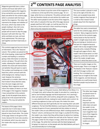
  • 1. Magazines generally have a colour 2ND CONTENTS PAGE ANALYSIS scheme and house style which runs constantly throughout the magazine. The editor has chosen to put the name of the magazine in The issue number is placed in small Q has carried this out and used red, a red banner at the top left of the contents page. ‘Q’ is in font at the right of the title. It is black and white for the contents page, large, white font on a red banner. The white contrasts with there, just so people know what which is consistent with the house the red, therefore stands out and catches the readers eye. number magazine they have got. It style for this magazine. The colour red The editor wants people to see the name of the magazine, is small so that it doesn’t draw represents the danger and rebellion of that’s why it is placed at the top, left of the page, because people away from the important the music, which may relate to the people read from left to right, so it will be seen first. He things. people reading it. Also red is very does this so that it will stick in their mind thus bringing them to buy the magazine more often. The editor has used a conventional bright and stands out, therefore name for the contents page, which is people will not want to skip this page, ‘contents’. Many magazines tend to because it will catch their eye. The use this title for the contents page, white and black are neat, and look mainly based on the fact that the fairly sophisticated. The colours go reader’s straight away know what well together and don’t look tacky or they are looking at. Contents are a cheap. vital part of a magazine because This contents page just has one column reader’s like to skip straight to their of information. This is the ‘features’ favourite artist, instead of flicking column. The numbers are placed at the through each page to find it. Also left of the heading. Underneath the reader’s like to know what is in their number and heading is a sentence magazine, so the title ‘contents’ will giving a little information on what the attract the reader straight away article is all about. This will inform the because it’s what they want to see. reader, allowing the reader to decide There are 3 smaller images on this whether the article will interest them contents page. There is an image of and whether they will want to read it. The Beatles in the ‘features’ column The numbers and headings are in bold, with the first page number and black font, which contrasts with the heading. This is included just so white background, making it easy to people have an insight to the inside read. However the sentence of the magazine, and also because underneath is in smaller, black font so The Beatles are a well known band, that it doesn’t draw attention away therefore people may be drawn to from the main images and main this image. headings. Most magazines would inform the readers of what is on most The main image is of the great musician, Matt Bellamy from Muse. It is of the pages in the magazine; however The other two images a ¾ length shot, which allows the reader to see what he, is wearing, as I have noticed that in this contents are placed nearer to well as see his body language and facial expressions. He is wearing a page, Q only let people know what is the bottom of the silver suit Jacket, with a shirt and tie, along with some sunglasses. This going to be in the second half of the contents page because is a very sleek kind of look, making him seem stylish and in control. He magazine. This may not satisfy the they are less is wearing sunglasses to cover up his eyes; this makes him seem readers. important and the different because you don’t generally see men wearing silver suits with editor does not want The layout of this page is fairly sunglasses. The fact that Matt Bellamy is portrayed as different/unique the reader’s to be organized, but in some ways it does conveys the genre of music represented and also relates to many of drawn away from the look a bit cluttered due to the images the reader’s who are also different/unique. Matt is looking towards the main image/the main placed on top of each other. The clutter ‘feature’ column, and because the main image is usually the first thing story of the magazine. of the page relates to the genre of the the reader’s see, means that they will be drawn to where he is looking, Plenty of images are music, because the music also sounds a also leading the reader to follow him and look at the ‘features’ column. included because bit cluttered, which may also relate to The page number for this image is in large, white font at the top right readers are attracted the reader who may be a cluttered of the image. The white font contrasts with the black background to images. person. bringing it to stand out, so that people who like Matt Bellamy will see it and automatically turn to that page.