
Recomendados
Más contenido relacionado
La actualidad más candente
La actualidad más candente (20)
Destacado
Destacado (20)
Similar a Colour Perception and its Aesthetic Translations - Part A
Similar a Colour Perception and its Aesthetic Translations - Part A (20)
Más de Ranjan Joshi
Más de Ranjan Joshi (20)
Último
Último (20)
Colour Perception and its Aesthetic Translations - Part A
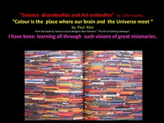
- 1. “Science disembodies and Art embodies” by John Fowles… “Colour is the place where our brain and the Universe meet “ by Paul Klee from the book by famous visual designer Alan Fletcher “ The Art of looking sideways”. I have been learning all through such visions of great visionaries.
- 2. Indo German Colour Conference March 1,2,and 3 2012 Hosted by pm Tuc Chemnitz University of Technology,(Germany) GATE,(Graphic Art and Technology Education) Print Week India, Campaign India pm India linking high potentials
- 3. Colour perception and its Aesthetic translations Academic Experiments in visual and communication art Ranjan Raghuvir Joshi
- 4. Gratitude… To: My elder brother Suhas R. Joshi then student of GIPT and first class merit ranker of the first batch of OFF-SET (1962) Printing Technology Education started in 1960s in Western India. My first exposure to PRINT in 1960 then 10 years old, due to him when he showed me this Government Institute of Printing Technology…known as GIPT in India
- 5. Gratitude… Colour Experiments at Art Institutes… Sir J.J. Institute of Applied Art, Government Institute of Printing Technology, Sir J.J. College of Architecture-Mumbai, Thane Art Society’s Thane School of Art, Cambrian College of Applied Art and Technology-Canada-EIOL (Mumbai)., Somani College of Applied Art and Craft-Mumbai, Symbiosis Institute of Design-Pune, ecole intuit.lab.-Paris-France (Mumbai Campus) MAEER’s Maharashtra Institute of Technology-MIT-Institute of Design-Pune University of Huddersfield – U.K.
- 6. Thanks… Students, and Faculties… • Sonali Mandke, Karlyle Gomes, Nadia, Karan Arora, Gayle D’souza, and whole class Faculties:Jamila Varawala, Prashant Acharya, - Cambrian College-Canada., (Mumbai) Natasha,Mahima,Anita,Annya, and class of Fashion Communication, Faculties: Prof. Subhash Kotwal , Prof. Mrs. Vaibhavi Ranavde, Haroop,Prashant Acharya,and Prof. Vinay Mundada-Director- Symbiosis Int. Des. Pune Ms. Dolly Biswas and her students., Somani College of Applied Art and Craft-Mumbai, Students of Sirj.j. college of Arch. ( MUMBAI ), Vyoma, Aditya, Monish,Sommya,Monaz,Pankhuri and class of ecole.intuit.lab. and the H.O. D. Jamilla Q. Varawalla., ecole.intuit.lab. France (Mumbai) Late Mr.Satish Deshpande (Pune),Prof. Deepak Ghare, Prof. Ashoak Desai,Prof. Bobade, Late Prof. Kamble,Late Prof.Lahane, Late Prof. Joglekar, and students of evening class of GIPT,(Mumbai)
- 7. A R T - for absorption of the light rays by the object being perceived by our eye - for reflection or refraction of the same light rays, and - for transmission of light rays in context to object being perceived.
- 9. Munsell’s original colour tree and my concept inspired from the same…
- 10. Munsell’s original colour tree and my concept inspired from the same. Here I have tried to develop the play of hue, value, chroma and saturation of color first on flat surface and then in three dimensions. It was photographed in different light conditions. The student Vishal Kullerwar of Graphic Design could implement this experience to design corporate packaging colour concept system
- 13. Notice the following visuals experimented for better understanding the questions mentioned… Do you find any colour difference when seen against opposite colors?, Such as Dull,Bright,Netural ect., Do you find optical change in size of the painted pattern against another colour?, Do you find colour difference due to change of medium, surface and get the similar when viewed in all of them?, Do you find colour change due to three dimensions when seen in actual shade and light?, Do you think this could be a guide line for colour checking?
- 14. Different combinations of Red, Green,Voilet,Blue with Cyan, Magenta and Yellow. Light and Pigment colour theories when seen and observed with context to colour in three different mediums the colour appearance change and also the colour vocabulary.
- 17. We can not be like an Ostrich, digging our neck in the ground searching for fish and be ignorant about the colorful world around us…. Artist, Client and the Printer are the three dimensions of this Industry
- 18. The change of colors due to third dimensions In the next slide you will notice the moment earlier colour swatches on white paper when peeled off from the flat two dimensional surface the painted color will change. The directions of source of light also influences the visual appearance
- 30. This basic diagram when reconstructed in three dimensional structure notice the shadow patterns… • I developed the same concept further with the help of students of Architecture. It was interesting to see the shadow patterns of the wire frames inviting different color perception. These patterns were painted back on flat paper surface by capturing the shadow patterns.
- 35. “Sciography” “Sciography” this new vocabulary in Architecture which means the patterns of shadows emerged out of the building construction falling on the ground that enhances the environment gave me inspiration. Here notice the two dimensional design painted in high key, low key and middle key captured from the three dimensional wire structure. It is like aesthetic visual and colour translation from three dimensions to two dimensions.
- 41. European colour palette has more pastel shades… Indian colour palette is different than European colour palette…
- 43. An original image on the left and redefined digitally on the right, notice the effect of atmospheric mist (Sfumato) which is lost though it looks sharp the image on the right…
- 44. Different shades of Sunrise and Sunset captured in Kerala state..
- 45. Observe the value translations
- 49. Notice the freshness of watermelon when viewed against different colour backgrounds
- 50. “Chiaroscuro” Redefined… light and shade through textures and surfaces seen in these examples..
- 53. A) Re-search into colour visual literacy: Concept of colour vocabulary for apt communication. B) Check True perception of an image: “Chiaroscuro” (Shade and light). C) Sir C.V. Raman Effect, SP effect ( Prof. Shantaram Pawar) and “Sfumato”
- 54. Colour Vocabulary: The students were ask to explore five different medium and check the vocabulary in their respective languages about the names of the color and see its names in other minimum three languages. This is focused with aim in mind for professional communication.
- 64. Re-search into colour visual literacy: Concept of colour vocabulary for apt communication. “In spite of proper use of color in various media, it has been found that colors are not read in the way they are intended to be. For 100 years, scientists have examined differences in color perception. Controversy continues over the question of whether different perceptions of color among various cultures can be attributed to perception or to color vocabulary.
- 65. It has been found that ancient cultures seem to have lacked words for certain colors. For instance, red is generally the first name to appear when discussing color. Yellow is found to rank next in prevalence. In general the color nomenclature of a culture usually begins with red and progresses towards blue end of the spectrum.
- 66. – Despite our highly developed color sense, many people still confuse bluish-green, blue- green and greenish blue. Similar case of red, when the color said to be red in general, it may be pink red, brick red, orange red, magenta red, crimson red roster red, depending on who expresses it.
- 67. The reason is the same red in printing, dyeing, photography, painting appears different. This can be avoided when visual literacy of color is established with the help of Audio-Visual education.” My research paper* 1985: Published in the proceedings of International Colour Conference (C.I.E.) “Role of Colour in Audio – Visual Education’” with invitation to present in form of a “POSTER PRESENTATION” at Monte Carlo–France which was presented by Co–author Dr.Shalini Patwardhan in France.
- 68. Check True perception of an image: “Chiaroscuro” (Shade and light). 1) Highlight: Light falls on the object and logically results in four aspects of light and shadow. The bright light where light from the source falls most directly on the object. 2) Reflected Light: Dim light when bounces back onto the object by the main light falling which on surface around the object. 3) Cast shadow: The darkest shadow, caused by the object’s blocking of light from the source. 4) Crest shadow: That which lies on the crest of the rounded form, between the highlight and the reflected light. Crest shadows and reflected lights is difficult to see at first, but is the key to rounding up forms for the illusion of 3D on the flat surface.
- 69. This an attempt by me and my student to explore “Primary, secondary, tertiary and quaternary colors” of pigment colour theory mixtures using different mediums. The subject is self portrait. Observe the changes of Hue, Value and Chroma.
- 70. Observe the translations of original self portrait photograph going through gray mode, image enhancement, invert mode and its gray mode. This is helping me to visualize new concepts. I call it digital interpretation and not manipulation.
- 76. “Chiaroscuro” Redefined… • The next slide is the further extension of “Chiaroscuro” that is shade and light expressed by means of man- made objects. The artist always try to reinterpret new ideas. While visualizing this illustration basic terminologies are not forgotten that were discussed earlier. Notice the play of colors and rendering techniques used for all the four differently.
- 78. • Here are few questions we can try to understand… • why is the Sky Blue? How was the colour treated by the old masters? What is “Chiaroscuro”? How did the impressionist paint light? How did expressionist differed impressionists in the use of colour? What is the emotional aspect of colour? And how was the colour used in INDIAN ART?
- 81. The Inspirations… • Sir C. V. Raman Effect. Refraction of Sun rays and its visual expressions… • Prof. Shantaram Pawar’s Goggle experiment. • “Sfumato” new visual perspective…mind mapping with Prof. Deepak Ghare.
- 82. My teaching interests inspired further to also connect the most interesting practical experience, It is proposed to be experience through small workshop. • It focuses on three aspects such as A) Environmental perception B) Sorting of the perceived things and C) Decision. (A thought by G.B. Newalkar, pioneer of conceptualizing small scale industrial concept and entrepreneurship in Maharashtra State. ) This book cover design was visualized on the said concept in 1972. 2D Treatment in flat two colors…
- 83. The Concept: “S.P.Effect”... • The Concept: “S.P.Effect”... The perception of color changes due to color goggle glasses filters. The Background: This experiment was inspired from the work of my guru/teacher Prof. Shantaram Pawar. He is 75 today, 50 years in the field of communication arts. He is painter, poet, calligraphist and creative art director. He was painting a backdrop scene for one the Marathi drama. The drama theatres normally have special lighting system designed with spotlight of various colors such as, dim yellowish Tungsten lights etc.
- 84. TO BE CONTINUED TO COLOUR PERCEPTION AND ITS AESTHETIC TRANSLATIONS - PART B
Notas del editor
- European colour palette has more pastel shades…
- Indian colour palette is different than European colour palette…
- An original image on the left and redefined digitally on the right, notice the effect of atmospheric mist is lost though it looks sharp the image on the right…
- Notice the freshness of watermelon when viewed against different colour backgrounds
- Primary, secondary, tertiary and quaternary colours
- Observe the translations of original self portrait photograph going through gray mode, image enhancement, invert mode and its gray mode. This is helping me to visualize new concepts. I call it digital interpretation and not manipulation.