SlideShare una empresa de Scribd logo
1 de 24
•Prospect targeting is clear. The headline and sub-headline are clearly targeted at beginners as most advanced
marketers and entrepreneurs would know what an email list is.
•The benefit is clear – if you subscribe, he’ll teach you how to get your first 100 subscribers.
•The green CTA button contrasts against the blue background and makes it stand out.
•The social proof at the bottom works to establish trust — NBC News, ESPN, Lifehacker and Moz are huge,
authoritative sites.
What Could Be Tested/Improved
•The words that convey the benefit “get your first
100 subscribers” is jarring and doesn’t show up well
in the blue background.
•I would test a different headline along the lines of
“Want to start your own business?” to see if it works
better.
“The main headline copy is short and persuasive with the
sub-head doing the heavy lifting (at the risk of sounding
clickbaity). The color and font of the CTA feels right and
there aren’t too many CTAs to distract the visitor. Social
proof with logos is good but can extend it by adding
testimonials from real users. The body text explains the
benefits but can be broken down into sections to have a
better flow. Finally, the difference between a good first
impression and a great one boils down to subtler aspects.
Use logos with better resolution!”
•The promise “launch your first website in 30 days” is strong, bordering on slightly “unbelievable” but induces lots of
curiosity.
•The word “free” is enticing. With an industry charging thousands of dollars for recycled information, a month-long free
course is interesting.
What Could Be Tested/Improved
•I would possibly tell a better, more emotionally-packed story. The current story currently feels too “common” and
“watered down” and doesn’t feel like it’s speaking directly to the audience.
“I like the usage of the ‘yes cascade’ in the first section
beneath the hero unit. The third ask could be more
effective. Instead of instigating a sense of uncertainty
with ‘Dream of starting your own business, but not sure
how to make that happen,’ ask ‘Ready to take charge
of your career by starting a business of your
own?'”
“The question of taking charge makes sense as a
motivator for those struggling with their career
direction.
“Bonus comment – there is a clear narrative that ‘we’
can help ‘you’ start your own business. I like that there
is a lot of focus on the ‘you’ throughout the page. We
could improve this further with the usage of ‘we’ to
mean both the user and ConvertKit by about halfway
through the page. It is a subtle reassurance that we are
here for you and the user will feel the reassurance
whether they are aware of it or not.”
•The word “free” is enticing. A $197 value course given away for free? Sign me up!
•I like the use of “$197.” This communicates to the prospect how much value he or she is expecting to receive when
they sign up.
•“Double your leads in the next 90 days” is a good headline that conveys a clear benefit with good specificity.
•I love the way they clearly laid out what the prospect will get if they signed up. Fully transparent, no BS.
•Giving away the content without opting in is an interesting concept.
•They could test removing the “Facebook Like” button right beside the Drip logo — so as to reduce the number of
actions the users can take.
“‘Double Your Leads Over The Next 90 Days With This
Complete Beginner’s Guide To Drip (A $197 Value,
FREE)’ should appear above and over ‘Getting Started
with Drip,’and with heavier font weight. It relays more
useful information about what Drip does and thus should
catch the eye first to retain attention at user landing.
“I would also rephrase it to ‘FREE Complete Beginner’s
Guide to Drip (worth $197),’ according to what would
interest readers first and foremost.
“Breaking away from the traditional positioning would also
enhance aesthetic novelty and grab attention further. For
instance, placing the Drip logo under ‘Getting Started with’
– less words, more images, more novel placements.
“‘What You’ll Find Inside Your Course’ section is well-
written, concise, but informative. The checklist format and
highlighted keywords works very well to convey digestible
chunks of information.
•The yellow CTA button pops off the page.
•The word “free” is enticing.
•Good benefit – David knows his audience well and knows that they need help talking to women with confidence.
•Greatly detailed testimonial used to showcase David’s expertise.
•I would test a video vs. no video. People are short on time, and may not want to watch a video before opting in.
•I would test a new set of headlines. The wording “effortlessly engaging” sounds more suited for a social media
company than a company teaching dating skills.
“This type of page was made famous by Russell Brunson of
ClickFunnels. It’s a page that serves one purpose – to make
visitors click the big CTA in the middle of the screen and move
them to the next step in the funnel.
“Converting visitors to Aura using an explainer video reinforced
with social proof is a winning combo.
“All I would do to improve this page is add subtitles to the video to
make it consumable on mobile without sound and adjust the font
used for the testimonial to make it stand out against the white
background.”
•Fantastic headline. MeetEdgar knows their prospects well, and understand that people are skeptical about the ROI
of social media. It addresses their objections and describes their problem with one statement.
•I love the promise. “Saving time” is a great benefit that appeals to everyone.
•Red CTA button stands out from the blue background.
•I would test having additional copy to lead into the CTA. It’s not obvious from the previous copy that signing up will get
them to see how it works.
I like the FAQ section. It’s good to always keep your persona in mind and what questions they
might have in regards to the product. A FAQ section can be a great place to facilitate those, e.g.
– What is Edgar?
– What can I do with it?
– Anything new? How does it work?
– Is this a problem for companies/people like me?
– Do I need this?
– What else do I need?
– What services do you offer that solve my problem?
– Can you show me the solution in action?
– How are you better?
– Who is it for?
– Who is using it?
– Can I try it?
– Is my data safe?
– What do experts say about your brand?
– Can you show me evidence?
– How does it compare?
– Do I get any deals?
– What is my impact on my reputation to use you
“These are typical questions a visitor or B2B buyer might have in mind and that Edgar could try to
address.
“Although very much discovery oriented (which can be very effective as a Call-to-Action), I don’t like
the ‘See How It Works.’ Am I really going to give my email address in exchange to learn more how
Edgar works? What about a ‘Free Trial’ instead or the content offer ‘Secret Blogging Formula.’
Always keep in mind that it’s a value exchange!
“I’ve tested the form and got redirected to another page where I can now watch a 12-minute video in
poor audio quality that runs me through the product. I can see additional testimonials. Not a great
experience or WOW factor.
“Additionally, on this page, there are two different call to actions which is confusing and causes
friction (Get Started & Get Our Free Ebook). I’d suggest changing the navigation CTA to ‘Get
Started’ instead.”
•Simple, clean and focused landing page helps in driving up conversions.
•The word “free” is emphasized. It is also further emphasized with “you’ve got nothing to lose,” making it a no-brainer
for prospects to sign up.
•The words “no Wall Street jargon” helps ease prospects’ worries that investing is too difficult to understand.
•I would test replacing the word “ensure” to “secure” to add more emotional punch.
“What ‘The Fool’ website does well is ensure the landing page is clear and void of
distractions.
“However, when it comes to the copy, I would change the CTA text. It says
‘Continue’ which alludes to the reader there are more steps than this.
“For many users, this will be a turn-off. So I would A/B test the word ‘Continue’ with
a different phrase like ‘Give me the tools’ or ‘I want in.’”
•Headline targets a pain point.
•Subhead conveys benefit that solves prospects’ problems.
•Featured logos show social proof, creating trust.
•Big green CTA button pops off the page
•I would check this landing page through again for errors. There are a few grammatical errors that make reading it
jarring.
•I would test the copy on the button – choosing either “order your copy” or “get more conversions.”
•I would test removing the “view example headlines” beside the CTA button – it distracts users from clicking the button.
•Using the words “more than 160,000 people” conveys social proof – many people use it, so you should too!
•Headline conveys an easy-to-understand benefit.
•Subheadline makes the product easy to understand.
•Sign up with Google makes it easier for people to sign u
•Adding some specific tasks to the image on the right will make the product even easier to remember.
“The checklist/tasklist on the right is unclear to me. I kinda got the
idea of what they do, but the list doesn’t help that much. Maybe
testing with some actual text and example tasks?
“Design-wise I like the choice of colors, not so much the watercolor
animal visuals. It doesn’t feel all that right and aligned with the copy.
But that’s just me 🙂 .
“The copy for the benefits/features section is clear and to the point.
Maybe testing with some more emphasis on the benefits? Like ‘helps
you develop a more collaborative and accountable business culture’
or ‘be always informed. Remove roadblocks/bottlenecks easily.’”
•Promise is great – solves a huge problem for
their prospects
•Having the logos make it easy to see where
authors can publish their books
•Bulleted points make it easy to glance for
benefits
•The CTA should say “get free ebook” instead
of “get free details”
•They should shift the part where it says
“discover how to take the mystery and the
work out of self-publishing with this free e-
book” up to emphasize the ebook download
1.“I look for landing pages to nail the ‘what’ and ‘why’ of a
product/service. This site does convey that what ‘publish your book’
and why ‘keep 100% of profits’ but I wouldn’t be clear on how the
what delivers the why. So I might expect something like ‘Helping you
to self-publish your book AND retain 100% of your profits!’
2.“Black copy on blue doesn’t contrast well enough and instead
causes a slight delay for someone to skim read – remember you
have very little time to convince someone that this page is worthy of
their time. Considering using a 5-second test to analyze further.
3.“I watched a few seconds of the video but the graphics were really
not great so didn’t watch further. People do judge sites by their cover,
so I’d upgrade the videodesign, simplify the animation and try focus
on the message better.
4.“On my first pass, I actually missed the logos near the top. Then
going back, I didn’t actually know why the logos were there – social
proof works when connected, so I’d add a title like ‘As featured on’ or
whatever is relevant.Also consider using the brand colors – believe it
or not the mind connects the color before the form – so seeing the
McDonalds arches, the yellow hits your retained memory faster than
the shape…
5.“The first CTA is very unclear. Make the CTA a hint as to what
they’re getting like ‘Get my free PDF guide’ and make it stand out. It
helps draw the eye towards your most important goal.
•The Halloween theme is done well to capture attention
and make the landing page fun.
•Specially-designed images for the landing page makes it
stand out.
•The PDF logo clearly indicates what the audience would
be getting.
•Good headline that conveys a benefit.
•Copy conveys immediate practicality, something the
audience can benefit from
•I would re-look at the word “monstrous.” While it is in
line with the Halloween theme, it doesn’t specifically
say anything about the ebook.
refreshing look as compared most landing pages that use
stock images.
“Layout: CTA button at the top and bottom of the landing
page makes it convenient for a website visitor to complete
the desired actions. In additions, single field form
minimises friction from form filling to submission.
“Content: Great headline. List style headline provides
clear value to site visitors. In addition, information like the
number of pages gives an impression that the content is
loaded with tons of value and time investment estimate
assure them that it only takes minimal investment (time)
from their end. Testimonial provides a concrete social
proof which gives your site visitor the confidence before
they feel save to pass you their email address.
“Loading speed: There is room for improvement when it
comes to the loading speed. Based on GT Metrics,
loading time stands at 2.4s which is considered speedy.
However, for those who are obsessed with the loading speed, they can
consider lossless compressing the images for some speed bump.
“Critical Issues: Duplicated Google Analytics Tag and Remarketing Tag
are found, which will result in inflated data. There are two set of Facebook
pixel found. If possible, unify and use one set of pixel to avoid loading the
page with too much JavaScript.
Google tag management will be a great tool to use so that all pixel can be
better managed and helps to reduce the JavaScript loading time.”
•Dan Kennedy is a huge brand name in that space (plus a
multi-best selling author), so it helps with social proof.
•Great offer – $1 for a free book is a killer deal for many.
•Limited time helps create urgency.
•The word “shipping included” adds on and makes the
“good deal” stands out even more.
•The image resolution could be better.
•2 CTAs together is overkill. Consider removing one.
•Consider removing the menu at the top, and focus on
getting more conversions.
“The Good:
“The only good thing I have to say about this landing page is at
least it exists. Many people never take the steps to get their
product online, so the fact that this page has been made is a
great first step, and can be improved through split testing over
time.
“The Bad:
“This landing page is only appropriate for prospects who are hot
and ready to take action on the offer. The first impression above
the fold assumes that you are already well acquainted with Dan
Kennedy’s world, and would already want his book.
Anyone outside of this audience will get no meaning from
anything above the fold, and will likely exit the page, aside from
opportunists who will jump because it’s a book for $1.
“Aside from these fundamental problems, the page is chock full of
design issues. The header bar takes up 1/4 of the screen with the
GKIC logo, which has no meaning to anyone who isn’t already
well acquainted with Dan Kennedy’s world.
The book graphic is oversized and in poor quality, and the text
lacks accents in its formatting, making it hard to read. While ‘ugly
design’ can work with a hot audience, poor design like this page
only stands to hurt its credibility.
“The content and design issues are pretty bad, but there are also
several fatal technical issues, such as the logo and privacy policy
leading to Leadpages.”
•The use of media logos convey social proof and build trust.
•Great headline combines social proof, specificity and curiosity.
•Subheadline presents the customer as a “hero” and tells them
they can do it too.
•Testimonial by a bestselling author indicates more social proof.
•Good use of the arrow to indicate where to get the book
•The design of the page could be better.
•Too many social proof elements might be overkill.
“One of the things they did well is having a lot of social
proof, reviews and testimonials. (Maybe a bit too much??)
“We noticed a whole list of things which they can improve
or test but most importantly the look and (as a result of
the) feel of the site. Seeing the testimonials/reviews I
guess that it’s good book to have.
“Visually it’s just not telling me this at all. Actually, it’s the
opposite and this is taking away from the book.
“A lot is happening on this page, text in various font types,
styles and colors. Both bold, bigger and smaller font sizes.
I counted 3 different font types, 14 different font sizes
either normal, italic, bold, black and red. No wonder it
feels hectic instead.
Also, psychology tells us that the better something looks
or the easier something is to process the more we trust it.
So if I would have to name one thing it would be to start
with the look and feel of it.
“I read the book description on Amazon. I was completely
amazed to find out that this book is about something
different than the value proposition currently says at the
top of the page. How to generate 52,000 email
subscribers a day. Imagine my surpris
•Good use of social proof – 4,600+ subscribers make the
newsletter look popular.
•The use of big brand names like Google, Apple and
Spotify makes you feel like you belong to an exclusive
club.
•Every Friday morning makes it clear to the reader when
they will receive an email.
•I would re-test the copy. “Want more from their work” is
vague and does not specifically convey any benefit.
“The subhead above the email box uses social proof with it’s ‘Join 4,600+
Subscribers’ call to action – always a strong pull and the idea of a
community is a powerful one.
“The secondary call to action ‘Subscribe below to receive a dose of
inspiration every Friday morning.’ is nice, giving you the idea that this isn’t going to be a barrage
of sales emails and that the writer is organized enough to stick to a schedule.
“Where it could do with some tightening up though is the overall proposition of the newsletter.
“The meta title proclaims ‘The Best Marketing Newsletter in the World.’ The page title calls it the
‘Swipe File Newsletter,’ then it promises creativity and productivity.
“I’m a bit confused now. Is this going to help my creativity, my productivity or my marketing?
“My first recommendation would be to test a few headlines and see which of these your
customers really want and stick to it like glue.
“The next would be to test a page with a very specific benefit like ‘5 tips that will gain you 45
minutes a day,’ or ‘3 ways creative professionals practice thinking differently.'”
“Raising the bar on how specific you are about your offer, or promise, to
your prospects nearly always raises conversion, and this can be the
difference between a landing page that is driven by warm traffic (blog posts
on the same site) and cold, paid traffic which will really let you scale up.
“After I submitted my email there’s an alert to check your inbox for a double
opt-in, but this goes to a bog standard drip confirmation page.
“This is a dead end in the relationship and a missed opportunity to keep the momentum
going.
“Some curated content from previous newsletters or a more substantial piece of content
would help cement the relationship from the reader who hasn’t actually had any benefit
from Jimmy yet. There’s a free email course linked in the menu which would be a good
start, or other ideas would be to get readers to consume content from you in other
channels.
“I did get a follow-on email, a few minutes later, but this could easily have been missed
in a busy inbox. The Thank-You page is wasted real estate for a lot of companies.
“The email itself is really worthwhile and comes at a time of the week when most people
are more receptive to new ideas.
•Great use of social proof. A quote from one of the top
business publication makes it stand out.
•Specific names, pictures and testimonials create social
proof and build trust.
•Headline immediately touches on a pertinent problem.
•Subheadline makes the prospect the “hero” – they will
receive the same blueprint that will make them $1.3
million.
•Yellow CTA button makes it pop out.
“There’s more bad than good about this page unfortunately. As soon as you load it, you have a
clear headline, which leads into a clear description, and a call to action. Great. However, the
video lacks subtitles, and there’s no way to see how long it is. It’s not a particularly exciting and
engaging video, it doesn’t tell me too much about what I’ll get, it’s more about them.
“This theme continues through the whole page really. There’s loads of information about why
they are so great, their achievements etc.
“You’ve got the testimonials just below the fold which is great, and this leads into a pretty strong
section about prospect pain points, but…there is then no call to action at the end of this section
“Unfortunately, it then leads into a long, text heavy section all about the founder, with no value
to the reader, and then flows into a very long list of goals and milestones, very few of which
provide any value to the reader. There are a few good social proof pieces, but most of them
are simply ‘me me me’. It reads more like a CV or an investor deck than a
landing page for prospects.
“The next sections about what’s included, and what’s involved are
generally pretty good, but should be way further up the page, giving me
value.
My one copy comment here is on the 12 month action plan which hypes up
by talking about Virgin, and then brings you crashing down with ‘well that’s
not us, but trust us we’re pretty good as well’. I get what they’re trying to do
here, but really the result was the opposite for me.
“Bonuses are good, but the re-seller policy potentially opens them up to
people buying the course solely for the purpose of ripping it off and re-
selling it.
“The case study section is good, but then I found the scholarship section
quite strange. It’s a good idea, but this is the first time the cost of the
program is hinted at, and it’s huge. It’s also labelled as the ‘value of our
program’ but really they mean price.
“Overall, for such a high ticket price program, there’s surprisingly little value
on the page for the reader. The smallest sections describe the program
itself, while the longest sections by far almost exclusively talk about the
founders and the company.”
•Landing page is focused, with only one CTA.
•Copy clearly conveys what the prospect will receive.
•Headline is unclear – what does faster social marketing
decisions mean?
•Too many form fields might deter prospects from signing
up
The first thought I have when landing on this page is that I
do NOT want to fill out all those form fields. Why?
Because it’s not worth my time and I definitely don’t want
to be contacted by a salesperson this early on in the
buying cycle. That’s before I even know what the offer is.
“Now, let’s talk about that offer. What exactly would I be
getting here? How is this ‘guide’ presented? Is it an
infographic? A video? An entire book? The deliverable is
not clear and the image doesn’t help.
“The headline doesn’t call anyone out. I don’t know if this
material is for me or not. I’m also not sure what type of
social media decisions this guide will help me to make,
why I need to make them faster or how this thing,
whatever it is, is going to do any of that.
•Great value proposition. Instead of giving away an ebook like everyone else in the industry, Louder Online offers a
free analysis tool.
•Big blue buttons clearly convey what the agency offers.
•Headline clearly conveys the benefit.
•Huge brand names help provide social proof.
•Instead of talking about themselves, they could test a subheadline that talks about the prospect.
“1st – I believe the 1st page should be about the visitor – Turn We into
YOU statements. ie Are You… Do YOU versus We…
“2nd – Instead of an Image of Aaron Aguis and Neil Patel – utilize a
video. 30 secs or less.
“3rd – Love the aesthetics, visuals, and credibility.
“Compliments would have been #1, BUT the site started with WE.
Readers what to know HOW you help, then who you are.”
•Sarah knows her audience well – the subheadline directly
talks about the “future” her audience desires.
•The word “free” makes it enticing.
•The copy in the brackets help handle a huge objection for
her target audience.
•I would test a new headline. The headline “Take action
today” seems premature before the promise is talked
about.
“The highest converting landing pages are usually focused
on a single conversion behavior. One page, one offer. You
have little or no distraction. That is something this landing
page has managed to achieved. I would split test having a
footer and completely removing it to see if that would
bump up your conversion.
“Another thing you should try out is moving the phrase
‘take action today’ a little lower. A better heading would be,
‘Ready to build the financial…’ As always, test, test and
test 🙂 .
“Lastly, the lead magnet lacks specificity. No one wants
another set of tools and tips to help them get to their end
goal. If the benefits are listed out in a format like, ‘the
exact tools I used to take my business from point A to
point B’ etc, You would be able to convert more visitors
into leads.”
•Good use of a testimonial to highlight the power of
Infusionsoft.
•Bulleted copy makes it easy to convey benefits.
•Too many form fields may deter prospects from signing
up.
•I would test a new headline as In The Pipeline doesn’t
say much about what the audience will expect to receive.
The Infusionsoft landing page does a few things right, such
as the image, the core message and the call to action, but the
page could be much more compelling.
“Let’s focus on one of the most essential features of landing
page: The Headline.
“The headline tries, but it doesn’t inspire anyone to take
action. The one thing it does do right is the word ‘free’. Apart
from that, there is room for improvement. For example, what
results could this guide produce? Or, What are the benefits of
using this guide? A rough example could be something like:
“Free Guide Reveals The Exact Steps To Close More
Leads In Less Time Through Automation or Free Guide
Shows You How To Use Automation To Take The Effort
Out Of Closing Leads.
“In other words, the headline is your first (and sometimes
only) chance to get your potential lead to enter their details,
so make the most of it and load it up.“
•Minimalist landing page helps prospect focus on taking
the only action available – signing up.
•Green CTA button pops off the page.
•Copy conveys benefits and tells prospects exactly what
they expect to learn.
•Good use of testimonial from a big name for social proof.
•It’s unclear what does 85% of my hottest business hacks
mean.
•I would test another CTA instead of “spice me up”.
“The site has a clear messaging and an easy to understand CTA.
The font and kerning on the paragraph ‘You’ll learn exactly…’
could be clearer/wider apart so that it’s easier to read. Nice clear
likeable image of Noah and a harmonious colour scheme makes
the website clear with main elements easy to pick up on.”
•Minimalist landing page makes CTA focused.
•Copy is transparent about what prospect will get.
•Good use of social proof featuring places like the New
York Times and Fortune.
•Testimonials convey social proof.
•Feature image conveys social proof that he works in a
prestigious startup (Uber).
•Instead of @andrewchen, he could test something more
enticing with a proper benefit-oriented headline.
“Andrew Chen’s site is minimalist in nature; he knows the focus of the site is
on content, social proof, and of course to get people to sign up for his
newsletter which is the main conversion goal. However, the layout is not
making use of the real estate above the fold as it should be. Elements like
narrow text margin, a lack of vertical alignment, unclear <h2>’s, and misuse
of whitespace can harm conversion rates if used incorrectly.”
•The headline calls out a particular kind of prospect.
•Green CTA button pops off the page.
•Good use of his background to indicate social proof.
•It’s not obvious what the prospect is signing up for. I
would test giving away some kind of value or lead in copy.
•“Love the clean design, no distracting navigations that is going
to lead the user elsewhere other than its two main call-to-action.
•The message in the copy stands out because it steers away
from what everyone in the marketplace is shouting. The subtext,
however, can be broken down further or be ‘iconalized’ for
easier reading.
•The recent posts look a little squeezed and bunched up, would
help by having a little spacing in between each post. Also it
would be great to have a call-to-action after each posts like
‘read more…’ but I’m guessing it goes against the brand’s ‘clean
look’ approach so I guess it’s optional.
•Overall an extremely simple landing page with a clear call-to-
action and a unique ‘no bullshit’ positioning makes this a really
strong landing page to have.”
•The word free is enticing.
•The subheadline conveys a benefit.
•Blue CTA button pops off the page.
•Bullets convey easy-to-consume benefits.
•I would test offering the download immediately as a 2-
step popup, as compared to simply “continue.”
•I would test removing the checkbox to see if conversions
increase.
“I think it’s great that the moment we come to this landing
page we immediately know what HubSpot is offering. Both
the H1 and the H2 are bolded which is a bit distracting.
When viewing the landing page on iPhone the main
header text comes up perfectly right under the top gif,
which looks really clean. Overall the content does a great
job showcasing why we would want these ebook
templates. The biggest problems right now is I can’t read
the orange text on the FAQ’s, the ebook examples are
blurry, and the image behind the form at the bottom
distracts from the CTA button. I’d worry people would have
a hard time finding that CTA button. I’d also worry that
people would not be able to see the arrows to navigate
the example ebooks and like to test having less blurry
example ebooks. I also think it would be worth testing not
having sharing buttons on the landing page, as that could
also distract visitors.”
•Headline conveys a strong benefit.
•Lead capture form is obvious and eye catching.
•Countdown timer indicates urgency.
•Use of expert contributions communicate credibility.
•I’ll add a little more description to what the entire course
entails.
“Thoughts on what I would test on Email1k, for me there is no ‘finished’
landing page, there is always room to test and improve.
“Testing needs to happen on all devices to ensure the benefits are clear
and the user can take action easily on every device. For example, on
mobile the page loads the the form in view so the user does not see ‘A free
30 day course to DOUBLE YOUR EMAIL LIST,’ an important message that
gives the user a reason to enter their email address.
“It’s clear that the goal on this page is to get someone to
leave their email address, but there is a lot to distract them,
the very first link is to ‘Powered by SumoMe’ at the very top of the page,
the social share icons are an overlay that appears after page load. You
need to test all these, how many people click these, how many social
shares do you get from the share widget, how valuable is the evidence that
many people have shared the page – is it worth the distraction. How many
people click SumoMe and don’t complete the form – testing will tell you all
of this.
“I can see that ‘Meet the Email Marketing Experts’ is designed to give
gravity to the course, are these names your audience has heard of and
respect? If not, what purpose do they serve? If the course had comments
from Seth Godin it’s a name I’m going to value, over someone I’ve never
heard of.
Test company logos your experts have worked with, or even better
testimonials from people who’ve downloaded the document as there is
there is less need for these to be recognisible names.
“So. Test every device, are key messages clear and visible. Reduce
distractions that take people away from your primary goal and ensure
evidence of quality resonates the the audience, test some other proof
here.”
•Before and after pictures demonstrate proof that she knows what she is
talking about – and has helped both herself and her clients get results.
•The word free is enticing.
•The idea of losing weight using spices creates a lot of curiosity.
•Handles objections well by showing that prospects can still eat their favorite
foods.
•Good use of logos to indicate social proof.
•Testimonials help further indicate social proof.
•I would test sticking to one offer instead of having two.
“Once you open this particular website, the owner doesn’t
waste any time getting right to the point. The immediate benefit
of fast weight lost is very evident. The brand and recipes
mentioned are immediately backed by extensive social proof
showing that Nagina has been featured in the likes of Forbes,
Huffington post and Time.
“One item that stands out from the rest of the landing page is the header.
While the rest of the landing page gives off a premium feel, the header
feels like it didn’t get enough attention. Although it’s not something that
will immediately affect conversions or bounce rate it would be something
to keep in mind for the future.
“Moving further downward, the 3 spices that have been ‘scientifically
proven’ to burn fat are shown. Although it’s not a necessity, a quote from
a nutritional expert or a doctor would reinforce the validity of Nagina and
her brand.
“Moving on the before and after images show Nagina’s recent success
with other participants. Highlighting their success in a different colour
would draw the reader’s attention to the results that they can expect
even more. The landing page finishes with a very good summary of the
Nagina and more testimonials.
“Masala Body has a very engaging and direct landing page. An industry
often associated with scams or amateurs getting the right message
across has never been more crucial. With some more (optional) tweaks
it could be optimised even further, yielding higher conversion rates.”

Más contenido relacionado

La actualidad más candente

Mastering the art_of_converting_words_into_gold
Mastering the art_of_converting_words_into_goldMastering the art_of_converting_words_into_gold
Mastering the art_of_converting_words_into_goldFlora Runyenje
 
Free Advertising Hacks
Free Advertising HacksFree Advertising Hacks
Free Advertising HacksLarry Janson
 
Why SEO’s Are Hated and 50 Things You Can Do About It
Why SEO’s Are Hated and 50 Things You Can Do About ItWhy SEO’s Are Hated and 50 Things You Can Do About It
Why SEO’s Are Hated and 50 Things You Can Do About ItJustin McGill
 
How to get more email subscribers
How to get more email subscribersHow to get more email subscribers
How to get more email subscribersJoAnne Mbonigaba
 
Clickbank Marketing Secrets
Clickbank Marketing Secrets  Clickbank Marketing Secrets
Clickbank Marketing Secrets slhkh
 
10 Minute Awakening is a 3-Week Program created by Paul Thomas
10 Minute Awakening is a 3-Week Program created by Paul Thomas 10 Minute Awakening is a 3-Week Program created by Paul Thomas
10 Minute Awakening is a 3-Week Program created by Paul Thomas AMIT KUMAR
 
Extreme persuasion strategies
Extreme persuasion strategiesExtreme persuasion strategies
Extreme persuasion strategiesFlora Runyenje
 
Making money online
Making money onlineMaking money online
Making money onlinefasiraar
 
The Ultimate Lead Generation Swipe File
The Ultimate Lead Generation Swipe FileThe Ultimate Lead Generation Swipe File
The Ultimate Lead Generation Swipe FileChris Perks
 
More time more money
More time more moneyMore time more money
More time more moneyMRSefeen
 
Clickbank secrets prooven method easy step by step guide
Clickbank secrets prooven method easy step by step guideClickbank secrets prooven method easy step by step guide
Clickbank secrets prooven method easy step by step guideanisa default
 
7 Sales Techniques to Improve your Link Outreach
7 Sales Techniques to Improve your Link Outreach7 Sales Techniques to Improve your Link Outreach
7 Sales Techniques to Improve your Link OutreachSean Si
 
How to Make Money fast
How to Make Money fastHow to Make Money fast
How to Make Money fastKhalid456174
 
12 Monthly Marketing Tips for 2014
12 Monthly Marketing Tips for 201412 Monthly Marketing Tips for 2014
12 Monthly Marketing Tips for 2014Becky Livingston
 
Blogging School - Getting Started as a Blogger for B2B
Blogging School - Getting Started as a Blogger for B2BBlogging School - Getting Started as a Blogger for B2B
Blogging School - Getting Started as a Blogger for B2BKrista Kauppinen
 

La actualidad más candente (20)

Copywriting Tips
Copywriting TipsCopywriting Tips
Copywriting Tips
 
More traffic
More trafficMore traffic
More traffic
 
Mastering the art_of_converting_words_into_gold
Mastering the art_of_converting_words_into_goldMastering the art_of_converting_words_into_gold
Mastering the art_of_converting_words_into_gold
 
Free Advertising Hacks
Free Advertising HacksFree Advertising Hacks
Free Advertising Hacks
 
IGS-Local-Solutions
IGS-Local-SolutionsIGS-Local-Solutions
IGS-Local-Solutions
 
Why SEO’s Are Hated and 50 Things You Can Do About It
Why SEO’s Are Hated and 50 Things You Can Do About ItWhy SEO’s Are Hated and 50 Things You Can Do About It
Why SEO’s Are Hated and 50 Things You Can Do About It
 
How to get more email subscribers
How to get more email subscribersHow to get more email subscribers
How to get more email subscribers
 
Clickbank Marketing Secrets
Clickbank Marketing Secrets  Clickbank Marketing Secrets
Clickbank Marketing Secrets
 
10 Minute Awakening is a 3-Week Program created by Paul Thomas
10 Minute Awakening is a 3-Week Program created by Paul Thomas 10 Minute Awakening is a 3-Week Program created by Paul Thomas
10 Minute Awakening is a 3-Week Program created by Paul Thomas
 
Lauralynn signup audit
Lauralynn signup auditLauralynn signup audit
Lauralynn signup audit
 
Extreme persuasion strategies
Extreme persuasion strategiesExtreme persuasion strategies
Extreme persuasion strategies
 
Making money online
Making money onlineMaking money online
Making money online
 
The Ultimate Lead Generation Swipe File
The Ultimate Lead Generation Swipe FileThe Ultimate Lead Generation Swipe File
The Ultimate Lead Generation Swipe File
 
More time more money
More time more moneyMore time more money
More time more money
 
More time more money
More time more money More time more money
More time more money
 
Clickbank secrets prooven method easy step by step guide
Clickbank secrets prooven method easy step by step guideClickbank secrets prooven method easy step by step guide
Clickbank secrets prooven method easy step by step guide
 
7 Sales Techniques to Improve your Link Outreach
7 Sales Techniques to Improve your Link Outreach7 Sales Techniques to Improve your Link Outreach
7 Sales Techniques to Improve your Link Outreach
 
How to Make Money fast
How to Make Money fastHow to Make Money fast
How to Make Money fast
 
12 Monthly Marketing Tips for 2014
12 Monthly Marketing Tips for 201412 Monthly Marketing Tips for 2014
12 Monthly Marketing Tips for 2014
 
Blogging School - Getting Started as a Blogger for B2B
Blogging School - Getting Started as a Blogger for B2BBlogging School - Getting Started as a Blogger for B2B
Blogging School - Getting Started as a Blogger for B2B
 

Similar a Landing

"Les erreurs à ne pas faire sur votre homepage" par Oussama Amar
"Les erreurs à ne pas faire sur votre homepage" par Oussama Amar"Les erreurs à ne pas faire sur votre homepage" par Oussama Amar
"Les erreurs à ne pas faire sur votre homepage" par Oussama AmarTheFamily
 
Harvest User Onboarding Analysis
Harvest User Onboarding AnalysisHarvest User Onboarding Analysis
Harvest User Onboarding AnalysisNathan Allotey
 
Wait what? How to Enhance your Responsive Process with Content Questions
Wait what? How to Enhance your Responsive Process with Content QuestionsWait what? How to Enhance your Responsive Process with Content Questions
Wait what? How to Enhance your Responsive Process with Content QuestionsEileen Webb
 
VIP session Content Marketing Lab
VIP session Content Marketing LabVIP session Content Marketing Lab
VIP session Content Marketing LabCalin Rotarus
 
Best Practices for Increasing User Conversion
Best Practices for Increasing User Conversion Best Practices for Increasing User Conversion
Best Practices for Increasing User Conversion Jennifer Chynoweth
 
Conversion Rate Optimization - Ful2.com Marketing Team
Conversion Rate Optimization - Ful2.com Marketing TeamConversion Rate Optimization - Ful2.com Marketing Team
Conversion Rate Optimization - Ful2.com Marketing Teamvgandhi86
 
7 landing page tips to get more conversions
7 landing page tips to get more conversions7 landing page tips to get more conversions
7 landing page tips to get more conversionsYourDigitalStory -YDS
 
READ THIS THOROUGHLY BEFORE YOU PLAN TO DESIGN LANDING PAGE
READ THIS THOROUGHLY BEFORE YOU PLAN TO DESIGN LANDING PAGEREAD THIS THOROUGHLY BEFORE YOU PLAN TO DESIGN LANDING PAGE
READ THIS THOROUGHLY BEFORE YOU PLAN TO DESIGN LANDING PAGEe-Definers Technology
 
11 Killer Lead Generation Tips For Professional Services Firms
11 Killer Lead Generation Tips For Professional Services Firms11 Killer Lead Generation Tips For Professional Services Firms
11 Killer Lead Generation Tips For Professional Services FirmsJeanie Guthrie Hornung
 
Email Submit Cash Machine
Email Submit Cash MachineEmail Submit Cash Machine
Email Submit Cash Machinemikeroosa
 
What Else…The TWO WORDS Responsible For Over 18 Million Dollars
What Else…The TWO WORDS Responsible For Over 18 Million DollarsWhat Else…The TWO WORDS Responsible For Over 18 Million Dollars
What Else…The TWO WORDS Responsible For Over 18 Million DollarsAlecia Stringer
 
How To Write A Blog
How To Write A BlogHow To Write A Blog
How To Write A BlogTodd Paton
 
How to Write a Blog
How to Write a BlogHow to Write a Blog
How to Write a BlogTodd Paton
 
5 ways to increase your affiliate commissions
5 ways to increase your affiliate commissions5 ways to increase your affiliate commissions
5 ways to increase your affiliate commissionsChidi Nwadiuto
 
Usability: whats the use? Presented by We are Sigma and PRWD
Usability: whats the use? Presented by We are Sigma and PRWDUsability: whats the use? Presented by We are Sigma and PRWD
Usability: whats the use? Presented by We are Sigma and PRWDNexer Digital
 
The Ultimate Guide To Landing Page Optimization
The Ultimate Guide To Landing Page OptimizationThe Ultimate Guide To Landing Page Optimization
The Ultimate Guide To Landing Page OptimizationKumaran Balachandran
 
Selling to seniors & web design for seniors
Selling to seniors & web design for seniorsSelling to seniors & web design for seniors
Selling to seniors & web design for seniorsTom Wilson
 
GOV.UK - a teardown of the British Government's self-service journey
GOV.UK - a teardown of the British Government's self-service journeyGOV.UK - a teardown of the British Government's self-service journey
GOV.UK - a teardown of the British Government's self-service journeyKayako
 

Similar a Landing (20)

"Les erreurs à ne pas faire sur votre homepage" par Oussama Amar
"Les erreurs à ne pas faire sur votre homepage" par Oussama Amar"Les erreurs à ne pas faire sur votre homepage" par Oussama Amar
"Les erreurs à ne pas faire sur votre homepage" par Oussama Amar
 
Harvest User Onboarding Analysis
Harvest User Onboarding AnalysisHarvest User Onboarding Analysis
Harvest User Onboarding Analysis
 
Wait what? How to Enhance your Responsive Process with Content Questions
Wait what? How to Enhance your Responsive Process with Content QuestionsWait what? How to Enhance your Responsive Process with Content Questions
Wait what? How to Enhance your Responsive Process with Content Questions
 
VIP session Content Marketing Lab
VIP session Content Marketing LabVIP session Content Marketing Lab
VIP session Content Marketing Lab
 
Best Practices for Increasing User Conversion
Best Practices for Increasing User Conversion Best Practices for Increasing User Conversion
Best Practices for Increasing User Conversion
 
Conversion Rate Optimization - Ful2.com Marketing Team
Conversion Rate Optimization - Ful2.com Marketing TeamConversion Rate Optimization - Ful2.com Marketing Team
Conversion Rate Optimization - Ful2.com Marketing Team
 
7 landing page tips to get more conversions
7 landing page tips to get more conversions7 landing page tips to get more conversions
7 landing page tips to get more conversions
 
READ THIS THOROUGHLY BEFORE YOU PLAN TO DESIGN LANDING PAGE
READ THIS THOROUGHLY BEFORE YOU PLAN TO DESIGN LANDING PAGEREAD THIS THOROUGHLY BEFORE YOU PLAN TO DESIGN LANDING PAGE
READ THIS THOROUGHLY BEFORE YOU PLAN TO DESIGN LANDING PAGE
 
landing_page
landing_pagelanding_page
landing_page
 
11 Killer Lead Generation Tips For Professional Services Firms
11 Killer Lead Generation Tips For Professional Services Firms11 Killer Lead Generation Tips For Professional Services Firms
11 Killer Lead Generation Tips For Professional Services Firms
 
5 Tips to building Successful Action Content
5 Tips to building Successful Action Content5 Tips to building Successful Action Content
5 Tips to building Successful Action Content
 
Email Submit Cash Machine
Email Submit Cash MachineEmail Submit Cash Machine
Email Submit Cash Machine
 
What Else…The TWO WORDS Responsible For Over 18 Million Dollars
What Else…The TWO WORDS Responsible For Over 18 Million DollarsWhat Else…The TWO WORDS Responsible For Over 18 Million Dollars
What Else…The TWO WORDS Responsible For Over 18 Million Dollars
 
How To Write A Blog
How To Write A BlogHow To Write A Blog
How To Write A Blog
 
How to Write a Blog
How to Write a BlogHow to Write a Blog
How to Write a Blog
 
5 ways to increase your affiliate commissions
5 ways to increase your affiliate commissions5 ways to increase your affiliate commissions
5 ways to increase your affiliate commissions
 
Usability: whats the use? Presented by We are Sigma and PRWD
Usability: whats the use? Presented by We are Sigma and PRWDUsability: whats the use? Presented by We are Sigma and PRWD
Usability: whats the use? Presented by We are Sigma and PRWD
 
The Ultimate Guide To Landing Page Optimization
The Ultimate Guide To Landing Page OptimizationThe Ultimate Guide To Landing Page Optimization
The Ultimate Guide To Landing Page Optimization
 
Selling to seniors & web design for seniors
Selling to seniors & web design for seniorsSelling to seniors & web design for seniors
Selling to seniors & web design for seniors
 
GOV.UK - a teardown of the British Government's self-service journey
GOV.UK - a teardown of the British Government's self-service journeyGOV.UK - a teardown of the British Government's self-service journey
GOV.UK - a teardown of the British Government's self-service journey
 

Más de joseramostexas (19)

Tm science
Tm scienceTm science
Tm science
 
Reading2
Reading2Reading2
Reading2
 
Tm reading
Tm readingTm reading
Tm reading
 
Tm math
Tm mathTm math
Tm math
 
Measurement2
Measurement2Measurement2
Measurement2
 
Money2
Money2Money2
Money2
 
Perimeter3
Perimeter3Perimeter3
Perimeter3
 
Fraction3
Fraction3Fraction3
Fraction3
 
Area3
Area3Area3
Area3
 
Perimeter3
Perimeter3Perimeter3
Perimeter3
 
Data analysis3
Data analysis3Data analysis3
Data analysis3
 
Money3
Money3Money3
Money3
 
Measurements3
Measurements3Measurements3
Measurements3
 
Measurements3
Measurements3Measurements3
Measurements3
 
Measurements3
Measurements3Measurements3
Measurements3
 
Time3 c
Time3 cTime3 c
Time3 c
 
Time2.9 g
Time2.9 gTime2.9 g
Time2.9 g
 
Fraction2.3
Fraction2.3Fraction2.3
Fraction2.3
 
How to
How toHow to
How to
 

Último

BAG TECHNIQUE Bag technique-a tool making use of public health bag through wh...
BAG TECHNIQUE Bag technique-a tool making use of public health bag through wh...BAG TECHNIQUE Bag technique-a tool making use of public health bag through wh...
BAG TECHNIQUE Bag technique-a tool making use of public health bag through wh...Sapna Thakur
 
Sports & Fitness Value Added Course FY..
Sports & Fitness Value Added Course FY..Sports & Fitness Value Added Course FY..
Sports & Fitness Value Added Course FY..Disha Kariya
 
Paris 2024 Olympic Geographies - an activity
Paris 2024 Olympic Geographies - an activityParis 2024 Olympic Geographies - an activity
Paris 2024 Olympic Geographies - an activityGeoBlogs
 
Class 11th Physics NEET formula sheet pdf
Class 11th Physics NEET formula sheet pdfClass 11th Physics NEET formula sheet pdf
Class 11th Physics NEET formula sheet pdfAyushMahapatra5
 
social pharmacy d-pharm 1st year by Pragati K. Mahajan
social pharmacy d-pharm 1st year by Pragati K. Mahajansocial pharmacy d-pharm 1st year by Pragati K. Mahajan
social pharmacy d-pharm 1st year by Pragati K. Mahajanpragatimahajan3
 
IGNOU MSCCFT and PGDCFT Exam Question Pattern: MCFT003 Counselling and Family...
IGNOU MSCCFT and PGDCFT Exam Question Pattern: MCFT003 Counselling and Family...IGNOU MSCCFT and PGDCFT Exam Question Pattern: MCFT003 Counselling and Family...
IGNOU MSCCFT and PGDCFT Exam Question Pattern: MCFT003 Counselling and Family...PsychoTech Services
 
Introduction to Nonprofit Accounting: The Basics
Introduction to Nonprofit Accounting: The BasicsIntroduction to Nonprofit Accounting: The Basics
Introduction to Nonprofit Accounting: The BasicsTechSoup
 
Activity 01 - Artificial Culture (1).pdf
Activity 01 - Artificial Culture (1).pdfActivity 01 - Artificial Culture (1).pdf
Activity 01 - Artificial Culture (1).pdfciinovamais
 
Grant Readiness 101 TechSoup and Remy Consulting
Grant Readiness 101 TechSoup and Remy ConsultingGrant Readiness 101 TechSoup and Remy Consulting
Grant Readiness 101 TechSoup and Remy ConsultingTechSoup
 
Sanyam Choudhary Chemistry practical.pdf
Sanyam Choudhary Chemistry practical.pdfSanyam Choudhary Chemistry practical.pdf
Sanyam Choudhary Chemistry practical.pdfsanyamsingh5019
 
The Most Excellent Way | 1 Corinthians 13
The Most Excellent Way | 1 Corinthians 13The Most Excellent Way | 1 Corinthians 13
The Most Excellent Way | 1 Corinthians 13Steve Thomason
 
The basics of sentences session 2pptx copy.pptx
The basics of sentences session 2pptx copy.pptxThe basics of sentences session 2pptx copy.pptx
The basics of sentences session 2pptx copy.pptxheathfieldcps1
 
Russian Escort Service in Delhi 11k Hotel Foreigner Russian Call Girls in Delhi
Russian Escort Service in Delhi 11k Hotel Foreigner Russian Call Girls in DelhiRussian Escort Service in Delhi 11k Hotel Foreigner Russian Call Girls in Delhi
Russian Escort Service in Delhi 11k Hotel Foreigner Russian Call Girls in Delhikauryashika82
 
Unit-IV- Pharma. Marketing Channels.pptx
Unit-IV- Pharma. Marketing Channels.pptxUnit-IV- Pharma. Marketing Channels.pptx
Unit-IV- Pharma. Marketing Channels.pptxVishalSingh1417
 
Q4-W6-Restating Informational Text Grade 3
Q4-W6-Restating Informational Text Grade 3Q4-W6-Restating Informational Text Grade 3
Q4-W6-Restating Informational Text Grade 3JemimahLaneBuaron
 
1029-Danh muc Sach Giao Khoa khoi 6.pdf
1029-Danh muc Sach Giao Khoa khoi  6.pdf1029-Danh muc Sach Giao Khoa khoi  6.pdf
1029-Danh muc Sach Giao Khoa khoi 6.pdfQucHHunhnh
 
Arihant handbook biology for class 11 .pdf
Arihant handbook biology for class 11 .pdfArihant handbook biology for class 11 .pdf
Arihant handbook biology for class 11 .pdfchloefrazer622
 
Software Engineering Methodologies (overview)
Software Engineering Methodologies (overview)Software Engineering Methodologies (overview)
Software Engineering Methodologies (overview)eniolaolutunde
 

Último (20)

Código Creativo y Arte de Software | Unidad 1
Código Creativo y Arte de Software | Unidad 1Código Creativo y Arte de Software | Unidad 1
Código Creativo y Arte de Software | Unidad 1
 
BAG TECHNIQUE Bag technique-a tool making use of public health bag through wh...
BAG TECHNIQUE Bag technique-a tool making use of public health bag through wh...BAG TECHNIQUE Bag technique-a tool making use of public health bag through wh...
BAG TECHNIQUE Bag technique-a tool making use of public health bag through wh...
 
Sports & Fitness Value Added Course FY..
Sports & Fitness Value Added Course FY..Sports & Fitness Value Added Course FY..
Sports & Fitness Value Added Course FY..
 
Paris 2024 Olympic Geographies - an activity
Paris 2024 Olympic Geographies - an activityParis 2024 Olympic Geographies - an activity
Paris 2024 Olympic Geographies - an activity
 
Class 11th Physics NEET formula sheet pdf
Class 11th Physics NEET formula sheet pdfClass 11th Physics NEET formula sheet pdf
Class 11th Physics NEET formula sheet pdf
 
INDIA QUIZ 2024 RLAC DELHI UNIVERSITY.pptx
INDIA QUIZ 2024 RLAC DELHI UNIVERSITY.pptxINDIA QUIZ 2024 RLAC DELHI UNIVERSITY.pptx
INDIA QUIZ 2024 RLAC DELHI UNIVERSITY.pptx
 
social pharmacy d-pharm 1st year by Pragati K. Mahajan
social pharmacy d-pharm 1st year by Pragati K. Mahajansocial pharmacy d-pharm 1st year by Pragati K. Mahajan
social pharmacy d-pharm 1st year by Pragati K. Mahajan
 
IGNOU MSCCFT and PGDCFT Exam Question Pattern: MCFT003 Counselling and Family...
IGNOU MSCCFT and PGDCFT Exam Question Pattern: MCFT003 Counselling and Family...IGNOU MSCCFT and PGDCFT Exam Question Pattern: MCFT003 Counselling and Family...
IGNOU MSCCFT and PGDCFT Exam Question Pattern: MCFT003 Counselling and Family...
 
Introduction to Nonprofit Accounting: The Basics
Introduction to Nonprofit Accounting: The BasicsIntroduction to Nonprofit Accounting: The Basics
Introduction to Nonprofit Accounting: The Basics
 
Activity 01 - Artificial Culture (1).pdf
Activity 01 - Artificial Culture (1).pdfActivity 01 - Artificial Culture (1).pdf
Activity 01 - Artificial Culture (1).pdf
 
Grant Readiness 101 TechSoup and Remy Consulting
Grant Readiness 101 TechSoup and Remy ConsultingGrant Readiness 101 TechSoup and Remy Consulting
Grant Readiness 101 TechSoup and Remy Consulting
 
Sanyam Choudhary Chemistry practical.pdf
Sanyam Choudhary Chemistry practical.pdfSanyam Choudhary Chemistry practical.pdf
Sanyam Choudhary Chemistry practical.pdf
 
The Most Excellent Way | 1 Corinthians 13
The Most Excellent Way | 1 Corinthians 13The Most Excellent Way | 1 Corinthians 13
The Most Excellent Way | 1 Corinthians 13
 
The basics of sentences session 2pptx copy.pptx
The basics of sentences session 2pptx copy.pptxThe basics of sentences session 2pptx copy.pptx
The basics of sentences session 2pptx copy.pptx
 
Russian Escort Service in Delhi 11k Hotel Foreigner Russian Call Girls in Delhi
Russian Escort Service in Delhi 11k Hotel Foreigner Russian Call Girls in DelhiRussian Escort Service in Delhi 11k Hotel Foreigner Russian Call Girls in Delhi
Russian Escort Service in Delhi 11k Hotel Foreigner Russian Call Girls in Delhi
 
Unit-IV- Pharma. Marketing Channels.pptx
Unit-IV- Pharma. Marketing Channels.pptxUnit-IV- Pharma. Marketing Channels.pptx
Unit-IV- Pharma. Marketing Channels.pptx
 
Q4-W6-Restating Informational Text Grade 3
Q4-W6-Restating Informational Text Grade 3Q4-W6-Restating Informational Text Grade 3
Q4-W6-Restating Informational Text Grade 3
 
1029-Danh muc Sach Giao Khoa khoi 6.pdf
1029-Danh muc Sach Giao Khoa khoi  6.pdf1029-Danh muc Sach Giao Khoa khoi  6.pdf
1029-Danh muc Sach Giao Khoa khoi 6.pdf
 
Arihant handbook biology for class 11 .pdf
Arihant handbook biology for class 11 .pdfArihant handbook biology for class 11 .pdf
Arihant handbook biology for class 11 .pdf
 
Software Engineering Methodologies (overview)
Software Engineering Methodologies (overview)Software Engineering Methodologies (overview)
Software Engineering Methodologies (overview)
 

Landing

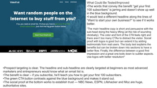
  • 1. •Prospect targeting is clear. The headline and sub-headline are clearly targeted at beginners as most advanced marketers and entrepreneurs would know what an email list is. •The benefit is clear – if you subscribe, he’ll teach you how to get your first 100 subscribers. •The green CTA button contrasts against the blue background and makes it stand out. •The social proof at the bottom works to establish trust — NBC News, ESPN, Lifehacker and Moz are huge, authoritative sites. What Could Be Tested/Improved •The words that convey the benefit “get your first 100 subscribers” is jarring and doesn’t show up well in the blue background. •I would test a different headline along the lines of “Want to start your own business?” to see if it works better. “The main headline copy is short and persuasive with the sub-head doing the heavy lifting (at the risk of sounding clickbaity). The color and font of the CTA feels right and there aren’t too many CTAs to distract the visitor. Social proof with logos is good but can extend it by adding testimonials from real users. The body text explains the benefits but can be broken down into sections to have a better flow. Finally, the difference between a good first impression and a great one boils down to subtler aspects. Use logos with better resolution!”
  • 2. •The promise “launch your first website in 30 days” is strong, bordering on slightly “unbelievable” but induces lots of curiosity. •The word “free” is enticing. With an industry charging thousands of dollars for recycled information, a month-long free course is interesting. What Could Be Tested/Improved •I would possibly tell a better, more emotionally-packed story. The current story currently feels too “common” and “watered down” and doesn’t feel like it’s speaking directly to the audience. “I like the usage of the ‘yes cascade’ in the first section beneath the hero unit. The third ask could be more effective. Instead of instigating a sense of uncertainty with ‘Dream of starting your own business, but not sure how to make that happen,’ ask ‘Ready to take charge of your career by starting a business of your own?'” “The question of taking charge makes sense as a motivator for those struggling with their career direction. “Bonus comment – there is a clear narrative that ‘we’ can help ‘you’ start your own business. I like that there is a lot of focus on the ‘you’ throughout the page. We could improve this further with the usage of ‘we’ to mean both the user and ConvertKit by about halfway through the page. It is a subtle reassurance that we are here for you and the user will feel the reassurance whether they are aware of it or not.”
  • 3. •The word “free” is enticing. A $197 value course given away for free? Sign me up! •I like the use of “$197.” This communicates to the prospect how much value he or she is expecting to receive when they sign up. •“Double your leads in the next 90 days” is a good headline that conveys a clear benefit with good specificity. •I love the way they clearly laid out what the prospect will get if they signed up. Fully transparent, no BS. •Giving away the content without opting in is an interesting concept. •They could test removing the “Facebook Like” button right beside the Drip logo — so as to reduce the number of actions the users can take. “‘Double Your Leads Over The Next 90 Days With This Complete Beginner’s Guide To Drip (A $197 Value, FREE)’ should appear above and over ‘Getting Started with Drip,’and with heavier font weight. It relays more useful information about what Drip does and thus should catch the eye first to retain attention at user landing. “I would also rephrase it to ‘FREE Complete Beginner’s Guide to Drip (worth $197),’ according to what would interest readers first and foremost. “Breaking away from the traditional positioning would also enhance aesthetic novelty and grab attention further. For instance, placing the Drip logo under ‘Getting Started with’ – less words, more images, more novel placements. “‘What You’ll Find Inside Your Course’ section is well- written, concise, but informative. The checklist format and highlighted keywords works very well to convey digestible chunks of information.
  • 4. •The yellow CTA button pops off the page. •The word “free” is enticing. •Good benefit – David knows his audience well and knows that they need help talking to women with confidence. •Greatly detailed testimonial used to showcase David’s expertise. •I would test a video vs. no video. People are short on time, and may not want to watch a video before opting in. •I would test a new set of headlines. The wording “effortlessly engaging” sounds more suited for a social media company than a company teaching dating skills. “This type of page was made famous by Russell Brunson of ClickFunnels. It’s a page that serves one purpose – to make visitors click the big CTA in the middle of the screen and move them to the next step in the funnel. “Converting visitors to Aura using an explainer video reinforced with social proof is a winning combo. “All I would do to improve this page is add subtitles to the video to make it consumable on mobile without sound and adjust the font used for the testimonial to make it stand out against the white background.”
  • 5. •Fantastic headline. MeetEdgar knows their prospects well, and understand that people are skeptical about the ROI of social media. It addresses their objections and describes their problem with one statement. •I love the promise. “Saving time” is a great benefit that appeals to everyone. •Red CTA button stands out from the blue background. •I would test having additional copy to lead into the CTA. It’s not obvious from the previous copy that signing up will get them to see how it works. I like the FAQ section. It’s good to always keep your persona in mind and what questions they might have in regards to the product. A FAQ section can be a great place to facilitate those, e.g. – What is Edgar? – What can I do with it? – Anything new? How does it work? – Is this a problem for companies/people like me? – Do I need this? – What else do I need? – What services do you offer that solve my problem? – Can you show me the solution in action? – How are you better? – Who is it for? – Who is using it? – Can I try it? – Is my data safe? – What do experts say about your brand? – Can you show me evidence? – How does it compare? – Do I get any deals? – What is my impact on my reputation to use you “These are typical questions a visitor or B2B buyer might have in mind and that Edgar could try to address. “Although very much discovery oriented (which can be very effective as a Call-to-Action), I don’t like the ‘See How It Works.’ Am I really going to give my email address in exchange to learn more how Edgar works? What about a ‘Free Trial’ instead or the content offer ‘Secret Blogging Formula.’ Always keep in mind that it’s a value exchange! “I’ve tested the form and got redirected to another page where I can now watch a 12-minute video in poor audio quality that runs me through the product. I can see additional testimonials. Not a great experience or WOW factor. “Additionally, on this page, there are two different call to actions which is confusing and causes friction (Get Started & Get Our Free Ebook). I’d suggest changing the navigation CTA to ‘Get Started’ instead.”
  • 6. •Simple, clean and focused landing page helps in driving up conversions. •The word “free” is emphasized. It is also further emphasized with “you’ve got nothing to lose,” making it a no-brainer for prospects to sign up. •The words “no Wall Street jargon” helps ease prospects’ worries that investing is too difficult to understand. •I would test replacing the word “ensure” to “secure” to add more emotional punch. “What ‘The Fool’ website does well is ensure the landing page is clear and void of distractions. “However, when it comes to the copy, I would change the CTA text. It says ‘Continue’ which alludes to the reader there are more steps than this. “For many users, this will be a turn-off. So I would A/B test the word ‘Continue’ with a different phrase like ‘Give me the tools’ or ‘I want in.’”
  • 7. •Headline targets a pain point. •Subhead conveys benefit that solves prospects’ problems. •Featured logos show social proof, creating trust. •Big green CTA button pops off the page •I would check this landing page through again for errors. There are a few grammatical errors that make reading it jarring. •I would test the copy on the button – choosing either “order your copy” or “get more conversions.” •I would test removing the “view example headlines” beside the CTA button – it distracts users from clicking the button.
  • 8. •Using the words “more than 160,000 people” conveys social proof – many people use it, so you should too! •Headline conveys an easy-to-understand benefit. •Subheadline makes the product easy to understand. •Sign up with Google makes it easier for people to sign u •Adding some specific tasks to the image on the right will make the product even easier to remember. “The checklist/tasklist on the right is unclear to me. I kinda got the idea of what they do, but the list doesn’t help that much. Maybe testing with some actual text and example tasks? “Design-wise I like the choice of colors, not so much the watercolor animal visuals. It doesn’t feel all that right and aligned with the copy. But that’s just me 🙂 . “The copy for the benefits/features section is clear and to the point. Maybe testing with some more emphasis on the benefits? Like ‘helps you develop a more collaborative and accountable business culture’ or ‘be always informed. Remove roadblocks/bottlenecks easily.’”
  • 9. •Promise is great – solves a huge problem for their prospects •Having the logos make it easy to see where authors can publish their books •Bulleted points make it easy to glance for benefits •The CTA should say “get free ebook” instead of “get free details” •They should shift the part where it says “discover how to take the mystery and the work out of self-publishing with this free e- book” up to emphasize the ebook download 1.“I look for landing pages to nail the ‘what’ and ‘why’ of a product/service. This site does convey that what ‘publish your book’ and why ‘keep 100% of profits’ but I wouldn’t be clear on how the what delivers the why. So I might expect something like ‘Helping you to self-publish your book AND retain 100% of your profits!’ 2.“Black copy on blue doesn’t contrast well enough and instead causes a slight delay for someone to skim read – remember you have very little time to convince someone that this page is worthy of their time. Considering using a 5-second test to analyze further. 3.“I watched a few seconds of the video but the graphics were really not great so didn’t watch further. People do judge sites by their cover, so I’d upgrade the videodesign, simplify the animation and try focus on the message better. 4.“On my first pass, I actually missed the logos near the top. Then going back, I didn’t actually know why the logos were there – social proof works when connected, so I’d add a title like ‘As featured on’ or whatever is relevant.Also consider using the brand colors – believe it or not the mind connects the color before the form – so seeing the McDonalds arches, the yellow hits your retained memory faster than the shape… 5.“The first CTA is very unclear. Make the CTA a hint as to what they’re getting like ‘Get my free PDF guide’ and make it stand out. It helps draw the eye towards your most important goal.
  • 10. •The Halloween theme is done well to capture attention and make the landing page fun. •Specially-designed images for the landing page makes it stand out. •The PDF logo clearly indicates what the audience would be getting. •Good headline that conveys a benefit. •Copy conveys immediate practicality, something the audience can benefit from •I would re-look at the word “monstrous.” While it is in line with the Halloween theme, it doesn’t specifically say anything about the ebook. refreshing look as compared most landing pages that use stock images. “Layout: CTA button at the top and bottom of the landing page makes it convenient for a website visitor to complete the desired actions. In additions, single field form minimises friction from form filling to submission. “Content: Great headline. List style headline provides clear value to site visitors. In addition, information like the number of pages gives an impression that the content is loaded with tons of value and time investment estimate assure them that it only takes minimal investment (time) from their end. Testimonial provides a concrete social proof which gives your site visitor the confidence before they feel save to pass you their email address. “Loading speed: There is room for improvement when it comes to the loading speed. Based on GT Metrics, loading time stands at 2.4s which is considered speedy. However, for those who are obsessed with the loading speed, they can consider lossless compressing the images for some speed bump. “Critical Issues: Duplicated Google Analytics Tag and Remarketing Tag are found, which will result in inflated data. There are two set of Facebook pixel found. If possible, unify and use one set of pixel to avoid loading the page with too much JavaScript. Google tag management will be a great tool to use so that all pixel can be better managed and helps to reduce the JavaScript loading time.”
  • 11. •Dan Kennedy is a huge brand name in that space (plus a multi-best selling author), so it helps with social proof. •Great offer – $1 for a free book is a killer deal for many. •Limited time helps create urgency. •The word “shipping included” adds on and makes the “good deal” stands out even more. •The image resolution could be better. •2 CTAs together is overkill. Consider removing one. •Consider removing the menu at the top, and focus on getting more conversions. “The Good: “The only good thing I have to say about this landing page is at least it exists. Many people never take the steps to get their product online, so the fact that this page has been made is a great first step, and can be improved through split testing over time. “The Bad: “This landing page is only appropriate for prospects who are hot and ready to take action on the offer. The first impression above the fold assumes that you are already well acquainted with Dan Kennedy’s world, and would already want his book. Anyone outside of this audience will get no meaning from anything above the fold, and will likely exit the page, aside from opportunists who will jump because it’s a book for $1. “Aside from these fundamental problems, the page is chock full of design issues. The header bar takes up 1/4 of the screen with the GKIC logo, which has no meaning to anyone who isn’t already well acquainted with Dan Kennedy’s world. The book graphic is oversized and in poor quality, and the text lacks accents in its formatting, making it hard to read. While ‘ugly design’ can work with a hot audience, poor design like this page only stands to hurt its credibility. “The content and design issues are pretty bad, but there are also several fatal technical issues, such as the logo and privacy policy leading to Leadpages.”
  • 12. •The use of media logos convey social proof and build trust. •Great headline combines social proof, specificity and curiosity. •Subheadline presents the customer as a “hero” and tells them they can do it too. •Testimonial by a bestselling author indicates more social proof. •Good use of the arrow to indicate where to get the book •The design of the page could be better. •Too many social proof elements might be overkill. “One of the things they did well is having a lot of social proof, reviews and testimonials. (Maybe a bit too much??) “We noticed a whole list of things which they can improve or test but most importantly the look and (as a result of the) feel of the site. Seeing the testimonials/reviews I guess that it’s good book to have. “Visually it’s just not telling me this at all. Actually, it’s the opposite and this is taking away from the book. “A lot is happening on this page, text in various font types, styles and colors. Both bold, bigger and smaller font sizes. I counted 3 different font types, 14 different font sizes either normal, italic, bold, black and red. No wonder it feels hectic instead. Also, psychology tells us that the better something looks or the easier something is to process the more we trust it. So if I would have to name one thing it would be to start with the look and feel of it. “I read the book description on Amazon. I was completely amazed to find out that this book is about something different than the value proposition currently says at the top of the page. How to generate 52,000 email subscribers a day. Imagine my surpris
  • 13. •Good use of social proof – 4,600+ subscribers make the newsletter look popular. •The use of big brand names like Google, Apple and Spotify makes you feel like you belong to an exclusive club. •Every Friday morning makes it clear to the reader when they will receive an email. •I would re-test the copy. “Want more from their work” is vague and does not specifically convey any benefit. “The subhead above the email box uses social proof with it’s ‘Join 4,600+ Subscribers’ call to action – always a strong pull and the idea of a community is a powerful one. “The secondary call to action ‘Subscribe below to receive a dose of inspiration every Friday morning.’ is nice, giving you the idea that this isn’t going to be a barrage of sales emails and that the writer is organized enough to stick to a schedule. “Where it could do with some tightening up though is the overall proposition of the newsletter. “The meta title proclaims ‘The Best Marketing Newsletter in the World.’ The page title calls it the ‘Swipe File Newsletter,’ then it promises creativity and productivity. “I’m a bit confused now. Is this going to help my creativity, my productivity or my marketing? “My first recommendation would be to test a few headlines and see which of these your customers really want and stick to it like glue. “The next would be to test a page with a very specific benefit like ‘5 tips that will gain you 45 minutes a day,’ or ‘3 ways creative professionals practice thinking differently.'” “Raising the bar on how specific you are about your offer, or promise, to your prospects nearly always raises conversion, and this can be the difference between a landing page that is driven by warm traffic (blog posts on the same site) and cold, paid traffic which will really let you scale up. “After I submitted my email there’s an alert to check your inbox for a double opt-in, but this goes to a bog standard drip confirmation page. “This is a dead end in the relationship and a missed opportunity to keep the momentum going. “Some curated content from previous newsletters or a more substantial piece of content would help cement the relationship from the reader who hasn’t actually had any benefit from Jimmy yet. There’s a free email course linked in the menu which would be a good start, or other ideas would be to get readers to consume content from you in other channels. “I did get a follow-on email, a few minutes later, but this could easily have been missed in a busy inbox. The Thank-You page is wasted real estate for a lot of companies. “The email itself is really worthwhile and comes at a time of the week when most people are more receptive to new ideas.
  • 14. •Great use of social proof. A quote from one of the top business publication makes it stand out. •Specific names, pictures and testimonials create social proof and build trust. •Headline immediately touches on a pertinent problem. •Subheadline makes the prospect the “hero” – they will receive the same blueprint that will make them $1.3 million. •Yellow CTA button makes it pop out. “There’s more bad than good about this page unfortunately. As soon as you load it, you have a clear headline, which leads into a clear description, and a call to action. Great. However, the video lacks subtitles, and there’s no way to see how long it is. It’s not a particularly exciting and engaging video, it doesn’t tell me too much about what I’ll get, it’s more about them. “This theme continues through the whole page really. There’s loads of information about why they are so great, their achievements etc. “You’ve got the testimonials just below the fold which is great, and this leads into a pretty strong section about prospect pain points, but…there is then no call to action at the end of this section “Unfortunately, it then leads into a long, text heavy section all about the founder, with no value to the reader, and then flows into a very long list of goals and milestones, very few of which provide any value to the reader. There are a few good social proof pieces, but most of them are simply ‘me me me’. It reads more like a CV or an investor deck than a landing page for prospects. “The next sections about what’s included, and what’s involved are generally pretty good, but should be way further up the page, giving me value. My one copy comment here is on the 12 month action plan which hypes up by talking about Virgin, and then brings you crashing down with ‘well that’s not us, but trust us we’re pretty good as well’. I get what they’re trying to do here, but really the result was the opposite for me. “Bonuses are good, but the re-seller policy potentially opens them up to people buying the course solely for the purpose of ripping it off and re- selling it. “The case study section is good, but then I found the scholarship section quite strange. It’s a good idea, but this is the first time the cost of the program is hinted at, and it’s huge. It’s also labelled as the ‘value of our program’ but really they mean price. “Overall, for such a high ticket price program, there’s surprisingly little value on the page for the reader. The smallest sections describe the program itself, while the longest sections by far almost exclusively talk about the founders and the company.”
  • 15. •Landing page is focused, with only one CTA. •Copy clearly conveys what the prospect will receive. •Headline is unclear – what does faster social marketing decisions mean? •Too many form fields might deter prospects from signing up The first thought I have when landing on this page is that I do NOT want to fill out all those form fields. Why? Because it’s not worth my time and I definitely don’t want to be contacted by a salesperson this early on in the buying cycle. That’s before I even know what the offer is. “Now, let’s talk about that offer. What exactly would I be getting here? How is this ‘guide’ presented? Is it an infographic? A video? An entire book? The deliverable is not clear and the image doesn’t help. “The headline doesn’t call anyone out. I don’t know if this material is for me or not. I’m also not sure what type of social media decisions this guide will help me to make, why I need to make them faster or how this thing, whatever it is, is going to do any of that.
  • 16. •Great value proposition. Instead of giving away an ebook like everyone else in the industry, Louder Online offers a free analysis tool. •Big blue buttons clearly convey what the agency offers. •Headline clearly conveys the benefit. •Huge brand names help provide social proof. •Instead of talking about themselves, they could test a subheadline that talks about the prospect. “1st – I believe the 1st page should be about the visitor – Turn We into YOU statements. ie Are You… Do YOU versus We… “2nd – Instead of an Image of Aaron Aguis and Neil Patel – utilize a video. 30 secs or less. “3rd – Love the aesthetics, visuals, and credibility. “Compliments would have been #1, BUT the site started with WE. Readers what to know HOW you help, then who you are.”
  • 17. •Sarah knows her audience well – the subheadline directly talks about the “future” her audience desires. •The word “free” makes it enticing. •The copy in the brackets help handle a huge objection for her target audience. •I would test a new headline. The headline “Take action today” seems premature before the promise is talked about. “The highest converting landing pages are usually focused on a single conversion behavior. One page, one offer. You have little or no distraction. That is something this landing page has managed to achieved. I would split test having a footer and completely removing it to see if that would bump up your conversion. “Another thing you should try out is moving the phrase ‘take action today’ a little lower. A better heading would be, ‘Ready to build the financial…’ As always, test, test and test 🙂 . “Lastly, the lead magnet lacks specificity. No one wants another set of tools and tips to help them get to their end goal. If the benefits are listed out in a format like, ‘the exact tools I used to take my business from point A to point B’ etc, You would be able to convert more visitors into leads.”
  • 18. •Good use of a testimonial to highlight the power of Infusionsoft. •Bulleted copy makes it easy to convey benefits. •Too many form fields may deter prospects from signing up. •I would test a new headline as In The Pipeline doesn’t say much about what the audience will expect to receive. The Infusionsoft landing page does a few things right, such as the image, the core message and the call to action, but the page could be much more compelling. “Let’s focus on one of the most essential features of landing page: The Headline. “The headline tries, but it doesn’t inspire anyone to take action. The one thing it does do right is the word ‘free’. Apart from that, there is room for improvement. For example, what results could this guide produce? Or, What are the benefits of using this guide? A rough example could be something like: “Free Guide Reveals The Exact Steps To Close More Leads In Less Time Through Automation or Free Guide Shows You How To Use Automation To Take The Effort Out Of Closing Leads. “In other words, the headline is your first (and sometimes only) chance to get your potential lead to enter their details, so make the most of it and load it up.“
  • 19. •Minimalist landing page helps prospect focus on taking the only action available – signing up. •Green CTA button pops off the page. •Copy conveys benefits and tells prospects exactly what they expect to learn. •Good use of testimonial from a big name for social proof. •It’s unclear what does 85% of my hottest business hacks mean. •I would test another CTA instead of “spice me up”. “The site has a clear messaging and an easy to understand CTA. The font and kerning on the paragraph ‘You’ll learn exactly…’ could be clearer/wider apart so that it’s easier to read. Nice clear likeable image of Noah and a harmonious colour scheme makes the website clear with main elements easy to pick up on.”
  • 20. •Minimalist landing page makes CTA focused. •Copy is transparent about what prospect will get. •Good use of social proof featuring places like the New York Times and Fortune. •Testimonials convey social proof. •Feature image conveys social proof that he works in a prestigious startup (Uber). •Instead of @andrewchen, he could test something more enticing with a proper benefit-oriented headline. “Andrew Chen’s site is minimalist in nature; he knows the focus of the site is on content, social proof, and of course to get people to sign up for his newsletter which is the main conversion goal. However, the layout is not making use of the real estate above the fold as it should be. Elements like narrow text margin, a lack of vertical alignment, unclear <h2>’s, and misuse of whitespace can harm conversion rates if used incorrectly.”
  • 21. •The headline calls out a particular kind of prospect. •Green CTA button pops off the page. •Good use of his background to indicate social proof. •It’s not obvious what the prospect is signing up for. I would test giving away some kind of value or lead in copy. •“Love the clean design, no distracting navigations that is going to lead the user elsewhere other than its two main call-to-action. •The message in the copy stands out because it steers away from what everyone in the marketplace is shouting. The subtext, however, can be broken down further or be ‘iconalized’ for easier reading. •The recent posts look a little squeezed and bunched up, would help by having a little spacing in between each post. Also it would be great to have a call-to-action after each posts like ‘read more…’ but I’m guessing it goes against the brand’s ‘clean look’ approach so I guess it’s optional. •Overall an extremely simple landing page with a clear call-to- action and a unique ‘no bullshit’ positioning makes this a really strong landing page to have.”
  • 22. •The word free is enticing. •The subheadline conveys a benefit. •Blue CTA button pops off the page. •Bullets convey easy-to-consume benefits. •I would test offering the download immediately as a 2- step popup, as compared to simply “continue.” •I would test removing the checkbox to see if conversions increase. “I think it’s great that the moment we come to this landing page we immediately know what HubSpot is offering. Both the H1 and the H2 are bolded which is a bit distracting. When viewing the landing page on iPhone the main header text comes up perfectly right under the top gif, which looks really clean. Overall the content does a great job showcasing why we would want these ebook templates. The biggest problems right now is I can’t read the orange text on the FAQ’s, the ebook examples are blurry, and the image behind the form at the bottom distracts from the CTA button. I’d worry people would have a hard time finding that CTA button. I’d also worry that people would not be able to see the arrows to navigate the example ebooks and like to test having less blurry example ebooks. I also think it would be worth testing not having sharing buttons on the landing page, as that could also distract visitors.”
  • 23. •Headline conveys a strong benefit. •Lead capture form is obvious and eye catching. •Countdown timer indicates urgency. •Use of expert contributions communicate credibility. •I’ll add a little more description to what the entire course entails. “Thoughts on what I would test on Email1k, for me there is no ‘finished’ landing page, there is always room to test and improve. “Testing needs to happen on all devices to ensure the benefits are clear and the user can take action easily on every device. For example, on mobile the page loads the the form in view so the user does not see ‘A free 30 day course to DOUBLE YOUR EMAIL LIST,’ an important message that gives the user a reason to enter their email address. “It’s clear that the goal on this page is to get someone to leave their email address, but there is a lot to distract them, the very first link is to ‘Powered by SumoMe’ at the very top of the page, the social share icons are an overlay that appears after page load. You need to test all these, how many people click these, how many social shares do you get from the share widget, how valuable is the evidence that many people have shared the page – is it worth the distraction. How many people click SumoMe and don’t complete the form – testing will tell you all of this. “I can see that ‘Meet the Email Marketing Experts’ is designed to give gravity to the course, are these names your audience has heard of and respect? If not, what purpose do they serve? If the course had comments from Seth Godin it’s a name I’m going to value, over someone I’ve never heard of. Test company logos your experts have worked with, or even better testimonials from people who’ve downloaded the document as there is there is less need for these to be recognisible names. “So. Test every device, are key messages clear and visible. Reduce distractions that take people away from your primary goal and ensure evidence of quality resonates the the audience, test some other proof here.”
  • 24. •Before and after pictures demonstrate proof that she knows what she is talking about – and has helped both herself and her clients get results. •The word free is enticing. •The idea of losing weight using spices creates a lot of curiosity. •Handles objections well by showing that prospects can still eat their favorite foods. •Good use of logos to indicate social proof. •Testimonials help further indicate social proof. •I would test sticking to one offer instead of having two. “Once you open this particular website, the owner doesn’t waste any time getting right to the point. The immediate benefit of fast weight lost is very evident. The brand and recipes mentioned are immediately backed by extensive social proof showing that Nagina has been featured in the likes of Forbes, Huffington post and Time. “One item that stands out from the rest of the landing page is the header. While the rest of the landing page gives off a premium feel, the header feels like it didn’t get enough attention. Although it’s not something that will immediately affect conversions or bounce rate it would be something to keep in mind for the future. “Moving further downward, the 3 spices that have been ‘scientifically proven’ to burn fat are shown. Although it’s not a necessity, a quote from a nutritional expert or a doctor would reinforce the validity of Nagina and her brand. “Moving on the before and after images show Nagina’s recent success with other participants. Highlighting their success in a different colour would draw the reader’s attention to the results that they can expect even more. The landing page finishes with a very good summary of the Nagina and more testimonials. “Masala Body has a very engaging and direct landing page. An industry often associated with scams or amateurs getting the right message across has never been more crucial. With some more (optional) tweaks it could be optimised even further, yielding higher conversion rates.”