
Recomendados
Más contenido relacionado
La actualidad más candente
La actualidad más candente (20)
Similar a Poster analysis
Similar a Poster analysis (20)
Más de jphibbert
Más de jphibbert (20)
Último
Último (20)
Poster analysis
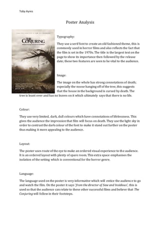
- 1. Toby Ayres Poster Analysis Typography: They use a serif font to create an old fashioned theme, this is commonly used in horror films and also reflects the fact that the film is set in the 1970s. The title is the largest text on the page to show its importance then followed by the release date; these two features are seen to be vital to the audience. Image: The image on the whole has strong connotations of death; especially the noose hanging off of the tree, this suggests that the house in the background is cursed by death. The tree is leant over and has no leaves on it which ultimately says that there is no life. Colour: They use very limited, dark, dull colours which have connotations of lifelessness. This gives the audience the impression that film will focus on death. They use the light sky in order to contrast the dark colour of the font to make it stand out further on the poster thus making it more appealing to the audience. Layout: The poster uses route of the eye to make an ordered visual experience to the audience. It is an ordered layout with plenty of spare room. This extra space emphasises the isolation of the setting which is conventional for the horror genre. Language: The language used on the poster is very informative which will entice the audience to go and watch the film. On the poster it says ‘from the director of Saw and Insidious’, this is used so that the audience can relate to these other successful films and believe that The Conjuring will follow in their footsteps.
- 2. Toby Ayres Conventions of Form: The poster is quite informative; it gives details of the film title, its release date and actors who feature in the film. This is all relevant information vital to the audience when it comes to deciding on whether to watch the film or not. The poster is not over cluttered so therefore the audience can focus on relevant images or information included. Conventions of Genre: The poster includes an image of a wilting tree with a noose hanging from it, this image is in the forefront of the image so will therefore stand out to audience. This has strong connotations of death which is very conventional for horror films. The image also allows us to establish the setting which is an isolated house, the audience can piece together a rough idea of the theme of the film.
- 3. Toby Ayres Typography: They use a serif font which suggests that the film has a reasonably modern context or even futuristic. They use a consistent font style to convey this point. The title of the film is in the largest font size so that the audience can establish the name of the film. Image: The image is a close up, this is used to display and emphasise the characters mask. Masks are props used commonly in horror to de-humanise characters so that they look paranormal or evil. The character now looks more scary so therefore the audience can establish the horror genre that the film offers. Colour: The poster uses very simple colours. The background colour is black to accentuate the mask further on the poster to the audience. The colours contrast well also. The colour of the text also contrasts well against the dark background, this increases the clarity of the poster to the audience. Layout: The general layout of the page is quite ordered which is conventional for a film poster. The image of the mask and the main body of text are separated on either side of the page to make each feature stand out on the page. It also uses the route of the eye technique to enhance features on the page and makes it look very presentable with a clear, professional structure Language: The language used on the page gives clues to the general sub-genre of the horror. We can establish the plot of the film. It also gives information of other successful films created by the directors, the audience (horror fans) can then relate to these films and increases the probability that they will watch this film as well.
- 4. Toby Ayres Conventions of Form: One main image; Blocking bill; Title; Slogan; Release date; Logo of studios