HTML5 – SVG Map Example

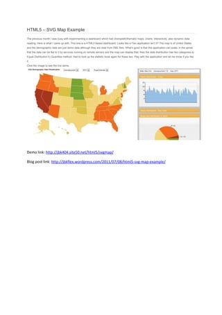
The previous month I was busy with experimenting a dashboard which had choropleth/thematic maps, charts, interactivity, also dynamic data reading. Here is what I came up with. This one is a HTML5 based dashboard. Looks like a Flex application isn’t it? The map is of United States and the demographic data are just demo data although they are read from XML files. What’s good is that this application can scale, in the sense that the data can be fed to it by services running on remote servers and the map can display that. Also the data distribution has two categories a) Equal Distribution b) Quantiles method. Had to look up the statistic book again for these two. Play with the application and let me know if you like it. For the full post download this file or visit the full blog post link: http://jbkflex.wordpress.com/2011/07/08/html5-svg-map-example/
Recomendados

Recomendados
Más contenido relacionado
Último
Último (20)
Destacado
Destacado (20)
HTML5 – SVG Map Example
- 1. HTML5 – SVG Map Example The previous month I was busy with experimenting a dashboard which had choropleth/thematic maps, charts, interactivity, also dynamic data reading. Here is what I came up with. This one is a HTML5 based dashboard. Looks like a Flex application isn’t it? The map is of United States and the demographic data are just demo data although they are read from XML files. What’s good is that this application can scale, in the sense that the data can be fed to it by services running on remote servers and the map can display that. Also the data distribution has two categories a) Equal Distribution b) Quantiles method. Had to look up the statistic book again for these two. Play with the application and let me know if you like it. Click the image to see the live demo. Demo link: http://jbk404.site50.net/html5/svgmap/ Blog post link: http://jbkflex.wordpress.com/2011/07/08/html5-svg-map-example/