
Recomendados
Más contenido relacionado
Último
Último (20)
Destacado
Destacado (20)
Kane gibbons conventions question ancillary
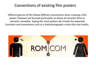
- 1. Conventions of existing film posters Different genres of film follow different conventions when creating a film poster. However we focused particularly on those of romantic films or romantic comedies. Saying this most posters do include the expected functions and conventions such as a lead photograph a main title and credits.
- 2. Centre image Most posters have a main centre image of which the poster is based around. Sometimes it is an extract from the film itself, however it is mostly posed. This image includes both the male and female as do most romantic films. It is simple and precise and shows the audience the extract romance they want from a romantic film. Actors names Film title Actors names are not A typical convention of always included, film posters is to include a however they provide large bold film title. This an added selling point film title is clear and to the audience. vibrant. It also continues the theme of the rest of the poster with a delicate Quotes and ratings font. The red colour also Some posters take quotes suggests romance. about the film from magazines and Overall effect critiques, this shows that The overall impression the poster has on the audience is key. It the film is held in high tells the audience what to expect. It shows what genre the film is regard to professionals. and what approach it will take. This poster in particular has a This can however make a strong effect as the subtlety shows that it will be an enjoyable poster look over crowded. light hearted romance with passion involved
- 3. Film title Centre image The film title uses a conventional font and a bold red colour in I think this is a very order to stand out from the image. The use of such a simple font effective main ensures that the title doesn’t completely overpower the image. image. Although it is in black and white, it provides strong emotion Release date whilst remaining This poster, as do sincere and simple. many, includes a It also provides a screening date of clear background when the film is in the for the title to take cinema. This works as the forefront a useful promotional without been lost package behind the title. Overall effect This poster provides a satisfying impression of the film. It shows the artistic approach in which the film takes. It reaches its target audience and appeals to a younger generation. The classic photography also provides an asp rational image in the young actor and actress making other young people wanting to go and see the film for that purpose.
- 5. Photography I used two separate photographs and using Overall effect Photoshop, blended them into the one image. I chose to used a very simple, natural take on It’s an aspirational image which shows the two this poster. The scenery and the characters characters in both long shots and medium shots. complement eachother to create a very ‘arty’ It follows the convention of a romantic frame, poster which says everything a romance with the two characters looking back at each should. other. Extras I also included actors names and cinema Film title release date. This I used a subtle but very makes it more contrasting colour for the professional, and also title. Its a pastel colour and works as a luring sticks to the naturalistic technique to entice theme. I also made the word people into coming to ‘love’ bold to further see the film. enhance the genre. The font Credits is very clear and subtle, but At the bottom of the poster I decided to include with the colour works credits. This adds to the verisimilitude of a real film effectively poster and makes it look more authentic. I also included the facebook link, I did this as it would appeal more to my target audience and make them more of an active audience.
- 6. Conventions of existing film magazines Image Main text Sometimes the image is Provides the main body of posed, however this opinion and analytical writing of image is taken directly the film. Usually the writer used from the film its 'self, formal langue with colloquial when this occurs a key comments here and there. The part in the narrative is writer takes a point of view either usually shown in the in favour or against the film and image then evaluates and describes. Film title Strap-line Bold capital font, large Usually after the film title, a and clear to see. Key strap line is used to lure the convention of most audience into reading the magazine film reviews. review. Summary phrase Summarises the bulk of Verdict/rating the review into a sentence An overall verdict on this film. This advises people on and provides an overall weather the film is worth going to see or not. It opinion provides the writers overall opinion on the film
- 7. My film magazine review
- 8. Strap-line Film title I have chose a different I have stuck to conventions Image colour font for my strap and used bold black capitals as Although I used a posed image, it line to make it stand out it makes my title stand out and is an action shot and looks as but ensure that it doesn't’ it looks classic and though it could have been taken overpower my title. Its conventional from the film. The photo adds made of one sentence another dimension to the review which entices the as the colours make the page audience to read on. more appealing. Main text In my text I review the film. I talk Summary phrase analytically and honestly. I tried My summary phrase to include as much film, media stands out in purple. It terminology as possible, but only summarised all that I have when necessary. said in the text and again Verdict/rating adds that appeal to the The verdict gives my opinion on the eye. film and breaks the text down into Footstep details sections making it more enjoyable Running along the bottom I have to read. included the magazine name, the Colour scheme date, and the website of my magazine. My purple colour scheme provides the magazine This looks professional and ensures an with a strong brand recognition active audience will further research the brand