Polish that presentation! 25 tips to bring clarity to your slides
•
2 recomendaciones•2,241 vistas

There are many big things that you can do to improve your slides. There are also many small things that you could, and should, be doing. This presentation shows some tips for easily adding polish to your presentations.

Recomendados
Recomendados
Más contenido relacionado
La actualidad más candente
Destacado
Destacado (13)
Similar a Polish that presentation! 25 tips to bring clarity to your slides
Similar a Polish that presentation! 25 tips to bring clarity to your slides (20)
Más de Keith Bradnam
Más de Keith Bradnam (14)
Último
Último (20)
Polish that presentation! 25 tips to bring clarity to your slides
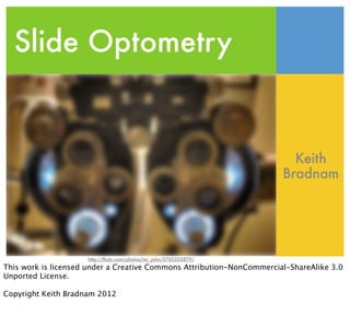
- 1. Slide Optometry Keith Bradnam http://flickr.com/photos/mr_john/3705255879/ This work is licensed under a Creative Commons Attribution-NonCommercial-ShareAlike 3.0 Unported License. Copyright Keith Bradnam 2012
- 2. Bringing clarity to your slides Keith Bradnam http://flickr.com/photos/mr_john/3705255879/ This is a talk about some simple things that you can do to improve your presentations.
- 3. Overview
- 4. There are many BIG things you can do to improve a talk Big things can take time to work on. E.g. trying to turn your talk into a story, adding a beginning, middle, and end etc.
- 5. There are many BIG things you can do to improve a talk Some examples of ‘big things’ which are not always quick things to work on. This presentation is *not* about these types of presentation skills.
- 6. Have very clear Turn talk take-home messages into a story Know what slides are coming up Be entertaining Give sufficient background Rehearse! There are many BIG things you can do to improve a talk Summarize Tailor the talk effectively Speak with passion to the audience Give sufficient Understand Separate talk into background the science distinct sections Some examples of ‘big things’ which are not always quick things to work on. This presentation is *not* about these types of presentation skills.
- 7. There are many small things you can do to improve a talk This is about small things, also known as...
- 8. http://flickr.com/photos/bobleckridge/7983214053/ The simple quick fixes that you can easily make to polish your presentations.
- 9. http://flickr.com/photos/bobleckridge/7983214053/ Low hanging fruit The simple quick fixes that you can easily make to polish your presentations.
- 10. 25 slide optometry tips Ever been to the optometrist where they ask you “does it look better like this? Or like this? Is it clearer with this? Or with this?” Well this presentation will ask you similar before/after questions. Twenty-five pairings of slides with one type of alteration made.
- 11. #1
- 12. Porcupine genomics 10/25/2012 http://korflab.ucdavis.edu Do you like your slides looking like this?
- 13. Porcupine genomics 10/25/2012 HTTP://KORFLAB.UCDAVIS.EDU Or like this? There is nothing wrong with using black text on a white background. But it can sometimes get a little boring. Slide themes can often, but not always, enliven a dull presentation. Stay away from cartoonish themes or those that are very dated (e.g. yellow text on bright blue background).
- 14. #2
- 15. PORCUPINE GENOMICS 10/25/2012 http://korflab.ucdavis.edu A nice bright, modern style. But could it be improved?
- 16. PORCUPINE GENOMICS Keith Bradnam 10/25/2012 http://korflab.ucdavis.edu Better now? I’m always amazed when I go to talks where people fail to introduce themselves and even omit their name from the title slide. This is the one slide that may be on screen longer than most (assuming you are ready to present while people are still arriving). Add your name!
- 17. #3
- 18. PORCUPINE GENOMICS 10/25/2012 http://korflab.ucdavis.edu Keith Bradnam Does it look better when you hide your name away in a corner?
- 19. PORCUPINE GENOMICS Keith Bradnam 10/25/2012 http://korflab.ucdavis.edu Or better now, when it is center stage? Don’t be afraid to take credit for your work. You want people to remember you, and letting them see your name is the first step.
- 20. #4
- 21. PORCUPINE GENOMICS Keith Bradnam http://korflab.ucdavis.edu Don’t clutter your title slide with logos for every affiliation that you worked with or who funded you. If there was an important collaboration between different institutions, then maybe that merits a separate slide to highlight the fact.
- 22. PORCUPINE GENOMICS Keith Bradnam http://korflab.ucdavis.edu This is a cleaner slide, but I’d still prefer removing my departmental logo altogether. The two important things on this slide should be a) who I am, and b) what am I going to talk about.
- 23. #5
- 24. PORCUPINE GENOMICS Keith Bradnam A clean title slide, but is this the best that it could be?
- 25. PORCUPINE GENOMICS http://flickr.com/photos/artbandito/18090396/ Keith Bradnam For most presentations, you should be able to find a pleasing image that relates to your talk. People respond well to images. If you work on any plant or animal, then you almost certainly should have no trouble finding something suitable. Here I use a freely licensed image from Flickr’s ‘Creative Commons’, a great collection of images for all occasions (attribution usually required).
- 26. #6
- 27. Species included in this study Mouse (Mus musculus) Pig (Sus scrofa) Cow (Bos taurus) Elephant (Loxodonta a!icana) A neat, bullet-point list. What’s so wrong about this?
- 28. Species included in this study http://flickr.com/photos/randomreality/8093539/ http://flickr.com/photos/thelivelygirl/5261389796/ http://flickr.com/photos/danielrowe/5743445752/ http://flickr.com/photos/the_farnsworths/4720850597/ When everyone on the planet knows the animals in questions, perhaps you don’t need to add their names. Instead you could just find some great images to highlight what you work on.
- 29. #7
- 30. Species included in this study http://flickr.com/photos/randomreality/8093539/ http://flickr.com/photos/thelivelygirl/5261389796/ http://flickr.com/photos/danielrowe/5743445752/ http://flickr.com/photos/the_farnsworths/4720850597/ Same slide as before, but could it be simplified any more?
- 31. http://flickr.com/photos/randomreality/8093539/ http://flickr.com/photos/thelivelygirl/5261389796/ http://flickr.com/photos/danielrowe/5743445752/ http://flickr.com/photos/the_farnsworths/4720850597/ Some slides don’t really require any form of title. People sometimes feel obliged to add titles to every slide because that’s what the presentation software prompts you to add. However, if you have many people in your audience that are not native speakers of your own language, having text can help people more easily follow your presentation.
- 32. #8
- 33. Winter http://flickr.com/photos/marcusramberg/89760576/ Simple image. Could it be made worse?
- 34. Winter http://flickr.com/photos/marcusramberg/89760576/ Adding a simple border to images can be useful when your image doesn’t have much contrast with the background of your slide. This is one of these things where it might look okay on your computer screen, but lose all contrast when sent through a projector.
- 35. #9
- 36. Computing resources A simple image. How can we make it look more lifeless?
- 37. Computing resources Adding a drop shadow to images/objects gives them depth and makes the slides just a little bit more interesting. Without the drop shadow, the slide now looks very flat. You can easily alter the degree and angle of drop shadows.
- 38. #10
- 39. Computing resources The same image as before. Can we improve it in anyway? Do we need that white background?
- 40. Computing resources It it not difficult to subtract the background from images (in Apple’s Keynote, it is one click on the ‘Alpha’ tool to do this).
- 41. #11
- 42. Go Ags! A simple image, with a minimal drop shadow. Let’s make it a million times worse
- 43. Go Ags! If you take a small image and enlarge it in your presentation software, you will end up with a pixelated image that will look horrible. Never increase the size of the images beyond their original size. Instead, find a higher resolution version of the image.
- 44. #12
- 45. Puppet show and Minor Groove Sometimes we have photos/images that contain extraneous components at the edges.
- 46. Puppet show and Minor Groove Now we have cut out the cruft! The basic point here is that you don’t have to present all of an image. You can crop it or mask it, to focus only on the parts you want to show.
- 47. #13
- 48. THE MEERKAT GENOME Keith Bradnam A polished title slide, with simple title and author name. What more could you want?
- 49. The Meerkat Genome Keith Bradnam If you have an strong/beautiful/inspiring image, then consider breaking out of the usual slide format and make your image fill the entire slide (assuming it is high enough resolution). No photo attribution on this one because I was the photographer (taken at San Diego zoo).
- 50. #14
- 51. Boyle’s law “the absolute pressure and volume of a given mass of confined gas are inversely proportional” There are many things that we might naturally assume are best written as a textual statement.
- 52. Boyle’s law Pressure Volume Sometimes though, text can be replaced by a simple visual. In this case I created the graph myself.
- 53. #15
- 54. Very important graph Region 1 Region 2 100 75 50 25 2007 2008 2009 0 2010 The only thing better than including a 3D chart in your presentation?
- 55. Very important graph Region 1 Region 2 100 75 50 25 0 2007 2008 2009 2010 Including a 2D chart! Scientific data should never be displayed in 3D, unless you have 3D glasses to see it. Portraying a 3D image on a 2D surface makes it very hard to accurately compare data series. This can be particularly offensive when using 3D pie charts. NO MORE 3D GRAPHS IN SCIENCE!
- 56. #16
- 57. Very important figure How can we make this graph potentially unusable?
- 58. Very important figure Let’s change the data series to be barely distinguishable. Don’t ever use colors which are very similar. They make look very different on your computer screen, but projectors can sometimes display colors very differently.
- 59. #17
- 60. The Korf Lab Established in 2004 Twelve full-time members. 21 publications Many diverse research projects. Three things wrong with this slide. The bullet points are in several different font sizes, the second bullet point starts with a space character, and two of the bullet points end in a period. BE CONSISTENT!
- 61. The Korf Lab Established in 2004 Twelve full-time members 21 publications Many diverse research projects Ah, we can breathe again!
- 62. #18
- 63. What makes Keith very angry? Many things can anger him You should be aware of this Easy to avoid this problem! Nothing upsets me more than slides like this. Leaving all of those single words wrapping around to separate lines makes this slide very unbalanced and ugly.
- 64. What makes Keith very angry? Many things can anger him You should be aware of this Easy to avoid this problem! Now, I’ve simply reduced the title font a little and resized the bullet point text box. Now it looks calmer and more serene (despite the imminent death-by-Mummy-attack)
- 65. #19
- 66. Important table Person C00lness Force Perl H-index skills skills Ian 6.023 4.001 135.423 44.0 Nigel 11.11 2.0045 -2.456 0.0 Yoda 86.321 2,234.5 28.242 52.0 Bieber -0.132 0.00001 -200.00 0.00 Tables with too many cells are not going to make for great reading by the audience. Are they going to be expected to look at every value? Do we need to show them all of those decimal places, or could it be simplified? Can we make the header row stand out a little bit?
- 67. Important table Person Coolness Force skills Perl skills H-index Ian 6 4 135 44 Nigel 11 2 -2 0 Yoda 86 2,234 28 52 Bieber 0 0 -200 0 Et voila! All very simple changes, and now the table is much more readable (well, before the changes it was unreadable). Personally, I try to avoid anything more than a 5x5 table, and even then I will ensure I patiently explain the key points from it.
- 68. #20
- 69. Result from paper Here is a figure that I extracted from a paper. I only want you to look at panel C, so I highlighted it in red. Don’t look at anything else!
- 70. Result from paper Better now? If you only want to show one thing, then remove everything else. Also note that there is no need to see the ‘C’ from the panel label, so I drew a white rectangle over it to hide it.
- 71. #19
- 72. Methylation patterns in rice introns Another complex figure grabbed from a paper, which in turn has been grabbed from an online database. Look at all those tiny fonts, and hard-to-read coordinates.
- 73. Methylation patterns in rice introns 12,956,000 12,967,000 chr3 Gene Os03g22570 Now I’ve tried clearing things up a little bit. I’ve added my own label to the x-axis of this figure. You can do the same for many graphs that you show where the original fonts are too small or unclear. I could — and perhaps should — also add my own legend to this figure to better explain the different colored series.
- 74. #20
- 75. Growth of GenBank Continues to grow exponentially Shows no sign of slowing Hundreds of billions of bases Sequencing has become cheaper and faster Data from GenBank 2000–2005 There are so many things that are wrong with this slide. A 3D chart with old data, which has a title that is almost reproduced by the slide title. The bullet points do very little other than explain the data that should be obvious from the graph itself.
- 76. Growth of GenBank number of number of base pairs sequences A different graph makes things simpler and clearer. I added my own legend, but even that could probably go. Let the data speak for itself!
- 77. #21
- 78. Intron length vs position You can calculate the length of introns at different positions in a gene There is a notable pattern of different lengths at different intron positions First introns in particular are significantly longer than others Downstream introns tend to have similar lengths and are shorter Bradnam & Korf 2008: “Longer first introns are a general property of eukaryotic gene structure” PLoS ONE Out of 500 species surveyed, 30 out of 36 species that had sufficient data exhibited longer first introns Too many bullet points, and too many bullet points which don’t add to the story and just makes things needlessly complex.
- 79. Intron length vs position First introns tend to be longer Bradnam & Korf 2008: “Longer first introns are a general property of eukaryotic gene structure” PLoS ONE 30 out of 36 species had significantly longer first introns Now, it is just focused on the salient points. Much easier for people to digest. As a general rule I try to avoid using more than 4–5 bullet points on a slide (and I try to avoid bullet point slides altogether).
- 80. #22
- 81. I like cheese Which cheeses do I like? Havarti Brie Shaft’s Blue a local cheese from California! Roquefort This slide starts off with a top-level bullet point and immediately moves to a 2nd-level bullet point. Do we return to the top level? No. In this case the first bullet point might as well be the slide title.
- 82. Which cheeses do I like? Havarti Brie Shaft’s Blue (from CA!) Roquefort Simpler and cleaner, with no loss of information.
- 83. #23
- 84. Assemblathon 2 Who will be the winner? There is so much terrible clip-art in the world. It will only ever make your presentation look worse.
- 85. Who will win Assemblathon 2 http://flickr.com/photos/boston_public_library/6323440907/ If you need an image, search Flickr Creative Commons for a stronger, more stirring, visual.
- 86. #24
- 87. Just look at the difference! Coffee Water Milk 100% Stella’s liquid consumption All numerical data should be shown graphically, right?
- 88. Just look at the difference! Liters consumed Liquid per year Coffee 50,245 Water 76 Milk 25 Stella’s liquid consumption Well sometimes, the raw numbers tell a better story. When you are comparing numbers which are very different, a graph will never really capture the scale of the difference (unless you do some sort of log-transformation).
- 89. #25
- 90. Background research Keith’s breakthrough paper was in 1999 A collaboration with Ken ‘yeast genome’ Wolfe G+C Content Variation Along and Among Saccharomyces cerevisiae Chromosomes. 1999, Mol. Biol. Evol. There is nothing really wrong with this slide. But could there be a way to improve it up by adding an image that made things more interesting without introducing any clutter?
- 91. Background research My first paper Published in Mol. Biol. Evol, 1999 It doesn’t take much to think of ways of including simple visuals in your presentation that actually add to the content. In this case I, hopefully, reinforce that this is a real paper that actually existed. It also allows me to simplify the bullet points on the screen. I sometimes do a similar thing with screen-grabs of websites, to show databases that I used.
- 92. Summary
- 93. There are many easy things that you can do to greatly improve your slides. All of the tweaks on the preceding 25 sets of slides took only seconds to apply in most cases.
- 94. 5 things to remember Lots of little changes can add up to having a bigger overall effect. Hope you found this presentation useful!
- 95. 5 things to remember i. We are visual creatures...use images Lots of little changes can add up to having a bigger overall effect. Hope you found this presentation useful!
- 96. 5 things to remember i. We are visual creatures...use images ii. Use good images. Look at Flickr Creative Commons Lots of little changes can add up to having a bigger overall effect. Hope you found this presentation useful!
- 97. 5 things to remember i. We are visual creatures...use images ii. Use good images. Look at Flickr Creative Commons iii. Less is often more Lots of little changes can add up to having a bigger overall effect. Hope you found this presentation useful!
- 98. 5 things to remember i. We are visual creatures...use images ii. Use good images. Look at Flickr Creative Commons iii. Less is often more iv. People remember good presentations Lots of little changes can add up to having a bigger overall effect. Hope you found this presentation useful!
- 99. 5 things to remember i. We are visual creatures...use images ii. Use good images. Look at Flickr Creative Commons iii. Less is often more iv. People remember good presentations v. Don’t leave slides to the last minute (it will show!) Lots of little changes can add up to having a bigger overall effect. Hope you found this presentation useful!