
Recomendados
Más contenido relacionado
La actualidad más candente
La actualidad más candente (19)
Destacado
Destacado (20)
Similar a Evaluation media
Similar a Evaluation media (20)
Último
Último (20)
Evaluation media
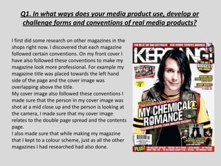
- 1. Q1. In what ways does your media product use, develop or challenge forms and conventions of real media products? I first did some research on other magazines in the shops right now. I discovered that each magazine followed certain conventions. On my front cover I have also followed these conventions to make my magazine look more professional. For example my magazine title was placed towards the left hand side of the page and the cover image was overlapping above the title. My cover image also followed these conventions I made sure that the person in my cover image was shot at a mid close up and the person is looking at the camera, I made sure that my cover image relates to the double page spread and the contents page. I also made sure that while making my magazine that I kept to a colour scheme, just as all the other magazines I had researched had also done.
- 2. • I also researched different magazine contents pages, I also realised that each of them followed conventions such as layout, colour scheme, fonts etc. • I saw that all the magazines had everything laid out in columns full of text with pictures to a certain side of the page, I think this layout works well since it makes everything clear to see and keeps everything tidy. • The colour scheme and fonts that I have used on my front cover have followed through to the contents page of my magazine, I found that this worked well because it made everything on the front cover relate very well to my contents page • I challenged a convention by adding an editors not to my magazine as I found this was not usually used in music magazines but only used in fashion magazines.
- 3. My Final Front Cover I made sure I added in an issue number and date to my magazine. I found that in other magazines that the headlining story stood out I added a black more than the background under other stories my writing to make featured, I made the writing stand mine stand out by off the page more. making the text bigger than the rest of the other I used red, black and stories in the white as my colour magazine scheme as I felt them colours worked well together and stood out I added a on the page. competition in also as I found it I added a barcode was used in all in to make my magazines magazine seem more realistic.
- 4. Final contents page I have kept my I didn’t feature every colour scheme page number in my throughout my magazine because magazine there would be too much to write, I have All of the images I just included the main have used are my stories like other own. I have magazines also do. chosen these because they are clear images. I included special offers/deals to promote my I have also magazine more and included an so the readers get editors note as better value for all of the their money, all of magazines I the magazines I analysed had a analysed did this. editors note.
- 5. Final double page spread
- 6. Q.2 How does your media product represent particular social groups? . My cover image is of a young local singer which appeals more to the younger side of my audience, she’s styled in just natural normal clothes making the audience feel like they can relate to her. She is posed in a natural way in majority of her photos, I wanted this effect because it represents her as a middle class person which the audience would relate to well, and would be seen as quite a good role model to the younger readers of the magazine. I have included other bands such as Paramore and you me at six, which are bands that have been going for a longer period of time which will appeal to the older readers of the magazine. My magazine also includes different bands from different places in the world such as America and Australia, I did not feature any pictures that I had took from their concerts as I didn’t feel as there where a good enough quality and clear enough, but this would not be a problem in a normal magazine. My magazine doesn’t address sexuality directly but this could be a possibility for future issues.
- 7. Q3. What kind of media institution might distribute your media product and why? I have found that there are many media distributors. I have found that Bauer and IPC are the two most popular ones. I think Bauer would be a good distributer of my magazine as I think that my magazine is quite similar to Kerrang magazine. • Bauer Media Group is a large German publishing company based in Hamburg, which operates in 15 countries worldwide. Worldwide circulation of Bauer Media Group's magazine titles amounts to 38 million magazines a week. I think that my magazine would fill the gap in the market that is not covered by Bauer magazine
- 8. Q4. Who would be the audience for your media product? • My audience for my magazine would be 15-30 year olds as they are the age range that buy magazines. My magazine is aimed towards alternative/rock music fans which is why I included popular alternative bands such as pendulum, you me at six, enter shikari, paramore, a day to remember.
- 9. Q5. How did you attract/address your audience? • I attracted my audience by having the magazine priced at £2.50 whereas other magazine such as Q and NME are priced at around £4.00 making my magazine more widely appealing to people as its cheaper. In my magazine I have added an editors note about the first issue of my magazine to make the audience feel connected to the magazine. in my questionnaire the people I asked said they would buy a magazine that had their favourite bands/artists as the cover image. I used small images on my contents page of other bands to attract readers. The age range I decided on is 15- 25 because they are typical people that listen to the genre of music.
- 10. Audience Feedback For I audience feedback I showed 10 different people my magazine and asked a few questions about what they thought of it, these are the answers I found:- would you buy this What do you think of the colour magazine? scheme? “ I think the colour scheme is good as it stands out and is quite in your face, if I yes saw this on a shelf it would attract me no towards it” maybe Do you think this magazine looks professional? What are you thoughts on the contents page? “I think that its good a clear, the NO writing is a good size and it matches the front cover well, the pictures used Yes stand out well!” 0 5 10
- 11. Q6. What have you learnt about technologies from the process of constructing this product Before this project I had very little experience with Photoshop and I had never used Quark before. Over the time I have created my magazine I have learnt many new skills on how to use both of the technologies, once I learnt the basics about each of the software's I found it quite easy to navigate around both of them whilst making my magazine. I found that I could make my magazine look more professional just by changing simple settings on my work. Photoshop:- I found that Photoshop was really good software, as I could crop, rotate and edit my picture all in one programme. At first I found it difficult finding out what each of the tools did but once I learnt what each tool does it became easy. I used the Lasso tool to crop my pictures. This was useful because I could crop parts out of the picture that I didn’t want to use in my magazine like backgrounds. I also used the shape tool, this had a bank of different shapes which I could of used for my work, I used shapes such as boxes on my work to make parts of it stand out.
- 12. Continued…. • Quark- I found that quark was quite useful too, I could add my work onto the software easily and, I could separate I writing into columns by just typing in how many columns I wanted it in, whereas in in other software’s I would have had to separate my work into text boxes and shape them where I want to. I could also add pictures in, and the text would move around my picture. Quark is a programme that is specially designed for making magazine pages, which is perfect for this project.
- 13. Q7. Looking back at your preliminary task, what do you feel you have learnt in the progression from it to the full project? Looking back on my preliminary task I have found that I have became a lot more confident in using the software and know how the different settings work. I hadn’t used Photoshop much before this project so the cropping of my photos looked very messy and unprofessional.
- 15. I think that the fonts I used look unprofessional and childish. I also think that it looks quite plain, as there are quite a lot of blank spaces left between the writing, whereas in my final project there is not as many huge gaps between each set of writing. I found that the editing of my photos has improved as I can cut and crop my photos more neatly. Comparing the two cover pages together, its clear that my music magazine looks more professional, and contains a lot of the conventions of a professional magazine where as my college magazine has a lot of the conventions missing from it. I learnt a lot about market research, for my college magazine I didn’t do much market research and just included things and colours I thought where interesting. In my music magazine I did various different parts of research on the music magazine industry, which made it more specific to not just what I am interested in but what other people are interested in too. I feel confident about the softwares now and would be confident if I was asked to use quark and Photoshop again.