Strategize a Smooth Tenant-to-tenant Migration and Copilot Takeoff
Homepage Analysis
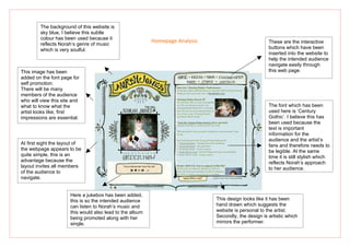
1. The background of this website is
sky blue, I believe this subtle
colour has been used because it
Homepage Analysis These are the interactive
reflects Norah’s genre of music
which is very soulful. buttons which have been
inserted into the website to
help the intended audience
navigate easily through
This image has been this web page.
added on the font page for
self promotion.
There will be many
members of the audience
who will view this site and
what to know what the The font which has been
artist looks like, first used here is ‘Century
impressions are essential. Gothic’. I believe this has
been used because the
text is important
information for the
audience and the artist’s
At first sight the layout of fans and therefore needs to
the webpage appears to be be legible. At the same
quite simple, this is an time it is still stylish which
advantage because the reflects Norah’s approach
layout invites all members to her audience.
of the audience to
navigate.
Here a jukebox has been added,
this is so the intended audience This design looks like it has been
can listen to Norah’s music and hand drawn which suggests the
this would also lead to the album website is personal to the artist.
being promoted along with her Secondly, the design is artistic which
single. mirrors the performer.