
Recomendados
Más contenido relacionado
La actualidad más candente
La actualidad más candente (19)
Destacado
Destacado (17)
Similar a Skills Development Journal
Similar a Skills Development Journal (20)
Último
Último (20)
Skills Development Journal
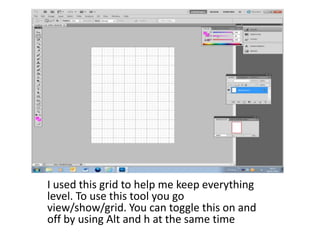
- 1. I used this grid to help me keep everything level. To use this tool you go view/show/grid. You can toggle this on and off by using Alt and h at the same time
- 2. This is a font that I copied and pasted from www.dafont.com to use as my masthead. I chose it because it looks relevant to the genre as it is bubbly and bold.
- 3. I dragged the masthead to the top left of the cover, this is because when a magazine is on a shelf this is the bit which is visible to the audience.
- 4. I copied and pasted each of the men separately and then resized them using edit/free transform. I dragged them into position and then merged all the layers to make it easier to move them all as one.
- 5. I changed the background colour of the cover by using the paint filler, I chose a metal grey so it did not take away from the colours of the men.
- 6. To achieve this effect I double clicked on the layer and added a gradient. This adds more tone and interest to the background.
- 7. I restored the background white after changing my mind. I used the paint filler to make the masthead a bright and fun blue to fit the genre. I then added a pink banner using the rectangle tool.
- 8. To achieve the other boxes I copied and pasted images from the internet and deleted the background by selecting it with the magic wand tool. I used text boxes to fill the banner with appropriate sentences.
- 9. After finding a font I liked from www.dafont.com I wanted to create a patterned effect inside the ‘D’. I copied and pasted a patterned image that I liked and dragged the letter over the top. I changed the opacity of the letter and then merged the layers together. I then deleted all the pattern on the outside using the magic wand tool and was left with a patterned ‘D’.
- 10. I placed the patterned letter along with the originals to create my Daina masthead. I chose the pattern to make the image represent feminism and fun.
- 11. I made several copies of the masthead by selecting the whole thing then holding Ctrl/c to cope and then Ctrl/v to paste. I then tried out different colour schemes by going into image/adjustments/hue and saturation and changing the levels appropriately. To have as many different versions as possible.
- 12. To start my front cover I took away the background of my photo by drawing around it with the magnet lasso. After deleting it I used the paint bucket tool to fill the background in light pink.
- 13. I copied and pasted my masthead onto the top of my magazine, I did this to follow the usual design conventions and keep it to seeand attract attention.
- 14. I included a strap line under my masthead, I did this using the text box.
- 15. I added another strap line at the bottom, for this I used the rectangular tool to make the box and then used the paint bucket to colour it a dark pink. I then added text over the top using the text tool.