1. 1
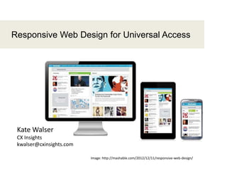
Responsive Web Design for Universal Access
Image: http://mashable.com/2012/12/11/responsive-web-design/
Kate Walser
CX Insights
kwalser@cxinsights.com
2. 2
Speaker – Kate Walser
- 15 years in usability, accessibility and user experience design
- Member of TEITAC, or Section 508 / Section 255 refresh committee
- Principal consultant at CX Insights, the user experience division of
Tritus Technologies, Inc.
- Originally from upstate NY, now call Fairfax, VA (near DC) home
- Wrote "Usability and Gov 2.0" chapter for Usability in Government
Systems book. (June 2012)
7. 7
Agenda
Topic Timeline
Introductions 9:00 – 9:10
What is responsive design 9:10 – 9:20
How does it work 9:20 – 9:25
Responsive design & accessibility 9:25 – 9:35
Group exercise
Look at AustinTexas.govon your mobile phone
9:35 – 9:50
Planning a responsive design 9:50 – 10:05
Group exercise
Make TXHHS responsive
10:05 – 10:20
Discussion,Wrapup 10:20 – 10:30
14. 14
The goals of responsive web design are to use the
same content for different devices but trim and mold
the content and features to best fit the device.
Goals
16. 16
3 main parts
- Fluid grid (adjustable widths)
e.g., column width = 45% (vs. 300px)
- Flexible images (scalable)
e.g., image size is 24em wide by 12em high (vs. 248px x 124px)
for desktop viewing, but just 12em x 6em for mobile
- Media queries (check device / browser width)
e.g., if the device width (or the max-width of the viewable area) is
480px wide, then show this version
17. 17
1. Decide what to show and how to
order it
Wireframes show web page elements
and how they look, where they go on
different devices
“Media Queries,” by Juan Arregin
Source: http://dribbble.com/shots/185755-Media-Queries
18. 18
2. Check maximum (device) width
Option A: Link to a CSS file for that max-width
<link rel="stylesheet" type="text/css" media="screen and (max-
width:480px)" href="minimal.css" />
Option B: As lines in CSS file
@media (max-width: 60em) {/* styles for 60em - less*/}
@media (max-width: 30em) {/* styles for 30em - less*/}
Option C: As import statement in CSS file
@import url("minimal.css”) screen and max-width:480px
19. 19
3. Use fluid layouts, flexible images
(i.e., em or % vs. px)
http://adaptive-images.com/details.htm
media="only screen and (min-width: 768px)"
html.details #how-it-works {
float: left;
width: 64.5%;
padding-bottom: 20px;
}
26. 26
Improve readability for all devices
Responsive design often hides decorations
.decoration {display:none}
Use for both screen readers and responsive version
<link rel="stylesheet" type="text/css"
media="speech"href="minimal.css" />
<link rel="stylesheet" type="text/css" media="screen and
(max-width:480px)"href="minimal.css" />
27. 27
Challenge 3
Many tab stops before content
Multiple navigation elements precede the content on the
WorldWildlife.org website
World Wildlife Fund
Desktop version
28. 28
Since the AustinTexas.gov uses a responsive design, at narrower widths, the submenus are
hidden, making it easier for users to get to main section options or content.
Collapsed navigation can* mean fewer tab
stops to reach content
*The WorldWildlife.org website doesn’t update its CSS to use display:none to “hide” the collapsed options as tab
stops and from screen readers.
29. 29
Challenge 4
Images that degrade on zoom
Images: http://coding.smashingmagazine.com/2012/01/16/resolution-independence-with-svg/
Images designed at one resolution degrade as users, especially those with screen magnifiers,
increase their screen magnification.
30. 30
Use responsive, scalable images
Scalable vector graphics used for responsive web designs also improve screen
usage for those with visual impairments.
31. Group Exercise (15 minutes)
Take a look – AustinTexas.gov
- Visit the AustinTexas.gov website on a mobile device
- How does it compare to the desktop version?
- What works? What could be improved?
31
35. 35
2. Pick devices
Google Analytics reports include Mobile reports. Check the Devices section, and drill down by screen resolution or browser as a
secondary dimension to see what users are using to visit your site.
38. 38
ItalioKitchen.com’s website hides the gallery of different dishes when a
user visits from a mobile site. Instead the menu, locations, news, and
specials take center stage.
Example:
italiokitchen.com
53. Summary
- Combine media queries, responsive images, flexible grid
- Identify the main reasons, devices users will use to visit
your site
- Adjust your design to respond to that
53
55. Contact
Kate Walser
kwalser@cxinsights.com• @kwalser• +1 (571) 281-2626
To learn more
- “Responsive Web Design,” by Ethan Marcotte
Article: http://alistapart.com/article/responsive-web-design
Book: http://www.abookapart.com/products/responsive-web-design
- “Logical Breakpoints for Your Responsive Design,” by Vasilis van Gemert
http://www.smashingmagazine.com/2013/03/01/logical-breakpoints-responsive-design/
- ResponsiveDesign.is
55
Notas del editor
How do users reach your site?What features and content do they use most?
What’s the heart, core of your product?If hidden, which elements would be missed by users?Which items are just for visual appeal?Which things are harder to use?